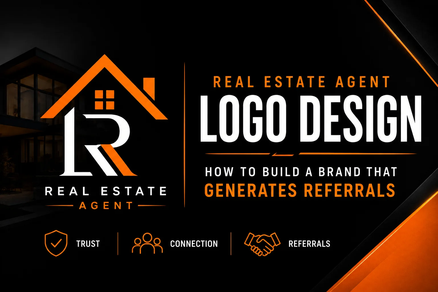
Real Estate Agent Logo Design: How to Build a Brand That Generates Referrals
A real estate agent’s logo appears more times in local community view than the logos of most national brands. A yard sign on an active listing is seen by every neighbor, every visitor, every delivery driver, and every car that passes the property during the listing period, sometimes for months at a time. Multiply that by the number of active listings an agent carries and the number of years they are in the market, and the cumulative brand impression of a yard sign logo rivals paid advertising campaigns that cost thousands of dollars monthly. Yet most agents treat their logo as an afterthought rather than the high-frequency marketing asset it actually is. This guide changes that.
Key takeaways
- Design your logo to pass the yard sign test, since each listing sign is seen daily by the neighbors you want to reach.
- Avoid defaulting to navy blue and gold, because when most local agents use it the color no longer sets you apart.
- Early in your career and without a team, brand under your own name so the equity follows you through brokerage moves.
The Unique Brand Challenge Facing Real Estate Agents
Real estate agents face a branding challenge that most other professionals do not: they operate at the intersection of personal brand and brokerage brand, and the relationship between the two is often complicated. An agent affiliated with a national franchise brokerage operates under brand standards that constrain but do not eliminate their ability to build a distinctive personal identity. An independent agent has complete freedom but no institutional brand recognition to borrow. An agent building a team has the additional challenge of creating a brand that is bigger than any individual member.
In all three scenarios, the strategic priority is the same: build a visual identity that is consistent enough to be remembered, distinctive enough to be recognized, and professional enough to justify the price points at which the agent wants to operate. In a category where trust is the primary purchase driver and all competitors claim the same basic competence, visual differentiation and consistency are among the few tools available to shift client preference before the first conversation.
The Yard Sign Test: Your Most Important Design Criterion
The yard sign is the real estate agent’s most valuable and most underappreciated marketing asset. Every listed property is a free billboard in the exact neighborhood where the agent wants to be known. The quality of the visual identity on that sign either builds or undermines local reputation with every person who drives past.
The yard sign test is straightforward: print or display your logo at the approximate scale of the logo area on a standard yard sign, typically 45cm to 60cm wide, and evaluate it from 10 to 15 meters away. This approximates the viewing distance from the sidewalk across a front lawn, or from a car at low speed on a residential street. At that distance and scale, every element of the logo that is not immediately legible and recognizable fails the test.
Most real estate logos fail the yard sign test for one of three reasons. The business name is in a font that is decorative at large scale but illegible at viewing distance. The logo contains fine details, thin lines, small icons, decorative elements, that disappear or merge into noise at distance. Or the color contrast between the logo and the sign background is insufficient for the sign to stand out against the landscaping, fencing, or architectural colors of the properties where it will be placed.
Breaking Free From the Blue-and-Gold Real Estate Visual Cliché
Navy blue and gold is the dominant color combination in real estate branding across most markets. It communicates trust, professionalism, and premium positioning, all appropriate qualities for a real estate agent. The problem is that when 60 to 70 percent of agents in a given market use the same color combination, the color provides no differentiation signal. A prospect who has seen three agents’ yard signs, all in navy and gold, cannot distinguish them from memory by color alone.
Color differentiation is one of the highest-leverage moves available to a real estate agent building a local brand. Deep forest green communicates local rootedness, environmental consciousness, and stability, qualities that resonate strongly with residential buyers and sellers. Rich burgundy or wine communicates premium positioning and long-established success, working well for agents focused on luxury or move-up markets. Sophisticated charcoal or near-black communicates contemporary authority and appeals to urban and design-conscious demographics. Bold teal creates immediate visual recognition precisely because it is rarely used in the category.
Personal Name vs. Team Brand: Choosing the Right Identity Foundation
An agent early in their career who does not yet have a team benefits from branding under their personal name, first name and last name, clearly typeset, consistently applied. This builds personal equity that carries forward through career changes, brokerage moves, and market shifts. The person is the brand, and every transaction and referral accumulates equity in the individual’s name recognition.
An agent building a team faces a different calculation. A team name that is only recognizable if all original team members remain creates fragility, personnel changes require a rebrand that loses accumulated recognition. More durable team brands use geographic names (“Westside Group”), value-based descriptors (“Clarity Real Estate”), or distinctive abstract names that can survive team evolution without losing relevance. If a team name is based on founding partners’ names, it should be treated as a brand name rather than a list of names, condensed, distinctive, and visually treated as a single unit.
Applying the Logo Across the Real Estate Agent’s Marketing System
A real estate agent’s brand appears across a specific and predictable set of touchpoints, and designing the logo with all of them in mind from the start prevents expensive adaptations later. Yard signs and riders require a bold, simple lockup that works at large scale with high contrast. Business cards require a version that is clean and professional at small scale. MLS profile photos and listing platforms require a square or near-square image at low pixel density. Email signatures require the logo at 150 to 200 pixels wide maximum. Mailer postcards require a version that reproduces cleanly in offset printing on glossy postcard stock.
Having a designer prepare tested versions for each of these applications at the time of original logo design is far more cost-effective than discovering incompatibilities one by one as each new application arises.
Frequently Asked Questions About Real Estate Agent Logo Design
Should a real estate agent brand under their personal name or a team name?
Independent agents early in their career benefit from branding under their personal name because it builds personal equity that transfers between brokerages. Agents with a team should brand under a name that can survive team member changes, a geographic name, a value-based name, or a distinctive phrase rather than a combination of personal names that creates fragility.
What elements make a real estate logo stand out in a competitive market?
Real estate logos that stand out use a color uncommon among local competitors, a typographic approach that is legible at yard sign scale, and the complete absence of generic real estate icons like houses, keys, and location pins that make logos indistinguishable from thousands of others in the same market.
How important is the yard sign test for a real estate logo?
The yard sign test is the single most important quality test for any real estate logo. A yard sign is seen by every person who passes a listed property during the entire listing period. A logo that cannot be read clearly from a moving vehicle on a residential street is failing its primary local marketing function every day it is in the ground.
Should a real estate agent include their photo in their logo?
A photo should not be incorporated into the primary logo mark, photos become dated quickly and create production problems. However, a professional headshot used consistently alongside the logo on yard signs, website, business cards, and marketing materials is one of the most effective brand elements for real estate agents because it builds personal recognition in a relationship-driven category.
What file formats does a real estate agent need for their logo?
Real estate agents need vector format (AI, EPS, SVG) for yard sign production and large-format print, PNG files with transparent backgrounds at high resolution for digital marketing and MLS listings, a black-only version for single-color applications, and versions that meet the specific requirements of any franchise brand system they operate within.