Presentation Folder Logo Design: Keep the Pocket From Hiding Your Mark
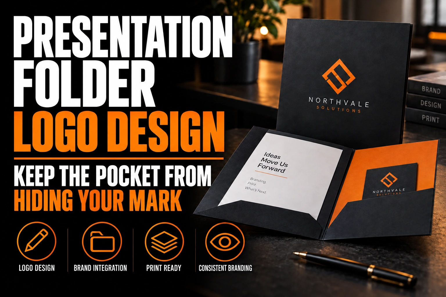
On a presentation folder, the main logo belongs on the upper half of the front cover. A second placement goes on the pocket face inside. Never let a logo straddle the top edge of the pocket: the fold cuts it in two.
Key takeaways
- Place the main logo on the upper half of the front cover, the zone that stays visible in a stack or on a desk.
- Never let a logo straddle the top edge of the pocket, since the fold splits it and the two halves rarely line up.
- Centre the inside logo on the pocket face, clear of the business card slits and the area a card will cover.
A folder looks simple on a proof and hides half its surface once it is folded and filled. This guide maps each panel, so you know where your mark stays visible and where it disappears.
How is a presentation folder built, panel by panel?
A presentation folder is usually one die-cut sheet. It folds into a front cover, a back cover, 2 inside panels and 1 or 2 pockets. The pockets fold up from the bottom of the inside panels and are glued along their sides.
That construction creates a problem the flat proof does not show. On the flat sheet, the pocket flaps sit below the inside panels and print upside down or rotated. On a generic rectangle, artwork can land across a future fold, a glue tab or the back of a pocket.
The solution is to design on the printer’s dieline from the first sketch. The dieline marks every cut, fold, glue area and business card slit. It turns guesswork into a map.
Why does the pocket slice through a logo on the inside panels?
The pocket slices through a logo because its top edge runs straight across the inside panel. Anything placed across that line is split. The upper half stays on the panel, the lower half sits on the pocket face, and they rarely line up.
Even a perfect fold leaves a visible step. The pocket’s cut edge casts a small shadow, and the paper thickness shifts the 2 halves slightly. A logo split by that edge looks broken. A tagline split by it can lose a whole line of words.
The inserted documents create a second problem. Pages tucked into the pocket rise well above its edge and cover most of the inside panel behind them. Artwork printed there is visible only when the folder is empty, which is almost never how the client sees it.
Which spot on the front cover gives a folder logo the most room?
The upper half of the front cover gives a folder logo the most room, ideally centred or aligned with a clear margin. That zone stays visible when the folder sits in a stack, lies on a desk or slides out of a bag.
Restraint works better than filling the cover. A folder is handed over at a meeting, a proposal or a closing, so it should look calm and organized. One strong logo on a solid colour or a single quiet image makes the documents inside feel more important.
Keep a safe margin from every edge and fold. The spine and the outer edges take the most wear when a folder is carried. Artwork pushed against them is the first thing to scuff. Our guide to logo clear space and minimum size rules explains how to document that breathing room for every supplier.
The back cover deserves a small role too. A compact logo with your website or phone number near the bottom gives the folder a finished look.
Where does the logo go inside the folder?
Inside the folder, the best logo spot is the pocket face, centred and clear of any business card slits. The pocket stays visible in front of the inserted pages, so a mark placed there is seen every time the folder opens.
The inside panels above the pockets work best as plain colour or a subtle pattern. They show only briefly before the pages fill them. If you want a message there, keep it short and high on the panel, above the height your inserted sheets will reach.
A single pocket on the right is common for proposals. A double pocket gives you 2 faces. Put the logo on one and a short list of services or contact details on the other.
Will A4 pages or letter pages change the folder layout?
Yes. The paper size you insert decides how much of the inside panel stays visible. Canadian offices mostly print on letter paper, 8.5 by 11 inches. Clients and partners abroad often send A4 instead.
The ISO 216 standard defines the A series used across most of the world. In that series, an A4 sheet measures 210 by 297 mm. That is taller than a letter sheet, which measures about 216 by 279 mm. A folder sized tightly for letter paper lets A4 pages stick out above the cover.
If your firm works with international clients, ask for a folder size that holds both formats. Then check the inside layout with A4 pages inserted, because they cover even more of the inside panel than letter pages do.
Where do business card slits cut into the folder design?
Business card slits are die-cut into the pocket face, usually on the right pocket, so they cut into whatever artwork sits there. A card slipped into them also covers a rectangle of the pocket, roughly the size of a standard business card.
Mark the slit position on your layout before placing the logo. Keep the logo clear of both the cuts and the area the card will cover. A logo half hidden behind someone’s business card looks like a layout mistake.
Your own business card then sits inside your folder, so the 2 should share the same system. Our overview of premium business card finishes shows how a foil or spot varnish can echo the folder cover.
A logo that stays whole on every cover and pocket
We design logos with the compact and 1-colour versions a folder needs, so the cover, the pocket face and the card slits all work together.
Can a dark folder cover crack along the folds?
A dark, solid colour printed across a fold can crack and show white paper at the crease. The risk grows with heavy, coated stock, which is exactly what most folders use. Folders are folded and refolded far more often than brochures.
Ask the printer how the folds will be scored, and whether a lamination is planned. Both reduce cracking. If you love a deep navy or black cover, keep the logo away from the spine. A slight crack then never touches it. Our guide to brochure paper weight and finish covers how stock choices affect folds on any folded piece.
Finishes can raise the cover without adding colour. A spot gloss or a foil on the logo alone, over a matte cover, draws the eye exactly where you want it. It also works only if your logo exists as a clean vector file, which is where a professional logo design pays off.
Conception-Logo.com designs presentation folders and has them printed, along with letterhead, envelopes, business cards and multi-page brochures. Every piece then comes from the same master logo file.
What to mark on the dieline before the folder goes to print
- The main logo sits on the upper half of the front cover, clear of the spine and edges.
- No logo or tagline straddles the top edge of the pocket.
- The inside panels above the pockets carry nothing the client must read.
- The inside logo sits on the pocket face, clear of the business card slits.
- The folder size holds both letter and A4 pages if you work abroad.
- Dark solids avoid the folds, or scoring and lamination are confirmed.
- The artwork is built on the printer’s own dieline, not a generic rectangle.
Where should a logo go on a presentation folder?
A logo should go on the upper half of the front cover and on the pocket face inside a presentation folder. The questions below cover the placements owners ask about most before printing.
Should the logo go on the inside pocket of a presentation folder?
Yes, the pocket face is the best inside spot for a logo. It stays visible in front of the inserted pages every time the folder opens. Centre the logo and keep it clear of the business card slits and the area a card will cover.
What size documents does a presentation folder hold?
Most folders in Canada are sized for letter pages of 8.5 by 11 inches. A4 pages, defined by the ISO 216 standard at 210 by 297 mm, are taller and can stick out. Firms with international clients should choose a size that holds both.
Can a full-colour background crack at the folds?
A dark, solid background can crack along the folds and show white paper, especially on heavy coated stock. Scoring the folds properly and adding a lamination reduce the risk. Keeping the logo away from the spine protects it if a small crack appears.
Where do business card slits go on a presentation folder?
Business card slits are usually die-cut into the face of the right pocket. They cut through any artwork underneath, and the card covers a small rectangle once inserted. Mark their position on the dieline first, then place the logo and text around them.
Start with a logo design built for folders and stationery, so every pocket and cover shows your mark whole.