Pull-Up Banner Logo Design: Sized for Standing Eyes and a Hidden Base
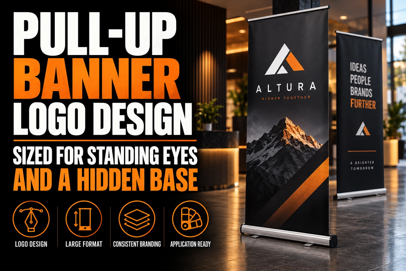
On a pull-up banner, the logo should span most of the width, often 60 to 80 percent. It should sit in the upper part of the graphic, near the eye level of a standing adult. The bottom of the print rolls into the base and hides behind tables and people, so nothing important belongs there.
Key takeaways
- Make the logo span 60 to 80 percent of the banner width so it reads clearly from across an aisle.
- Place the logo near the top at standing eye level, leaving a clear margin under the top rail.
- Keep anything important out of the bottom zone, which rolls into the base and hides behind tables and visitors.
A pull-up banner looks like a tall poster on screen. Once it stands in a hall, it behaves like hardware with dead zones. This guide shows you where they are.
What happens to the artwork at the base of a pull-up banner?
At the base of a pull-up banner, the bottom of the artwork stays rolled inside the cassette or tucked behind its cover. That band is never visible. The strip just above it sits low, behind the base, a table or the legs of visitors.
The hardware explains why. A spring-loaded roller in the base winds the graphic up for transport. When you pull the banner out, the last part of the print stays attached to the roller. It may also curve slightly where it leaves the base, which distorts anything placed there.
Every stand maker publishes a template with that hidden zone marked. Ask for it before any design work starts, and confirm which model you own. Two stands that look identical can hide different amounts at the base.
The top has a dead zone too. A rail clamps the upper edge of the graphic and covers a thin strip. Keep the logo clear of that rail, with a clear margin below it.
At what height do visitors actually look at a pull-up banner?
Visitors look at a pull-up banner from their own eye level, a little below their full standing height. A logo placed in the upper part of the banner meets those eyes directly instead of forcing people to look down.
Statistics Canada’s Canadian Health Measures Survey gives a useful reference. By age group, it measured mean standing height at about 173 to 178 cm for men. For women, the range was about 159 to 163 cm. Eyes sit several centimetres below the top of the head.
That puts the eye level of most adult visitors in the upper portion of a banner around 2 metres tall. It is also the band that stays visible over a crowd, a table or a seated colleague. The logo belongs there, not at the visual centre of the file.
Seen on a laptop, a centred logo looks balanced. Seen in a hall, the centre of a tall banner sits around waist or chest height. That is where people and furniture block it first.
How wide should the logo run across a pull-up banner?
The logo should run across most of the banner’s width, often 60 to 80 percent, so it reads from across an aisle. A logo that only fills a third of the width looks timid from a distance and leaves the brand unreadable.
Width is your only real lever. Pull-up banners are narrow and tall, so a horizontal logo is limited by the side margins, not by the height. Use that width fully, then leave clear space on each side so the logo never touches the edge of the print.
Long names need a choice. If a horizontal logo shrinks too much to fit, a stacked version with the symbol above the name often reads better. Our guide to horizontal, vertical and icon logo versions explains how to build that alternative from your main mark.
Avoid the small icon alone unless people already know it. A visitor who does not recognize your symbol needs the name to understand who is standing behind the banner.
Should the logo sit at the very top of a pull-up banner?
The logo should sit near the top of a pull-up banner, but not against it. Leave a clear margin under the top rail, then place the logo, then the main message. That order matches how people scan a tall surface: from the top, then down.
A logo jammed under the rail looks cramped and risks being clipped if the graphic is mounted slightly off. A margin of a few centimetres solves both problems.
Below the logo, keep one short headline. Detailed information belongs lower, in the zone visible when the stand sits in a quiet corner. It never goes in the hidden band at the base. Our roll-up banner design guide for trade shows covers the overall message hierarchy. This article stays on the logo and the hardware.
What changes when the banner stands behind a table?
When a pull-up banner stands behind a table, the table hides the lower third or more of the graphic. Only the upper part, with the logo and the headline, stays visible from the aisle.
Plan for the worst setup you will face. At a trade show, the banner may stand behind a skirted table with staff in front of it. At a reception desk, it may stand next to a counter. In both cases, the bottom of the banner is decoration at best.
Design the upper half to work alone. Fold a printout of your layout at the halfway mark and look at only the top. If the logo and the core message still make sense, the banner will survive any table.
Can you reuse a pull-up banner design on a different stand?
You can reuse a pull-up banner design on a different stand only after checking the new template. Width, visible height and the hidden zone at the base often differ between models, even when the banners look alike.
A design made for one stand can lose the bottom of its message or show a strip of blank material on another. Resize the layout from the master file rather than stretching the old print file. The logo position should be recalculated from the new visible area, not copied.
Conception-Logo.com designs roll-up and X-frame banners and has them printed, along with trade-show booths, vinyl banners and table covers for kiosks. Every piece can share the same logo file and the same placement logic.
A pull-up banner built around the zones people actually see
We design pull-up banners on your stand’s real template, with the logo at standing eye level and nothing important lost in the base.
Which logo file should go into a pull-up banner layout?
A pull-up banner layout needs a vector logo file, such as an AI, EPS, SVG or vector PDF, placed at full size. A PNG taken from your website will print soft and jagged once enlarged to banner width.
The scale jump is large. A logo that measures a few centimetres on a business card can span more than half a metre on a banner. Only vector artwork stays sharp across that range. Our guide on why a logo looks blurry on signs explains the difference in practical terms.
Colour also needs care. Large-format printers work from specific colour references, and a bright screen colour can print duller on banner material. Ask for a printed proof or a colour sample if your brand colour is central to recognition. If the printer rejects your files, our article on why printers reject logo files lists the usual causes.
If you only have a web logo, start there. A professional pull-up banner design includes rebuilding the logo as clean artwork when needed.
What to mark on your pull-up banner template before you design
- The hidden zone at the base and the strip covered by the top rail.
- The band near standing eye level, where the logo will sit.
- A logo width of about 60 to 80 percent of the banner, with side margins.
- A clear margin between the top rail and the logo.
- The height a table will hide, so the upper half works alone.
- A vector logo file placed at full size, with a colour reference.
How big should a logo be on a pull-up banner?
A logo on a pull-up banner should span roughly 60 to 80 percent of the width. It should sit near the top, at standing eye level. The answers below cover the layout questions owners ask most before printing.
Where is the hidden area on a pull-up banner?
The hidden area sits at the very bottom of the graphic. There, the print stays rolled inside the base or behind its cover. A thin strip at the top is also covered by the rail. Each stand maker marks these zones on its template, so check it before designing.
Should the logo go at the top or the middle of a pull-up banner?
The logo should go near the top, below a small margin under the rail. The middle of a banner around 2 metres tall sits near waist or chest height, where tables and people block it. The top stays visible above a crowd and matches standing eye level.
Can I reuse my roll-up banner design from a different stand?
Only after comparing the 2 templates. Stand models differ in width, visible height and the hidden zone at the base. Resize the layout from the master file and recalculate the logo position instead of stretching the old print file.
What file format should a pull-up banner logo be?
A pull-up banner logo should be a vector file, such as AI, EPS, SVG or vector PDF. Vector artwork stays sharp when enlarged to banner width, while a PNG or JPG from a website prints soft and jagged. Include a colour reference so the printer can match your brand colour.
Conception-Logo.com has completed more than 5,000 projects for businesses that show up at trade shows, lobbies and events. Start with a pull-up banner designed around your logo, ready for your stand’s real template.
See also our page Adobe firefly ai logo.