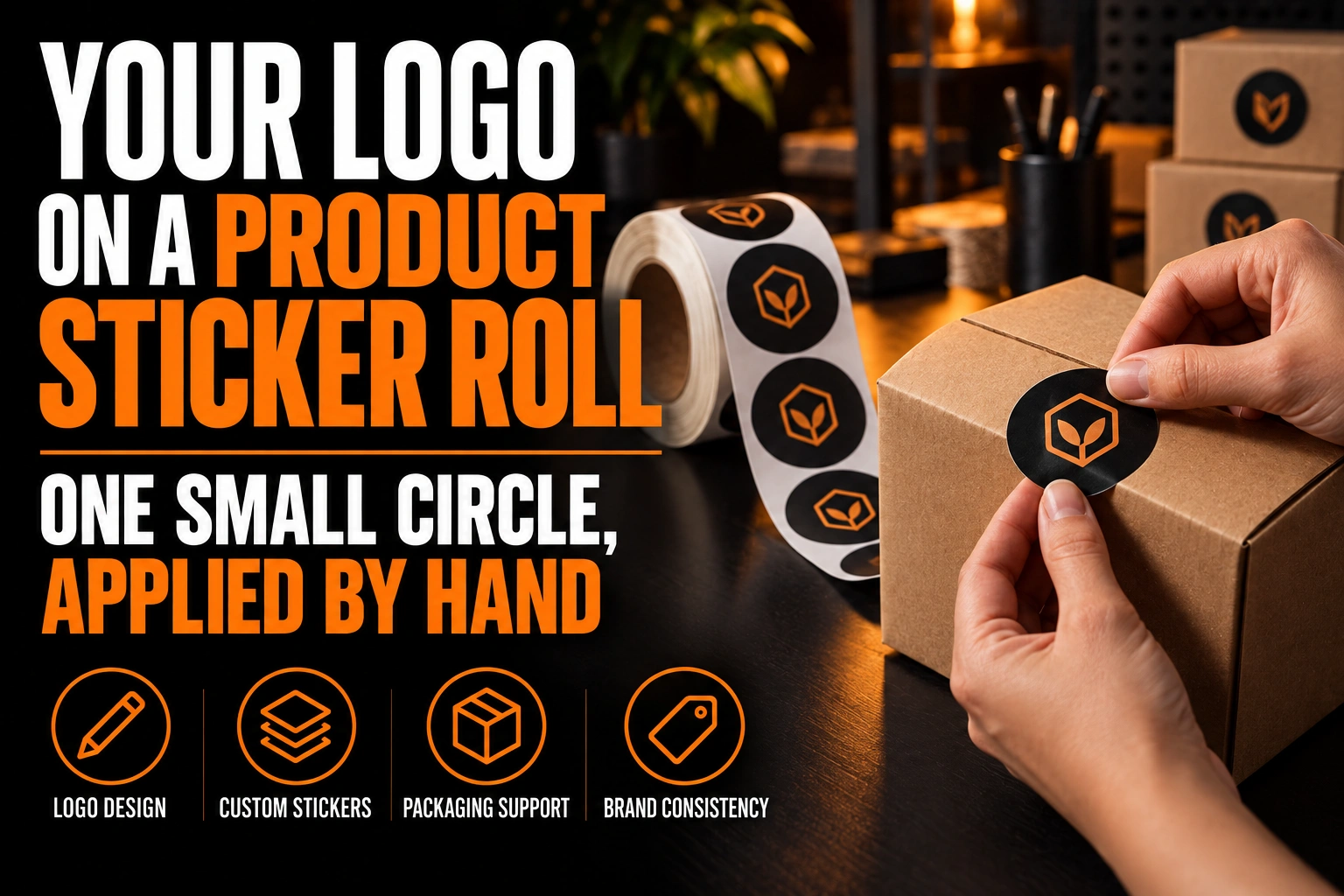
Your Logo on a Product Sticker Roll: One Small Circle, Applied by Hand
A product sticker logo should be sized to the smallest flat surface it will sit on. Build it as a compact mark inside a simple circle or rounded shape. Because the roll is applied by hand, the design has to look right even when a sticker lands a few millimetres off centre or slightly turned.
Key takeaways
- Size the sticker to the smallest product it goes on, keeping at least 3 mm of clear surface on every side.
- Choose a round sticker for hand application, since a slightly turned circle never looks crooked next to a box edge.
- Approve colours on the real stock, since a brand colour on matte or kraft paper looks duller than on glossy white.
This guide covers the small branded sticker that seals a bag, closes a gift box or dresses a jar. By the end, you will know how to size it, which version of your logo to put inside it and which stock to choose.
What size should a product sticker logo be?
Size the sticker to the smallest product it will go on, then size the logo to the sticker. Measure the flat area of that product with a ruler, and keep at least 3 mm of clear surface around the sticker on every side.
A single roll usually serves several products. A small business might use the same sticker on a 60 ml jar, a kraft coffee bag and a folded gift box. The jar shoulder is the tightest space of the 3, so it sets the maximum size for the whole roll.
Inside the sticker, the logo needs its own margin. A mark that touches the cut edge looks cramped, and any small shift during cutting makes the gap uneven. Leave an empty ring around the logo, then print the design at 100% on office paper. Cut it out, tape it to the real product and look at it from arm’s length before you approve anything.
Why does a round sticker forgive hand application better than a rectangle?
A circle has no straight edge, so nobody can compare it with the edge of the box or the seam of the bag. A rectangle applied 2 degrees off looks crooked next to a straight package edge, while a circle turned by the same amount looks identical.
Hand application is never perfectly repeatable. On a busy packing afternoon, one person may apply hundreds of stickers, and each one lands a little differently. The shape of the sticker decides whether those small differences show.
The logo inside the circle matters too. A symmetrical symbol, a monogram or a name set on a curved path still reads correctly when the circle turns. A straight horizontal wordmark does not: tilt the sticker slightly and the text looks careless. If a rectangle suits your packaging better, choose rounded corners. They lift less when the sticker is peeled from the liner and pressed down with a thumb.
Which version of your logo belongs inside a small product sticker?
The most compact version of your identity: a symbol, a monogram, or a short name inside a badge. The full horizontal logo with a tagline shrinks until the tagline is unreadable and the name looks like a thin line across the circle.
A well built identity already contains this compact version. If yours only has a wide lockup, the sticker is the moment to add one. The same mark will also serve on social media profiles and other small surfaces. Our article on why a logo needs horizontal, vertical and icon versions explains how each version is planned.
Fine details are the second issue. Thin outlines, small text inside a symbol and tight letter spacing all close up on a small sticker. Set a minimum size for the compact mark and write it down, as described in our guide to logo clear space and minimum size rules.
How does the sticker stock change the colours of your logo?
The same ink looks different on glossy and uncoated stock. A brand colour that looks bright on a glossy white sticker usually looks duller and slightly darker on a matte paper or kraft sticker.
X-Rite, the company behind the Pantone colour guides, explains the reason. On coated paper, the ink sits on top of a glossy coating and absorbs very little. On uncoated paper, the ink soaks into the fibres. According to X-Rite, most of the visible difference comes from that reaction between ink and paper, not from the amount of ink.
For a sticker roll, this means choosing the stock before approving the colours. Kraft stock adds its own brown tone under every colour, so a dark single colour often works better than a full palette. A clear sticker shows the product through the design, so light colours almost vanish on a dark jar unless white ink is printed underneath. Ask for a printed proof on the stock you plan to use. Our guide to the single-colour Pantone logo for print covers how to prepare that version.
Should you order a custom die-cut sticker or a standard circle?
For stickers applied by hand, a standard circle or rounded rectangle is usually the safer choice. A custom die-cut shape that follows your logo outline looks striking. Its thin parts tear, though, and sharp inward corners lift once the sticker is on a bag.
A die-cut outline also makes hand application slower. Each sticker has to be peeled carefully so a narrow point does not stay behind on the liner. If you want a custom shape, keep a solid border of 2 to 3 mm around the whole mark. That border gives the cut a simple path and protects the details of the logo.
Should every product in your line get its own sticker?
Usually, one sticker design with a single changing element is enough. Keep the same mark, the same shape and the same position, and change only the background colour or one word under the logo.
Picture a candle maker with 6 scents. A different colour band for each scent lets customers spot their favourite on a shelf. The shared logo and shape still tell them every candle comes from the same maker. Six completely different stickers would look like 6 different brands.
Plan this colour system at the start. Choose colours that stay distinct on your chosen stock, since 2 close shades on kraft paper can look identical.
A mark that still reads inside a small circle
We design the compact version of your logo, the symbol, monogram or round badge, so your product stickers stay sharp on jars, bags and boxes.
Where does a product sticker sit in the rest of your packaging?
The sticker is the smallest piece of your packaging, and often the first one a customer touches. It closes the bag, seals the tissue paper or holds the lid of a gift box. It should match the box, the card and the tag around it.
Use the same colours and the same compact mark on every piece. A customer who opens a box and sees the same circle on the seal, the thank you card and the jar connects them to one brand. Our article on branded packaging design and the unboxing moment shows how these pieces work together.
Roll stickers are among the products Conception-Logo.com designs and prints, along with business cards, postcards and greeting cards for gift notes. The same master file can carry all of them.
What to check before you order your next roll of product stickers
Run through these points with your logo designer before the file goes to print.
- The sticker size comes from the smallest flat surface it will cover, with at least 3 mm of margin.
- The shape is a circle or a rounded rectangle, so small rotations during hand application do not show.
- The logo inside is the compact version: symbol, monogram or round badge, with no tagline.
- The colours were approved on a printed proof of the actual stock, glossy, matte, kraft or clear.
- A custom die-cut shape, if used, has a solid border of 2 to 3 mm around the mark.
- Product variations change one colour or one word, never the logo itself.
How do you design a product sticker that looks right on every package?
Start from the smallest product, use a compact mark inside a simple shape, and approve colours on the real stock. Those 3 decisions cover most of the problems a hand-applied sticker roll will meet.
What size should a product sticker be for a small jar?
Measure the flat area of the jar’s lid or shoulder. Size the sticker to fit inside it, with at least 3 mm of clear space around it. If the same roll also goes on bags and boxes, the jar sets the maximum size because it offers the least room.
Is a round or a rectangular product sticker better?
A round sticker is more forgiving when stickers are applied by hand. A circle turned a few degrees looks the same, while a rectangle that is slightly off looks crooked next to a straight package edge. If you choose a rectangle, rounded corners lift less after application.
Why does my logo look duller on a kraft or matte sticker?
Uncoated stock absorbs ink, while glossy coated stock keeps it on the surface. X-Rite, which produces the Pantone guides, attributes most of the visible difference to that reaction between ink and paper. Approve your colours on a printed proof of the stock you plan to use.
Can I put my full logo on a product sticker?
Usually not. A horizontal logo with a tagline shrinks inside a small circle until the tagline cannot be read. A symbol, a monogram or a short name in a round badge fills the sticker better and still matches the rest of your packaging.
Conception-Logo.com has completed more than 5,000 projects, from full identities to the small marks that live on packaging. If your logo has no compact version yet, our professional logo design service can build one for your next sticker roll.