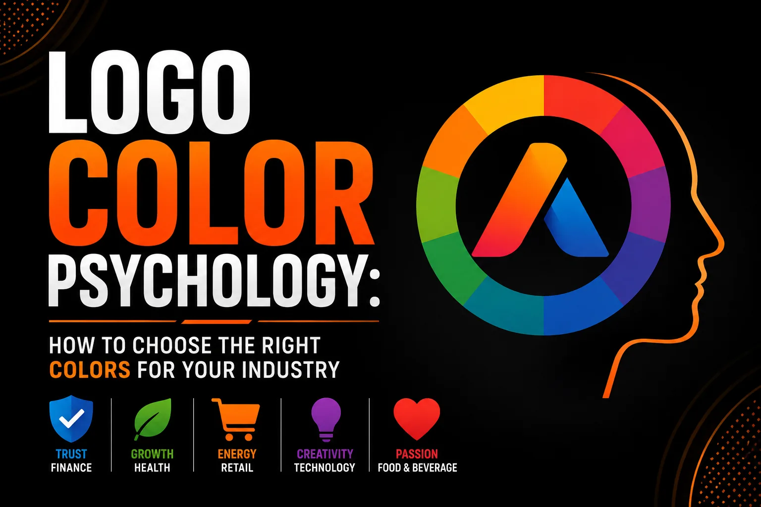
Logo Color Psychology: How to Choose the Right Colors for Your Industry
Color is the first thing the human brain registers when encountering a visual stimulus, before shape, before text, before any other design element. It happens in milliseconds, and the emotional response it triggers is largely involuntary. This is why logo color choice is not primarily an aesthetic decision. It is a strategic communication decision with measurable consequences for brand recognition, trust, and purchase behavior. Choosing the wrong color for your industry does not just look wrong, it actively works against every other effort your brand makes to connect with the right clients.
Key takeaways
- Treat logo color as a strategic decision, since color is registered before shape or text and triggers an emotional response.
- Blue suits finance, law and consulting because it signals trust and stability, the main driver when clients choose.
- Audit competitor colors first, because using a different color in a crowded category creates instant recognition.
How Color Works in the Brain
The connection between color and emotion has two components: biological and cultural. The biological component is consistent across populations and creates baseline associations that transcend language and geography. Red increases heart rate and creates physiological arousal because it is associated at the primal level with blood, danger, and urgency. Blue reduces heart rate and creates calm because it is associated with sky and water, environments that evolutionary psychology identifies as safety signals. These biological responses form a predictable baseline that brand strategists can rely on across diverse markets.
The cultural component adds layers of specific meaning that vary by region, age, and industry context. White means purity and cleanliness in Western markets but represents mourning in some East Asian cultural contexts. Green signals environmental responsibility in contemporary Western marketing but signals prosperity and wealth in different historical and cultural contexts. Understanding which layer is most relevant for your specific target audience is essential for making effective color choices that go beyond the biological baseline.
Industry-by-Industry Color Guide
Financial services and professional services, banking, insurance, accounting, law, consulting, are dominated by blue for a reason that is both psychological and historical. Blue communicates trust, stability, competence, and reliability across virtually all demographics. When a client is choosing who to trust with their money, their legal affairs, or their business strategy, the trust signal is the primary purchase driver. Blue delivers that signal more reliably than any other color in the spectrum. Navy blue specifically communicates decades of experience and institutional solidity. Brighter blues communicate accessibility and innovation within the same trust framework.
Healthcare and wellness brands use blue extensively for its calm and trust associations, but the category is increasingly diversified. Green communicates health, growth, and natural wellness, the dominant color choice for holistic health practices, nutritional brands, and wellness coaching. Soft teal communicates the intersection of professional competence and personal care, working well for therapy, mental health, and integrative medicine practices. Warm coral or terracotta is emerging as an effective wellness color that communicates approachability and warmth without the clinical associations of blue or green.
Food and restaurant brands are dominated by red, orange, and yellow for documented reasons. Red stimulates appetite and creates urgency, the same urgency that drives impulse food purchases. Orange communicates warmth, energy, and approachability, working particularly well for fast casual and family restaurant concepts. Yellow signals happiness and energy, effective for brands targeting a young demographic or communicating value and accessibility. Green has become the dominant color for health-focused food brands, organic products, and plant-based offerings, directly communicating the health positioning through color alone.
Technology companies at every level from consumer apps to enterprise platforms are dominated by blue, particularly bright, saturated blues that communicate digital energy and intelligence. The proliferation of blue in tech has created opportunities for differentiation through purple (creativity and innovation, used by Yahoo and Twitch), orange (energy and accessibility, used by Amazon and Cloudflare), and green (growth and sustainability, used by Shopify and many fintech brands positioning around financial growth).
Luxury brands across fashion, jewelry, hospitality, and automotive consistently use black, white, and gold, or combinations of these, as their primary color vocabulary. Black communicates authority, sophistication, and exclusivity. Gold communicates premium quality and prestige. White communicates purity and precision. The absence of saturated color signals that the brand’s quality is self-evident and requires no additional emotional stimulation to sell.
The Competitive Audit: Color as Differentiation
Understanding industry color conventions is only half the strategy. The second half is using that knowledge to differentiate. In categories where most competitors use the same color, being the brand that uses a different color creates immediate visual recognition without any additional effort. A financial advisory firm that uses deep forest green while every competitor uses navy blue is instantly recognizable as different, which in a trust-based category implies confidence in one’s own positioning.
Before finalizing any logo color, conduct a competitive audit: collect the primary logo colors of your ten closest competitors and note the dominant color families. Then evaluate: Is there a color that communicates appropriate industry associations but is underrepresented among competitors? Is there a way to use a conventional industry color in an unconventional way, unusual shade, unexpected pairing, that creates differentiation while maintaining category belonging? The answers to these questions produce color choices that are both strategically appropriate and genuinely distinctive.
Practical Color Selection: The Four-Step Process
Step one: Identify the primary emotional message your brand must communicate in the first two seconds of contact. Trust? Energy? Growth? Luxury? Approachability? Innovation? This is determined by your specific positioning and target audience, not by industry convention.
Step two: Identify which color most reliably triggers that emotion in your specific target demographic. Reference the industry guide above as a starting point, then refine based on any specific cultural, demographic, or contextual nuances relevant to your audience.
Step three: Conduct the competitive audit described above. Identify where differentiation opportunities exist within the appropriate color family.
Step four: Select the specific shade, saturation, and brightness within your chosen color family that best communicates the required emotion while creating the desired level of differentiation. A deep, desaturated navy communicates different qualities than a bright, saturated royal blue, even though both are “blue.” The specific shade is a meaningful design decision, not just a variation on a theme.
Frequently Asked Questions About Logo Color Psychology
Does logo color really affect how customers feel about a brand?
Yes, demonstrably. Research found that color increases brand recognition by up to 80 percent and influences up to 85 percent of purchase decisions. Color is processed before shape or text, it creates an emotional response before any rational evaluation begins, making it the single most powerful and fastest-acting element in any logo design.
What is the best color for a technology company logo?
Blue is the dominant and most effective color for technology company logos because it communicates trust, intelligence, and competence, the qualities technology buyers most need to feel. Facebook, PayPal, Samsung, Dell, and hundreds of other technology brands use blue as their primary color because its trust associations directly support technology adoption decisions.
What color should I avoid for a food or restaurant logo?
Blue is most reliably associated with appetite suppression in the food context. There are almost no naturally occurring blue foods, so the brain has no conditioned appetite response to blue the way it does to red, orange, and yellow. For food and restaurant logos, red, orange, yellow, and green are all more effective appetite cue colors than blue.
How many colors should a professional logo use?
The most effective professional logos use one or two colors in the primary version, with three as the absolute maximum. More than three colors creates visual complexity that dilutes the emotional signal each color carries, increases production costs, and reduces versatility. The world’s most recognized logos, Nike, Apple, McDonald’s, Coca-Cola, all use one or two colors in their primary form.
Should I choose a logo color based on what I like personally?
Personal preference should not be the primary driver of logo color choice. Your logo color must communicate to your target audience, not to you. The correct process is to identify the primary emotional message your brand must communicate, identify which color most reliably triggers that emotion in your specific target demographic, conduct a competitive audit for differentiation opportunities, and then select the color that best balances these strategic considerations.