Logo Design for Music and Instrument Stores: A Mark That Has to Share the Wall With Guitars
A music store logo works best as a calm frame around the instruments. It needs a strong wordmark, 1 or 2 colours that stand apart from wood finishes and chrome, and a compact version for tags and bags. The guitars are the display, and the logo signs it.
Key takeaways
- Choose 1 or 2 colours that stand apart from wood and chrome, since warm browns melt into a wall of instruments.
- Skip the guitar silhouette unless guitars are the whole business, so drummers and band parents feel included too.
- Keep one master brand for lessons, clinics and events, naming each program in plain text instead of a new logo.
This guide covers independent music and instrument stores, from guitar shops to full-line stores with drums, keyboards and band instruments. It focuses on the wall, the photos, the tags and the lesson rooms.
What style works for a music store logo?
The style that matches your store’s specialty, set in a clean, confident form. A vintage guitar shop can lean on warm, classic lettering. A store serving school bands and families should look organized and friendly. A pro audio and keyboard store suits a sharper, modern wordmark.
Whatever the tone, avoid imitating the script logos printed on instrument headstocks. Those flowing signatures belong to the makers. A store that copies their style looks like a minor instrument brand rather than the place that sells, repairs and teaches.
Typography carries most of the weight here. A sturdy, well-spaced wordmark reads from across the room and on a small tag. Our guide to typography in logo design explains how a typeface sets tone before any symbol is added.
Why does a wall of instruments swallow most music store logos?
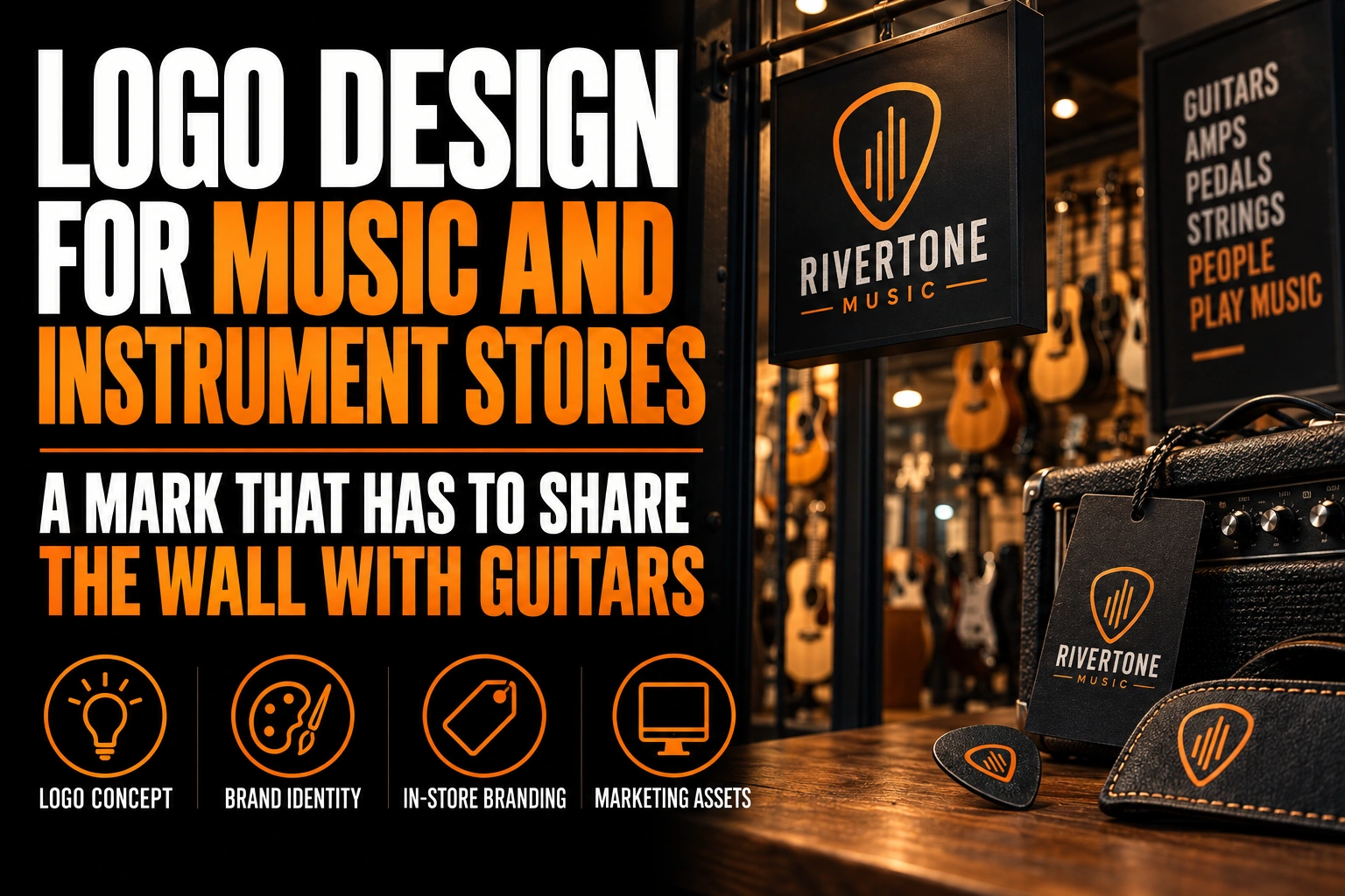
Because the wall is already full of colour, texture and shine. Sunburst finishes, natural wood, metallic hardware and bright custom colours fill every hook. A logo in warm brown, amber or orange melts straight into that background.
The fix is contrast, chosen on purpose. Stand in front of your main wall and list its dominant tones. Most instrument walls are warm. A deep blue, a clean black, a cream on a dark panel or a single cool accent will stand apart from them.
Placement matters as much as colour. Put the main wall sign above the instruments, on a solid panel, rather than between hanging guitars. A logo surrounded by headstocks becomes one more shape in the crowd. A logo on its own band, at the top of the wall, signs the whole display.
Can a music store put its logo on product photos?
Not on photos used for online shopping listings. Google’s product image requirements for Merchant Center exclude store names and logos added over a product photo after it is taken. Logos that are physically part of the product itself are allowed.
The same Google page sets a minimum of 500 by 500 pixels for product images and recommends 1500 by 1500 pixels or more. It also asks for a clean, unobstructed view of the item. A watermark in the corner of every guitar photo works against that rule.
So the store’s brand has to live around the product instead. A small logo on the backdrop of your photo corner carries your name honestly. So does a branded shop mat under a pedal or the wall sign behind a demo video. Plan the logo for those uses: it should read when it is partly out of focus in the background. Our guide to graphic design for e-commerce covers how a visual identity carries through an online store.
Should a music store logo show a guitar?
Only if guitars are the whole business. A guitar silhouette tells the drummer, the keyboard player and the parent renting a clarinet that they are secondary. A full-line store needs a mark that belongs to every instrument it sells, or to none of them.
Guitar shapes, headstocks, treble clefs and vinyl records are also the most common symbols in the category. They say music, but they do not say which store. A shape drawn from your name, your building or your neighbourhood is easier to remember.
Simple geometry often does the job. A circle can suggest a sound hole or a drum head without drawing either one. Our article on logo shapes and geometry explains how a basic form can carry character.
How does a music store logo work on hang tags, repair tickets and rental cases?
In a compact, 1-colour version. These are the small surfaces where the store’s logo is the only brand in sight, and they are handled every day by customers and staff.
Hang tags on instruments carry the price and model, with the logo in a corner. Rigid plastic tags last longer than paper on a busy wall. Repair tickets are often carbonless forms, which copy in a single colour, so a gradient logo turns into a blur on the customer’s copy. Rental instruments for school programs travel in cases that need a sticker with the store’s name and phone number.
Rigid plastic tags, carbonless forms and roll stickers are all products Conception-Logo.com designs and prints, so one master file can carry the whole system. Keep fine lines out of the compact version, since every one of these pieces is small.
How should the logo work for lessons, clinics and store events?
As one master brand, with the program name in plain text. Many stores run lessons, gear clinics and small concerts, and each one tempts the owner to create a new logo. Separate logos split the recognition the store has built.
A poster for a pedal clinic or a student showcase should use the same wordmark and colour as the rest of the store. Keep the same layout grid too. Our guide to event poster design explains how to make that poster readable from across a room.
Store merch follows the same rule. Shirts, hoodies and guitar picks need a simplified version with thick lines and no gradient. Our guide on vectorizing a logo for screen printing covers the file a printer expects.
A store mark that stands out on a wall full of instruments
We design music store logos with a wall-ready wordmark, a compact version for tags and a 1-colour file for repair tickets and merch.
What should a music store sign do from the street?
Name the store clearly, then let the window do the selling. A short, bold wordmark on the sign and a well-lit display of instruments in the window work together. A sign crowded with notes, guitars and a slogan competes with the window instead.
Many music stores sit on commercial streets with heavy foot traffic. A window decal with the logo at eye level beside the door repeats the name for people walking past. Window decals are part of the catalogue Conception-Logo.com designs and prints.
Check the sign after dark as well. Many customers drop by after work, when a backlit sign does most of the talking. Thin letters blur once they glow, while a sturdy wordmark stays sharp. Our list of storefront sign design mistakes covers the other errors to avoid.
What to check before your music store logo goes on the wall
Review this list with your logo designer before ordering signs, tags or merch.
- The main colour stands apart from the warm wood and sunburst tones of your instrument wall.
- The wall sign sits on its own panel above the instruments, not between them.
- Product photos for online listings stay free of overlaid logos, as Google’s requirements ask.
- The mark belongs to every instrument you sell, not only guitars.
- A compact 1-colour version works on hang tags, repair tickets and rental case stickers.
- Lessons, clinics and merch use the master logo with the program name in plain text.
What makes a good logo for a music and instrument store?
A calm, confident mark that contrasts with the instrument wall and works at small sizes. The store’s logo should sign the display, not compete with it.
What style works for a music store logo?
A clean, confident style matched to the store’s specialty. Classic lettering suits a vintage guitar shop, a friendly organized look suits a school band store, and a sharper wordmark suits pro audio. Avoid copying the script logos found on instrument headstocks.
Can I add my store logo to product photos for online listings?
Not on images used in Google Shopping listings. Google’s Merchant Center image requirements exclude store names and logos added over product photos, and they set a minimum image size of 500 by 500 pixels. Keep your brand on the backdrop, the wall sign or the packaging instead.
Should a music store logo include a guitar?
Only if the store sells guitars almost exclusively. A guitar silhouette makes drummers, keyboard players and band families feel secondary, and it is one of the most common symbols in the category. A mark drawn from the store’s name or location is more distinctive.
What colour should a music store logo be?
A colour that stands apart from your instrument wall. Most walls are full of warm wood and sunburst tones. A deep blue, a clean black, a cool accent or cream on a dark panel usually stands out better than brown or orange.
Conception-Logo.com has completed more than 5,000 projects for local businesses that compete for attention in a crowded room. Our music store logo design service gives your store a mark that holds its own on the wall. Fast, professional design is available.