Your Logo in a Trade Magazine Ad: Sharing the Page With a Dozen Competitors
To make your logo stand out in a trade magazine ad, make it recognizable before a word is read. Use one consistent mark, in a colour your competitors avoid, in the same spot every issue. In a trade publication your ad sits beside others selling almost the same thing, so recognition beats decoration.
Key takeaways
- Use one consistent mark, in a colour your competitors avoid, placed in the same spot in every issue.
- Test your ad by laying it among competitor ads cut from the last 2 issues and checking if someone can find it.
- Keep the same frame in every issue and rotate only the headline, the product photo and the offer.
This guide shows you how to test your logo against the ads around it and which element carries the brand when the ad is small. It stays on differentiation; file preparation gets only a short section at the end.
Why is a trade magazine ad harder on a logo than other print ads?
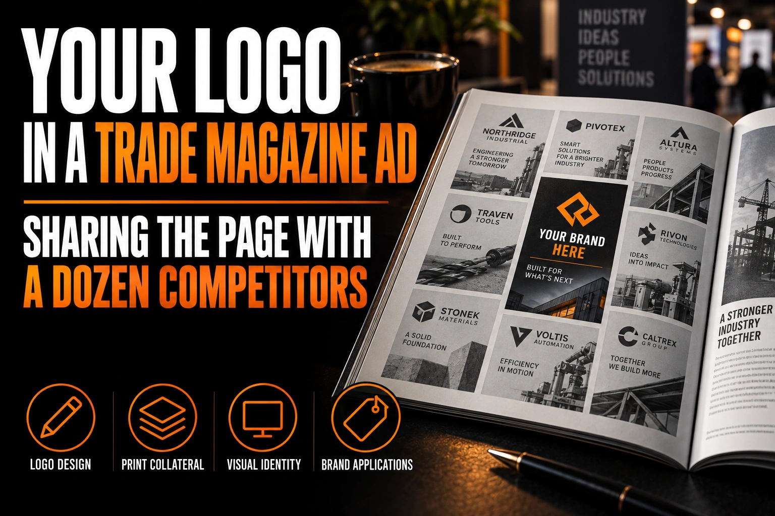
A trade magazine ad is harder because the reader is comparing. Ads in a trade publication cluster by category, so your logo often shares a spread with a dozen direct competitors aimed at the same buyer.
A flyer or a billboard competes with everything else in the street. A trade magazine ad competes with your own industry, in a single glance. A supplier section or a buyers’ guide can put 8 or 10 small ads for similar products on one page.
That page tends to look uniform. Many industries settle on the same colours, the same safe sans serif and the same symbols: a gear, a leaf, a drop, a globe, an arrow. When every logo uses the shared vocabulary, none of them is remembered.
What makes a logo recognizable in a magazine ad before the name is read?
A logo is recognized before it is read when its colours, shapes and type style are linked to one business only. Researchers call those elements distinctive assets, and they do the recognition work at a glance.
The Ehrenberg-Bass Institute for Marketing Science describes distinctive assets as the logos, colours, typefaces and shapes that tell an audience something comes from one particular brand. It assesses them on 2 dimensions: how unique the asset is, and how widely buyers know it.
A trade magazine page tests both at once. If your blue and your gear look like a competitor’s, you fail on uniqueness. If your mark is unique but appears only once a year, buyers never learn it. A strong trade ad needs a mark that is different and seen often.
How can you test your logo against the competitors in the same issue?
Put your logo on the actual page and see if someone can find it. Take the last 2 issues of the magazine and cut out every ad in your category. Lay them on a table with your own ad among them.
Ask a colleague who did not design the ad to find yours in a few seconds. Then repeat the test with a greyscale photocopy, which removes colour and shows whether your shape alone is distinctive.
Write down what overlaps: the same colour family, the same symbol, the same type style. Each overlap is a reason your ad blends in. Our guide to logo colour psychology by industry explains why whole sectors drift toward the same colours, and why that sameness costs recall.
Which part of a small trade ad carries your brand?
In a small ad, such as a quarter or sixth of a page, your colour and layout carry the brand, because the logo itself is tiny. A consistent colour block or frame can be spotted from across the spread before the logo is legible.
Use the logo version built for small sizes, not the full one with a tagline. A wordmark with a distinctive letterform or a compact lettermark usually holds better than a detailed pictorial mark. Our guide to wordmarks, lettermarks and pictorial marks compares how each type behaves when it shrinks.
Typography also does more work than people expect. A typeface that belongs to you, used in every headline, turns the whole ad into a brand signal. The article on typography in logo design covers how a font builds that authority.
Where should your logo sit in a trade magazine ad?
Put it in the same position in every issue, with clear space around it, and at a size that reads at arm’s length. Consistency of position matters more than the exact corner you choose.
Regular readers learn where to look. If your logo moves from the top left to the bottom right between issues, each ad starts from zero. A fixed spot, a fixed size and a fixed amount of breathing room let repetition do its job.
Clear space is the first thing sacrificed when an ad gets crowded. A logo jammed against a phone number and a web address reads as an afterthought.
Should a trade magazine ad keep the same design in every issue?
Keep the same frame in every issue and change only the message. The colour, the layout, the logo position and the typeface stay fixed, while the headline, the product photo and the offer rotate.
This is the fame side of the Ehrenberg-Bass framework in practice. A buyer who sees the same frame 6 times a year learns to connect it with your name. A buyer who sees 6 different designs learns nothing.
A short set of brand guidelines makes this easy to maintain when different people prepare the ads. Our article on what brand guidelines are and why you need them explains what to put in that document.
A logo buyers can pick out on a crowded trade page
We design marks that do not borrow your industry’s usual colours and symbols, with a compact version that stays legible in a quarter-page ad.
What do certification badges and partner logos do to your trade ad?
They compete with your own logo for attention. A row of 4 or 5 badges in full colour can easily outweigh the mark you paid to promote, especially in a small ad.
Group them in one line, at a smaller size, ideally in a single neutral colour. They then read as supporting proof, not as the headline. Your logo should remain the strongest mark in the ad, clearly larger than any partner logo beside it.
What file does the magazine’s production team need for your ad?
Each publication sets its own ad specifications, so ask for them before designing anything. They usually cover the ad sizes, the bleed, the colour mode and the accepted formats.
Your logo should go into the ad as vector artwork, never as a screen capture. If a publication sends your file back, our guide on why a printer rejects a logo file covers the usual causes.
What to check before your trade magazine ad goes to the publisher
Review this list with your logo designer before you book the next insertion.
- Your logo avoids the colours and symbols your competitors already use.
- It passes the competitor wall test, in colour and in greyscale.
- A compact version stays legible in a quarter-page ad.
- The logo keeps the same position, size and clear space in every issue.
- Badges and partner logos sit in one smaller, quieter line.
- Only the message changes between issues, never the frame.
How do I make my logo stand out in a print ad?
Make it distinctive within your own industry, then repeat it in the same place, colour and style every time the ad runs.
Should my logo be big in a trade magazine ad?
It should be large enough to read at arm’s length and clearly the strongest mark in the ad, but size alone does not create recognition. A distinctive shape and colour, repeated in the same position every issue, does more than a larger logo. In a small ad, the colour and layout carry the brand when the logo is tiny.
What colour helps a logo stand out in a trade publication?
A colour your direct competitors do not already use. Many industries cluster around the same few colours, so the best choice depends on what the other ads in your category look like. Lay the competing ads side by side and pick a colour family that none of them owns.
Do I need a different logo version for magazine ads?
You need a compact version for small ads, without the tagline and with simplified details. The full logo works in a full-page ad but often becomes unreadable in a quarter or sixth of a page. Both versions should come from the same master file.
How often should a trade magazine ad change?
The message can change every issue, but the frame should stay the same. Keep the colour, layout, logo position and typeface fixed, and rotate the headline, image and offer. Repetition of the frame is what teaches buyers to recognize your ad.
Conception-Logo.com has completed more than 5,000 projects and offers fast turnaround on every logo design project. If your mark disappears among the ads around it, start with a professional logo design built to be found on a crowded trade page.