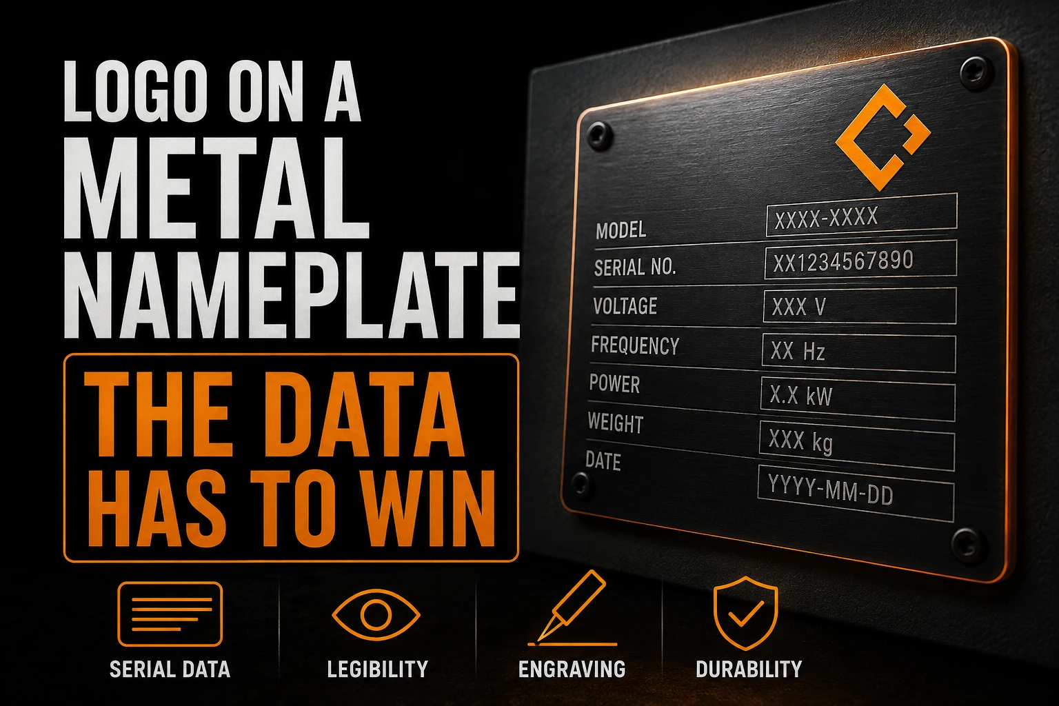
Your Logo on a Metal Nameplate: The Data Has to Win
A logo on an equipment nameplate is not the main message. It shares a small piece of metal with model information, operating data, serial fields, fasteners and a finish that changes whenever the light moves. The plate succeeds when the manufacturer can produce it repeatedly and the user can still read the information that matters.
Key takeaways
- Give the plate’s data priority over your logo, since an oversized emblem can squeeze serial fields into an unreadable column.
- Use a compact logo variant that keeps one recognisable element instead of shrinking the full lockup onto the plate.
- Keep permanent artwork and variable fields like serial numbers on separate layers so the supplier only swaps the data.
This makes the nameplate a useful test of a logo system. The full brand mark may look polished on a website, yet fail when it must fit beside fixed data on brushed aluminum. The solution is not to shrink everything. It is to build a production variant whose line weight, spacing and contrast belong to the plate.
Why does the plate decide the hierarchy?
A business card begins with the brand. An equipment plate begins with the available rectangle and the fields that the product team has reserved. The logo receives what remains. It may sit in one corner, above a data grid or inside a narrow band. A large emblem can make the plate look branded while forcing serial information into an unreadable column.
Start with the plate drawing at final size. Mark every hole, edge, cutout and variable field. Only then should the logo enter the layout. This reverses the usual branding workflow, but it prevents the common failure where a polished composition cannot be manufactured because the fastener passes through the clear space.
The finish creates a second image
Brushed metal has a direction. Light travels along that grain and can make a shallow mark look bright from one angle and dark from another. Mirror finishes add reflections. Painted fills can improve contrast, while exposed metal lines depend on the relationship between the raw surface and the coating.
The artwork should therefore be tested without relying on screen colour. View the mark as light against dark, then dark against light. If it only works in one orientation, the supplier needs to know which finish and process create that orientation. A generic grey mockup is not enough.
A professional vectorization service can rebuild the artwork as clean closed paths that the nameplate supplier can separate by process.
Every thin line becomes a manufacturing decision
Nameplate manufacturers publish minimum stroke and edge clearance guidance because the logo is being etched, engraved, printed or formed, not displayed. A hairline may disappear during etching. A narrow counter may fill. A sharp internal corner may be rounded by the tool. Small type can survive in a digital proof and still fail on the finished plate.
Do not solve this by adding a thick outline around the entire logo. That often changes the negative spaces and makes the mark heavier than the approved identity. Rebuild the smallest features deliberately. Open counters, simplify fragile details and make the compact variant a controlled asset rather than an emergency edit by the supplier.
Permanent and variable information need separate layers
The logo, product family and static labels may be identical on every plate. A serial number, model number or capacity field changes. Mixing both groups into one flat image creates avoidable errors. The supplier should be able to lock the permanent artwork and replace only the variable information.
Use named layers and a clear visual proof. Convert brand lettering to outlines, but do not convert variable data into decorative shapes unless the production system requires it. The point is operational clarity. Anyone opening the file should know what never changes and what must be populated for each unit.
A compact logo is not a shrunken logo
If the mark contains a symbol, a wordmark and a descriptor, the smallest plate may not support all three. Shrinking the complete lockup preserves the composition while destroying its readability. A compact variant chooses which element carries recognition at that scale.
This is the same reason a favicon is not simply a tiny website header. Our published guide to favicon and app icon adaptation explains how a small container changes the job of the mark. The nameplate adds a different constraint: the logo must also yield space to information that cannot be removed.
A supplier also needs artwork it can open without guessing. The checks in our published guide to rejected logo files apply here, with one extra demand: the nameplate drawing must preserve the relationship between the mark, the data field and the physical features.
Give the manufacturer paths it can actually produce
We redraw weak edges, open small counters and prepare a compact one colour version without turning your logo into a different mark.
The mounting method belongs in the artwork review
Adhesive mounting leaves the full face available. Rivets and screws consume visible space and create circular no-go zones. A shaped plate introduces corners and narrow shoulders. If the logo is approved before these features are shown, the final layout becomes a series of compromises made by someone who may not know the brand.
Ask for the production drawing and place the logo inside it at actual size. Check the smallest plate in the product family, not the largest. If the smallest version works, larger plates can usually preserve the same relationship with more breathing room. If it fails, create the compact variant before the order reaches production.
That controlled variant should be stored with the brand assets. A clean vector master also makes future plate sizes easier to prepare because every contour remains measurable.
Approve the plate as an object, not a screenshot
A screen proof confirms spelling and placement. It does not show how a brushed surface reflects, how deep an engraved line appears or whether a small opening stays clear after the chosen process. Request a physical sample or a process-specific proof when the plate will be repeated across a product line.
Inspect it in the orientation in which the equipment will be used. Look from the expected distance and under ordinary light. The logo should identify the maker without competing with the data. When those two jobs remain distinct, the plate feels designed rather than crowded.
Key takeaways
- Begin with the final plate drawing and its fixed fields.
- Test contrast against the real finish, not a grey mockup.
- Use closed vector paths and outlined brand lettering.
- Separate permanent artwork from variable data.
- Create a controlled compact variant for the smallest plate.
- Approve a process sample when the plate will be repeated.
Frequently asked questions
Should a nameplate logo be supplied as a vector file?
Yes. The manufacturer needs editable paths to separate etched, printed, raised and clear areas. A bitmap can be a visual reference, but it should not be the only production file.
Can a metal nameplate reproduce a full colour logo?
Some printing processes can, but engraving and etching often reduce the mark to one contrast relationship. Decide the manufacturing process before deciding which logo variant to send.
How much space should be left around mounting holes?
Use the manufacturer’s drawing, not a generic rule. The safe area changes with hole diameter, plate thickness, fastener choice and the tolerance of the cutting process.
Can the same artwork be used for every equipment size?
Not reliably. A plate that becomes narrower may force the data fields closer to the logo and close small counters. Keep a controlled compact variant for the smallest approved plate.
What should be included in the artwork package?
Include vector paths, outlined lettering, a colour or finish reference, a drawing at final size and a clear layer map. Also include a visual proof that shows what is permanent data and what changes from one unit to another.