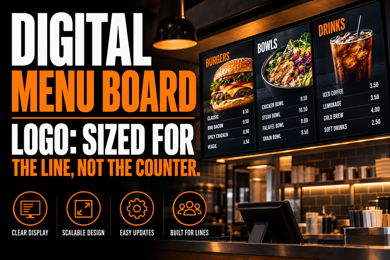
Digital Menu Board Logo: Sized for the Line, Not the Counter
A digital menu board is read from a line 8 to 12 feet back, not held in the hand like a paper menu, so a logo built for a business card or a storefront sign rarely survives the jump. The screen is usually split into 2 or 3 zones run by signage software, and that software decides how a logo gets cropped, colored and rotated once it is uploaded. Get the file wrong and the mark either shrinks into an unread corner or stretches across a strip it was never drawn for.
Key takeaways
- Size the logo for customers standing in line several feet back from the board, not for a paper menu held in the hand.
- Prepare a horizontal lockup for landscape counter boards and a separate logo file for a portrait drive-thru screen.
- Avoid low-contrast color pairs, since a backlit screen in a bright room washes them out faster than paper does.
This article covers only the logo file that goes into a digital menu board, the screen mounted over a counter or a drive-thru lane and driven by signage software. It does not cover the self-order kiosk at the entrance, a separate touchscreen with its own square logo slot and its own fixed vendor branding. It does not cover the payment terminal screen at checkout, which crops rather than resizes, or the guest Wi-Fi login page, which cannot reach an external file at all. Menu layout and pricing are also out of scope here: this is about what happens to the logo file once the menu is built around it.
What makes a menu board screen different from a storefront sign?
A storefront sign is one fixed surface seen from the street. A menu board is a piece of software with a screen attached, and the logo is one asset among several the platform arranges on its own.
Prices, item photos and category headers change throughout the day, while the logo is meant to sit still in whatever space the template leaves for it. That single difference explains most of the bad results businesses see: a logo exported the way it would be for a sign, at one fixed size and shape, gets pushed into a header strip that the software resizes, recolors behind the scenes, or tiles across more than one screen without asking first.
How far away is a menu board actually read from, and why does that matter for the file?
Quick-service counters typically put the ordering line 8 to 12 feet from the board, and that distance should decide screen size and logo weight. A common industry rule of thumb, published by DigitalSignage.com, sets screen diagonal at 4 to 6 times the viewing distance in feet.
At 10 feet back, that works out to a diagonal of roughly 40 to 60 inches, which is why most quick-service menu boards land in the 43 to 55 inch range rather than something smaller. A logo drawn for a business card assumes a viewing distance measured in inches. A menu board assumes one measured in feet. Thin strokes, tight letter spacing and small secondary marks that read cleanly on paper close up simply vanish at 10 feet, long before the price list does.
Why do most menu boards run more than one screen at once?
Because a single screen rarely holds a full menu at a readable size once photos and prices are added, so many locations tile 2 or 3 panels side by side and let the signage software manage them as one continuous layout.
One panel often carries the fixed brand header, while the others rotate combo prices, seasonal items or a drink menu on a timer. This changes what the logo file needs to do. It is not designed once and placed once; it is designed once and then handed to software that decides which panel it lives on, how much header height it gets, and whether it repeats if the location adds a third screen later. A file drawn as flat, vector-based art with a wide margin around it survives that handoff far better than a screenshot of a printed menu with the logo baked into a fixed layout.
What happens to your brand color under a bright screen in a bright room?
Backlit screens under kitchen or storefront lighting wash out low-contrast color pairs long before they wash out on paper or on a monitor at a desk. The World Wide Web Consortium’s Web Content Accessibility Guidelines set a minimum contrast ratio of 4.5 to 1 for normal text.
The guidelines add 3 to 1 for large text, meaning 18 point type or 14 point bold and larger. Those numbers were written for on-screen reading generally, not for menu boards specifically, but they are the closest published baseline for how much contrast a screen needs before text or a mark starts to blur into its background under normal light. Two brand colors that differ in hue but sit close in lightness, a common combination in logo pairs built around one warm and one neutral tone, often pass that test on a business card and fail it on a glowing screen at arm’s length from a fryer. Testing the logo at screen brightness, not on a color-calibrated design monitor, catches this before the board goes live rather than after.
Does a portrait drive-thru screen need a different logo file than a landscape counter board?
Yes, because the two shapes disagree with each other the same way a phone screen and a laptop screen do. A landscape counter board gives width and little height, which favors a horizontal lockup with the symbol beside the name.
A portrait drive-thru panel gives height and little width, which favors a stacked lockup, symbol above name, the same logic behind keeping a horizontal, a vertical and an icon version of a logo on hand rather than one file for everything. A single centred logo squeezed into whichever shape it was not drawn for either shrinks down to a sliver or gets stretched until the letters distort. Locations running both a landscape counter board and a portrait drive-thru screen, which is most of them, are preparing 2 files from the start rather than discovering the mismatch after installation.
How much of the screen can your logo actually claim once the menu is built?
Less than most businesses assume, and it shrinks further as the item count grows. A 32-inch panel fits roughly 6 to 8 menu items before the layout feels crowded, a 43-inch panel fits about 8 to 12, and a 55-inch panel stretches to 12 to 16.
That range comes from signage design guidance published by Seenlabs. As the item count climbs toward the upper end of each range, the header space reserved for a logo is the first thing a template shrinks to make room, not the last. That is the practical argument for the same clear space discipline used everywhere else a logo appears: a mark drawn with generous internal breathing room, following the same clear space and minimum size rules that apply on a business card, tolerates a shrinking header far better than one with fine detail crowded against its own edges. The businesses that get this right treat the logo as the one fixed element in a layout everything else keeps changing, not as an afterthought squeezed in wherever space remains once the last item is added.
A logo file built for tiles you don’t control
We rebuild your mark as real vector paths, so exporting a stacked, high-contrast version for a 43-inch header panel or a 65-inch board takes minutes instead of a redraw every time the screen count changes.
What should the file look like before you hand it to whoever manages the signage software?
Three things, prepared once rather than redone every time a location adds a screen. This mirrors the rebuild already documented for two other screens this practice has covered: a payment terminal splash screen that crops rather than resizes, and a guest Wi-Fi login page that cannot load an external file.
A stacked version and a horizontal version, both built from a rebuilt vector master. The portrait and landscape panels genuinely disagree, and a scalable source lets each export land at the exact header size the template asks for, rather than an enlarged raster file going soft at 10 feet.
A version tested for contrast at screen brightness, not on a monitor. The 4.5 to 1 baseline above is a reasonable floor to check against before the board goes live in a room with fryer glare and overhead spotlights working against it.
A short answer to how many screens and what orientation each one runs. Whoever manages the signage account, often the location manager rather than a designer, rarely thinks to send this detail unprompted, and it decides which of the two lockups actually gets used where. It is a detail that restaurant chains and independent cafes with a restaurant or cafe visual identity already in place tend to skip, since the identity work usually stops at the print menu and never accounts for a screen split into tiles.
What to confirm before your menu board goes live
Five checks, run once before the board goes live and again whenever a screen is added.
- Screen diagonal matched to line distance: roughly 4 to 6 times the viewing distance in feet, commonly 43 to 55 inches for an 8 to 12 foot line.
- A stacked file for portrait drive-thru panels and a horizontal file for landscape counter boards, both exported from a vector source.
- Contrast checked against the 4.5 to 1 baseline for normal text and 3 to 1 for large text, tested at screen brightness.
- Logo placed once in a fixed header or panel rather than repeated on every rotating price slide.
- Header space budgeted to shrink as item count rises, from roughly 6 to 8 items on a 32-inch panel up to 12 to 16 on a 55-inch panel.
What do restaurant owners ask before putting a logo on a menu board screen?
Five questions come up most often once a location moves from a paper menu to a screen.
What size should my logo be for a digital menu board?
There is no single pixel size, because menu board software places the logo inside whatever header or panel the template reserves, and that reservation changes by template and by screen count. What stays constant is the shape: export a stacked, high-contrast version built from vector paths, then let the software fit it into the header strip rather than sending one all-purpose horizontal file and hoping it survives the crop.
Can I use the same logo file on a 32-inch board and a 65-inch board?
The file can be the same master, but the export usually should not be. A 32-inch board sits closer to the counter and carries fewer items, so a compact lockup reads fine, while a 65-inch board is read from farther back across a longer item list, where a thin stroke or a light tint that worked up close can disappear. Export from a vector source so each size gets a version calibrated for its own distance and item density.
Should my logo appear on every rotating screen or just one?
Most menu board layouts keep the logo in one fixed header or side panel rather than repeating it on every rotating price slide. Putting it on every slide competes with the numbers the customer actually needs mid-order, while a single fixed placement still keeps the brand visible for as long as the customer stands in line.
Does a portrait drive-thru screen need its own logo file?
Yes. A portrait panel gives height rather than width, which favors a stacked symbol-over-name lockup, while a landscape counter board favors a horizontal lockup with the name beside the symbol. Stretching one orientation to fill the other is what produces the thin, oddly spaced logos visible on so many drive-thru boards.
My two brand colors look identical under the restaurant’s kitchen lighting. What now?
That usually means the two colors are close in lightness even though they differ in hue, so they collapse together once a bright screen and glare from overhead lighting reduce the contrast between them. The fix is a version of the logo that also works in a single dark tone against a light background, checked at screen brightness rather than adjusted by eye on a designer’s monitor.