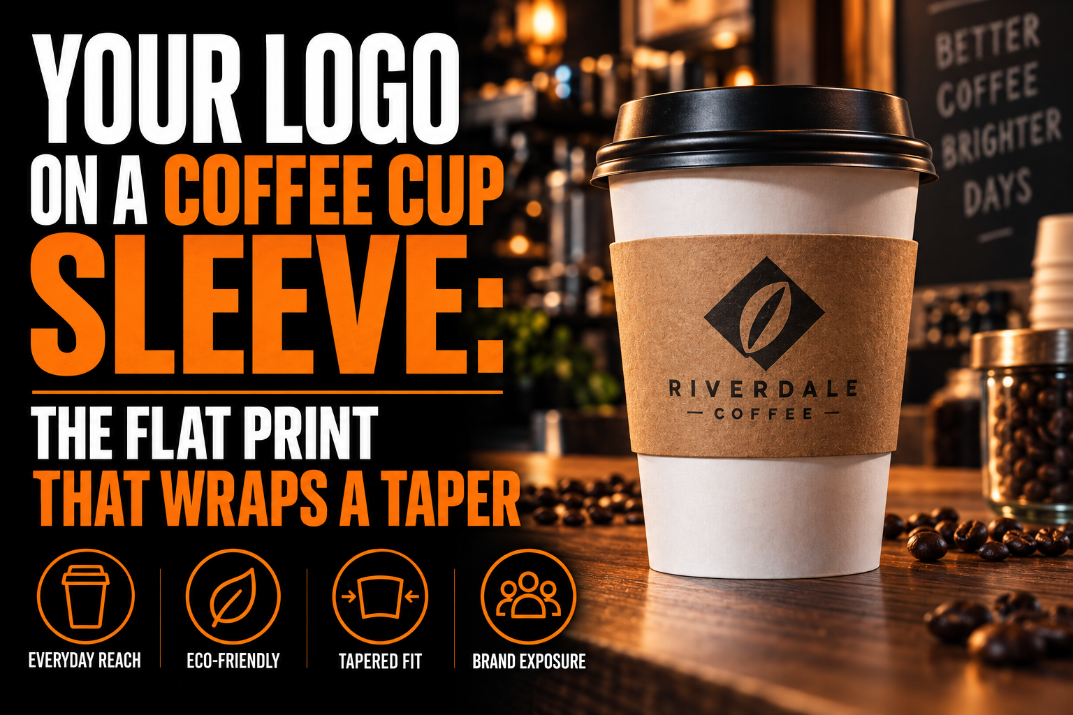
Your Logo on a Coffee Cup Sleeve: The Flat Print That Wraps a Taper
A flat sleeve design does not survive being wrapped around a tapered cup without changing shape. The piece is cut wider along one edge than the other, so a straight line in your logo follows a slight curve once the paper closes around the cup. Plan for that bend instead of discovering it after the order arrives.
Key takeaways
- Plan for the taper, since a straight line in your logo follows a slight curve once the sleeve wraps around the cup.
- Keep symbols and wordmarks away from the closing edge, where the overlap sits on top of the artwork underneath it.
- Prepare a spot colour version of the logo, since printed sleeves use a limited colour set rather than unlimited shades.
Every coffee shop logo eventually meets this surface, and almost none of them were drawn for it. A sleeve is not a business card scaled down. It is a flat piece of board cut to a taper, curved around a cone, and closed with a small overlap you never notice until the printed roll comes off the press. This stays on the sleeve itself, not on colour choice, naming or the rest of your cafe branding.
Why does a flat print change shape once it is wrapped?
Because the sleeve is not a rectangle. A cup narrows toward its base, so the flat pattern is a shallow wedge, wider along the top edge than the bottom. A straight line in your artwork follows that wedge once it wraps into a ring.
This is geometry, not a printing defect. A cone can only be flattened into a wedge, never into a true rectangle, so any pattern meant to wrap one has to be drawn as a wedge from the start, and the wider top edge is what pushes a straight line into a visible curve once it wraps and closes. A logo built as a long, straight horizontal lockup will look slightly bowed once it is wrapped, while a mark already built around a circle or an arc will look right at home on the same surface.
How the sleeve is cut before it becomes a tube
The sleeve starts as one flat piece of board, die cut to a wedge, then curved around the cup and closed with a short overlap near one edge. That overlap sits directly on top of whatever artwork prints underneath it.
That overlap is typically glued or locked with a small tab. The overlap is the reason a cup sleeve cannot be treated as one continuous canvas. A design that reads as a single unbroken shape from edge to edge will have part of itself hidden under its own seam, and exactly where that hidden strip falls can shift slightly from one production run to the next.
What print method and colour count are realistic?
Printed cup sleeves are produced with a limited colour set, not painted with unlimited detail. One established sleeve manufacturer advertises full colour process printing built on CMYK, with 2 extra Pantone matched spot colours added for brand accuracy, which covers most palettes without a custom plate for every shade.
That range is generous compared with some other printed objects in a coffee shop’s kit, but it is not photographic. Gradients and soft shadows still have to be rebuilt as flat shapes before they hold up on textured board stock rather than smooth paper.
If your only file is a flattened image pulled from your website, a vector rebuild is what turns it into artwork a sleeve printer can actually separate into plates. Our guide on SVG files and the vector format explains why a resolution independent file behaves differently from a raster export at this stage.
Where the seam eats part of your design
Keep anything that needs to read as one continuous shape away from the closing edge of the sleeve. Symbols, wordmarks and any element that depends on being seen whole should sit inside the front facing band, not straddling the point where the two ends meet.
This is the same logic behind keeping clear space around a mark on any small surface: the area nearest an edge is the least reliable part of the piece. Our guide on clear space and minimum size covers the same margin discipline for other tight formats, and it applies here without any change. A rebuilt vector file makes that margin easy to hold, since every edge is a clean path rather than a soft raster boundary that shifts when it is scaled.
Does one sleeve size fit every cup you sell?
Not exactly, and that changes how forgiving your design needs to be. Sleeve suppliers commonly sell an 8 ounce size, a 10 ounce size, and a wider flexible size rated to fit a range of roughly 10 to 24 ounce cups on a single pattern.
A single flexible size is a convenience for whoever is stocking cups behind the counter, not a guarantee that your logo lands at the same height on every order. A mark anchored tight to the bottom edge on a small cup can ride noticeably higher once the same pattern stretches around a larger one. Centring the design with generous margin on every side is what survives that range, rather than a layout pinned to one exact edge. Our guide on keeping a logo sharp at every size covers the same discipline for other formats that stretch or shrink.
A wedge shaped file built for the wrap, not the screen
We rebuild your logo as clean vector artwork, thicken what would close up on textured board, and hand you the spot colour version a sleeve printer can drop onto the die line without redrawing it.
How long does your logo actually stay in someone’s hand?
Longer than most other printed surfaces you own. One sleeve manufacturer estimates an average exposure time near 53 minutes per cup, counting the walk back to a desk, the meeting it sits through, and the time it spends cooling on a counter before it gets thrown out.
The object itself has a fairly specific origin. An entrepreneur built the first corrugated version after coffee spilled on him while he was driving his own daughter to school, and patented the waffle textured design soon after under the Java Jacket name. International Paper now produces similar sleeves under its own name, and the object even carries an old term borrowed from a cup holder, zarf. None of that history changes your file, but it explains why the surface exists at all: it replaced double cupping, stacking two paper cups inside each other for insulation, with a single printed wrap that also happens to sit in a customer’s hand for most of an hour.
What to lock down before you order printed cup sleeves
Run through this short list before the file leaves your desk for the printer.
- Treat the flat pattern as a wedge, not a rectangle, and expect a straight line to curve once it wraps.
- Keep any element that must read as one whole shape away from the closing seam.
- Plan for CMYK plus roughly 2 Pantone matched spot colours rather than a full photographic palette.
- Rebuild gradients and soft shadows as flat shapes before sending the file.
- Centre the design with generous margin so it still sits well on a larger or smaller cup from the same batch.
- Send outlined vector artwork, not a raster export pulled from a website.
- Ask your printer for the die line for the exact cup size you are ordering, not a generic template.
- Approve a wrapped sample on the actual cup, not a flat proof.
Do you need a different logo file for a cup sleeve?
Usually yes. Your everyday logo file rarely survives the wedge shape and the limited colour count without a vector rebuild made for this specific print run.
Can I just send my regular logo file for a cup sleeve order?
Usually not without changes. Most everyday logo files are flat images or are built for a straight rectangle, and neither survives being cut into a wedge and wrapped without adjustment. A simplified vector version built for the taper and the limited colour count gets a cleaner result than forcing the existing file to fit.
Why does my logo look bowed once the sleeve is wrapped around a cup?
Because the flat sleeve pattern is a wedge, not a rectangle, matching the taper of the cup it wraps. A straight horizontal line drawn in your file follows that wedge once it closes into a ring, so it reads as a gentle curve rather than a flat line on the finished cup.
How many colours can a coffee cup sleeve actually print?
A common commercial option combines four colour process printing with about 2 additional Pantone matched spot colours, which is enough for most brand palettes. Gradients and soft photographic effects still need to be rebuilt as flat shapes through a vectorization service, since the printing process is not built for continuous tone.
Will one sleeve size fit every cup my shop sells?
Often yes across a range, since suppliers commonly sell a flexible size rated for roughly 10 to 24 ounce cups alongside smaller fixed sizes like 8 ounce and 10 ounce. That flexibility means your logo’s exact height can shift slightly depending on which cup in the range it ends up on, so centred, generous margin matters more than precise edge placement.
Where should I position my logo so the seam does not cover it?
Keep it inside the front facing band of the wedge, away from the edge where the two ends of the sleeve overlap and close. Anything that depends on being read as one unbroken shape, like a wordmark or a tight symbol, should never straddle that closing line.