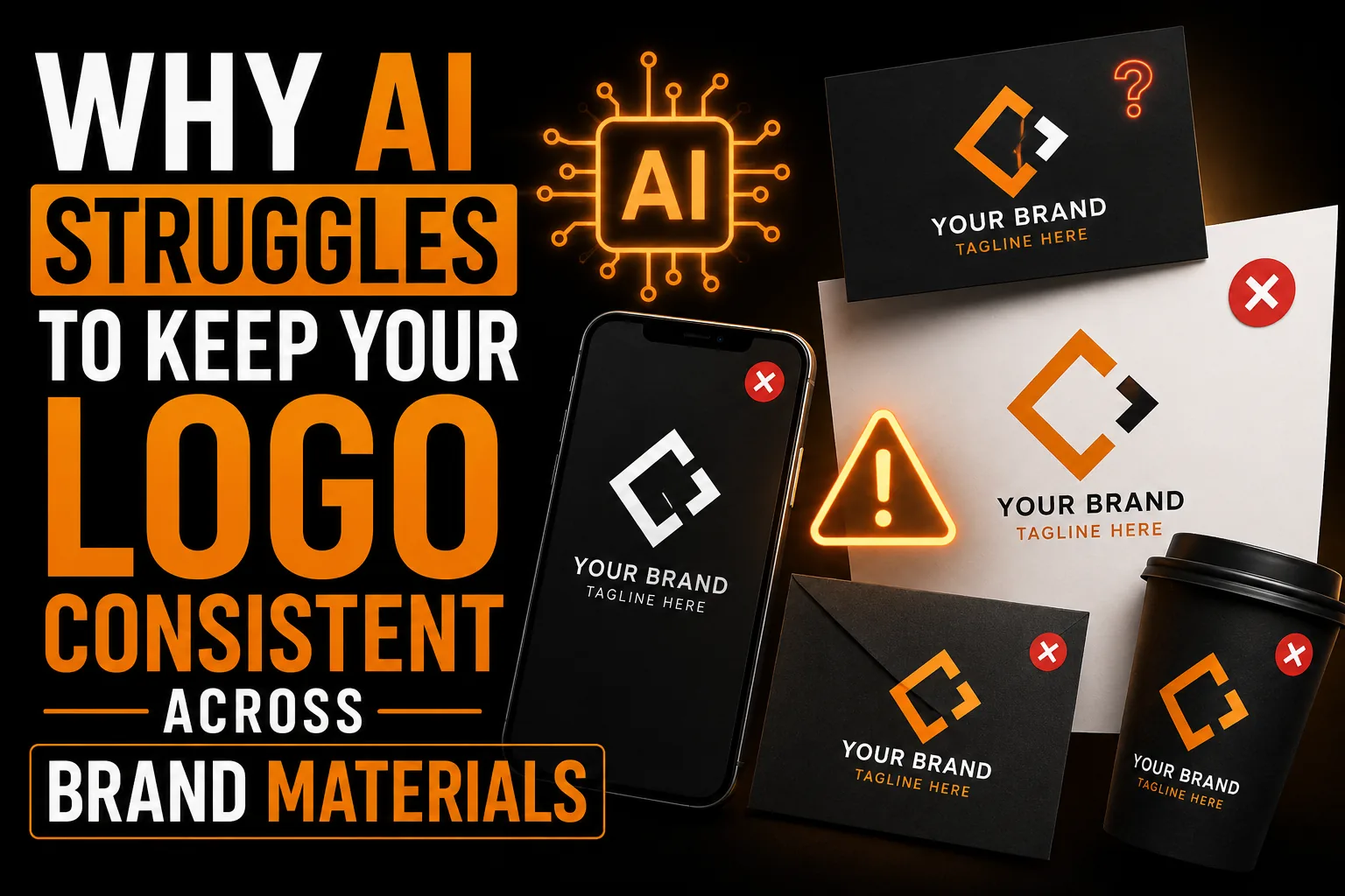
Why AI Struggles to Keep Your Logo Consistent Across Brand Materials
You have an AI logo you like. Now you need a horizontal version for your website header, a square one for social media and a tiny one for a favicon. So you ask the AI for each. The trouble is that you often get three different logos instead of one logo in three layouts. Here is why that happens and why it quietly damages your brand.
Key takeaways
- Asking an AI tool for each new layout usually produces a different logo, not the same logo in a new format.
- Build horizontal, stacked and icon versions from one master file so colors and proportions match exactly.
- Small differences across your sign, website and social profiles slow recognition and make a brand feel less established.
AI Generates, It Does Not Adapt
Each time you prompt an AI tool, it creates a fresh image from scratch. It has no memory of the exact logo it made before, so a request for a new version produces a new interpretation. Colors shift slightly, proportions change and details differ. The result is a family of near-misses rather than one consistent mark.
Consistency Is What Builds Recognition
Brands become familiar through repetition. The same logo, colors and shapes appearing again and again is what makes customers recognize you at a glance. When every touchpoint shows a slightly different version, that recognition never fully forms and your brand feels less established.
Real Versions Come From One Source
In professional design, every layout (horizontal, stacked, icon-only) is built from a single master file. They are the same logo arranged differently, not different logos. Colors match exactly because they are defined once and reused everywhere.
Stay Recognizable Everywhere
Get one master logo and every version derived from it, perfectly consistent across all your materials.
See logo design service →The Hidden Cost of Inconsistency
Inconsistent branding looks amateur and makes a business seem less stable. Customers may not consciously notice, but the impression of a scattered identity lingers. For something as important as your logo, that is a cost worth avoiding.
Building a Consistent Logo System
A designer creates one master logo and derives every version and color variant from it. You receive a coordinated set that stays perfectly consistent across your website, signage, cards and social media.
Why AI Generates Instead of Adapting
Each time you prompt an AI tool, it creates a fresh image from scratch with no memory of the logo it made before. So a request for a horizontal version or a favicon produces a new interpretation rather than the same logo rearranged. Colors shift slightly, proportions change and details differ, leaving you with a family of near-misses. Real versions come from a single master file, the way clean vector sources work as explained in our guide on logo quality at every size. The inconsistency is not a flaw you can prompt away; it is built into how image generation works.
How Inconsistency Quietly Hurts Your Brand
Customers may not consciously notice that your logo looks slightly different on your sign, your website and your social profile, but the overall impression is of a business that is not quite put together. Recognition is built on repetition, and inconsistency interrupts it, so your brand feels less established and less trustworthy. Strong brands keep everything aligned on purpose, including disciplined color and type choices like those in our article on choosing logo colors. The cost of inconsistency is subtle but real: it slows the recognition that turns first-time viewers into customers who remember you.
What a Consistent System Does for Growth
A coordinated logo system makes a small business look larger and more reliable. When the same mark, colors and proportions appear everywhere, customers come to know you at a glance, and that familiarity builds trust and referrals. Whether your business is in Montreal, across Quebec, throughout Canada or serving international clients, a consistent identity means every touchpoint reinforces the same brand. Building one master logo and deriving every version from it ensures that consistency holds as you grow into new surfaces and markets. It is one of the most underrated drivers of a professional, memorable brand.
How Recognition Is Actually Built
Recognition is not a single event; it is the accumulation of repeated exposures to the same mark. Each time a customer sees your identical logo, in the same colors and proportions, the association strengthens a little. Inconsistent versions reset that progress, because the brain treats each variation as slightly new. This is why consistency is not a cosmetic preference but the actual mechanism of brand memory. Building one master and deriving every version from it, the way clean vector sources work as explained in our guide on logo quality at every size, is what lets recognition compound instead of constantly restarting.
The Tell-Tale Signs of an Inconsistent Brand
You can often spot inconsistency once you look for it: a logo that is a slightly different shade on the website than on the sign, proportions that shift between the business card and the social profile, or an icon that does not quite match the full logo. Customers rarely name these issues, but they register the overall impression of a business that is not fully put together. Strong brands eliminate these tells through deliberate, repeated use of the same assets and disciplined color choices, like those discussed in our article on choosing logo colors. Consistency is what makes a small business look polished and dependable.
A Real Scenario: Three Slightly Different Logos
A business owner asks an AI tool for their logo, then later for a horizontal version and a square icon. Each comes back subtly different in color and proportion, so the website header, the email signature and the social avatar never quite match. A prospective client who encounters all three forms a faint impression of disorganization. The fix is to build every version from one master so they are genuinely the same logo arranged differently. That coordinated approach, which a professional logo design service provides, keeps the brand consistent everywhere and lets recognition build instead of fragmenting across near-identical variations.
Locking In Consistency With a One-Page Reference
A simple way to protect consistency is a one-page brand reference that lives with your logo files. It records your exact colors for screen and print, your fonts, and which logo version to use where. Whenever you brief a printer, a web developer or a social manager, this sheet removes guesswork and keeps everyone applying your brand the same way. Combined with a master logo that all versions derive from, it makes inconsistency almost impossible. This kind of disciplined, documented approach supports the consistent recognition our guide on logo quality at every size is built around. Whether your business is in Montreal, across Quebec, throughout Canada or serving international clients, a one-page reference plus clean files keeps your brand aligned as it grows, so every touchpoint reinforces the same confident, recognizable identity.
Getting Consistent Logo Versions
Here is how to ensure every version of your logo is truly the same logo.
- Start from one master logo, not separate AI generations.
- Derive horizontal, stacked and icon-only layouts from it.
- Define exact color values used identically everywhere.
- Create one-color and reversed versions for any background.
- Keep the master so future versions stay aligned.
A coordinated set keeps your brand recognizable across every surface, the kind of consistent system a professional logo design service is built to deliver.
Frequently Asked Questions
Why does AI give me different logos for each version?
AI generates a fresh image every time and has no memory of the exact logo it made before. So each request becomes a new interpretation with shifted colors, proportions and details, producing a family of near-misses rather than one consistent logo.
Why does logo consistency matter?
Brand recognition is built on repetition. The same logo, colors and shapes appearing everywhere makes customers recognize you instantly. Inconsistent versions prevent that recognition and make a business look less established.
How are real logo versions created?
Every layout, such as horizontal, stacked and icon-only, is built from a single master file. They are the same logo arranged differently, with colors defined once and reused, so everything matches exactly.
How do I get consistent logo versions?
A designer creates one master logo and derives every layout and color variant from it, delivering a coordinated set that stays consistent across your website, signage, cards and social media.