
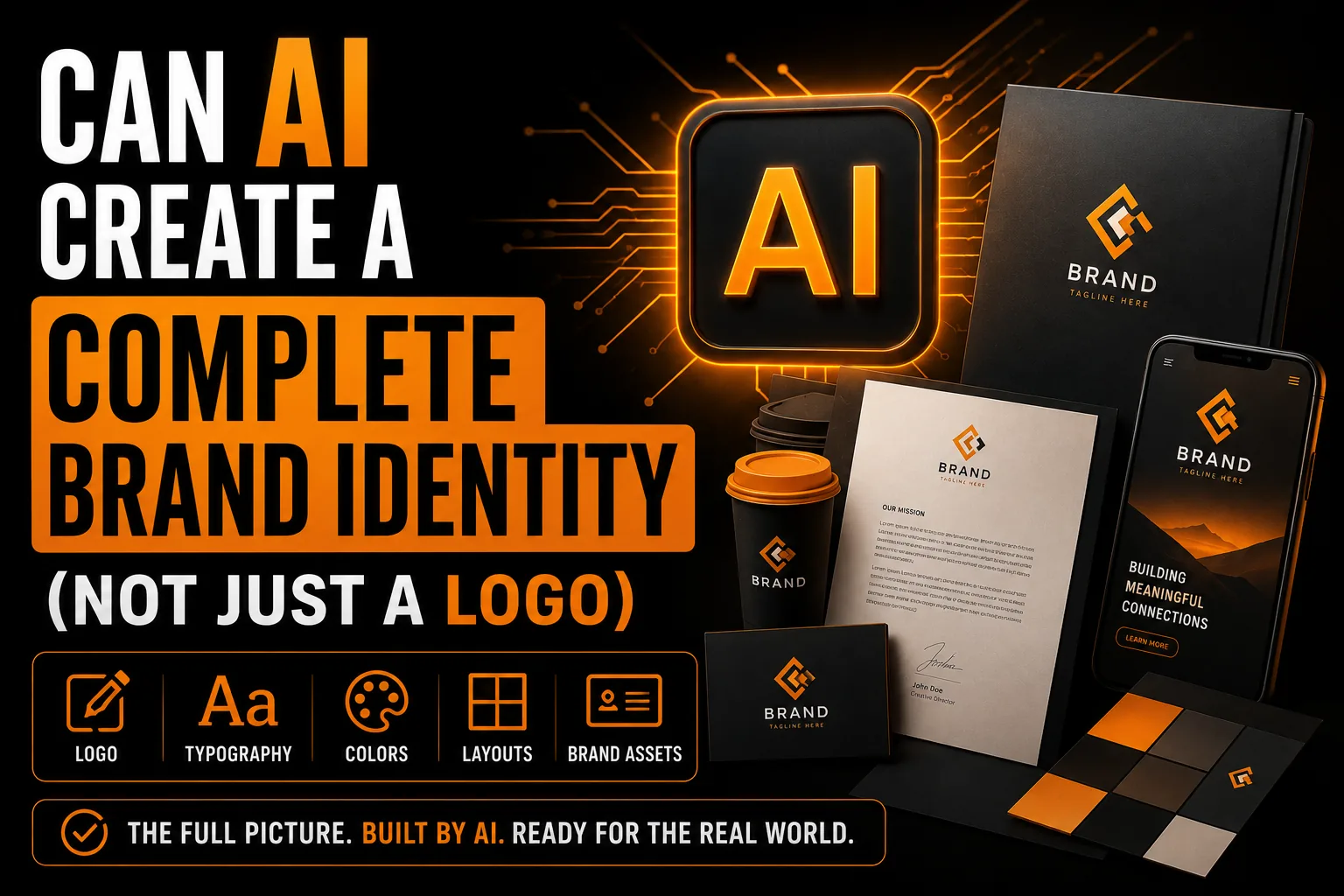
Can AI Create a Complete Brand Identity (Not Just a Logo)
A logo is the most visible piece of a brand, but it is only one piece. A complete brand identity is the system that keeps everything looking like it belongs together, from your business card to your website to your storefront. AI can help with parts of this, but it cannot build the whole thing. Here is what a real identity includes and where AI fits.
Key takeaways
- A full identity includes logo layouts, a color palette with exact values, chosen typography and spacing rules.
- Use AI for early visual directions and color ideas, not for building the connected system your brand needs.
- Asking AI for a card, a sign and a profile photo usually gives three unrelated graphics, not one cohesive brand.
What a Brand Identity Actually Contains
A complete identity is a coordinated set: a primary logo plus alternate layouts, a defined color palette with exact values, chosen typography, rules for spacing and sizing, and guidance for how it all behaves across print and screen. The point is consistency, so a customer recognizes you instantly whether they see a sign, an invoice or a social post.
Where AI Can Help
AI is useful for generating early visual directions, suggesting color combinations and producing inspiration quickly. It can accelerate the exploration stage and help you articulate the feeling you are after before any real design work begins.
Where AI Falls Short
AI produces individual images, not a connected system. It does not maintain consistent color values across assets, it does not build matching logo variants, and it does not create the production-ready files each application needs. Ask it for a business card, a sign and a profile photo and you get three unrelated graphics rather than one cohesive brand.
Build a Brand That Holds Together Everywhere
Get a complete identity with logo variations, defined colors, typography and print-ready files.
See logo and identity design →Consistency Is the Whole Point
Brand recognition is built on repetition. The same colors, the same shapes and the same typography appearing again and again is what makes a brand feel established and trustworthy. That coordination is a design decision applied deliberately across everything, which is precisely what a single AI image cannot do.
Building a Real Identity
A designer takes a direction, then builds the full kit: logo variations, defined colors, typography and clean vector files for every use. The result is a brand that holds together everywhere it appears and that you fully own.
The Pieces a Real Identity Includes
A complete brand identity is a coordinated set, not a single graphic. It includes a primary logo plus alternate layouts, a defined color palette with exact values, chosen typography, and rules for spacing and sizing across print and screen. Each piece exists so a customer recognizes you instantly, whether they see a sign, an invoice or a social post. Building this system involves deliberate choices, including the color decisions explored in our article on choosing logo colors and the restraint discussed in our piece on minimalist logos. AI can suggest a look, but it does not assemble these elements into a connected, consistent whole.
Why Consistency Is the Whole Point
Brand recognition is built on repetition. The same colors, shapes and typography appearing again and again is what makes a business feel established and trustworthy. When every touchpoint shows a slightly different version, that recognition never fully forms. AI produces individual images rather than a coordinated system, so asking it for a card, a sign and a profile photo yields three unrelated graphics. A real identity keeps everything aligned on purpose, which is exactly what makes it work. For a growing business, that coordination is not a luxury; it is the mechanism by which customers come to know you at a glance.
What a Coordinated Identity Does for Your Business
A consistent identity makes a small business look larger and more reliable than a scattered one. It signals discipline, and customers transfer that impression to your products and service. Whether you operate in Montreal, across Quebec, throughout Canada or with international clients, a unified identity means your storefront, your website and your stationery all reinforce the same brand. That repetition compounds over time into recognition and trust, which translate directly into referrals and repeat business. Investing in a full identity, rather than a single AI image, is investing in the perception that holds your marketing together.
Beyond the Logo: The Assets You Will Need
A working brand needs more than a logo. You will need a defined color palette, chosen fonts, social profile and banner versions, business card and stationery layouts, and templates for the documents you send clients. Each of these has to look like it belongs to the same brand, which only happens when they are designed as a coordinated set. AI produces these as unrelated one-off images, leaving you to stitch together a brand that never quite matches. The deliberate choices behind a cohesive set, including the color work in our article on choosing logo colors, are what make all your materials feel like one confident business.
How Brand Guidelines Keep Everyone Aligned
As soon as more than one person touches your brand, a printer, a web developer, a social manager, you need a shared reference so everyone uses the logo, colors and fonts the same way. That is what brand guidelines provide: clear rules that keep your identity consistent no matter who is applying it. AI cannot create this kind of living system; it generates images without rules attaching them together. A professionally built identity includes the guidance that prevents your brand from drifting into a dozen slightly different versions, the inconsistency that quietly erodes recognition.
A Real Scenario: The Mismatched Touchpoints
A growing business uses AI to make a logo, then later asks the same tool for a business card and a social banner. Each comes out with slightly different colors and proportions. Now the website, the card and the social profile all look subtly off from one another. A potential client who sees all three is left with a vague sense that the business is not quite organized. Nothing is obviously broken, but the impression of professionalism slips. A coordinated identity built from a single master, the kind a real logo and identity service delivers, keeps every touchpoint aligned so the impression is always one of a confident, established brand.
Where to Start When Building Your Identity
Building a full identity can feel daunting, so it helps to know where to begin. Start with the logo, because every other asset flows from it: your colors, your typography and your layouts all coordinate around that central mark. Once the logo exists as a clean vector with defined colors and fonts, the business cards, social profiles and stationery fall into place as a matching set. The deliberate choices behind that foundation, including the color work in our article on choosing logo colors, shape everything that follows. Approaching it this way turns a vague, overwhelming project into a clear sequence. Whether your business is in Montreal, across Quebec, throughout Canada or working internationally, starting from a strong, owned logo and building outward is the most reliable path to a coordinated identity that makes your brand look established everywhere it appears.
Building a Real Identity From an AI Concept
If you like an AI-generated direction, here is how it becomes a complete, coordinated identity.
- Choose the AI direction that best fits your brand feeling.
- Have a designer build the primary logo and alternate layouts.
- Define exact color values and choose typography.
- Create one-color and reversed versions for every background.
- Receive clean vector files for print, signage and the web.
The result is a coordinated brand that holds together everywhere, the kind of owned, production-ready system a full logo and identity service delivers.
Frequently Asked Questions
Can AI build a full brand identity?
AI can generate individual images and suggest directions, but it cannot build a connected identity system. It does not maintain consistent colors, matching logo variants or production-ready files, so the pieces do not hold together as one brand.
What is included in a brand identity?
A complete identity includes a primary logo and alternate layouts, a defined color palette with exact values, chosen typography, sizing and spacing rules, and production-ready files for print and screen. The goal is consistent recognition across every touchpoint.
Why is consistency so important for a brand?
Recognition is built on repetition. When the same colors, shapes and typography appear everywhere, your brand feels established and trustworthy. A single AI image cannot deliver that coordination across many uses.
How do I turn an AI concept into a full identity?
Bring the direction you like to a designer, who builds the complete kit: logo variations, defined colors, typography and clean vector files for every application, all owned by you.



)