
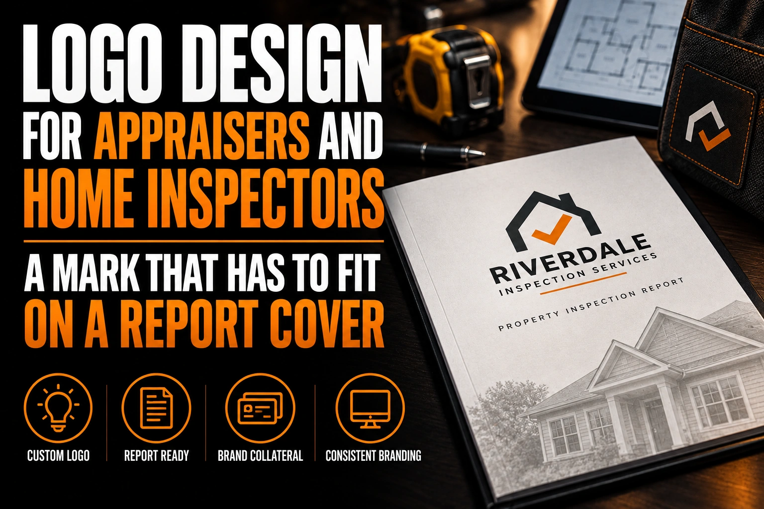
Logo Design for Appraisers and Home Inspectors: A Mark That Has to Fit on a Report Cover
A home inspection logo should convey care, precision and calm, and it has to prove it on the report. That means a clean mark that fits a cover page, repeats as a small header on every page and stays readable in black and white. The report is what clients pay for, so that is where the logo is judged first.
Key takeaways
- Place the logo in a clear band above or beside the house photo on the report cover, never on top of it.
- Prepare a compact horizontal version or a monogram that stays clear in the small header of every report page.
- Avoid bright red and strong orange in the logo, since inspection reports use those colours to flag urgent issues.
This guide applies to home inspectors and property appraisers, two trades whose main deliverable is a long document. It covers the logo’s place on that document, then the few other surfaces that matter.
What should a home inspection logo convey?
Care, precision and calm. A buyer hiring an inspector is often nervous, and the real estate agent who referred them wants a clear, professional report. The logo should reassure both without looking alarming or overly technical.
That rules out 2 extremes. A playful mark with a cartoon house looks too casual for someone who will judge the condition of a roof. A heavy, aggressive mark with warning shapes adds stress to a stressful day. The sweet spot is a steady wordmark, a simple symbol and a colour that reads as competent, such as navy, deep green or charcoal.
Appraisers need the same tone with a little more formality. Their reports are read by lenders and other professionals who expect a sober, document-style identity.
Why is the report cover the most important place for an inspector’s logo?
Because the report is the product, and the cover is the first page everyone sees. It is opened by the buyer, forwarded to the agent, shared with family and sometimes sent to a contractor for quotes. Your logo travels with every copy.
These documents are long. InterNACHI, the International Association of Certified Home Inspectors, notes that a 6-page report would now be considered short even for a small house. It also explains that inspection software can place photos beside the matching comments or group them at the start or the end of the report.
So the cover is not decoration. It is the page that says who did the work, on a document that may be read dozens of times by people who never met you. A logo that looks sharp there earns referrals long after the inspection.
How should a home inspector logo sit on a report cover with a house photo?
Above or beside the photo, never on it. Most covers combine a photo of the property, the address, the date and the client’s name. The logo belongs in a clear band at the top, where it does not compete with the house or the details.
A horizontal version works best in that band. A tall stacked logo pushes the photo down and leaves less room for the address. Keep the cover layout identical from one report to the next, so agents start to recognize your reports at a glance in their inbox.
Many inspectors upload their logo into report software once and never look at it again. Ask your designer for a version sized for that upload, with a transparent background. It will then never appear inside a white box on a coloured cover band. Our checklist of logo files to request from your designer covers the formats to keep on hand.
What happens to the logo in the header of every report page?
It becomes very small and it repeats on every page. A header leaves a shallow strip of space, so the logo needs a compact horizontal version or a simple monogram that stays clear at that height.
The header logo must also survive printing. Some clients print the full report on a home printer in black only, to read it with a pen in hand. A mark that relies on 2 close colours or a soft gradient turns into a grey smudge on those pages.
The test is quick. Print 1 page of a real report in black only and look at the header from arm’s length. If the name is hard to read, the header needs a simpler version. Our article on horizontal, vertical and icon logo versions explains how each version is planned from one master design.
Which colours should a home inspector avoid in a logo?
Bright red and strong orange are risky choices. Inspection reports often use colour to flag items, and those warm alarm colours are the usual way to mark urgent issues. A red logo on every page can make the whole document feel like a warning.
Choose a calm main colour that does not compete with the flags inside the report. Navy, slate blue, deep green and charcoal all keep the brand visible without adding tension. If you love a warm accent, keep it for a small detail rather than the whole mark.
Check the colour on screen as well. Most reports are read as PDF files on a phone, so a very pale colour on a white cover can disappear in bright daylight.
Which symbols does every home inspection logo already use?
The magnifying glass over a house, the checkmark roof, the clipboard and the house outline with a chimney. Each one says inspection instantly, which is exactly why they no longer help one inspector stand out from the next.
These symbols also crowd the header. A magnifying glass with a house inside has thin lines and a small interior shape, and both fill in at header size. A strong wordmark, a monogram built from your initials or a simple shape tied to your region usually works harder.
The shape itself carries meaning. Solid, balanced geometry reads as stable and careful. Our article on how logo shapes communicate explains how a basic form can carry that message without a literal icon.
A mark built for the cover and every page after it
We design home inspector and appraiser logos with a cover version, a compact header version and a 1-colour file that prints cleanly in black.
Do appraisers need a different logo approach than home inspectors?
The logic is the same, with a more formal tone. An appraisal report is dense with figures and comparisons, and it is read by professionals rather than nervous buyers. A restrained wordmark in a serious typeface suits that reader.
When most pages follow a fixed template, the cover and the header are the only places your brand controls. That makes the cover version and the compact header version even more important. A firm offering both inspection and appraisal should keep one master logo and name each service in plain text. Its reports then look like they come from one organized business.
Where else does an inspector’s logo have to work?
On the business card, the presentation folder, the shirt and the online listing. Each one is seen by the same people who read your reports, so they should share the same mark and colours.
Real estate agents often refer inspectors to their clients, and they notice every piece. A business card left at an open house and a folder holding a printed report both reinforce your name. Business cards and presentation folders are among the products Conception-Logo.com designs and prints. Our guide on real estate agent logos and referrals shows how agents think about the brands they recommend.
What to check before your logo goes on the next inspection report
Go through this list with your logo designer before uploading new files to your report software.
- A horizontal version fits the cover band above the property photo.
- A compact version or monogram stays readable in the shallow page header.
- A 1-colour version prints cleanly on a black-only home printer.
- The main colour stays clear of the red and orange used to flag urgent items.
- The upload file has a transparent background, so no white box appears on the cover.
- Cards, folders, shirts and the online listing share the same master file.
How do you design a home inspector logo that works on a long report?
Design the cover version and the header version first, test both in black only, and keep the colours calm. A mark that holds up on page 1 and page 40 will hold up everywhere else.
What should a home inspection logo convey?
Care, precision and calm. Buyers are often nervous and agents expect a professional report, so a steady wordmark with a simple symbol in navy, deep green or charcoal reassures both. Avoid cartoon houses and aggressive warning shapes.
Where should the logo go on a home inspection report?
In a clear band at the top of the cover, above or beside the property photo. A small compact version then goes in the header of each page. Keeping the same layout on every report helps agents recognize your work quickly.
Why should a home inspector avoid a red logo?
Inspection reports often use red and orange to flag urgent items. A red logo on every page competes with those flags and can make the whole document feel like a warning. A calm main colour keeps the brand visible without adding tension.
Do appraisers and home inspectors need different logos?
They follow the same logic: a cover version, a compact header version and a 1-colour file. Appraisers usually benefit from a slightly more formal wordmark because their reports are read by lenders and other professionals.
Conception-Logo.com has completed more than 5,000 projects for professionals whose work ends up on paper. Our home inspector logo design service builds a mark that looks right on page 1 and on every page after it.