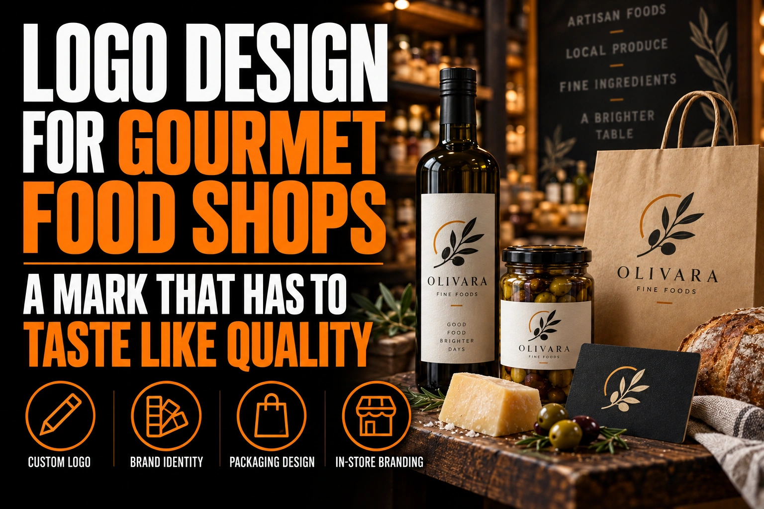
Logo Design for Specialty Food and Gourmet Shops: A Mark That Has to Taste Like Quality
A specialty food shop logo looks premium when typography and colour carry the quality, not a drawing of the food. A well-chosen typeface, a short palette and generous space read as craft. A cheese wedge, an olive branch or a chef’s hat reads as a generic deli.
Key takeaways
- Let typography, a short palette and generous space signal quality instead of drawings of cheese or olive branches.
- Prepare a sturdier small-size version, since hairline serif strokes can break on a jar label or a thermal price tag.
- Pair one deep colour such as forest green, oxblood or navy with a warm neutral for a considered look.
The catch is that elegant type often breaks at small sizes. This guide covers how to choose the style, then how to keep it intact on a jar label, a price tag and a gift certificate.
How do I make a specialty food shop logo look premium?
Let restraint do the work. A premium mark usually combines 1 well-crafted typeface, 1 or 2 colours and plenty of breathing room around the name.
Customers in a gourmet shop pay for selection and care. A logo that looks edited, with nothing extra, suggests a shop that edits its shelves the same way.
Restraint is not blandness. Personality comes from details: a distinctive letter, a custom ligature joining 2 characters, a monogram, or a colour no neighbour uses.
Think about where people first meet the mark. For a specialty shop, that is often a bag carried down the street or a gift certificate a friend hands over. The logo has to feel premium in a hand, not only on a sign.
Why do cheese wedges and olive branches cheapen a gourmet shop logo?
Because they describe a product instead of the shop. Literal food drawings appear everywhere, from supermarket private labels to takeout menus, so they pull a gourmet brand toward the ordinary.
They also date quickly and narrow the offer. A shop that starts with cheese and later adds charcuterie, oils and chocolate soon outgrows a logo built around a single wedge.
If you want an image, make it emblematic rather than literal: a seal, a crest built from your initials, or a simple frame shape. These suggest careful selection without naming one product.
Abstract emblems also age better. A shop that adds a coffee counter or opens a second location keeps the same mark. The mark never promised one product in the first place.
Our guide on wordmarks, lettermarks and pictorial marks helps you choose the structure that leaves room to grow.
Which typefaces signal craft in a gourmet food shop logo?
Serifs with refined detail, and well-drawn sans serifs with generous spacing, both read as quality. The choice depends on whether the shop leans traditional, like an old-world delicatessen, or modern and minimal.
Many premium marks rely on high contrast, a strong difference between thick and thin strokes. The Google Fonts Knowledge glossary notes that serif typefaces tend to carry more of that contrast than sans serif designs.
Be careful with fonts that imitate handwriting. Cheap scripts are common on mass-market packaging, and their loops close up when printed small.
Our guide to typography in logo design explains how a font sets the authority of a brand.
How does a high-contrast serif logo survive a tiny jar label?
Often it does not, unless you plan a small-size version. Hairline strokes that look elegant on a storefront sign can fade or break on a coin-sized label or a thermal price tag.
Type designers solve this with optical sizes. The Google Fonts glossary entry on optical sizes explains that versions drawn for small text tend to have lower contrast and looser spacing. Their lowercase letters also tend to be taller than in display versions.
Apply the same idea to your logo. Keep the refined version for the sign, the website header and the gift box. Build a sturdier version, with thicker thin strokes and slightly wider spacing, for jar labels, price tags and stamps.
Both versions should look like the same brand at a glance; the difference shows only up close. Our guide on responsive logo design covers how to build that family of versions.
How many colours should a gourmet food shop logo use?
Two colours is a practical ceiling, plus black and white. One deep colour, such as forest green, oxblood or navy, paired with a warm neutral looks considered without competing with the products.
Your shelves are already full of colour from producers’ labels. A quiet palette lets the shop’s identity frame that variety instead of fighting it.
Metallic gold is tempting but not required. It works best as a finish on a few special pieces, such as gift certificates or a seasonal box. It should not be the everyday logo colour.
Our guide to premium business card finishes shows how foil and texture add value when used sparingly.
A gourmet shop logo that tastes like quality at every size
We design specialty food shop logos built on typography and colour: a refined version for the storefront, a sturdier one for labels and price tags.
How does a gourmet shop logo hold its own among hundreds of producer labels?
By owning the surfaces where it is the only brand: the sign, the bag, the gift basket tag, the house-brand label and the receipt. Inside the shop, the producers’ labels lead. Outside it, your mark does.
House-brand products are the strongest of these surfaces. A jar of the shop’s own jam, oil or spice blend carries your logo into a customer’s kitchen long after the visit. Roll labels for those jars are among the pieces we can design and print.
Gift certificates and gift baskets carry the brand to people who have never visited. Plan a compact version of the mark for tags and seals, where space is tight. Our guide on branded packaging design covers how packaging turns a purchase into marketing.
Keep every piece in the same 2 colours and the same typeface. That consistency is what makes a small independent shop look established.
What to check before your gourmet shop logo goes on jars, bags and gift certificates
Go over this list with your logo designer before you order labels and signage.
- Typography and colour carry the quality, not a drawing of the food.
- No cheese wedge, olive branch or chef’s hat narrows the offer.
- A refined version exists for the sign and the website.
- A sturdier small-size version holds up on jar labels and price tags.
- The palette stays at 2 colours plus black and white.
- Metallic finishes are kept for a few special pieces.
- A compact version fits gift tags, seals and house-brand labels.
How do you design a specialty food shop logo that reads as quality?
A specialty food shop logo reads as quality through careful typography, a short palette and generous space, with a sturdier version prepared for small labels.
How do I make a specialty food shop logo look premium?
Rely on typography, colour and space rather than food illustrations. One well-chosen typeface, 1 or 2 colours and plenty of breathing room suggest a carefully curated shop. A distinctive detail, such as a custom letter or monogram, adds personality without clutter.
Should a gourmet shop logo include food imagery?
Usually not as a literal drawing. Cheese wedges, olive branches and chef’s hats are so common that they pull a premium shop toward the ordinary. An emblematic seal, a monogram or a simple frame shape works better and lasts as the product range grows.
Why does my elegant logo look weak on small labels?
High-contrast typefaces have very thin strokes that fade or break at small sizes. Type designers handle this with optical sizes, which use less contrast and looser spacing for small text. A logo needs the same approach: a sturdier small version for labels and tags.
What colours suit a gourmet food store logo?
One deep colour, such as forest green, oxblood or navy, paired with a warm neutral suits most specialty shops. Keeping to 2 colours lets the logo frame the colourful producer labels on the shelves instead of competing with them.
Conception-Logo.com has completed more than 5,000 projects. Start with a custom gourmet food shop logo that signals quality on the sign and stays sharp on the smallest jar label.