Logo Design for Sushi Restaurants: The Mark That Has to Work on a Chopstick Sleeve
A sushi logo has to survive a printed surface smaller than a business card. That surface is often close to 29 mm wide. The cuisine itself is built on restraint: a few ingredients, a clean cut, a small plate. The logo has to follow the same rule, or it disappears at that scale.
Key takeaways
- Design the logo for your smallest printed surface first, the chopstick sleeve, not the sign.
- A detailed fish or wave icon often turns into a dark smudge once printed that small.
- Avoid using Japanese characters in the logo unless a fluent reader has verified them.
This guide covers why minimalism is a print requirement here, not just a style choice. It explains how to pick an icon that survives heavy reduction. It also covers the colours and type choices that hold up on paper, wood and a takeout lid.
Why does a sushi restaurant need a more minimal logo than other restaurants?
Most restaurant logos get tested at sign scale first, then shrink down from there. A sushi restaurant works the other way. The smallest surface sets the real limit. A chopstick sleeve or a soy sauce packet decides how simple the mark has to be everywhere else.
A busy icon with 3 or 4 overlapping shapes looks fine on a laptop screen. Printed at 29 mm wide, those shapes merge into a single dark mark. Sushi branding rewards the opposite approach instead. Use 1 strong shape, 1 consistent line weight, and open space around it.
This restraint also matches the cuisine itself. Minimalist design already signals precision and quality in Japanese dining. A restrained mark is not a compromise here. It reinforces the same message the food already sends. A professional logo design project is built to protect exactly that.
What size should you actually design for first?
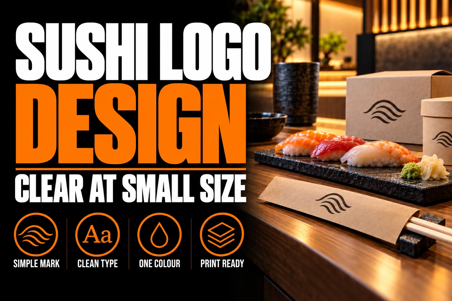
Start from the chopstick sleeve, not the sign. A full open-end paper sleeve for a 21 cm chopstick measures close to 225 by 29 mm flat, per packaging printer DiningPrint’s dieline specification guide. Keep logos and text at least 3 mm inside the cut line, off folds and glue zones.
Fine detail on a fold or a glue area is risky: ink can crack there, and glue zones rarely print well once stamped.
A takeout box lid, a receipt header and a social icon are only slightly larger than that sleeve. Design and test the mark at sleeve width first. If it holds up there, every larger surface becomes easier, not harder.
Printing on wood, bamboo or unbleached kraft also changes how sharp an edge looks. Fine lines that look crisp on a screen often blur once stamped on a textured material. Test a physical proof before you finalize anything, not just a digital preview.
Should the logo use a fish, a wave or no icon at all?
Only if the icon survives heavy reduction. A detailed koi fish with scales and fins looks appealing at full size. At sleeve scale, that same detail turns into a dark smudge. An ornate wave pattern with multiple curls fails the same way.
A single curved line suggesting motion holds up far better. A geometric fish silhouette built from 2 or 3 clean shapes works too. Many strong sushi marks skip the literal icon entirely. They rely on a well-chosen wordmark instead, letting the typography carry the identity.
A guide to typography in logo design covers how font weight and spacing alone can signal precision. That matters here, since type often does more work than any icon.
What colours and materials actually hold up on sushi packaging?
Black, deep red and natural wood tones dominate sushi branding for a practical reason, not just tradition. These print reliably in 1 or 2 colours on paper sleeves, kraft boxes and wooden chopstick bands. Full-colour printing adds real cost per unit on small runs like these.
A 2-colour build keeps costs down while staying legible. Use 1 dark ink, plus the natural paper or wood tone as the second colour. White or unbleached stock as a background reinforces the same clean, minimal positioning the cuisine relies on.
Avoid gradients and soft shadows in the mark itself. Both tend to flatten into a muddy block once printed small. This happens most on absorbent paper stock, where ink spreads slightly beyond the intended edge.
Should a sushi logo include Japanese characters?
Treat this with caution. Characters placed incorrectly, reversed, misspelled, or mismatched to the restaurant’s actual cuisine region, are a common and visible mistake. A restaurant without a Japanese-speaking owner or a verified translator on staff should avoid characters in the permanent mark entirely.
A strong logo can communicate the same positioning through shape, line weight, spacing and type choice alone. If characters matter to the concept, use them on supporting materials instead. A menu or interior sign, checked by a fluent reader, carries far less risk. An unverified character locked into the logo is the riskier move.
The same caution applies to the restaurant’s full visual identity, not just the icon. A designer familiar with the cuisine’s visual language can flag a mismatch before it reaches print. A correction at the draft stage costs far less than one after printing.
How does this differ from general restaurant branding?
A general restaurant branding guide covers cuisine signalling, atmosphere and price positioning across every restaurant category. Those rules still apply here. What changes for sushi specifically is the print floor. The smallest surface a sushi restaurant actually uses is smaller than what most casual or fine dining concepts plan around.
A burger counter or a bakery can often use a slightly denser mark. Their smallest common surface, a wrapper or a bag, gives a little more room. A sushi restaurant does not get that margin. The chopstick sleeve sets the real ceiling for how much detail the mark can carry anywhere else.
A mark built to survive your smallest printed surface, not just your sign
A designer tests your logo at sleeve, box and sign scale before you commit to it. Vector files come ready for every material your kitchen actually uses.
What to confirm before your sushi logo goes to print
Check these before approving a final file:
- The mark stays legible printed at 29 mm wide, not just on a screen
- Any icon survives reduction to 1 or 2 simple shapes with no merging lines
- The colour build uses 1 or 2 inks that print cleanly on paper, kraft and wood
- No fine detail sits directly on a fold or a glue zone of any sleeve or box
- Any Japanese characters used anywhere in the brand are verified by a fluent reader
- A physical proof has been checked on the actual sleeve, box or wood stock, not only a digital preview
A guide to choosing the right logo designer covers what to ask about print testing before a project starts. That question matters more here than in most restaurant categories.
Does a minimal sushi logo actually perform better than a detailed one?
Yes, measured against the surfaces a sushi restaurant actually uses every day. A detailed mark might look stronger in a single large mockup. But it fails on the sleeve, the box lid and the small social icon. Those are the 3 places customers see the brand most often.
What style of logo works best for a sushi restaurant?
A minimal mark works best: a single line-weight icon, or a clean wordmark on a short grid with open space. Sushi branding leans on restraint, since the cuisine itself is built the same way. A mark with fine linework or small text rarely survives the smallest print surfaces a restaurant actually uses.
How small does a sushi restaurant logo need to print?
Plan for a chopstick sleeve as the smallest surface, often close to 29 mm wide for a 21 cm chopstick. A takeout box lid, a receipt header and a social media icon are only slightly larger. Testing the logo at that width, not at screen size, is the only reliable way to confirm it still reads.
Should a sushi logo use a fish or wave icon?
Only if the icon stays reduced to 1 or 2 simple shapes. A detailed fish illustration or an ornate wave pattern loses its lines at sleeve scale. It turns into a dark smudge instead. A single curved line, or a geometric fish silhouette, holds up far better under heavy reduction.
What colours suit a sushi restaurant logo?
Black, deep red and natural wood tones are the most common choices, often set against white or unbleached kraft. These colours print reliably in 1 or 2 colours on paper sleeves and boxes, where full-colour printing adds cost. A limited palette also keeps the mark legible at the smallest sizes.
Does a sushi logo need Japanese characters or calligraphy?
No, and adding characters you cannot read correctly is a real risk. A restaurant without a Japanese-speaking owner or a verified translator should avoid characters entirely. A strong mark built from shape, line weight and type choice communicates the same positioning without that risk.
Conception-Logo.com has designed more than 5,000 logos and visual identities for restaurants and other small businesses. Your sushi restaurant needs a mark that survives a sleeve, a box and a sign without 3 separate redesigns. Our logo design service tests the file at every scale before you approve it.