How Do You Design a Brand Identity for a Small Business? 7 Steps
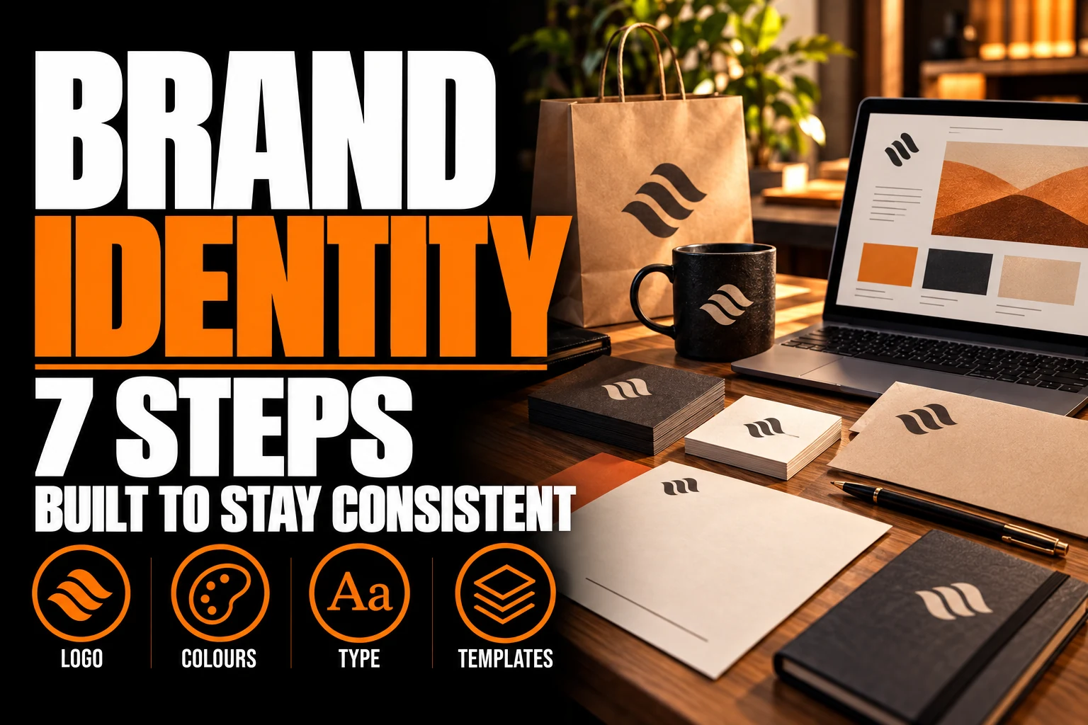
To design a brand identity for a small business, first define your promise and your customers, then build the visual pieces in a fixed order: logo, colour palette, typography, supporting elements, everyday templates and a short guidelines sheet. Working in that order means each piece is chosen to fit the ones already decided.
Key takeaways
- Define your main customers and your promise to them in writing before any logo or colour work begins.
- Design the logo first, since the colour palette and fonts are chosen to work with it, not the other way around.
- Build the templates you use every week first, such as business cards, email signatures and invoice headers.
Most small businesses build their identity piece by piece, as needs appear, and end up with 3 blues and 4 fonts. This guide gives you the 7 steps in the right order and what each step should produce, so the result looks like 1 business everywhere.
Step 1: What should you define before any design work starts?
Define 3 things in writing: who your main customers are, what you promise them that competitors do not, and the personality your business should project.
The Business Development Bank of Canada (BDC) recommends the same sequence for building a brand: identify your customers, define a promise backed by 3 or 4 specific attributes you can prove, then set the tone and style you will use to communicate. Its advisors also stress clarity, consistency and customer focus.
Keep this on 1 page. For example, a Sherbrooke bakery might write: “Families and office managers who order for groups; everything baked the same morning; warm and generous, never fussy.” Every design decision that follows can be checked against those lines.
Step 2: Why should the logo come first?
The logo comes first because every other piece, from colours to fonts to templates, is chosen to work with it. Designing a palette before the logo exists usually means redesigning the palette later.
A professional logo design starts from the page you wrote in step 1 and tests the mark where it will actually live: on a sign, a van, a polo, a website header and a tiny social icon. The logo also sets the structure of the identity. A strong wordmark leads to a type-driven identity; a symbol opens the door to icons and patterns.
Our guide to wordmarks, lettermarks and combination logos helps you understand which structure suits your name before concepts start.
Step 3: How many colours does a small business palette need?
Most small businesses need 1 or 2 main colours, 1 accent colour and 2 or 3 neutrals, such as a dark grey and an off-white. More colours make consistency harder for every supplier who reproduces them.
Each colour needs exact values for each medium: a Pantone reference for spot printing, CMYK for process printing, and RGB and HEX for screens. Without these, a printer, a sign shop and a web developer will each approximate the colour differently.
Check how the palette behaves as text. The W3C’s contrast guidance for web content asks for a ratio of at least 4.5 to 1 between regular text and its background, and 3 to 1 for large text. Logos themselves are not held to that ratio, but a light brand colour used for paragraphs on a website quickly becomes hard to read. Our guide to logo colour psychology by industry helps with the emotional side of the choice.
Step 4: Which fonts should carry your brand?
Choose 1 or 2 type families: 1 for headings and 1 for body text. The lettering in the logo can be custom, but the fonts you use every day must be available on your computers and your website.
A common mistake is choosing a beautiful display font that nobody on the team can install, so every quote and email falls back to a default font. Check that each font is licensed for your uses and exists in the weights you need, typically a regular and a bold.
Our article on typography in logo design explains how serif, sans-serif and script families shape the personality you defined in step 1.
Step 5: What supporting elements make the identity recognizable?
Supporting elements are the shapes, patterns, icons and photo style that make your materials recognizable even when the logo is small or absent.
They often come directly from the logo: a curve from the symbol becomes a background shape, or the icon becomes a repeating pattern on packaging. Keep the set small. 1 pattern, 1 icon style and 1 photo direction, such as natural light and real customers, are enough for most small businesses.
Step 6: Which templates should you build first?
Build the templates you use every week first: business cards, an email signature, a quote and invoice header, social media post templates and a simple presentation. These carry your identity to more people than any sign.
Printed pieces come next, based on your real needs: flyers, brochures, a storefront sign or a roll-up banner for trade shows. Each one should reuse the same logo files, palette and fonts rather than being redesigned by whoever prints it.
2 templates are often forgotten. Social media profiles crop the logo into circles and wide banners, which our guide on adapting a logo for social media profiles and banners covers. Presentations are the other; our article on designing a branded PowerPoint template shows how to keep slides on-brand when the whole team edits them.
Build your brand identity in the right order
We design the logo first, then the palette, fonts, templates and guidelines sheet around it, so every piece of your small business looks like it belongs together.
Step 7: How do you keep the identity consistent once others use it?
Write a short guidelines sheet that lists the logo versions, the colour values, the fonts and a few do’s and don’ts, then send it with the files to every supplier and new employee.
For a small business, 2 to 4 pages are enough. The sheet should answer the questions suppliers ask most: which logo version on a dark background, which exact blue, which font for body text, and how much space to leave around the logo. Our article on brand guidelines explains what the document does and why it saves money.
Store the logo files, fonts and guidelines in 1 shared folder with clear names. When a studio delivers a complete brand identity package, that folder is part of the handover.
What your brand identity should include before you launch
- A 1-page statement of your customers, your promise and your personality.
- A logo in horizontal, stacked and icon versions, in colour, black and white, as vector files.
- A palette of about 5 or 6 colours with Pantone, CMYK, RGB and HEX values.
- 1 or 2 licensed type families available on every computer and on the website.
- A small set of supporting elements: 1 pattern, 1 icon style, 1 photo direction.
- Templates for cards, email signature, quotes, social posts and presentations.
- A guidelines sheet of 2 to 4 pages shared with every supplier.
What do small business owners ask about designing a brand identity?
These 5 questions come up most often when a small business plans its identity.
What are the main elements of a brand identity?
A brand identity combines a logo with its versions, a colour palette with exact values, 1 or 2 type families, supporting elements such as patterns or icons, and templates for everyday materials. A short guidelines sheet ties them together so every supplier applies them the same way.
In what order should a small business design its brand identity?
Start by writing down your customers, your promise and your personality. Then design the logo, choose the palette and fonts around it, add supporting elements, build templates for everyday materials, and finish with a guidelines sheet. Each step depends on the decisions made before it.
How many colours should a small business brand identity use?
Most small businesses work well with 1 or 2 main colours, 1 accent and 2 or 3 neutrals. Each colour should have Pantone, CMYK, RGB and HEX values so printers and web developers reproduce it the same way. More colours make consistency harder to maintain.
Can I design my brand identity in stages instead of all at once?
Yes, as long as the logo, palette and fonts are settled first. Templates and printed pieces can be added over several months, because they reuse the same files and values. Designing materials before the logo and colours are fixed usually leads to paying for the same work twice.
Does a small business really need brand guidelines?
Yes, even a short version. A guidelines sheet of 2 to 4 pages tells printers, sign makers and employees which logo version, colours and fonts to use. Without it, each supplier approximates your identity, and small differences add up until the business no longer looks consistent.
Conception-Logo.com, a Montreal-based agency, has designed visual identities for more than 2,800 brands and builds each identity in this order, starting from the owner’s written promise.
FAQ
- What are the main elements of a brand identity?
- In what order should a small business design its brand identity?
- How many colours should a small business brand identity use?
- Can I design my brand identity in stages instead of all at once?
- Does a small business really need brand guidelines?