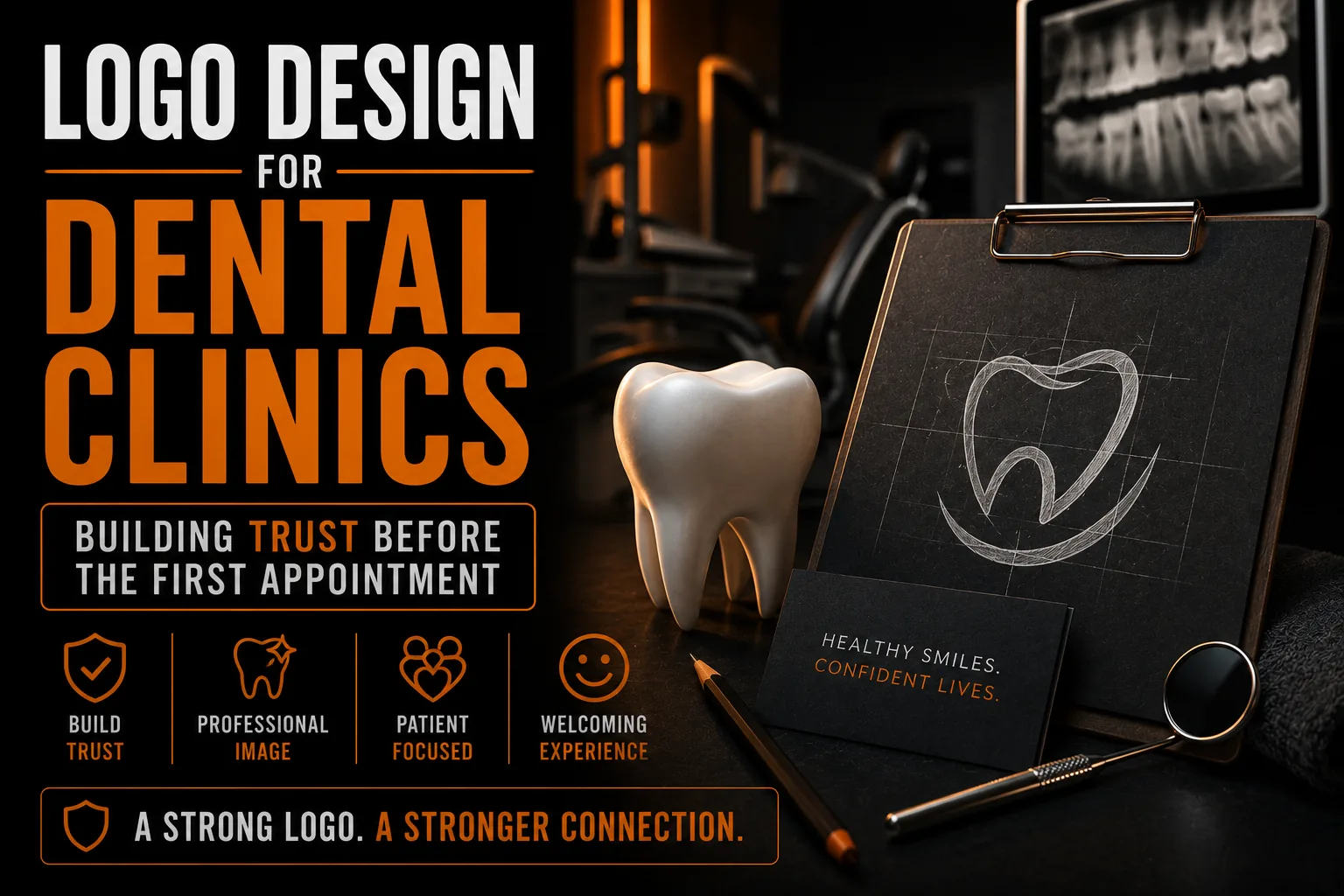
Logo Design for Dental Clinics: Building Trust Before the First Appointment
For a dental clinic, trust is everything, and it often begins before a patient ever sits in the chair. The first thing many people see is your logo: on your sign, your website, a referral card or a social post. In a few seconds it signals whether your practice feels clean, modern, professional and reassuring, or dated and forgettable. A well-designed dental logo does quiet but powerful work, turning a nervous first impression into confidence. This guide walks through what makes a dental clinic logo effective and how to build one that earns trust from the very first glance.
Key takeaways
- Blues, teals, soft greens and crisp whites signal clean and calm; warmer accents suit family or pediatric practices.
- Choose clean sans-serif type for a hygienic feel, or a refined serif for a premium or specialist clinic.
- Make sure your practice name reads clearly at every size, from an appointment card to a large exterior sign.
Why Your Dental Logo Carries So Much Weight
Dentistry is a personal, sometimes anxious experience, so patients look for reassurance everywhere, including your branding. A clean, confident logo signals that your practice is organized, modern and careful, the same qualities people hope for in their care. A weak or generic logo can quietly raise doubt. Because your logo appears on your sign, your reminder cards, your website and your team’s uniforms, it is repeated constantly, and that repetition either builds trust or chips away at it. Getting it right is one of the highest-leverage branding decisions a clinic can make, which is why thoughtful, custom design matters so much here.
Colors That Signal Clean and Calm
Color sets the emotional tone instantly. Blues are the most common choice in dentistry because they communicate cleanliness, calm and trust, while teals and soft greens suggest freshness and health. Crisp whites reinforce hygiene and modernity. Warmer accents can add approachability for family or pediatric practices. The key is intentional, consistent color, not a random palette, a topic we explore in depth in our article on choosing logo colors. The right colors make your clinic feel reassuring before a single word is read, which is exactly the impression a dental brand wants to create.
Symbols: Beyond the Obvious Tooth
A literal tooth is the default dental symbol, and it can work, but it is also everywhere, which risks looking generic. Strong dental logos often use a tooth in a fresh, abstract or minimal way, or lean on other ideas entirely: a gentle smile, a subtle shield for protection, a leaf for health, or an elegant monogram of the practice name. The goal is to feel distinct rather than interchangeable with every other clinic in town. A custom approach lets you find a symbol that is recognizably dental yet unmistakably yours, instead of the same clip-art tooth a competitor might also choose.
Typography That Feels Modern and Professional
Type carries as much personality as the symbol. Clean, modern sans-serif fonts tend to feel hygienic and current, which suits most dental practices. A refined serif can add a sense of established expertise for a premium or specialist clinic. What matters is legibility and consistency: your practice name should read clearly at every size, from a tiny appointment-card footer to a large exterior sign. Thoughtful typography quietly reinforces the same message as your colors, that your clinic is careful, current and worth trusting.
Where Your Dental Logo Has to Work
A dental logo lives in many places: exterior signage, glass-door lettering, business cards, treatment-plan documents, your website, social profiles and staff uniforms. Each surface has different demands, and a single low-resolution image cannot serve them all. To stay sharp on a large sign and crisp on a small card, your logo needs clean vector files, the foundation explained in our guide on logo quality at every size. Print-ready files also ensure your sign and printed materials never come back blurry, the issue covered in our article on print-ready logos and vectorization.
Give Your Dental Clinic a Logo Patients Trust
We design clean, modern dental logos with full vector files for signage, cards and uniforms.
See our logo design service →Common Mistakes Dental Clinics Make
A few missteps recur. Overusing the generic tooth clip-art makes a clinic blend in. Cluttered logos with too many elements look anxious rather than calm. Trendy effects like heavy gradients or 3D can date quickly and rarely print well. And relying on a logo that exists only as a low-resolution image leads to blurry signs and rejected print files. Avoiding these traps comes down to a simple principle: a clean, distinctive, professionally built mark almost always outperforms a busy or generic one in a field where calm and trust are the entire point.
Designed for Your Patients and Your Region
The strongest dental logos reflect the specific practice and community they serve. A modern downtown clinic, a warm family practice and a high-end cosmetic studio each call for a different feel, even within the same color family. Whether your clinic is in Montreal, elsewhere in Quebec, across Canada or beyond, a custom logo can be tuned to the patients you want to attract and the tone of your neighborhood. That tailoring is something template tools cannot do, and it is part of what makes a custom mark feel like it genuinely belongs to your practice.
How Your Logo Supports Patient Referrals
Word of mouth drives much of a dental practice, and a memorable logo makes referrals easier. When a happy patient recommends you, a friend who later sees your clean, recognizable mark on a sign or a search result feels an immediate sense of familiarity and trust. A forgettable or generic logo breaks that chain, because there is nothing distinctive to recognize. A strong, consistent brand turns every satisfied patient into more effective marketing. This is part of why a thoughtful, custom mark is worth the investment, as our article on creative logo design and customer engagement explains, especially in a relationship-driven field like dentistry.
Keeping Your Brand Consistent Across the Practice
A dental clinic touches patients through many materials: signage, appointment reminders, treatment plans, your website and your team’s uniforms. When the logo, colors and fonts are consistent across all of them, the practice feels organized and dependable, which reinforces clinical trust. Inconsistency, a slightly different shade here, a stretched logo there, quietly undermines that impression. Consistency only works when you start from clean, well-built files that everyone uses the same way, the foundation explained in our guide on logo quality at every size. A coordinated brand makes a small clinic feel established and a large one feel cohesive.
Your Dental Logo Checklist
Before finalizing a dental clinic logo, make sure it covers the essentials that build patient trust.
- A calm, clean color palette, often built around blues, teals or fresh greens.
- A distinctive symbol rather than generic tooth clip-art.
- Clear, modern, highly legible typography.
- A simple version that reads on a small card and a large sign.
- Clean vector files for signage, print and uniforms.
If your logo checks these boxes, it will quietly build trust everywhere it appears. A professional logo design service delivers all of this as one complete, owned set.
What You Receive With a Custom Dental Logo
A professional logo is not a single image but a complete set: vector masters that scale to any size, web and print formats, color and one-color versions, and layout variants for signs, cards and uniforms. You own these files outright and use them with any supplier. This completeness is what lets your brand stay sharp and consistent everywhere, the lasting value described in our overview of professional logo and vectorization. For a clinic where trust is built through every detail, that consistency is a real asset.
Frequently Asked Questions
What colors work best for a dental clinic logo?
Blues are the most popular because they convey cleanliness, calm and trust, while teals and soft greens suggest freshness and health, and crisp white reinforces hygiene. Warmer accents can add approachability for family or pediatric clinics. The key is intentional, consistent color rather than a random palette.
Should a dental logo include a tooth?
It can, but a literal tooth is extremely common and risks looking generic. Strong dental logos often use a tooth abstractly or minimally, or use other ideas like a gentle smile, a shield, a leaf or an elegant monogram, so the clinic feels distinct rather than interchangeable.
Why does my dental logo need vector files?
Your logo appears on large signs and tiny cards alike. Vector files stay perfectly sharp at any size because they are built from mathematical shapes, while a low-resolution image blurs when enlarged. Vector files also ensure signs and printed materials reproduce cleanly.
What makes a dental logo feel professional?
Clean, modern typography, a calm and intentional color palette, a distinctive rather than generic symbol, and a simple, uncluttered layout. Avoiding trendy effects that date quickly and ensuring the mark is sharp everywhere all reinforce a sense of care and trust.
What files should I get with a dental clinic logo?
You should receive vector masters (AI, EPS), web and print formats (SVG, PDF, transparent PNG), full-color, black and white versions, and layout variants for signs, cards and uniforms, all owned by you and usable with any supplier.