Logo Design for Tradesmen and Contractors
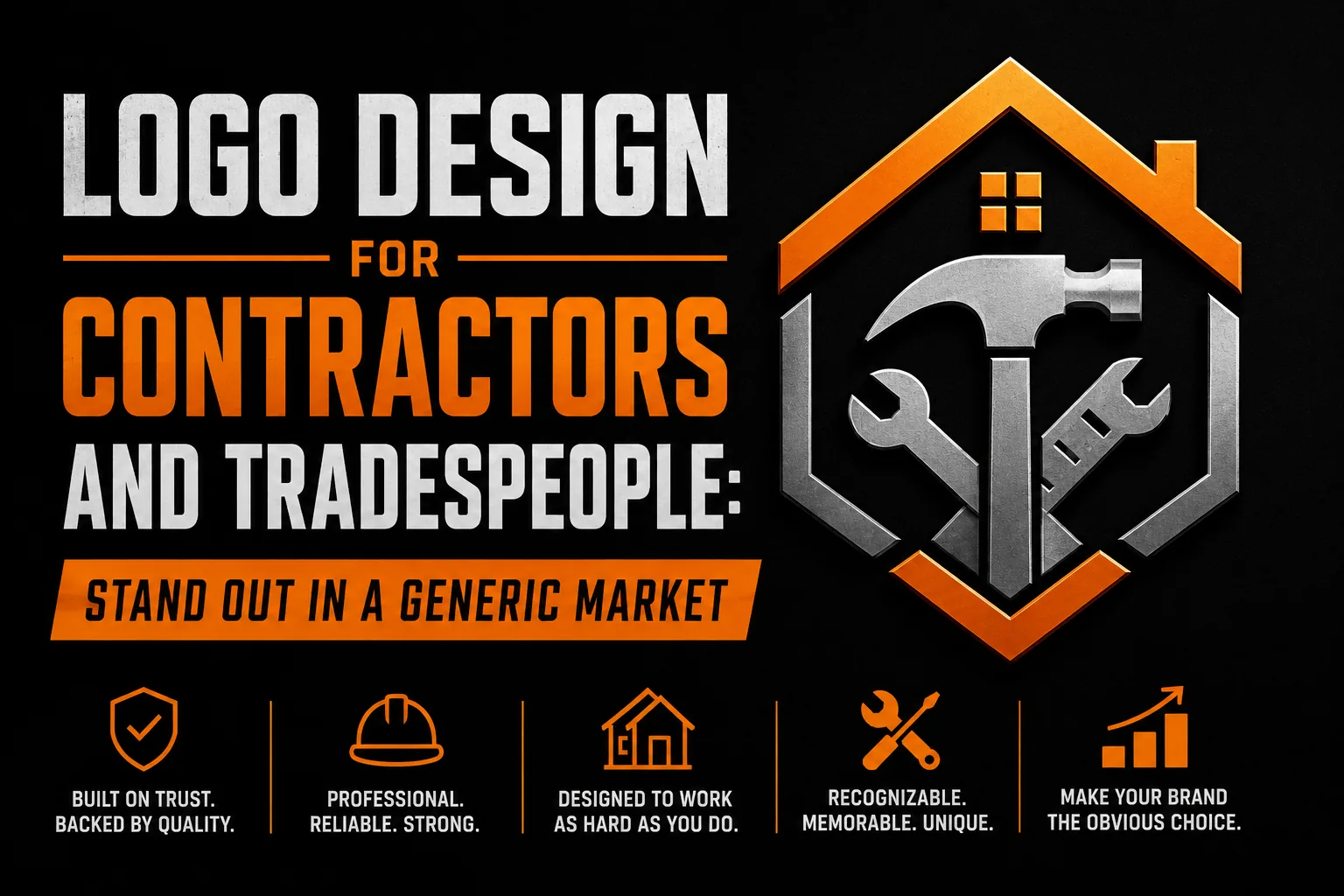
Logo design for tradesmen starts with a clear business name, a distinctive visual identity and lettering that stays readable on workwear. This guide shows contractors how to move beyond generic trade symbols and present a consistent, professional image.
Key takeaways
- Avoid the usual navy and orange or red and black combos if you want prospects to remember you among quotes.
- Use one bold, clean sans-serif typeface for your business name instead of several competing fonts.
Why Visual Identity Matters More in the Trades Than Most Contractors Realize
Homeowners and property managers selecting a contractor face a fundamental challenge: they cannot evaluate the quality of the work before it is done. They rely on proxies, online reviews, word-of-mouth referrals, and visual signals of professionalism, to make their selection decision. A professional logo on the quote document, a matching business card presented at the site visit, and a consistent email signature all contribute to a professionalism signal that influences the buying decision independently of the price submitted.
Research on contractor marketing and consumer behavior consistently shows that professional visual presentation correlates with higher quote acceptance rates, higher average project values, and greater willingness to pay premium prices. Clients who perceive a contractor as highly professional are less likely to negotiate aggressively on price and more likely to refer the contractor to others after project completion. The investment in professional visual identity is not marketing cost, it is a direct influence on win rate and average project margin.
The Distance Test: Design Your Logo to Be Read From Afar
Many contractors use logos that were not designed to be seen from a distance and look unclear or amateurish at large scale.
Design your logo for distance first. The business name must be readable from the distance of a neighboring property, at the speed of a car passing on the street. The logo mark must be large enough to register as a distinct visual element at that scale. The color scheme must create strong contrast with its background. Test your logo by previewing it at large scale, not just on a business card or screen, before finalizing the design.
Breaking the Generic Contractor Color Mold
Color is the fastest path to differentiation in a market where most competitors look similar. The most common color combinations in the contractor category across most markets are navy and orange, red and black, blue and white, and yellow and black. These combinations are not wrong, they signal energy and professionalism appropriately. But their prevalence means they provide zero differentiation. A prospect who has received quotes from three contractors with navy-and-orange logos cannot remember which is which from memory.
A contractor who chooses an uncommonly used color in their local market becomes instantly memorable. Deep forest green, used by very few contractors in most markets, communicates reliability and environmental care, qualities increasingly valued by residential clients. A rich burgundy communicates premium craftsmanship and appeals to clients renovating higher-value properties. Slate grey with a gold accent communicates precision and expertise in a way that commands higher price expectations. None of these colors are wrong for the trades, all of them are dramatically underused.
Typography That Projects Confidence
The most effective typography for contractor logos is bold, clean, and immediately legible, not decorative, not ornate, and not relying on multiple typefaces competing for attention. A single strong sans-serif typeface used for the business name, scaled to fill the available space boldly, creates a more professional impression than a complex combination of fonts trying to compensate for a weak underlying concept.
Geometric sans-serif fonts, Montserrat, Futura, Gotham and their equivalents, project modernity and precision, qualities that communicate well for electrical, HVAC, and specialist technical trades. Humanist sans-serif fonts, Gill Sans, Myriad, and similar, project warmth and approachability alongside professionalism, working well for residential renovation and home improvement contractors where personal relationship is central to the client experience.
The Workwear and Embroidery Constraint
Branded workwear, embroidered polo shirts, printed jackets, embroidered caps, is a significant branded touchpoint for most contractors. Every employee on a job site wearing branded workwear is a walking advertisement for the business. However, embroidery imposes specific design constraints that a logo not designed with this application in mind will fail.
For embroidery quality, your logo must work in two to three colors maximum, have no elements thinner than approximately 2mm at embroidery size, and have text at minimum 6mm to 8mm in cap height. Complex logos with gradients, fine details, or small text require a simplified embroidery version. Having your designer create an embroidery-specific variant at the time of original logo design is far more cost-effective than discovering the problem when your first branded workwear order comes back with a blurry, muddled result.
Frequently Asked Questions About Contractor Logo Design
What makes a good logo for a contractor or tradesperson?
A good contractor logo is instantly legible from a distance, works in a single color for embroidery and branded workwear, communicates the trade clearly without relying on overused tools, and projects professionalism that justifies premium pricing. The most effective contractor logos use bold, simple typography with a distinctive color that is uncommon in the local competitive landscape.
Should a contractor logo show their tools or trade symbol?
Literal trade symbols are the most overused icons in the trades category and rarely create meaningful differentiation. A contractor whose logo includes a generic tool icon looks identical to dozens of competitors. More effective approaches include a distinctive typographic mark, an abstract geometric form that suggests strength or precision, or a custom mark that references the trade in an unexpected or stylized way.
What colors work best for a contractor logo?
Navy blue and orange is the most common contractor color combination, which means it is also the most forgettable. Bold differentiation through color is one of the highest-leverage moves available. Dark green communicates reliability, deep burgundy signals premium positioning, and black and gold suggests luxury craftsmanship. Choosing a color no competitor in your local market uses creates immediate visual recognition.
How important is a professional logo for a small contracting business?
A professional logo is disproportionately important for small contractors competing against larger companies. When a homeowner compares quotes, the contractor with the most professional visual presentation wins a significant credibility advantage before price is even considered. Professional visual identity correlates with higher accepted quote rates at higher price points.
Does a contractor logo need to include the trade or service type?
For single-trade contractors, including a short descriptor below the primary logo mark helps new prospects immediately understand what the business offers. The descriptor should be part of the logo system as a lockup element, set in a secondary typeface and size that is clearly subordinate to the primary business name.