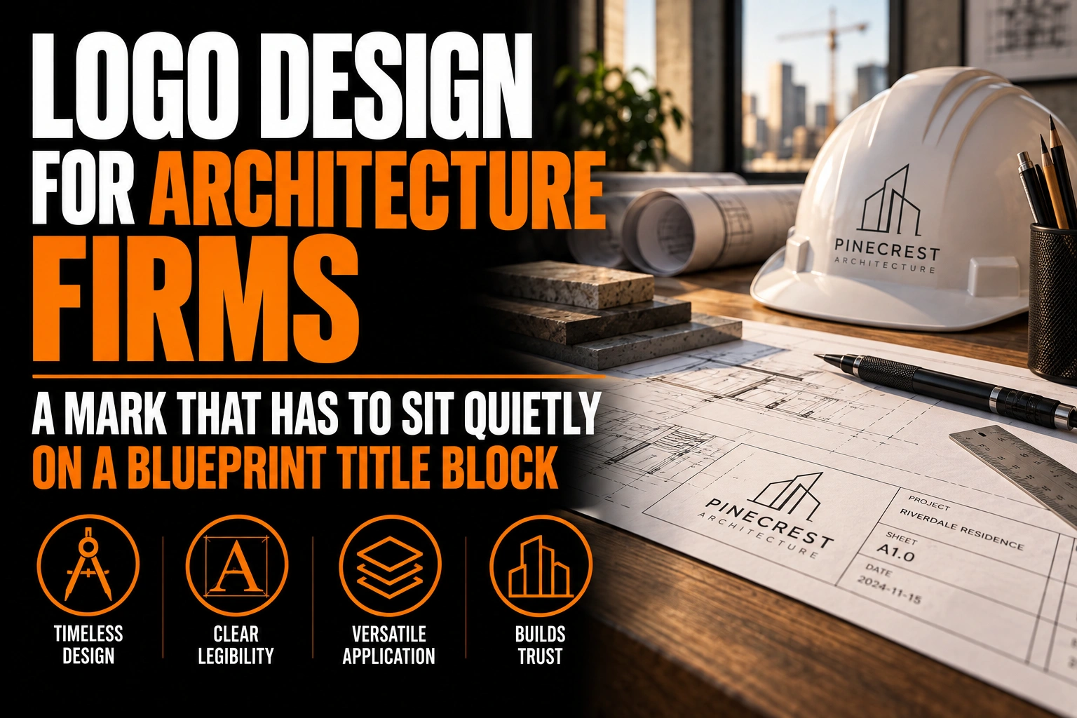
Logo Design for Architecture Firms: A Mark That Has to Sit Quietly on a Blueprint Title Block
An architecture firm logo has to work as a single flat colour, hold its shape at less than an inch wide, and stay quieter than the drawing it sits beside. Most architecture firm logos fail not because the design is weak, but because it was only ever tested on a screen, never on a printed drawing sheet or a site sign. The fix starts with picking the smallest, flattest version of the mark first, then scaling up from there.
Key takeaways
- Make sure the logo works in a single flat colour, since drawing sets print mostly in black ink on white paper.
- Start from the smallest, flattest version of the mark and test it in the title block before scaling up.
- Choose a clean geometric sans serif with even strokes that echoes the straight lines of a technical drawing.
What style of logo works best for an architecture firm?
A restrained, geometric mark in 1 or 2 colours works best for an architecture firm, because the logo has to compete with technical drawings, material boards and finished photography rather than with other brands on a store shelf.
That restraint shows up in 3 places at once: the shape has to simplify well, the colour palette has to stay muted enough to not fight with a material palette, and the typeface has to read as confident rather than decorative. Our guide to logo colour psychology by industry covers why certain palettes read as trustworthy in a technical field and others read as a lifestyle brand instead. For a firm that pitches with renderings and drawing sets, a loud or trend-driven mark usually loses that comparison, which is why professional logo design for this sector starts from the smallest, plainest version of the mark rather than the most decorative one.
Why does an architecture firm’s logo need to survive in 1 flat colour?
An architecture firm’s logo needs to survive in 1 flat colour because most of its daily use is line work, not full colour. Drawing sets print mostly in black ink on white paper, and a logo with a gradient or a drop shadow simply cannot be reproduced in that format without losing its shape.
Architectural drawing sheets also follow fixed proportions rather than whatever size looks good on a laptop. The U.S. engineering drawing standard ANSI/ASME Y14.1 sets common sheet sizes at 22 by 34 inches (ANSI D) and 34 by 44 inches (ANSI E), the formats most architecture and engineering offices still plot construction documents on. On a sheet that size, the title block strip is a small fraction of the page, and a logo built around 2 or 3 colours and fine gradients turns into a grey smudge the moment it is plotted in black and white for a site set or a permit submission.
How small can an architecture firm’s logo go before it disappears on a drawing?
An architecture firm’s logo has to stay legible from the title block strip of a full-size drawing sheet down to a business card, with no version in between that was never tested. If the mark only works at business card size, it will blur the moment it is reduced further for a stamp or a digital signature line.
The published guide on logo clear space and minimum size explains why a fixed floor size and a protected margin around the mark matter more than most firms expect. For an architecture practice, that floor size should be set using the smallest real use case first, such as a drawing sheet title block, a staff email signature or a site sign viewed from the sidewalk, not the largest version used on a proposal cover.
Which fonts keep an architecture firm’s name looking precise?
A clean geometric sans serif with even stroke widths keeps an architecture firm’s name looking precise, because it echoes the straight lines and consistent weight of a technical drawing instead of competing with it.
Our guide to typography and brand authority walks through why letterform choice signals credibility before a reader processes anything else on the page. Scripts, heavily rounded letterforms and condensed display fonts tend to read as decorative rather than technical, which works against a firm trying to look precise on a proposal cover or a permit drawing. A single weight of a well-built sans serif, set with slightly wider letter spacing, usually does more for an architecture firm than a custom hand-drawn wordmark.
Where does an architecture firm’s logo actually have to perform?
An architecture firm’s logo has to perform on a drawing sheet title block, a proposal cover, a business card, a site sign, an email signature and a staff directory photo, often all within the same week for the same project. Each of those surfaces imposes a different constraint, and a mark approved only on a laptop screen rarely survives all of them.
A proposal cover gives the most room: full colour, larger scale, room for a tagline. A site sign at a construction entrance is viewed from a sidewalk or a passing car, so stroke width and contrast matter more than fine detail. A title block strip is the tightest constraint of all, often under 2 inches of usable width once the project name, sheet number and revision history are placed. Designing for the title block first, then relaxing the constraint for the proposal cover, produces a more consistent result than the reverse. If your firm already has a brand guidelines document, this is exactly the kind of use case it should spell out rather than leave to whoever is printing the next drawing set.
In more than 5,000 logo and brand identity projects completed, the recurring pattern on technical and professional services files is the same: the firms that test their mark on the smallest surface first spend far less time redrawing it later for a format nobody anticipated. Our logo design service builds that test into the process rather than treating it as an afterthought once a client complains that the title block logo looks blurry.
A mark built to hold up on a drawing sheet, not just a screen
We design logos that are tested at title block scale and business card scale before a single file is handed over.
What to confirm before an architecture firm’s logo goes on a title block
- The logo holds its shape as a single flat colour, with no gradient or drop shadow that disappears in black and white plotting.
- A minimum size has been set using the title block strip or a business card, not the largest version on a proposal cover.
- The typeface reads as precise rather than decorative at both the largest and smallest approved size.
- A reversed, white-on-dark version exists for site signs and dark-background drawing templates.
- The file set includes a vector format that can be dropped directly into drawing and proposal templates without rework.
How much does it cost to design a logo for an architecture firm?
Cost depends on the scope of the project, since a single mark built for one use case is a different job from a full identity package covering a title block version, a proposal template and business stationery. A firm should ask for a quote based on the actual list of surfaces the logo needs to work on, rather than a flat industry-wide price, since that list is what drives most of the design and testing time.
What makes an architecture firm’s logo different from other business logos?
An architecture firm’s logo has to share visual space with technical drawings and material samples rather than stand alone, so it needs to stay restrained and work in a single flat colour instead of relying on bright colour or decorative detail to stand out.
Why should an architecture firm avoid a multi-colour logo?
A multi-colour logo loses its shape the moment it is printed on a drawing sheet plotted in black and white, which is still how most construction documents and permit sets are produced, so a single-colour version has to work first.
What is the smallest size an architecture firm’s logo needs to work at?
The smallest size should be set by the tightest real use case, usually the title block strip of a full drawing sheet or a staff business card, both of which are far smaller than a proposal cover or a website header.
Should an architecture firm’s logo include an icon like a compass or a building outline?
An icon is optional and should only be added if it still reads clearly at the smallest approved size. A wordmark alone, set in a precise typeface, often performs better across a drawing sheet, a business card and a site sign than a detailed icon that blurs when reduced.
Does an architecture firm need a different logo version for a stamp or signature line?
A firm may need a simplified, single-line version for any use case with very little vertical space, such as a digital signature block or a narrow footer, built from the same base mark rather than redrawn from scratch each time.