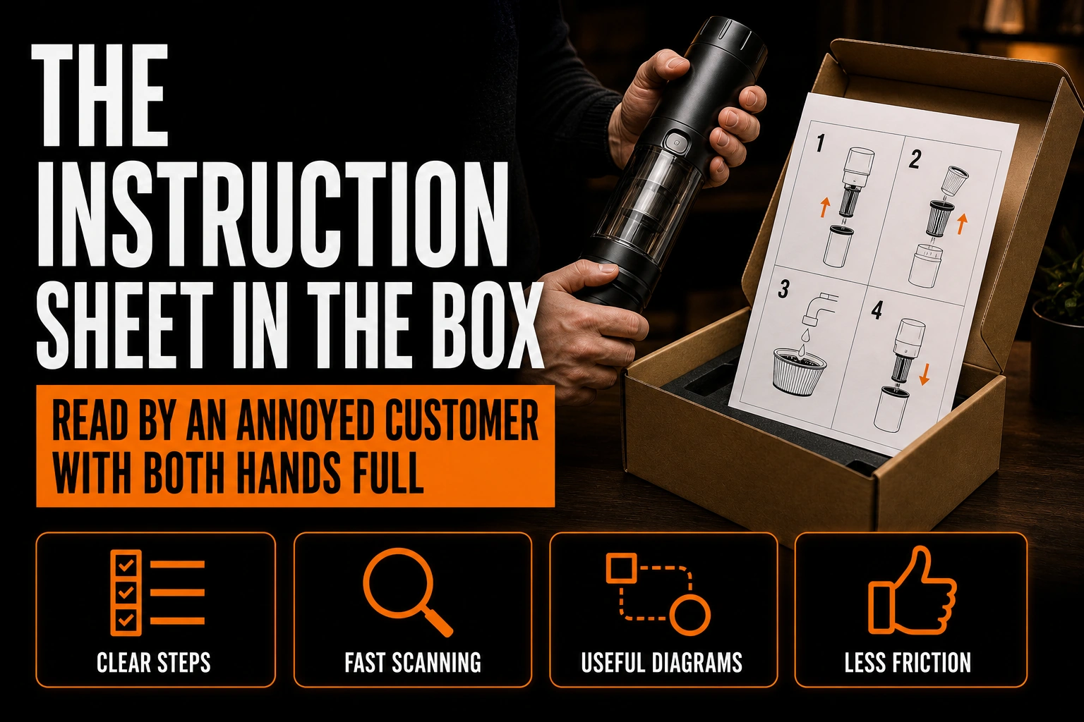
The Instruction Sheet in the Box Is Read by an Annoyed Customer With Both Hands Full
Every branded document your company produces is read by someone in a reasonably good mood. The brochure is read by a prospect who chose to pick it up. The proposal is read by a buyer who asked for it. The packaging is seen by a customer who just received something they wanted.
Key takeaways
- Choose the sheet format for how it will be held before laying it out, instead of letting the box size dictate the fold.
- Put your logo on the instruction sheet, but keep it small and away from the top of the page.
- Keep the printed sheet even if you add a code for videos, since readers may lack reception or a free hand for a phone.
There is exactly one exception, and almost nobody designs it. The folded sheet inside the box, the one that explains how to assemble the thing, set it up or attach it to a wall, is read by someone who is already mildly irritated, whose hands are occupied, and who is standing over a pile of parts on a floor.
It is the only piece of your brand that meets your customer at their worst moment. And it is usually the only piece that was never given to a designer.
Why this one document behaves differently from everything else
Start with the reading posture, because it explains everything that follows.
A brochure is held in two hands at a comfortable distance. A proposal is read seated, on a screen, at leisure. The instruction sheet is different in four specific ways, and each one has a design consequence.
It is read standing or crouching, so the distance between the eye and the page is inconsistent and usually greater than reading distance. It is read with occupied hands, so the sheet is on the floor, on a countertop or wedged under a knee, and it will not be held. It is read in short bursts, because the reader looks at the page, then at the object, then back at the page, dozens of times. And it is read under time pressure that the reader imposed on themselves, because they expected this to take ten minutes.
None of the four applies to any other document your company sends out. Which means every layout habit you carry over from your brochure is wrong here.
The single most common failure is not the writing
Ask people what makes instructions bad and most will say the words. In practice, the piece almost always fails earlier than that.
The reader loses their place. They look at the object, look back at the sheet, and cannot instantly find the step they were on. Every time this happens, a small amount of goodwill is spent, and the goodwill runs out well before the assembly does.
This is a layout problem, not a copywriting problem. It is caused by steps that look identical to each other, by numbers set at the same weight as the body text, by a two column grid that makes the reading order ambiguous, and by pages that break in the middle of a step. Solving it costs nothing: give the step number enough visual weight to be found from a metre away, keep one step visually complete on one surface, and make consecutive steps look different enough that the eye can tell them apart at a glance.
What the research actually establishes
There is real published work on this, which is worth more than design intuition.
Research from the Stanford graphics group on step by step assembly instructions is the reference most often cited, and its central finding is structural rather than aesthetic: instructions are more effective when the sequence and the illustrations follow how people actually build an object, rather than how the object is described in a parts list. Studies of furniture assembly repeatedly report the same failure mode, that users struggle to judge how far along they are, and that not knowing how many steps remain is itself a source of frustration independent of difficulty.
Two practical consequences follow. Show the reader where they are, with a step count that is visible on every surface rather than only at the start. And favour images over prose wherever an image can carry the instruction, because the reader is switching between a flat page and a three dimensional object and every sentence forces a translation they have to do in their head.
The format decision comes before the layout decision
Most instruction sheets are a folded rectangle because that is what fits the box, and the fold pattern is chosen by whoever packs the product. That is backwards, and it is the decision that constrains everything else.
Three questions settle the format, and all three are about the reader’s hands rather than the box. Can the sheet lie flat on its own without springing shut, because nobody will hold it open while holding a screwdriver. Does any single step ever get split across a fold, because a fold is a page break that the reader cannot ignore. And is the sheet large enough to be read at arm’s length from the floor, which usually means larger type than you think and fewer steps per surface than you want.
A sheet that fails the first question fails completely. Heavy stock that will not stay open is a common and expensive mistake, because it feels like a quality decision and behaves like a defect. This is the sort of trade off our print design service settles before the piece goes to press rather than after the first customer complaint.
The brand question, answered honestly
Here is the part that surprises clients. Your logo should be on this piece, but small, and not at the top.
The reason is that the top of the first surface is the most valuable real estate on the entire document, and it belongs to the reader’s first question, which is always some version of “do I have everything and where do I start.” Spending that space on a large logo and a marketing line is the clearest possible signal that the piece was designed for you rather than for them.
Your brand shows up here through competence, not through logo size. A sheet that is legible, correctly sequenced and complete communicates more about your company than any tagline, and it does so at the exact moment when the customer is forming an opinion about whether buying from you was a good idea. Place your logo and your contact information at the end, where the reader will look once they are finished or once they are stuck, which are the only two moments they will want to reach you.
The piece that meets your customer on their worst day deserves a designer
We lay out instruction sheets, setup guides and inserts the same way we lay out a brochure: a real grid, a real hierarchy and a format chosen for how the piece will actually be held.
What this guide does not cover
Three neighbouring subjects are deliberately left out.
The outer packaging and the unboxing sequence are a separate design problem with different goals, covered in our article on branded packaging and the unboxing experience. Nothing in this guide touches the box, the tissue paper or the thank you card.
Shipping and product labelling, which are governed by their own constraints, are not addressed. Neither is the technical writing itself, meaning how to phrase a step or structure a warning, which is a writing discipline rather than a design one. If your question is which printed format suits a given message, the comparison of flyers, leaflets and brochures answers it, and what a printer actually needs from your files covers the handover to production. Our brochure and print design service takes on the layout itself.
And no regulatory requirement of any kind is stated here. Whether your product category requires specific documentation, wording or symbols is a question for your own compliance advisor, not for a design guide. What follows from this piece is a layout argument, not a compliance argument.
Quick reference
- The instruction sheet is the only branded document read by an irritated customer with occupied hands.
- The most common failure is losing your place, which is a layout problem rather than a writing problem.
- Give step numbers real visual weight and never split a step across a fold or a page.
- Show how many steps remain, on every surface, not only at the start.
- Choose the format from how the sheet will be held, not from what fits the box.
- A sheet that will not lie flat on its own has failed regardless of how good it looks.
- Keep the logo small and put it at the end, with your contact information.
- Nothing here states a regulatory requirement; confirm those separately.
Frequently Asked Questions
Should the instruction sheet match our brochure design?
It should share the typeface, the colour and the logo, and almost nothing else. The brochure grid is built for a seated reader holding the page, and reusing it here produces a document that looks consistent and performs badly. Consistency of identity, yes. Consistency of layout, no.
Is it worth paying a designer for a piece the customer throws away?
The customer reads it before throwing it away, and reads it at the moment they are deciding whether the purchase was a good idea. Very few pieces of print are read that attentively. The cost is also small relative to the product, because the piece is short and prints alongside your other packaging.
Should we just put the instructions online and print a code?
Print the code, but do not remove the sheet. The reader may be in a basement or a garage with poor reception, may have their phone in another room, and may not want to hold a phone while assembling something. A code is a good addition for video and for a replacement copy, and a poor replacement for the page itself.
How many steps should fit on one surface?
Fewer than you want. The reader is at an inconsistent distance and looking back and forth, so a dense surface costs more than an extra page. If a step needs an illustration, that illustration should be large enough to interpret without leaning in.
Do images really work better than text?
For the physical action, yes, and this is one of the more consistent findings in the published work on assembly. Text stays useful for anything an image cannot show, such as a torque, an order that is not visually obvious, or a warning. The usual mistake is describing in a sentence something a drawing would settle instantly.
What about customers who do not read instructions at all?
Design for them too, and it costs nothing. A single clear surface showing the finished object, the parts and the number of steps gives the non reader enough to start correctly, and gives them a place to return to when they get stuck. That surface is the first thing they will look at, which is the real reason it should not be occupied by a logo.