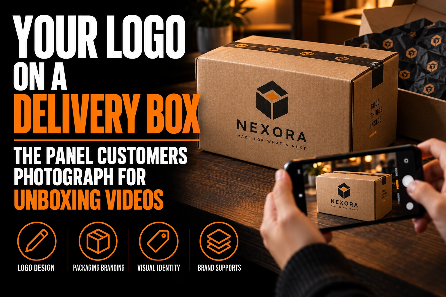
Your Logo on a Delivery Box: The Panel Customers Photograph for Unboxing Videos
The panel customers photograph is the top of the delivery box, filmed from above before the tape is cut. The inside of the lid comes next, once it opens. Your strongest logo belongs on those 2 surfaces, in a spot the shipping label cannot cover.
Key takeaways
- Put your strongest logo on the top panel and the inside of the lid, the 2 surfaces filmed in unboxing videos.
- Draw the shipping label rectangle on the box template first and treat that zone as a no-logo area.
- Use a solid, single-colour dark version on brown kraft board, where pale colours and thin lines almost disappear.
This guide shows you how to map the faces of a box, decide which ones carry your logo, and prepare a version that survives brown board. It stays on the outer box and its lid. Tissue paper, inserts and the shipping label itself are separate subjects.
Which panel of a delivery box ends up in the unboxing video?
The top panel ends up in almost every unboxing video, because the customer holds the phone above the box and films straight down. The inside of the lid comes second, at the moment the flap lifts. The sides appear for a second, and the bottom never does.
That gives you a ranking for the 6 outer faces plus the inside lid. Top first, inside lid second, the front edge third, then the long sides. Design in that order, and stop adding logos once the important faces are handled. A box covered with the same mark on every face looks like wrapping paper, not like a brand.
Why does the shipping label compete with your delivery box logo?
The shipping label competes with your logo because both want the same panel. Canada Post’s packing guidance asks for the label to sit flat on the largest side of the box. It must stay off edges, seams and the closure, with no tape over it.
On a flat mailer box, the largest side is usually the lid. So the face you designed as the hero of the unboxing video is also the face the carrier wants for its label. If you centre a large logo there, the label will land on top of it, often a little crooked, in the exact frame the customer films.
You have 3 workable answers. Leave a clear label zone on the lid and move the logo off centre. Move the hero logo to the inside of the lid and keep the top quiet. Or ship the printed box inside a plain outer carton, so the branded box arrives clean.
How do you reserve a label zone on a mailer box lid?
Measure the label your shipping software actually prints, then draw that rectangle on the box template before the logo goes anywhere. Treat it as a no-logo area, like the clear space around your mark.
Place the rectangle where your packing station will really stick it, usually the flattest part of the lid away from the front tuck. Then build the lid design around it. A logo set in the opposite corner, or a band along one edge, still reads in the overhead shot even with a label beside it.
Show the rectangle to whoever packs your orders. A label zone only works if the person holding the label gun knows it exists.
What should the inside of the lid show when the box opens?
The inside of the lid should show your logo alone, centred, with plenty of empty space around it. No carrier, label or tape will ever touch it. That makes it the cleanest frame of the whole video.
Resist filling it with a slogan, a website, social handles and a discount code. One mark, maybe one short line such as a thank-you, reads in the half second the lid is open on camera. The rules in our guide to logo clear space and minimum size apply here too: the empty area is what makes the mark look intentional.
Which version of your logo reads on a brown kraft delivery box?
A solid, single-colour dark version reads best on brown kraft board. Brown board absorbs ink and sits in a mid-tone, so pale colours, thin lines and soft gradients sink into it and almost disappear.
Test your logo against a kraft swatch before choosing a colour. Black, a deep navy or a dark green usually holds. Pastels, light grey and yellow often look dirty or vanish. If your brand colour is light, ask your packaging maker whether a white ink is possible on their line, and keep a dark backup version ready.
A logo built from one flat colour is the safest starting point, and our single-colour Pantone logo guide explains how to prepare it. If your mark relies on a gradient, it needs a redrawn flat version first, which belongs in any complete logo file set.
How big should the logo be on a delivery box lid?
Big enough to recognize on a phone screen when the whole box fills the frame. That screen, not the box in your hand, is where most people will see it, often as a small preview in a feed.
Run a simple test. Print a mock-up of the lid at full size, put it on the floor, and photograph it from standing height with your phone. Then look at the photo shrunk to a thumbnail. If you cannot tell whose box it is, the logo is too small or too detailed.
Shape matters as much as size. A square lid suits a stacked logo or an icon, while a long, narrow box suits a horizontal lockup. Our article on horizontal, vertical and icon logo versions explains which layout fits which panel.
A box logo that still reads in the overhead shot
We prepare the lid, inside-lid and side-panel versions of your logo, with a single-colour file for kraft board and a clear label zone marked on your template.
What do the side panels and the closure of a delivery box do for your brand?
The side panels work before the video starts: on a porch, in a building lobby, on a mailroom shelf. Put a compact logo on at least 2 opposite sides, so the box is identifiable however it gets stacked.
The closure is a separate opportunity. Since the label must stay off the seam, a branded seal sticker across the flap belongs to you alone. It can be in full colour, die cut, and as large as the flap allows. It also gives the customer something to break on camera, which turns the opening into a small brand moment.
Conception-Logo.com designs and prints roll stickers, so the seal can come from the same master file as the box artwork.
What file does a packaging maker need for a printed delivery box?
A packaging maker needs your artwork placed on its own box template, called a dieline. The logo should be vector paths, with text outlined and every ink colour named. The label zone should appear on that template as a marked area.
Ask for the dieline before anyone designs, because flaps, glue tabs and fold lines change where a logo can live. Our guide to branded packaging and the unboxing moment covers the wider packaging plan. For the full list of logo files worth holding, see what logo files to request from your designer.
What to settle before your delivery box artwork goes to production
Review these points with your logo designer before you approve the box proof.
- The top panel and the inside lid carry the main logo, in that order of priority.
- A label zone matching your real shipping label is marked on the lid.
- A single-colour dark version is tested on a kraft swatch.
- The logo is recognizable in a phone photo of the lid shrunk to a thumbnail.
- At least 2 opposite side panels carry a compact version.
- A seal sticker covers the closure, since the label cannot go there.
How do I design my logo for a shipping box?
Design it for the overhead phone shot first: the top panel and the inside of the lid. Reserve a spot for the carrier’s label and use a single-colour version on brown board.
Where should the logo go on a mailer box?
The main logo goes on the top panel and on the inside of the lid, the 2 surfaces filmed in an unboxing video. A compact version on 2 opposite side panels helps the box stay identifiable on a porch or a shelf. The bottom rarely needs a logo at all.
Can the shipping label go over my printed logo?
It can, and on a mailer box it often does, because Canada Post asks for the label on the largest flat side, which is usually the lid. Reserve a label-sized zone on the lid and keep the logo out of it. Another option is to move the hero logo to the inside of the lid.
What colour logo works on a kraft delivery box?
A solid dark colour works best, such as black, deep navy or dark green. Brown kraft board absorbs ink and sits in a mid-tone, so pale colours, thin lines and gradients fade into it. Test the logo on a kraft swatch before ordering a full run.
Should I print the inside of the delivery box lid?
Yes, if your budget allows one extra printed surface. The inside lid is the only face no label, tape or carrier ever touches, and it appears on camera at the moment the box opens. Keep it simple: your logo alone, with generous space around it.
Conception-Logo.com has completed more than 5,000 projects and offers fast design turnaround. If your box needs lid, inside-lid and kraft-ready files, start with a professional logo design built for the shot your customers actually film.