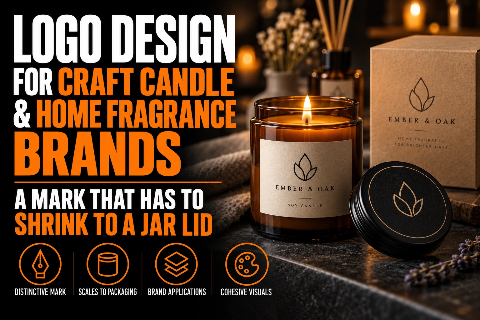
Logo Design for Craft Candle and Home Fragrance Brands: A Mark That Has to Shrink to a Jar Lid
A candle brand logo has to shrink to a jar lid, a tin top or a round sticker a few centimetres wide, while the scent name does most of the selling. The mark that works is a compact symbol or monogram drawn for that size first. A fuller wordmark serves the box, the website and the market table.
Key takeaways
- Design a compact symbol or monogram that reads at 1.5 to 3 centimetres across on lids, tins and round stickers.
- Let the scent name lead on the label, since customers choose a candle by its fragrance first.
- Keep the logo fixed on seasonal editions and change only the colours, patterns and scent names around it.
This guide covers the logo versus the scent, the lid materials, and how to keep a growing range under one brand.
Why does the scent name outrank the logo on a candle?
Because customers choose a candle by its fragrance first. The logo tells them who made it, but the scent name is what they pick up the jar to read.
The National Candle Association reports that three quarters of candle buyers call fragrance extremely or very important when they select a candle. That figure should shape your label hierarchy. The scent name leads, and the brand mark signs the jar in the same place every time.
This is good news for a small brand. You do not need a large, loud logo to be noticed. You need a small mark that customers learn to recognize across 10 or 20 scents, so they come back for the next one.
How small can a logo be on a candle label?
A candle logo often has to read at 1.5 to 3 centimetres across, on a lid sticker, a tin top or a bottom seal. Only a compact mark built for that size stays clear, not a full horizontal logo shrunk down.
A long brand name set in a delicate script is the usual problem. At 3 centimetres wide, the thin strokes fill in, and the letters close up. A tagline under the name becomes a grey line.
Design the compact version on purpose: a monogram, a simple symbol or a short name in a sturdy typeface. Then print it at real size on the actual sticker paper and look at it at arm’s length. A proper candle brand logo design includes this tested small version, not just the large logo for the website.
What changes between a candle tin lid, a wooden lid and a glass jar?
Each lid material handles the logo differently. A tin usually takes a printed sticker. A wooden lid is often laser engraved in 1 tone, and a glass jar may need a clear label.
On a tin, the sticker sits on a flat or slightly domed metal top. Keep the mark inside the flat area, away from the rolled edge. A metallic tin also changes how colours look, so approve a sample on the real metal.
A wooden lid engraved with a laser turns your logo into a single burnt tone. Gradients, shadows and thin outlines disappear. Our guide to vectorizing a logo for laser engraving explains the file that process needs.
On glass, a clear label lets the wax colour show behind your logo. A cream wax and an amber jar give 2 very different backgrounds. Keep a dark version and a light version of the mark ready for both.
Where does a candle logo live while the candle is burning?
While the candle burns, the lid comes off, and the logo on the jar or tin carries the brand alone. That vessel label is seen every time the candle is lit, for weeks.
The National Candle Association notes that about three quarters of candle users burn a candle for 4 hours or less per sitting. A single candle is therefore lit many times on a coffee table or a kitchen counter. Each sitting is another look at your brand.
So the vessel label deserves as much care as the lid. Place the logo where it stays visible from the side, above any area that wax or soot could reach. Repeat the compact mark on the bottom seal, where customers check the scent before reordering.
How should a candle logo handle holiday and limited-edition scents?
Keep the logo fixed and change everything around it. Seasonal colours, patterns and scent names can change every year, while the mark stays in the same place and the same colour.
The holiday season matters for candles. According to the National Candle Association, roughly 35% of candle sales happen during the Christmas and holiday season. Many small brands release special scents and gift sets just for those weeks.
A holiday label in deep red and gold works fine. The compact mark just has to match the one customers saw in the spring. If the logo itself changes for the season, gift recipients cannot find the brand again in January. Our article on branded packaging and the unboxing experience covers the gift box around the candle.
A candle mark that stays clear on the smallest lid
We design candle logos with a compact mark for tins, wooden lids and round stickers, plus a full wordmark for your boxes.
Which candle logo styles feel handmade without looking amateur?
A simple monogram, a hand-drawn symbol cleaned up as a vector, or a warm serif wordmark feel handmade and still look professional. A flame icon, a curly script and a watercolour texture are the styles that most often look amateur.
The flame is the candle equivalent of a wrench for mechanics. Almost every competitor on the market table uses one. A distinctive letter, a botanical shape tied to your scents or a seal inspired by your workshop is easier to remember.
Hand-drawn character is an asset, but it needs to be redrawn cleanly. A scanned sketch with rough edges looks charming on screen and blurry on a 2 centimetre sticker. Our guide on how a responsive logo works in multiple versions shows how one mark keeps its character from large to tiny.
What to confirm before ordering candle lids and labels
- The scent name leads the label, and the logo signs it in a fixed place.
- A compact mark reads clearly at 1.5 to 3 centimetres on real sticker paper.
- A 1-tone version is ready for laser engraving on wooden lids.
- Dark and light versions exist for clear labels on different wax colours.
- The vessel label shows the logo from the side while the lid is off.
- Holiday labels change colours and patterns, never the mark itself.
How do you design a candle logo that still works on a lid?
A candle logo works on a lid when a compact version is designed for that size from the start. The answers below cover size, materials and seasonal labels.
How small can a logo be on a candle label?
On a lid sticker, a tin top or a bottom seal, a candle logo often has to read at 1.5 to 3 centimetres across. Only a compact mark such as a monogram or a simple symbol stays clear at that size. Print it at real size on the actual sticker paper to confirm.
Should the logo or the scent name be bigger on a candle?
The scent name should usually lead. The National Candle Association reports that three quarters of candle buyers rank fragrance as extremely or very important. The logo signs the jar in a consistent place so customers recognize the brand across every scent.
Can a candle logo be engraved on a wooden lid?
Yes, if it works in 1 tone. Laser engraving turns the logo into a single burnt colour, so gradients, shadows and thin outlines disappear. A clean vector version with solid shapes and generous gaps engraves well.
Should a candle brand change its logo for holiday collections?
No. Change the colours, patterns and scent names, but keep the mark the same. The National Candle Association estimates that about 35% of candle sales happen in the holiday season. Gift recipients need to recognize the brand afterwards.
Conception-Logo.com has completed more than 5,000 projects and offers fast turnaround. We also design and print roll stickers for product labels. If your current logo breaks on a small lid, a logo design for your candle brand can start from the smallest size and work up.