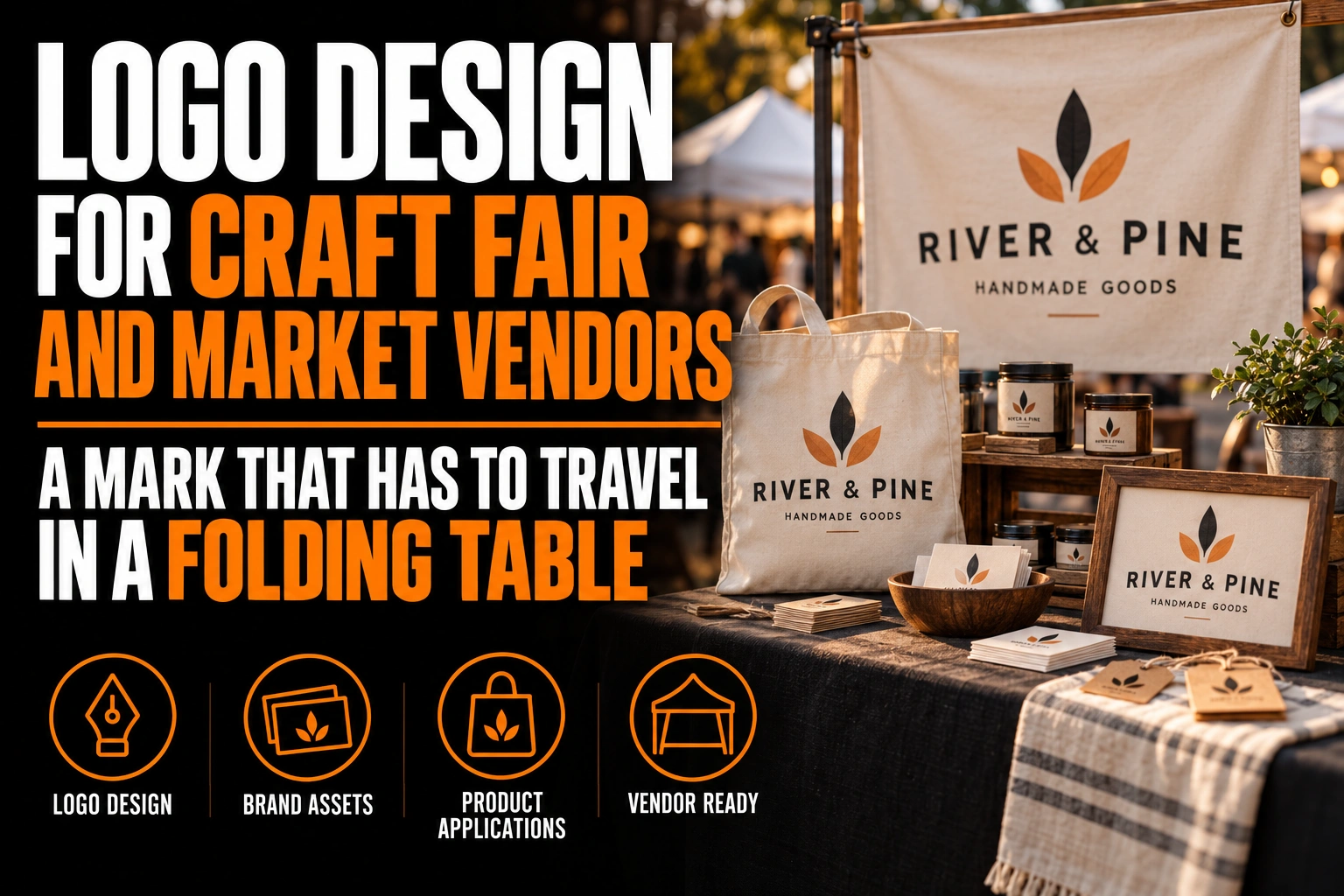
Logo Design for Craft Fair and Market Vendors: A Mark That Has to Travel in a Folding Table
A craft fair vendor logo has to work on whatever fits in the car: a table cover, a banner, product tags, stickers and a card. The mark that travels well is compact and works in 1 colour. It reads on fabric across the aisle and on a tag in a shopper’s hand.
Key takeaways
- Put the logo on the front panel of the table cover, since products hide the tabletop and you stand behind it.
- Keep one house logo and let product names change, so your candles, soaps and cards still read as one brand.
- Place the QR code beside the logo with a clear margin, since a logo pressed against it can stop phones reading it.
This guide covers the versions to build, where each one goes, and how to pack a brand that looks the same every weekend.
What makes a craft fair vendor logo different from a shop logo?
A shop logo goes up once, on a sign that never moves. A craft fair vendor logo is rebuilt every weekend, from a bin, on a table that is never in the same spot twice.
That changes the job. Your brand has no address, no window and no permanent lighting. A shopper meets you once, in a crowded hall or a church basement. Then they have to find you again online.
So the logo has 2 tasks. It has to be spotted on the day, among dozens of other tables. Then it has to stay on the product, the bag and the card, so shoppers can find you later.
How do market vendors create a consistent brand?
Market vendors create a consistent brand with one master logo, a few fixed colours and a kit packed the same way every time. Consistency comes from the kit, not from memory.
Start with 3 versions of the logo. A horizontal version fits the table cover and the banner. A compact symbol or monogram fits tags and stickers. A 1-colour version handles rubber stamps, kraft bags and anything printed in black.
Then fix 2 or 3 colours and keep them. A vendor who reorders stickers in a slightly different blue each season slowly looks like 2 different businesses. Our guide to the horizontal, vertical and icon versions of a logo explains which shape belongs on which surface.
Which part of a craft fair table carries the logo best?
The front panel of the table cover carries the logo best. The tabletop disappears under products and you stand behind it. The fabric dropping to the floor is what shoppers see from the aisle.
On a standard 6-foot folding table, that front panel is wide and short. A horizontal logo centred on it reads well. A tall stacked logo leaves empty fabric on both sides and ends up partly hidden by your knees when you sit.
A banner or a small roll-up behind you takes the second job. It lifts the name above the crowd for shoppers 3 or 4 tables away. Keep it to the logo and one word about what you make. The roll-up banner design guide covers the reading distances.
How small does a craft vendor logo get on tags and stickers?
On tags, stickers and bag seals, a craft vendor logo often shrinks to 2 or 3 centimetres across. Only a compact mark with 1 or 2 simple shapes stays clear at that size.
This is where most handmade brands break. A logo drawn with a delicate script and a small illustration looks lovely on the banner. On a 2 centimetre sticker, the script fills in and the drawing turns into a smudge.
The fix is a compact version designed on purpose, not cropped from the full logo the night before the market. A professional craft fair vendor logo design includes that small version from the start, tested at real size.
Where should the QR code sit next to a craft fair logo?
Put the QR code beside the logo, never touching it, with a clear empty margin all around. A logo pressed against the code can stop phones from reading it.
DENSO WAVE, the company that developed the QR Code, specifies a margin 4 modules wide on every side of the symbol. A module is one of the small squares inside the code. That quiet margin is part of the code, so your logo, a border or a pattern must stay out of it.
At a market, the code usually leads to your online shop or Instagram. Place it on the card and on a small sign near the payment area, where shoppers already have their phone in hand. Our guide to the back of a double-sided business card shows how to give it room.
Should each product line at the market have its own logo?
No. Keep one house logo and let the product names change. Separate logos for your candles, your soaps and your cards split a small brand into pieces shoppers cannot connect.
Use the same compact mark on every product, in the same corner of every tag. Then vary the product name, a colour accent or a pattern. A shopper who bought a mug in the spring should recognize your tea towels in the fall from the mark alone.
This also keeps the reprint list short. One sticker design and one tag template cover the whole table. That helps when you restock between 2 markets in the same week.
One brand that unpacks the same way every weekend
We design market vendor logos in the 3 versions a stall needs: one for the table cover, one for tags and one for stamps.
What does a market vendor logo need to survive a car trunk and an outdoor market?
A market vendor logo needs bold shapes, solid colours and no fine lines. Fabric creases, wind and sun all attack detail first. What looks crisp on screen has to survive being folded into a bin.
A table cover folded the same way every week develops permanent creases. A thin line or small text crossing a crease breaks visually. Outdoors, wind ripples the fabric, and strong sun flattens pale tints until they disappear.
Design the table version with thick strokes and strong contrast against the fabric colour. Test a printout folded in 4, then look at it from 3 metres. If the name still reads across the fold, it will read at the market.
What to pack in a craft fair brand kit before the next market
- A table cover with a horizontal logo centred on the front panel.
- A banner or roll-up carrying the logo and one word about what you make.
- A compact mark tested at 2 centimetres for tags, stickers and bag seals.
- A 1-colour version for stamps and kraft packaging.
- Cards with a QR code that keeps a 4-module margin clear of the logo.
- The same 2 or 3 colours on every piece, reordered from the same files.
How do you build a craft fair brand that shoppers recognize at the next market?
Shoppers recognize a market brand when the same mark appears on the table, the product and the card. The answers below cover versions, placement and the small formats.
How do market vendors create a consistent brand?
They use one master logo, 2 or 3 fixed colours and a kit of printed pieces packed the same way each time. Three versions cover most needs: a horizontal logo for the table cover, a compact mark for tags and a 1-colour version for stamps.
Where should a vendor put the logo on a craft fair table?
On the front panel of the table cover, because products cover the tabletop and the vendor stands behind it. A horizontal logo centred on that panel reads best from the aisle. A banner behind the table lifts the name above the crowd.
Can a QR code touch the logo on a vendor card?
It should not. DENSO WAVE, which developed the QR Code, specifies a clear margin 4 modules wide around the symbol. A logo inside that margin can stop phones from reading the code, so place it beside the code with space around it.
Does a handmade brand need a separate logo for each product line?
Usually not. Separate logos split a small brand into pieces shoppers cannot connect. Keep one house mark on every product and vary the product name, a colour accent or a pattern instead.
Conception-Logo.com has completed more than 5,000 projects and designs market vendor logos quickly. We also design and print table covers, roll-up banners, roll stickers and business cards. Start with a market vendor logo design built to unpack the same way every weekend.