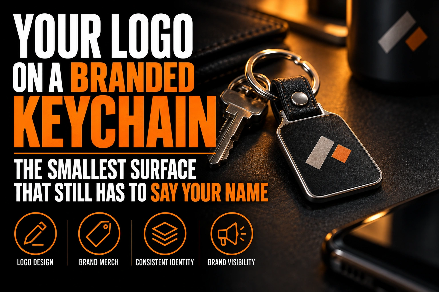
Your Logo on a Branded Keychain: The Smallest Surface That Still Has to Say Your Name
To simplify a logo for a keychain, keep the one element people recognize first, usually the symbol or the initial. Let the keychain’s outline carry part of the shape. Then thicken every line, drop the tagline, and plan around the hole for the ring.
Key takeaways
- Keep only the element people recognize first, usually the symbol or the initial, and drop the tagline on a keychain.
- Thicken every line, since keys and coins rub the surface daily and hairlines and tiny text wear away first.
- Send a vector file with outlined text, named colours, the cut line on its own layer and the ring hole position.
A keychain is held a few centimetres from the eye, rubbed by keys every day, and kept for years. This guide shows you how to build the version of your logo that survives that, and what to send the keychain maker.
Why does a branded keychain need its own version of your logo?
A branded keychain needs its own version because it combines the 2 hardest conditions for a logo: a tiny surface and years of wear. Your full logo was drawn for a website header or a sign, where it has room and stays clean.
The years part is not a guess. In a survey of 5,674 end users in the United States and Canada, the Promotional Products Association International (PPAI) found that 48.7 percent kept promotional products for more than 5 years. The top reason, cited by 75.4 percent, was that the product was useful.
A keychain is about as useful as a promotional object gets. So the version you print will be read on day 1 and again in year 5, after thousands of trips through a pocket. Design for the worn state, not for the proof.
Which part of your logo should survive on a keychain?
Keep the part a customer would draw from memory. For most businesses that is the symbol, a monogram or the first letter of the name. A long wordmark rarely survives unless the name is short.
Try this test. Print your full logo at the real size of the keychain face, then cover the tagline, then the name. The moment the mark stops looking like yours, you have removed one element too many.
The result is often close to your favicon or app icon. The reasoning in our guide to adapting your logo for tiny formats applies almost word for word, because both surfaces force you to pick one recognizable shape.
How does the ring hole change a keychain logo layout?
The ring hole takes the top of the keychain and decides which way the logo hangs. It needs its own clear margin, so the usable face is smaller than the outline suggests.
Keys hang from the ring, so the keychain dangles hole up. Set the logo upright in that hanging position, not in the position the object lies on a table. A horizontal lockup on a tall, narrow tag will hang sideways and read badly.
Keep the logo well away from the hole. Metal rings and keys strike that zone constantly, and the edges around the hole wear first. A symbol touching the hole looks cramped on day 1 and damaged by month 6.
Can the keychain’s outline become part of your logo?
Yes, and on small items it often should. A keychain cut to the silhouette of your symbol is recognizable from across a counter, even when the printed detail is too small to read.
This works only when the silhouette is simple. A clean outline with few points survives cutting and daily wear. Thin spikes, narrow stems and deep notches snap, bend or catch on fabric. If your symbol has delicate parts, simplify the cut line and keep the detail inside the shape.
Ask for the cut line as its own vector path, separate from the printed artwork. The maker uses it to shape the object, so it has to be clean and closed.
What happens to fine detail after years on a keyring?
Fine detail fades first. Keys, coins and pocket fabric rub the surface every day, so hairlines wear away, small counters fill with grime and tiny text becomes a grey smear.
Each common material fails in its own way. Printed acrylic and plastic lose thin ink lines to abrasion. Engraved or debossed metal and leather keep the shape, but small recesses fill with dirt and lose contrast. Moulded rubber tags need walls between colour areas, so very small shapes disappear.
The cure is the same in every case: thicker strokes, wider gaps and fewer elements. For engraved metal, our guide to vectorizing a logo for laser engraving explains how a design is prepared for that process.
Should both sides of a branded keychain carry the logo?
Yes, because a keychain flips constantly and you never know which face lands up. Use the symbol on one side and the business name on the other, so either face identifies you.
The name side is where your wordmark can return, set as large as the face allows. A phone number or web address only fits if the keychain is large and the type stays clear. If it does not fit cleanly, leave it off: a crisp name is easier to search than a cramped number.
Keep both sides in the same visual family. Same colours, same weight, same style of shapes, so the 2 faces read as one object.
A keychain mark that still says your name in year 5
We simplify your logo into a compact keychain version, draw the cut line as a clean vector path and deliver files your keychain maker can use directly.
Which colours hold up on a small branded keychain?
One or 2 strong colours with high contrast hold up best. On a tiny surface, colour does more recognition work than detail, so pick the colour customers already link to you and use it boldly.
Avoid tints and near-matching shades. Two close blues read as one blue at this size, and a light grey on white vanishes once the surface scuffs. A clean single-colour version is the safest base, and our article on preparing a logo for promotional products explains why small print zones favour it.
What file should you send a keychain maker?
Send a vector file of the keychain version, with text converted to outlines, colours named, and the cut line on its own layer. Include the ring hole position so nobody guesses where it goes.
Do not send your everyday logo and expect the maker to simplify it. That decision belongs to someone who knows your brand. A dedicated small version is also worth keeping for stamps, pins and other tiny items, as our guide to responsive logo versions explains.
What your keychain version needs before you approve the proof
Run through this list with your logo designer before any keychain is produced.
- Only the most recognizable element of the logo remains: symbol, monogram or short name.
- The logo is upright when the keychain hangs from its ring.
- A clear margin separates the logo from the ring hole.
- Strokes and gaps are thick enough to survive daily abrasion.
- The cut line is a simple, closed vector path on its own layer.
- Both faces identify the business, with 1 or 2 high-contrast colours.
How do you simplify a logo for a small item like a keychain?
Reduce it to the single shape people recognize, make every line thicker than feels necessary, and let the object’s outline do part of the branding work.
What size should a logo be on a keychain?
There is no universal size, because it depends on the keychain face and the method used. Print the logo at its real size on paper, then check that every stroke and gap is still visible at arm’s length. If the thinnest part disappears, simplify the mark rather than shrinking it further.
Can a full logo with text fit on a keychain?
Only when the name is short and the keychain face is large. In most cases the tagline and secondary text become unreadable and wear off first. A symbol on one side and the name on the other usually works better than a full logo squeezed onto one face.
Should a keychain logo be one colour?
One or 2 colours is the practical limit for most keychains. Fewer colours mean fewer small areas that can wear, blur or misalign. A strong single colour with high contrast stays recognizable longer than a detailed multicolour version.
How long do people keep a promotional keychain?
Often for years. A PPAI survey of 5,674 end users in the United States and Canada found that 48.7 percent kept promotional products for more than 5 years. The main reason was usefulness. A keychain logo should therefore be designed for its worn state, not only for the first day.
Conception-Logo.com has completed more than 5,000 projects. For a keychain version that keeps saying your name long after the giveaway, start with a professional logo design with a compact mark.