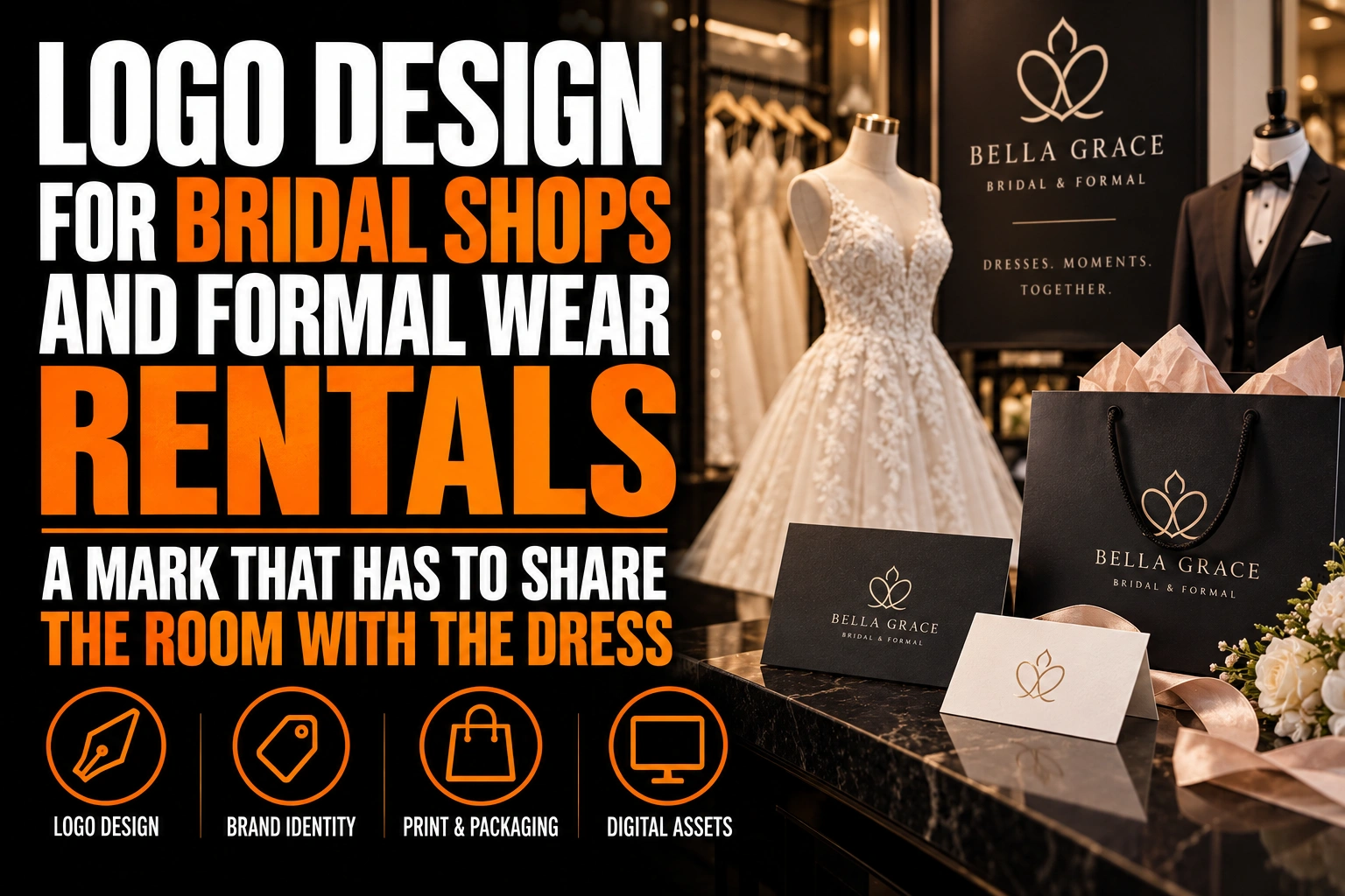
Logo Design for Bridal Shops and Formal Wear Rentals: A Mark That Has to Share the Room With the Dress
A bridal shop logo should be understated enough to step back behind the dress. It should also be distinct enough to be recognized on a garment bag across a parking lot. In practice, that means one refined wordmark, a single quiet colour and a simple monogram, so the gown stays the star while the logo signs the room.
Key takeaways
- Choose a logo colour darker than the dresses, since white, ivory and champagne shades vanish in a bridal showroom.
- Plan a compact monogram for garment bags, as thin script letters often turn into a tangle of thread when embroidered.
- Keep rental garment bag logos simple, solid and in 1 colour, since the bags are handled roughly, cleaned and reused.
This guide covers bridal boutiques and formal wear rental shops, including suit and tuxedo rentals. It focuses on the showroom, the garment bag, the rental return and the photos taken on the day a dress is chosen.
How understated should a bridal shop logo be?
Quiet in colour and size, but never weak in shape. The logo should never compete with a gown in the showroom. Yet it must stay clear and recognizable on every bag, card and sign that leaves the store.
The common mistake is confusing understated with faint. A pale gold script on an ivory wall looks elegant in a mock-up and disappears in real life. A better approach keeps the colour soft and the structure firm: well-drawn letters, steady spacing and a mark that reads at a glance.
Think of the logo as a signature at the bottom of a painting. It is small and calm, but nobody wonders who signed it. Our article on minimalist logos and simplicity explains how restraint can still carry personality.
Why does a white and ivory showroom change the colour of a bridal logo?
Because almost everything around the logo is already white, ivory, champagne or blush. A logo in one of those shades has nothing to contrast with, so it vanishes on the walls, the bags and the fitting room curtains.
Choose a colour that is calm but clearly darker than the dresses. Charcoal, deep green, navy, plum or a deep warm grey all keep the room soft while giving the logo a clear edge. Gold can work as a finish on business cards or boxes, but the logo should also exist in a solid dark colour.
Test the colour in the room itself. Print the logo, tape it to the wall beside a rack of gowns and look at it from the entrance. If the logo is harder to read than the price tags, it needs more contrast.
What happens when a script logo is embroidered on a garment bag?
Thin script letters need far more height than plain letters to stitch cleanly. A delicate script can look perfect on screen and still turn into a tangle of thread on a garment bag, a robe or a staff jacket.
Hatch Embroidery, the embroidery software line from Wilcom, publishes minimum lettering heights for its fonts. It lists a minimum of about 12 mm, or 0.5 inch, for a formal script such as Edwardian Script. Simple serif and sans serif faces start at about 6 mm. Fancy monograms need about 25 mm, or 1 inch.
Those figures change the brief. If your name is a long script, it will need a large space on the bag. A compact monogram drawn with simpler shapes is often the better choice for embroidery. Our guide on preparing a logo for embroidery covers the file a digitizer needs. Conception-Logo.com designs the logo and the artwork for the bag; the bag itself comes from your garment bag supplier.
How does a formal wear rental logo survive the return trip?
By being simple, solid and in 1 colour. A rental garment bag leaves the store, travels to a wedding, gets folded into a car trunk and comes back. Its logo is handled roughly, cleaned and reused, so fine details and pale colours wear out first.
Rental shops also need small, practical pieces. A pickup ticket, a fitting card for each member of a wedding party and a tag that identifies each suit all carry the logo. These pieces work best with a compact version of the mark and a clear space for the customer’s name and date.
Numbered tickets and business cards are among the products Conception-Logo.com designs and prints. A shared layout for all of them makes a group of 6 or 8 groomsmen easier to manage at the counter.
Where does a bridal logo appear when a bride says yes to the dress?
Usually in the photos family members take in the showroom. That moment is shared widely. The logo should appear calmly in the background, on a wall sign or a small handheld card, never on the mirror or across the dress.
A mirror is a poor place for a logo. It reflects light, it reverses a decal when seen in a photo and it competes with the bride herself. A small sign on a solid wall beside the main mirror stays readable and appears in many photos without spoiling them.
Many boutiques use a printed card that the bride holds up for the photo. Keep the logo small on that card and let the message lead. Postcards and greeting cards are part of the catalogue Conception-Logo.com designs and prints, so the card can match your business cards and thank you notes.
A refined mark that lets the dress stay the star
We design bridal and formal wear logos with a quiet wordmark for the showroom and a compact monogram built for embroidery and garment bags.
Should a bridal shop and its formal wear rental share one logo?
Yes, in most cases. One master logo with the service named in plain text keeps the business recognizable to the whole wedding party. The bride buys her dress and sends the groom’s party to the same name.
A separate logo for the rental side makes sense only if it runs as a distinct business with its own storefront. Even then, sharing the typeface and 1 colour shows customers the 2 shops belong together.
Which bridal shop logo symbols are already everywhere?
Interlocking rings, hearts, a dress silhouette on a hanger, a veil and a pair of doves. Each one says wedding, but each appears on so many boutique signs that it no longer tells a bride which shop she visited.
A dress silhouette has a second problem: it shows one style of gown. A shop selling ball gowns, sleek sheath dresses and suits does not want its logo to promise only one of them. A monogram, a refined wordmark or a detail drawn from your building ages better. Our guide to typography in logo design shows how lettering alone can carry elegance.
What to check before your bridal shop logo goes on the next garment bag
Review these points with your logo designer before ordering bags, cards or signs.
- The logo colour is clearly darker than the white, ivory and blush tones of the showroom.
- A solid 1-colour version exists alongside any gold or foil finish.
- A compact monogram is ready for embroidery, sized to the minimum heights the stitching needs.
- Rental bags, tickets and fitting cards use the compact mark and leave space for names and dates.
- The photo sign or handheld card keeps the logo small and the message first.
- The bridal and rental services share one master logo, with the service in plain text.
How do you design a bridal shop logo that stays quiet but memorable?
Keep the colour soft but darker than the dresses, and build a compact monogram for small and stitched uses. Then place the logo where it signs the room without touching the gown.
How understated should a bridal shop logo be?
Quiet in colour and size, but firm in shape. The logo should never compete with a gown, yet it must stay readable on bags, cards and signs. Faint colours such as pale gold on ivory tend to disappear in a white showroom.
Can a script logo be embroidered on a garment bag?
Yes, if it is large enough. Hatch Embroidery lists a minimum of about 12 mm for a formal script such as Edwardian Script, compared with about 6 mm for simple serif fonts. A compact monogram is often the better choice for small embroidered areas.
What colours work for a bridal shop logo?
Calm colours that are clearly darker than the dresses: charcoal, deep green, navy, plum or a deep warm grey. Gold works as a finish on cards or boxes, but the logo should also exist in a solid dark colour.
Should a formal wear rental shop have its own logo?
Usually not, if it belongs to the same business as the bridal shop. One master logo with the rental service named in plain text keeps the whole wedding party connected to one name. A separate logo makes sense only for a distinct storefront.
Conception-Logo.com has completed more than 5,000 projects, including identities that have to stay elegant without stealing the spotlight. Start with a professional bridal shop logo design.