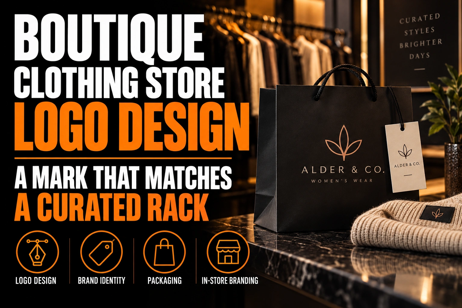
Boutique Clothing Store Logo Design: A Mark That Matches a Curated Rack
A boutique clothing logo looks upscale when it shows the same restraint as the rack. That means one confident typeface, careful spacing, 1 or 2 colours and no decoration the clothes would never wear. If the mark looks cheaper than the merchandise, shoppers quietly price the whole store down.
Key takeaways
- Use one confident typeface, careful spacing and 1 or 2 colours so the logo shows the same restraint as the rack.
- Avoid literal symbols such as hangers, needles, dress forms or measuring tapes, since your window already says clothes.
- Prepare a compact version for hang tags, tissue seals, gift cards and thank-you cards, where shoppers handle the mark.
This guide shows you how to set that taste level on purpose. You will then test it on the tag, the window, the tissue seal and the Instagram grid.
Why does a boutique clothing logo set the price shoppers expect?
A boutique logo sets the price shoppers expect because they see it before they touch a single garment. The sign, the window decal and the Instagram profile frame a promise. The rack then confirms that promise or contradicts it.
A curated boutique sells judgment. Someone chose these 40 pieces instead of 400. A logo built from a default font and a clip-art hanger tells shoppers that nobody chose anything at all.
The mismatch can also run the other way. A mark that imitates a luxury fashion house, hung above a rack of relaxed weekend basics, feels like a bait and switch. The goal is a match with your clothes, not the most expensive look available.
Which logo details make a clothing boutique look generic?
The details that make a clothing boutique look generic are the literal ones. Think of a hanger, a sewing needle, a dress form, a measuring tape or a looping script. Each one says “clothes”, which your window display already says far better.
These symbols also appear on hundreds of other shop signs. A shopper scrolling through local stores on a map sees the same hanger again and again. Nothing about it connects to your edit, your neighbourhood or your customer.
Precision is the other gap. Upscale marks have hand-adjusted letter spacing, even stroke weights and clean curves. Generic marks keep the default spacing of a free font, so some letter pairs touch while others float apart. Our article on how typography builds brand authority in a logo explains why those small adjustments read as care.
Serif, sans serif or script: which typeface fits your boutique’s rack?
Pick the typeface that sounds like your clothes. High-contrast serifs suit tailored pieces, occasion wear and evening dresses. Clean geometric sans serifs suit minimalist edits, Scandinavian-style basics and streetwear-adjacent racks. Script suits very few boutiques, and only when it is drawn custom.
Start from the 3 pieces you would put in the window to explain your store. Describe them in 3 words, such as “soft, relaxed, natural” or “sharp, black, structured”. Then reject every typeface that contradicts those words.
Spacing changes the tone as much as the letterforms do. Wide spacing between capital letters reads calm and elegant on a sign. On a hang tag 3 cm wide, the same spacing forces the name so small that it blurs. Plan 2 spacing settings from the start: an open version for large surfaces and a tighter one for small ones.
Script fonts carry a specific risk. Thin connecting strokes vanish on a sticker, fill in on embroidery and turn into a squiggle on a phone screen. If script truly fits your store, have it drawn with heavier strokes and keep a plain version beside it.
How many colours should a boutique logo use next to the clothes?
One colour is often enough for a boutique logo, and 2 is the practical ceiling. The clothes change colour every season, and the logo should never fight any of them. Black, off-white, a deep neutral or one signature colour leaves the rack room to speak.
Run a simple test. Photograph your draft logo printed beside your current rack, then beside a photo of next season’s colours. If the logo clashes with either one, it will clash in every shopping bag and every flat-lay photo.
Gold and silver deserve caution. They look rich as a print finish, such as foil on a business card or a greeting card. As the only version of a logo, they fail on a receipt, a screen or a 1-colour stamp. Our overview of premium business card finishes shows how foil and embossing dress up a flat mark without replacing it.
Where does a boutique logo actually meet the customer in the store?
A boutique logo meets the customer on small, handled surfaces far more often than on the sign. Think of the hang tag, the tissue seal sticker, the thank-you card in the bag, the gift card and the fitting room mirror. Each one needs a compact version of the mark.
Walk through a sale. The shopper reads a tag, tries the piece on in front of a mirror and watches it get folded into tissue. A sticker closes the tissue, a card goes in the bag, and the receipt prints. The large logo on the sign was seen once, on the way in.
Those small pieces are where taste is proven. A roll sticker with a crisp monogram feels considered. A blurry sticker made from a screenshot undoes the window display in 1 second.
Conception-Logo.com designs and has printed roll stickers for tissue seals, postcards for thank-you notes, greeting cards, window decals and counter posters. All of them come from one master file. Our guide to branded packaging and the unboxing moment covers how those pieces add up when you ship online orders too.
How does a boutique logo hold up on Instagram and in product photos?
A boutique logo on Instagram shrinks to a small circle and, sometimes, a corner mark on photos. Instagram’s Help Centre explains that photos are uploaded at a resolution of up to 1080 by 1080 pixels. A corner mark at 5% of that width is about 54 pixels wide.
At that size only a monogram or a very short wordmark survives. A long name with a tagline turns into a grey bar. Build a square icon version for the profile circle, and make sure it still reads when the app crops it round.
Keep the logo off the clothes in your photos. A large mark stamped over a dress looks like a stock watermark and competes with the product. A small, consistent corner mark, or none at all with a strong grid, feels more like a curated store. Our guide to horizontal, vertical and icon logo versions shows how to build the small version from the main one.
A logo that lives up to the clothes on your rack
We design boutique clothing logos with a full mark for the sign, a compact version for tags and tissue stickers, and a square icon for Instagram.
Should a boutique logo follow current fashion trends?
A boutique logo should borrow the mood of your clothes, not the trend of the moment. The racks change every season, while the logo has to carry the store for many seasons. A mark tied to one micro-trend dates the store as soon as that trend leaves the floor.
Separate the permanent layer from the seasonal one. The logo, its colours and its typeface stay fixed. Seasonal campaigns can use a new photo style, an accent colour or a playful sticker. The core mark simply appears unchanged beside them.
This also protects your budget. Reprinting tags, stickers and signage because the logo now looks dated costs far more than a seasonal poster. A well-chosen boutique logo design lets the campaigns change while the brand stays recognizable.
What to check before your boutique logo goes on the first hang tag
- The logo matches the taste level of your rack, neither cheaper nor more formal than the clothes.
- No hanger, needle, dress form or measuring tape stands in for an idea.
- The typeface fits 3 words that describe your window pieces.
- The palette stays at 1 or 2 colours and sits calmly beside this season and the next.
- A tighter-spaced compact version reads clearly at 3 cm wide on a tag or a sticker.
- A square icon survives the round Instagram crop and a 54-pixel corner mark.
- Foil or metallic effects are a finish, never the only version of the mark.
What makes a boutique clothing logo look upscale?
A boutique clothing logo looks upscale through restraint, precise type and a palette that never competes with the clothes. The questions below cover the decisions owners ask about most often.
Should a boutique clothing logo include a hanger or a dress icon?
Usually not. A hanger, a dress form or a sewing needle is among the most common clothing store symbols. That makes a boutique hard to tell apart. A custom wordmark, a monogram or a simple shape linked to the store’s name tends to look more distinctive and more upscale.
What font works best for a boutique clothing store logo?
The best font matches the style of the clothes the boutique sells. High-contrast serifs suit tailored and occasion wear, while clean sans serifs suit minimalist and casual edits. Script only works when it is drawn custom with strokes heavy enough to survive small tags and stickers.
How many colours should a boutique clothing logo have?
One or 2 colours is the practical range for a clothing boutique logo. The merchandise changes colour every season. A restrained logo in black, off-white, a deep neutral or one signature colour never clashes with the rack. Metallic effects belong to print finishes, not to the core logo.
What logo versions does a clothing boutique need?
A clothing boutique needs at least 3 versions. These are a full logo for the sign and website, a compact version for tags and stickers, and a square icon for social profiles. All 3 should come from one master vector file so every surface looks like the same store.
Conception-Logo.com has completed more than 5,000 projects, including identities for independent retailers who need a mark that keeps up with their racks. Start with a professional boutique clothing logo built for the tag, the tissue and the grid.