Logo Design for Mobile Mechanics: A Mark That Has to Work Without a Storefront
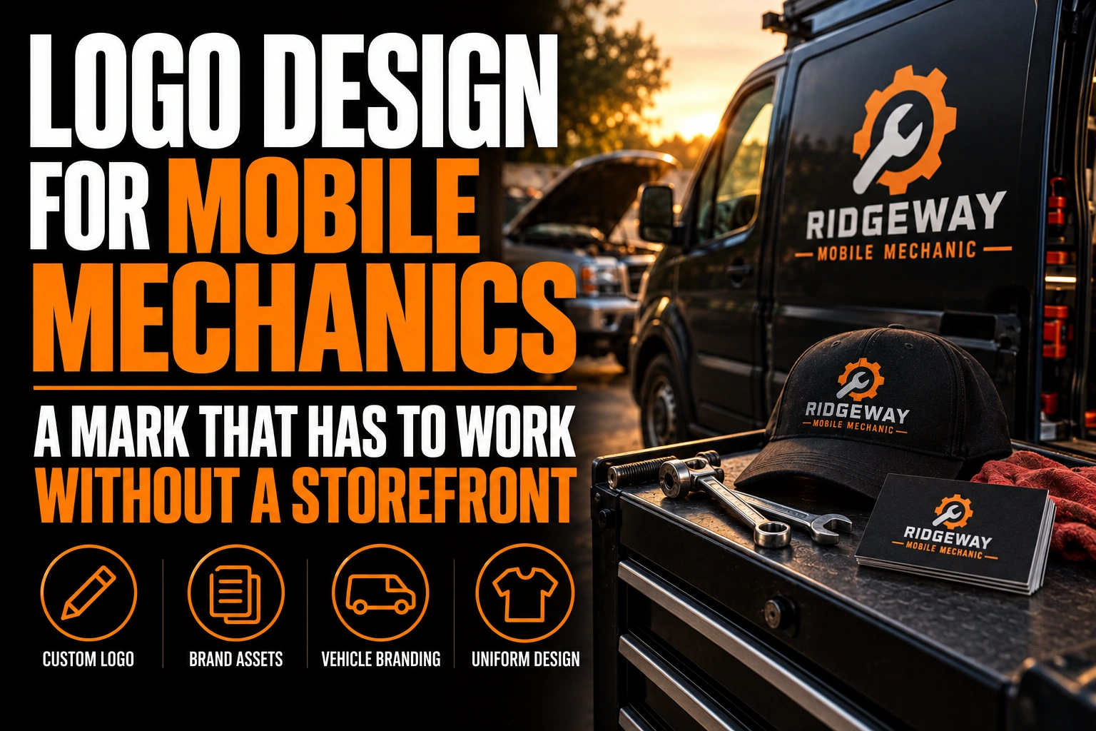
A mobile mechanic has no building, no storefront sign, and often no address a customer can look up before booking. The logo has to do that missing storefront’s job instead, on the van, on a Google listing, and on an invoice signed in someone’s driveway.
Key takeaways
- With no storefront, your van and your Google profile photo must do all the reassurance work a shop sign would share.
- Build a square icon from the start, since Google recommends 720 by 720 pixel images for Business Profile photos.
- Keep to two colours plus black and white so the mark holds on the van wrap, a circular profile photo and an invoice.
Why does a mobile mechanic’s logo carry more weight than a shop’s logo?
A mobile mechanic’s logo carries more weight because it is the only fixed, visual part of the business a customer sees before the work starts. A fixed-location shop has a sign, a window, and a waiting room to build trust. A mobile mechanic has a van pulling into a driveway and a profile photo on a phone screen, so those 2 surfaces have to do all the reassurance work a storefront would normally share.
That shifts the logo’s job from decoration to proof. A clean, consistent mark across the van, the invoice, and the online listing signals an established business rather than a side job running out of a truck bed.
What happens to your logo on Google when you have no storefront?
Most mobile mechanics operate as what Google calls a service-area business: a company that works at the customer’s location instead of its own. Google’s own guidance for Business Profiles states that a business should hide its address if it serves customers at their location rather than its own, and that the profile will then show a service area instead of a street address.
Once the address disappears, your logo and your profile photo pick up the slack. They become the first visual signal a customer compares against the quote and the reviews, in a listing that no longer shows a building to judge.
What size does a mobile mechanic logo need for a Google Business Profile photo?
Google’s own photo specifications recommend a 720 by 720 pixel image for Business Profile photos, with 250 by 250 pixels as the minimum size it will accept. A logo built as a square icon from the start meets that spec directly, instead of being cropped or stretched out of a horizontal version built for a van door.
Plan 2 versions early: a horizontal lockup for the van and paperwork, and a square icon version sized for Google, Facebook, and a text-message confirmation thumbnail. Forcing one file to cover both usually clips the wordmark or leaves awkward white space around a tiny icon.
How many colours and how much detail should a mobile mechanic logo carry?
Two colours, plus black and white, is a practical ceiling. A van wrap, a Google profile photo cropped into a circle, and a black and white printed invoice all have to carry the same mark, and a third or fourth colour tends to disappear or shift on at least 1 of those 3 surfaces.
Fine detail causes the same problem. A thin outline or a small interior shape that looks sharp on a laptop screen often blurs on a lower-resolution phone camera photo, which is how most customers will actually see your van parked outside their home.
Should a mobile mechanic logo use a wrench or a car icon?
A literal wrench silhouette or a generic car outline shows up on a large share of auto repair logos already on the road, which makes either one a fast way to blend into the next mechanic’s van instead of standing apart from it.
A short, confident wordmark, a single letterform treatment, or an abstract geometric shape usually works harder for a mobile business, since it has to be recognized at a glance in a driveway, not studied up close like a shop sign. If you already have a logo built for a different trade vehicle, the guide on logo design for contractors and tradespeople covers the same scaling problem for service vans and equipment trailers.
What size and shape work best on the van itself?
A mobile mechanic’s van is read from the street, from a neighbour’s driveway, and from inside a garage with the door half open, so the logo needs to hold up at several distances rather than just up close. A wide, high-contrast wordmark placed across a door panel reads at roughly 6 to 9 metres, which covers most of the distances a parked service van is actually seen from.
For the file formats and panel layout a vinyl installer will ask for when the design moves from screen to van, see our notes on vehicle wrap design, which cover the same seam and colour-count issues mobile service fleets run into.
A mark built for the van, the invoice and the Google listing
We design mobile mechanic logos with the versions the job actually needs: a van-ready wordmark and a square icon sized for Google and social profiles.
Where else does a mobile mechanic’s logo have to work besides the van?
Beyond the van, a mobile mechanic’s logo has to hold up on at least 3 more surfaces: a printed or emailed invoice, a text-message booking confirmation, and a uniform or hat. Each one compresses or simplifies the mark differently.
A black and white invoice strips out colour entirely, so the logo needs to still read as a clean shape in 1 colour. A text-message thumbnail shrinks it to a few millimetres on a phone screen, and embroidery on a uniform flattens fine detail into a handful of thread colours. Choosing a designer who tests a mark across all of these surfaces, not just the van, is worth the extra step. Our guide on how to choose the right logo designer covers what to ask before committing to one.
What to lock down before a mobile mechanic logo goes on the van
Run through this list with your logo designer before any file goes to a vinyl installer.
- Order a square icon version sized to meet Google’s 720 by 720 pixel recommendation.
- Limit the palette to 2 colours plus black and white across every surface.
- Test the wordmark’s readability from 6 to 9 metres, not just up close on a screen.
- Confirm the mark still reads clearly in black and white for printed invoices.
- Avoid a generic wrench or car silhouette already common across the trade.
What changes on your online listing once there is no storefront to show?
Once a mobile mechanic hides a home address and switches to a service area, the logo and profile photo become the only fixed visual a customer sees before booking, since there is no building photo or window display left in the listing to look at.
Do mobile mechanics need a storefront address on Google?
No. Google’s own guidance for service-area businesses says you should hide your address if you serve customers at their location rather than yours, and your profile will show your service area instead. Your logo and profile photo carry more of the trust signal normally handled by a storefront address.
What size should a mobile mechanic’s logo be for a Google Business Profile photo?
Google recommends a 720 by 720 pixel image for Business Profile photos, with 250 by 250 pixels as the minimum accepted size. A mobile mechanic logo built as a simple, square icon from the start will meet that spec without being redrawn.
How many colours should a mobile mechanic logo use?
Two colours, plus black and white, is a practical limit. A van wrap, a profile photo circle, and a black and white invoice all have to carry the same mark, and extra colours tend to disappear or shift on at least one of those three surfaces.
Should a mobile mechanic logo include a wrench or a car icon?
It can, but a wrench silhouette is one of the most reused symbols in the auto repair trade, which makes it a weak way to stand out. A distinct wordmark, a simple geometric shape, or a single letterform treatment usually sets a mobile mechanic apart more reliably than a literal tool icon.
Conception-Logo.com designs logos and visual identity systems for Canadian service and trade businesses, from the van-ready wordmark down to the square icon a Google listing actually needs. Start with a professional mobile mechanic logo design built for a business that works without a storefront.