Your Logo on a Payment Terminal: The Screen That Crops You
There is a screen in your business that shows your brand to every single paying customer, at the exact moment they are deciding how they feel about the transaction. It sits on the counter, it is bright, it is small, and it belongs to your payment provider.
Key takeaways
- Prepare a wide file, a tall file and a colourless file, since terminal screens come in fixed shapes that disagree.
- Keep a black and white version ready for handheld readers that convert any image to black and white on their own.
- Build margin into each file before uploading, because the terminal crops whatever falls outside its fixed frame.
Most businesses leave it showing a stock image. The ones that try to put their logo on it usually discover something unpleasant: the picture they uploaded is stretched, cropped through the middle of the name, or has quietly turned grey.
None of that is bad luck. It is written into the hardware, and it is knowable before you upload anything.
Why doesn’t this article cover your receipt or invoice?
This piece is about the screen on the terminal, not the paper it prints or the documents you send afterward. A receipt is a different surface with its own rules and its own coverage on this site. Your invoice or statement, which can carry tax or account information, is different again.
This is also not the general case for why your logo needs several versions, which is already made elsewhere on this site. What follows is narrower: this particular screen does not scale, and that changes everything about how you prepare a file for it.
The screen belongs to the hardware, not to your designer
Here is the mechanism, and everything else follows from it.
A card terminal shows what the payment platform calls a splash screen, the default view the machine sits on while it waits for the next sale. On most modern platforms you can replace it with an image of your own, usually from an account dashboard, usually per location.
What you are uploading, though, is not artwork. It is a finished picture at a fixed size. Stripe’s own documentation for its Terminal fleet is unusually plain about this: each reader has its own display resolution, and a JPG or PNG has to be cropped to those exact dimensions before it goes up. The platform will not do that work for you. Animated files are the exception, and they are resized automatically.
So the file you hand over is not a logo. It is a decision someone already made about how your logo sits inside a rectangle you did not choose.
Why can’t one logo work on every terminal screen?
Because the published resolutions point in different directions, not variations on a theme. Several readers use a tall screen of 720 by 1280 pixels. One uses 320 by 480, also tall. Another is 320 by 240, which is wide rather than tall. One is 1280 by 700, wide and very flat.
Some of these are portrait. Some are landscape. The flattest is close to twice as wide as it is tall, while the tallest ones are close to twice as tall as they are wide. A single centred logo cannot serve both: the tall screens favour a stacked arrangement, while the wide, flat screen forces a stacked logo down to a size where the name stops reading across the counter.
The documentation adds one more constraint: a single splash screen cannot be applied across every reader type at once. You choose the model, then supply the image for it. If your business runs two kinds of terminal, and many do once they add a mobile unit, you are preparing two different files. This is the same reasoning behind having a horizontal, a vertical and an icon version of your logo, except here the shapes are not your choice and the sizes are not negotiable.
Why does one common terminal turn your logo black and white?
Because of what the hardware physically is. One of the readers in that lineup, a small handheld unit many businesses use as their portable option, accepts only one image format and converts whatever you send into black and white on its own, shifting the position slightly while it does so.
You do not get a say, and there is no setting to turn it off. A brand built on a colour relationship, say a warm orange word next to a mid grey one, arrives on that screen as two nearly identical greys with the distinction gone.
This is exactly why a black and white version of your logo is worth having before anyone asks for it. The point specific to this surface is narrower: on this one device, the conversion is not a fallback you choose. It happens to you, automatically, on the smallest and busiest screen you own.
Nothing here scales, and that is the whole problem
Every other screen your brand appears on is forgiving. A website reflows. An app icon is generated from a source file. A social profile picture is resized for you.
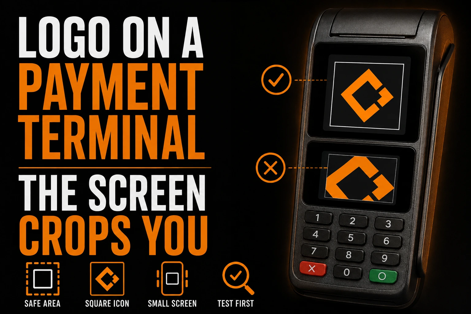
A terminal splash screen does none of that. It is a raster image at a fixed pixel count, and the platform crops to fit rather than scales to fit. Scaling shrinks the whole picture; cropping removes whatever falls outside the rectangle.
Three things follow. Margin has to be built into the file itself, in pixels, the way clear space works around a mark. Resolution cannot be improvised from a small file, since enlarging a web image to hit an exact pixel count produces a soft, amateur result on a bright screen viewed from 30 centimetres away. And this image sits on the counter for hours, stared at rather than glanced at, so small defects get studied.
What should you prepare before anyone opens a dashboard?
Three files, prepared once, before someone starts uploading images that never look right.
A version that reads with no colour at all. Not your usual logo with the saturation pulled down, but a drawing that works on shape and contrast alone. On at least one common reader this is not optional.
A version built wide, and a version built tall. The rectangles genuinely disagree with one another. A stacked arrangement for the portrait screens and a horizontal arrangement for the flat one solve the problem permanently.
Someone who knows which terminals you actually own. The person configuring the account rarely knows the model names, and the model determines the pixel dimensions. Reading the labels on the machines saves a week of trial and error.
A logo that survives a screen you do not control
We design your logo so it still reads when a machine crops it to a fixed rectangle and strips the colour out of it, and we hand you the wide, tall and colourless versions those rectangles will ask for.
What’s a two-minute check you can run before uploading your logo?
Open your logo, convert a copy to greyscale, and shrink it until the whole thing is about the width of your thumb. Then look at it at arm’s length, roughly the distance a customer stands from a counter terminal.
If the name still reads and the mark is still recognisable, you are in good shape. If two elements merge, or a thin stroke disappears, that is the element to deal with, and it is far better to have it redrawn properly than to let a machine make the decision for you at the worst possible moment.
What should you remember before you upload anything?
Your terminal shows a fixed-size image, not adaptable artwork. The 4 published shapes disagree with each other, 1 common handheld model forces black and white, and cropping removes whatever falls outside the frame. Prepare a wide file, a tall file, and a colourless file first.
- What you upload is a finished image at a fixed pixel size, not artwork the system will adapt.
- Stripe’s Terminal documentation states that each reader has its own display resolution and that JPG and PNG images must be cropped to fit it, while animated files scale on their own.
- The published resolutions include both portrait and landscape shapes, so a single centred logo cannot serve all of them.
- A single splash screen cannot be applied to every reader type at once. Two kinds of terminal means two files.
- One common handheld model accepts a single image format, converts it to black and white on its own, and shifts it slightly.
- Cropping is not scaling. Margin, resolution and legibility all have to be built into the file before it is uploaded.
How do you get your logo to display correctly on a payment terminal screen?
Match each reader’s exact pixel dimensions, keep a black-and-white version ready for the model that forces it, and build margin into the file before you upload it. The 5 questions below cover the details businesses run into most.
Can I use the same image on every terminal in my business?
Only if every terminal is the same model. The published specifications assign a different resolution to different readers, and the platform does not let you push one image to all reader types at once. If you have a countertop unit and a portable one, plan on two files from the start.
Do I need a vector file for this?
You will not upload one, but you badly want to own one. The upload is a flat image at an exact pixel size, produced from something. Hitting several fixed sizes crisply is only comfortable when you export from a scalable source rather than enlarge a small picture found in an email.
What happens if my image is the wrong size?
Nothing good, and it varies by platform. In the best case the upload is refused and you find out immediately. In the worst case it is accepted and the machine crops it, which usually means the top or bottom of your logo is simply gone. Checking the correct dimensions first costs a minute.
Should I put our address, hours or a promotion on the splash screen?
Almost never. The person looking at it is standing at a counter with a card in hand, waiting for a machine, often with someone behind them. That is not a reading posture. The screen does one job well, confirming whose business they are paying, and every extra line makes that part smaller.
Our logo is built around two colours. Is it a problem here?
On most readers, no. On the handheld model that converts to black and white by itself, it can be serious, because two colours that differ in hue but not in lightness collapse into the same grey. The fix is a version drawn to work on contrast, ideally prepared when the identity is created rather than improvised on a Tuesday afternoon.