Your Logo on Printed Packing Tape: A Pattern Someone Else Cuts
Every branded surface your business owns has a size you decided. The business card is a fixed rectangle. The sign is cut to a drawing. The box has six faces and you know all of them.
Key takeaways
- Choose a short repeat so the tape on your smallest box shows at least two full impressions of your logo.
- Use a horizontal, single ink lockup sized for the printable band, keeping clear of the edges that must seal.
- Plan for 1 or 2 solid inks on printed tape, with no gradients, hairline strokes or tight multicolour registration.
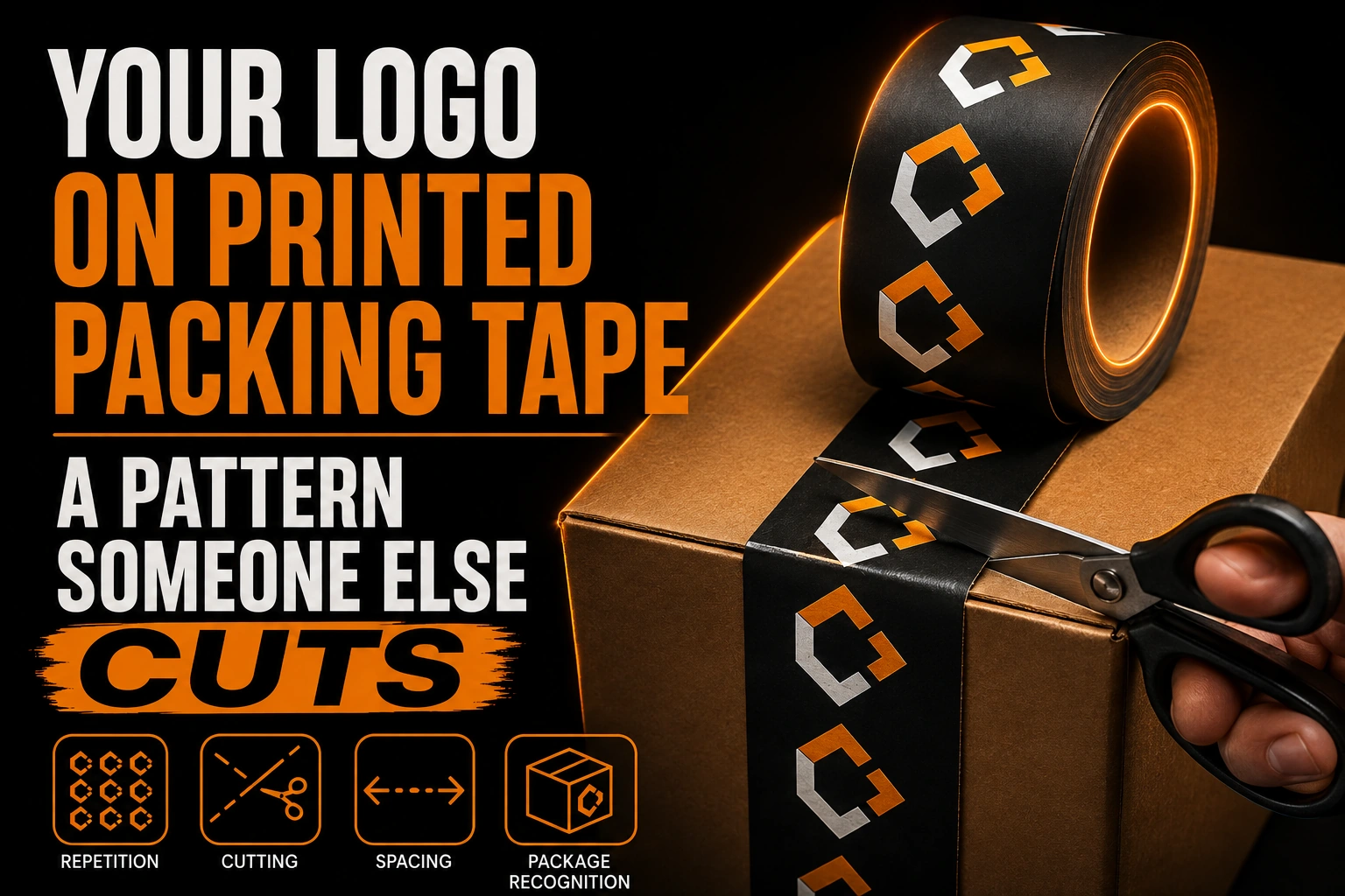
Printed packing tape has none of that. It is a continuous strip that repeats your artwork over and over down a roll, and the length that ends up on the box is decided by whoever is packing, at the speed of packing, with a blade. You are not designing an object. You are designing a pattern that will be cut in a place you cannot predict. This piece is not about box and package design as a whole, which is covered in the article on branded packaging and the unboxing moment, or general logo sizing rules, already handled in the article on clear space and minimum size; it covers one thing, what happens when your logo repeats down a printed tape roll and gets cut at random.
Why does the packer decide where my logo gets cut?
Tape printers don’t print one logo. They print a cylinder that turns, laying down the same impression again and again for the full length of the roll, commonly 100 or 300 feet, and the packer cuts that strip wherever the box seam happens to fall.
The distance from the start of one impression to the start of the next is the repeat. Suppliers do not let you choose it freely: they offer a short list of fixed repeats, typically 2, 3, 4, 6 or 12 inches, because each one corresponds to a physical printing cylinder they already own. Intertape Polymer Group, a North American tape manufacturer, states a maximum repeat of 14.5 inches and describes 5 to 7 inches as the usual range.
That number decides everything else. A short box seal of about 10 inches carries 5 impressions at a 2-inch repeat, and less than one full impression at a 12-inch repeat. In the second case, most of your customers will receive a strip of tape showing part of a word.
Is a longer repeat always better for my logo?
No. A longer repeat looks stronger on a single sheet of artwork, but on tape it raises the odds that a random 10-inch cut window shows only half a word instead of a complete mark.
The instinct is to pick the biggest repeat available, because a bigger logo feels stronger. On tape, that instinct is usually wrong.
Think about the actual sight line. A parcel arrives, it sits on a counter or a doorstep, and someone looks at the top of the box for a second or two before opening it. What they see is one strip crossing the seam, maybe 8 to 12 inches of it, with a cut at each end.
With a short repeat, that strip contains several complete impressions. Two of them may be cut, but the ones in the middle are whole, and the eye reads the whole one. With a long repeat, the strip contains one impression, and there is a real chance that the only thing visible is the second half of your name.
The design question is therefore not how your logo looks. It is what an arbitrary 10-inch window of your roll looks like, cut anywhere. That is a question you can test on paper before you order anything, and almost nobody does.
How tall can my logo be on packing tape?
Roughly 1.6 inches on 2-inch tape and 2.5 inches on 3-inch tape, because the printable band sits inside the edges that must stay clear for the tape to seal and track through the machine.
Tape widths are standard and modest. 2-inch and 3-inch tapes are the common formats, and one water-activated tape is sold at 2.75 inches wide.
The printable height is smaller than the tape itself, because the edges must stay clear for the tape to seal and to track through the machine. Intertape Polymer Group gives a maximum artwork height of 1.6 inches on 2-inch tape, and 2.5 inches on 3-inch tape.
That is the real constraint, and it is a vertical one. Your logo has to survive being squeezed into a band roughly 1.5 inches tall, at any length you like. A tall stacked logo with a symbol above the name loses almost all of its height. A horizontal lockup, symbol beside the name, uses the strip the way the strip is shaped. If you have never had that horizontal version made, this is the support that will demand it, and the article on keeping horizontal, vertical and icon versions explains why that set exists.
What does the printing process take away from my logo?
Solid-ink tape printing removes gradients, hairline strokes and tight multi-color registration. Suppliers commonly allow up to 3 colors and openly recommend 1 or 2, since each color is a separate plate.
Three consequences follow, and they are all shape problems rather than colour problems.
Gradients, soft shadows and any fade have to go. There is no continuous tone here. Every element ends up as a solid shape in a flat ink, so anything that depends on a blend has to be redrawn as a shape or dropped. That redrawing is a real task rather than a filter, and it is the everyday work of a vectorization service: deciding which shape replaces a blend without the mark losing its identity. A logo already built to work in a single ink handles this without a fight, which is one more argument for the discipline described in the piece on working in one colour.
Fine lines have to thicken. A hairline rule that survives on a laser-printed sheet will break up on tape, because the ink sits on a plastic film and spreads slightly as the roll is pressed.
Multi-color registration has a tolerance you should design around. Intertape Polymer Group states that plates can shift by up to 1 millimetre per colour during production. That is invisible in a two-colour design where the shapes do not touch, and it is a disaster in a design where a thin outline of one colour is supposed to sit exactly around a shape in another. If your logo has a keyline, either put it in the same ink as the shape or accept that it will sometimes be off.
Why doesn’t the tape lie flat on the box?
It crosses the seam, wraps around both box edges at a 90-degree fold, and gets pulled under tension as it’s applied, so anything centred or perfectly aligned will not stay that way.
It crosses the seam. The centre line of the tape sits on the gap between the two flaps, which is exactly where the tape sinks slightly and where the box will later be cut open. Anything critical placed dead centre, a symbol or the crossbar of a letter, sits on the weakest line of the whole package.
It goes over the edges. Whoever seals the box will run the tape down both sides of it, which folds part of your artwork around a 90-degree corner where it will not be read at all.
It gets pulled. Tape is applied under tension by hand or by a dispenser, and it wanders. A design that depends on being perfectly parallel to the box edge will not be.
None of that is fixable by the printer. It is fixable in the design, by keeping the centre band quiet, by repeating the important element often enough that at least one occurrence lands on a flat area, and by not designing anything that needs to align with the box.
The file your tape printer is actually asking for
We rebuild your logo as clean vector artwork from whatever you have, then hand you the outlined, flat ink, horizontal version that fits a printing band 1.5 inches tall.
What file should I send the tape printer?
Send a vector file, Illustrator or EPS, with text converted to outlines and ink colours named in the file, built as a horizontal, single-ink logo sized for a band about 1.5 inches tall.
Suppliers ask for an Illustrator or EPS file as the first choice and accept high-resolution raster at 300 dots per inch as a fallback, but the fallback costs you: raster art at that size has to be built at the final dimensions, and nobody has a clean raster logo sitting at 2 inches by 12 inches.
Send it with the text converted to outlines, so the tape supplier cannot substitute a font you do not have.
Send it in the ink colours you want named, not as a photograph of your website. The plate is made from a separated file, and a file that arrives as a flattened colour image has to be traced by someone who has never seen your brand.
And send the version built for a band, not the version built for a letterhead. The single most common cause of disappointing tape is that the artwork supplied was the everyday logo, and everything after that was an attempt to fit it into a shape it was never drawn for. If your only good file is a picture, a vectorization pass is what turns it into the outlined, single-ink, horizontal artwork the tape plate needs.
What should I remember before I order printed tape?
Design the strip, not the logo: pick a short repeat, keep the centre band quiet, use a horizontal lockup within 1.5 inches, plan for 1 or 2 solid inks, and test a cut mock-up before you order.
- Your tape is cut by the packer, not by you, so design the strip and not the logo.
- Ask the supplier for the list of available repeat lengths before you design anything.
- A shorter repeat means more complete impressions inside the length a customer actually sees.
- The printable band is roughly 1.5 inches tall on 2-inch tape, so use a horizontal lockup.
- Plan for 1 or 2 solid inks, no gradients, and thicker lines than you would use in print.
- Keep the centre of the strip quiet, because it sits on the seam and gets cut open.
- Supply outlined vector artwork with named ink colours, not a screen grab.
- Print a plain paper mock-up at final size, cut it in 3 random places, and look at what you get.
How do I make sure my logo survives being cut on packing tape?
How long should the repeat be?
Short enough that the length of tape used on your smallest common box contains at least two full impressions. Measure a typical seal, divide by the repeat you are considering, and check the result before you order.
Can I print a photograph or a gradient on packing tape?
No, and you should not try to work around it. The process lays down a small number of solid inks, so a gradient has to be redrawn as flat shapes. Anything that survives being reduced to shapes will look better on tape than a compromise version of the original.
Should the logo sit in the middle of the tape?
Not the critical part of it. The centre of the strip lands on the seam of the box and is the line that gets cut when the parcel is opened. Keep the middle simple and let the important elements sit off centre.
Is two colour tape worth the extra cost?
Only if the two colours do not need to align with each other. Registration can move by around 1 millimetre, so two independent shapes are safe and a thin outline wrapped around another colour is not.
My logo is tall. Do I need a different version for tape?
Yes. A stacked logo squeezed into a band about 1.5 inches tall becomes unreadable. The usual answer is a horizontal version with the symbol beside the name, which is worth having anyway for signage, letterheads and website headers.