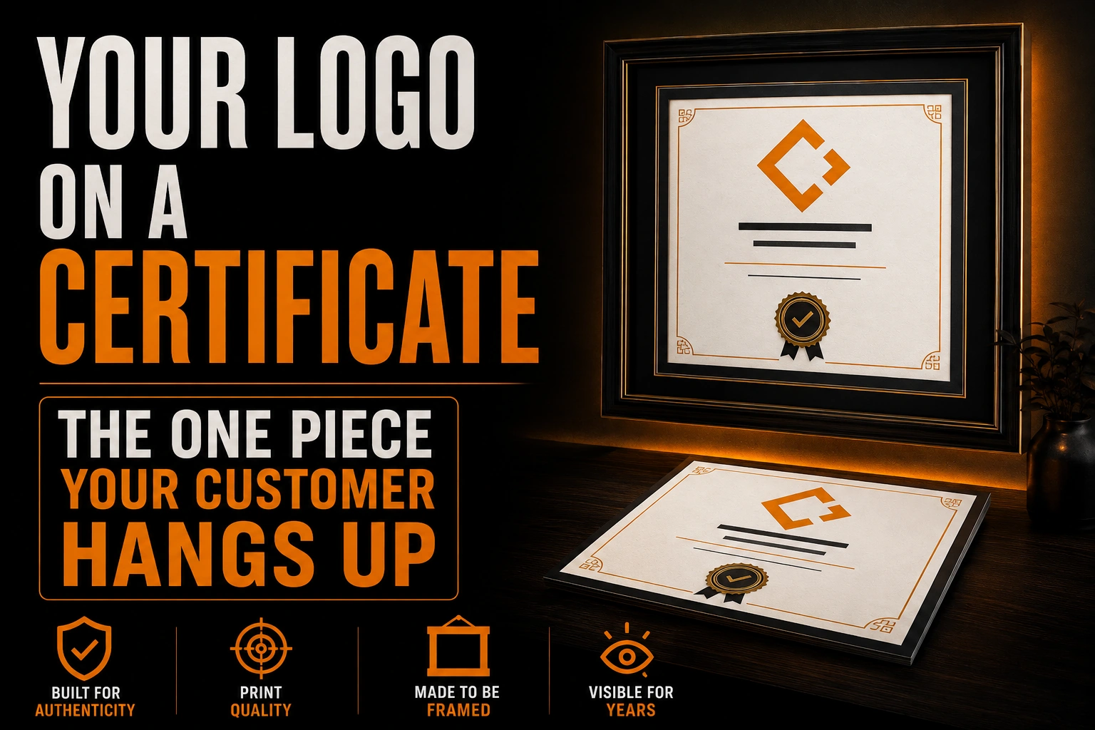
Your Logo on a Certificate: The One Piece Your Customer Hangs Up
Most of the printed things your business produces are handled once and then thrown away, filed, or forgotten. A certificate is the exception. A completion certificate for a training course, a warranty certificate for an installation, a recognition certificate for a supplier or a volunteer: someone takes it home or back to their office, and a fair number of them end up on a wall, in a frame, in a room where other people see them.
Key takeaways
- Size the logo for someone reading the framed certificate from 2 or 3 metres away, not for someone holding it.
- Keep borders well inside the page, since office printers have an edge zone where they cannot lay down ink.
- Let the recipient’s name and signature outrank your logo so the certificate reads as recognition, not an ad.
That single fact changes almost everything about how your logo has to behave on the page. It is not read the way a business card is read. It is not printed the way a brochure is printed. And it stays visible far longer than any campaign you will ever run.
This article is about the certificate as a printed object that gets displayed, not about gift certificates, which are transactional and disposable, and not about the header of an invoice or a quotation, which is produced in volume and read once. Framing and mounting are left out too, since those choices belong to the recipient.
How far away will people actually read this logo?
A framed certificate is read from 2 or 3 metres away, not from your hand. Visitors glance at it on a wall after the first 10 seconds; nobody studies it up close again. Every choice, especially logo size, has to work at that distance.
Almost every other piece of your identity is designed at arm’s length: you approve it on a screen at reading distance, or you hold a proof. A certificate breaks that habit.
At wall distance, only three things register. The shape of the page, the name of the person or company it honours, and whatever mark sits at the top or the bottom. Everything else becomes texture.
This has a practical consequence that most businesses get wrong. They place a small logo in a corner, sized the way it would be sized on a letterhead, and at wall distance it disappears into the border. The logo on a certificate needs to be treated as a display element, closer in scale to how you would treat it on a sign than on stationery.
That also means the version you use matters. A wide horizontal lockup with a tagline set in small type will lose the tagline entirely. If you have already built a proper set of versions, this is the moment to use the compact one. Our guide on keeping a horizontal, vertical and icon version of the same identity explains why that set exists, and a certificate is one of the clearest cases for it.
Clear space matters more here than anywhere else, because the certificate border, the seal and the signature line all crowd toward the same edges. Our article on clear space and minimum size rules covers the numbers to protect.
Who prints this, and what will their printer do to it?
The second thing that makes a certificate unusual is that you almost never print it. You send a file, and the recipient or an administrator prints it on whatever office machine is nearby. That machine imposes rules you do not control.
Every printer has a zone at the edge of the sheet where it physically cannot put ink or toner. The technical guides on borderless printing put that unprintable zone at roughly 0.1 to 0.3 inches on each side, and they give the reason: the rollers and grippers that pull the sheet through need unprinted edges to keep traction and stay aligned.
Laser printers are the worst case, and that is what most offices have. A laser fuser needs a clean lead edge to feed the sheet without jamming, so true edge to edge output is difficult on that technology and is often only achieved on two sides. Inkjet machines can do borderless, but they get there by slightly overscaling the image so that ink sprays past the paper edge into an absorbent pad.
Both of those behaviours destroy a certificate design that relies on a full bleed background or a decorative frame running to the edge. On a laser printer, the frame is simply clipped. On an inkjet in borderless mode, the whole page is enlarged a little, which means your logo, your border and your text all shift and grow, and the composition you approved is not the composition that comes out.
There is a third and even more common failure. The person printing leaves the scaling option at fit to printable area, which shrinks the whole page inward and leaves an uneven white band. Nothing is broken, but the piece looks slightly wrong in a way nobody can name.
The design answer is not to fight this. It is to build the certificate so that it never touches the edge: a generous internal margin, a border drawn well inside the sheet, and a logo that sits away from the trim. A certificate built this way prints correctly on every office machine, without instructions.
Does your logo outrank the recipient’s name and signature?
On a business card, your logo is the star. On a certificate, it is not, and designing as though it were is the fastest way to make the piece look like an advertisement instead of a recognition.
A certificate carries at least 3 marks that compete for authority: the name of the recipient, a handwritten signature, and often a seal, medallion or emblem. The recipient’s name is the reason the piece exists. The signature is what makes it feel granted rather than generated. The seal, when there is one, is the visual shorthand for legitimacy.
Your logo has to sit in that hierarchy without dominating it. In practice that means one strong placement rather than 3 weak ones. A single mark at the top, at display scale, is stronger than a logo at the top plus a repeat in the seal plus a third instance in the footer. The repeated version competes with the signature and makes the document feel like marketing material.
It also means being careful with colour. A brand colour that works on a website hero can look loud on a document trying to look considered. This is the one context where the restrained version of your identity is the correct one.
How long will this certificate stay on the wall?
Here is the part that businesses discover years later. A certificate on a wall is not updated. It carries whatever identity you had on the day it was issued, and it keeps carrying it after you rebrand, after you change your colours, after you drop the tagline.
That is not a problem to solve. It is a reason to be conservative. A certificate is the wrong place for a seasonal variation, an anniversary lockup or an experimental treatment. Use the version of your mark you expect to still be using in 5 years, which in most cases is the plainest one you own. If a redesign is on your horizon, our guide on when and how to rebrand is worth reading before you issue a large batch.
The physical side ages too. Golden Artist Colors, writing about protecting computer prints, states plainly that the water soluble dyes used by ordinary printers are fugitive, meaning they fade readily when exposed to sunlight or to any light source containing ultraviolet wavelengths. Their testing also found that ordinary glass and acrylic sheets provide no ultraviolet protection at all. A certificate hung near a window will lose colour, and it will lose the weaker inks first.
You cannot control where the recipient hangs it. You can control how much of the design depends on colour. A certificate whose logo still reads when the colour has drifted is a certificate that still works in 5 years. That is the same test as the one described in our piece on logos going blurry on signage: if the mark survives its worst reproduction, it survives everything else.
A wall does not forgive a low resolution logo
We rebuild your logo as a clean vector file and deliver the versions this piece needs, including the compact lockup and the single colour version, so the certificate prints sharp on any office machine.
What files should you hand over for printing?
If you issue certificates regularly, 3 files remove almost all of the problems above.
A vector version of your logo, so that whoever lays out the certificate can scale it to display size without softening the edges. A single colour version, for the day someone prints on a monochrome office machine, which happens more often than anyone plans for. And a locked print ready template, exported so the layout cannot drift when a different person fills in a name.
If you do not have the first two, that is exactly what our vectorization service produces: a clean vector rebuild of your mark plus the derived versions each supplier will ask for, prepared once rather than improvised every time. Where a full set is needed, our article on the complete brand identity kit lists what a proper handover contains.
What should you check before you send the file?
Before you send a certificate file to print, check these 8 points. Each one comes from how certificates are actually viewed, printed and displayed, not from stationery rules.
- A certificate is seen from across a room, so the logo needs display scale, not stationery scale.
- Use the compact version of your lockup; small taglines vanish at wall distance.
- Somebody else prints it, on a machine with an unprintable edge zone of roughly 0.1 to 0.3 inches.
- Laser printers cannot reliably print to the edge, so never rely on a full bleed border.
- Fit to printable area scaling silently shrinks the page and leaves an uneven white band.
- The recipient’s name, the signature and the seal outrank your logo; one strong placement beats 3 weak ones.
- Ordinary printer dyes fade in daylight, and plain glass gives no ultraviolet protection.
- Use the plainest version of your mark, because the certificate will outlast your next redesign.
How big should the logo be on a certificate?
Bigger than you think. Size it for a viewer standing 2 or 3 metres away rather than for someone holding the sheet. A useful check is to print the draft, pin it on a wall and step back. If you cannot identify the mark from across the room, it is too small, and the tagline underneath it is probably already unreadable.
Can I use a full bleed background or a border that runs to the edge?
Not if the certificate will be printed on an office machine, which is the usual case. Every printer has an edge zone where it cannot lay down ink or toner, and laser machines in particular need a clean lead edge to feed the sheet. A border drawn well inside the page prints correctly everywhere and needs no instructions.
Should the logo appear more than once?
Usually not. A certificate already carries a recipient name, a signature and often a seal, and each of those has more authority than your mark. One placement at display scale reads as a mark of origin. Three placements read as advertising, and they compete with the signature that makes the document feel granted.
Will the certificate fade on a wall?
Colour will drift if it hangs in daylight. The dyes used by ordinary printers fade when exposed to sunlight or to light containing ultraviolet wavelengths, and plain glass or acrylic offers no ultraviolet protection. You cannot control where it is hung, so the safeguard is a design that still reads once the colour has weakened.
What file should I give to whoever produces the certificates?
A vector file of the logo, a single colour version of the same mark, and a print ready template that cannot drift when someone types a new name into it. The vector file is the one that matters most, because it is what allows the mark to be scaled up to display size without going soft.