Your Logo on a Step and Repeat Wall: Nobody Ever Sees the Wall
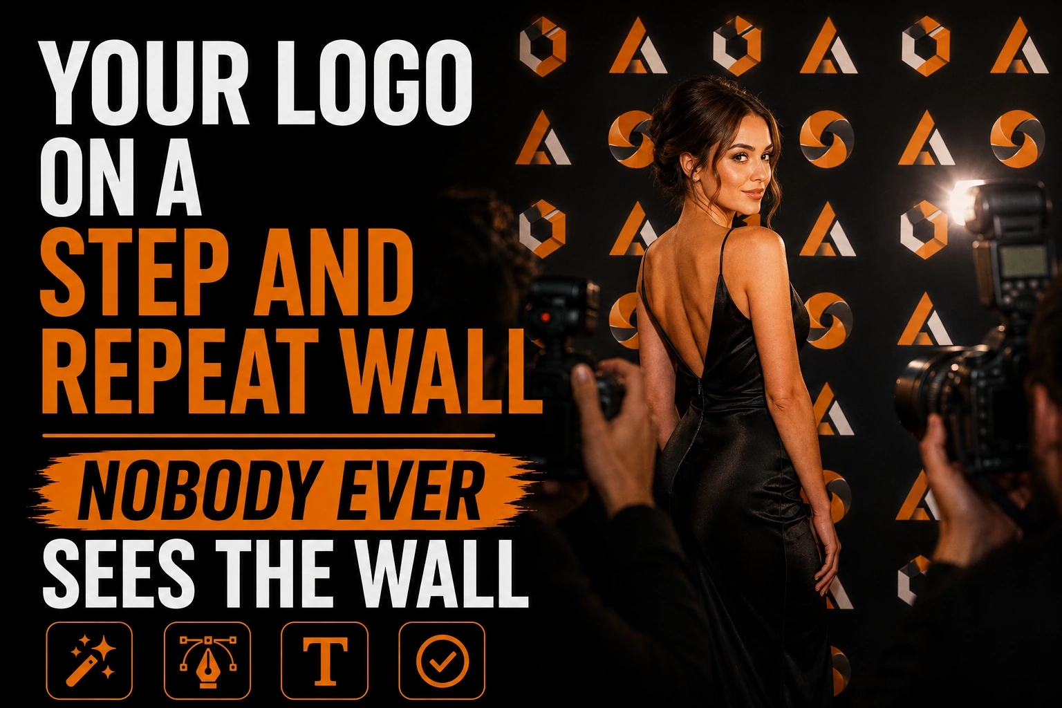
A step and repeat wall is designed for a photograph, not for a room. Nobody at your event will step back and look at the whole thing. What survives is a rectangle about as wide as two people’s shoulders, cropped by a camera and then cropped again by whoever posts it, and your logo either lands inside that rectangle complete or it does not appear at all.
Key takeaways
- Space logos about one logo width apart in both directions, with logo widths that suit the size of the wall.
- Offset the rows instead of aligning them, so guests standing side by side do not hide every logo in a column.
- Choose a matte finish, since a glossy surface bounces the camera flash into the frame where faces and logos sit.
Everything below follows from that one fact: how wide the logos should be, how far apart they sit, why the rows are offset, why the finish decides more than the colour does, and why the artwork has to be real vector.
What this article covers, and what it leaves out
This is about one object: the branded wall guests are photographed against at a launch, a fundraiser, a conference reception or a store opening.
It is not a guide to exhibition stands, so nothing here covers reading distance, message hierarchy or booth structure. If your event is a trade show, the freestanding pieces that flank a stand are handled in our guide to roll-up banner design for trade shows. It also says nothing about what a sponsorship level buys or how placement gets negotiated.
Why a step and repeat is designed backwards
Because the wall is never the deliverable. The deliverable is a few hundred photographs, each framed on people rather than on the graphics behind them.
Every other sign a business commissions is meant to be looked at directly. A step and repeat is the only graphic you will ever pay for that succeeds by sitting in the background of something else, so the design unit is not the wall, it is the crop. Pull any photo off an event feed and the visible portion of an eight foot wall is roughly three feet across. Everything outside that never existed as far as the audience is concerned, which is why approving a flat proof on screen misleads: judging the whole layout at once is the surest way to end up with a handsome wall and disappointing photos.
How large should the logos be, and how far apart?
Sign suppliers converge on a narrow range. Published guidance from one sign company puts logo width between six and twelve inches, narrowing to eight to ten inches on an eight by eight foot wall and ten to twelve inches on a ten by ten or larger, with roughly one logo width of empty space between repetitions in both directions. An eight inch logo therefore sits about eight inches from the next one, vertically and horizontally.
Why that rule works is visible only in crop terms. Logo plus gap gives a pitch of about sixteen inches. A crop three feet wide contains a little more than two full pitches, so wherever the guest happens to stand, at least two complete logos land beside them.
Now scale the logo up to twenty inches because it looks impressive on the flat proof. The pitch grows to forty inches, wider than the crop itself, and photos come back with the tail of one letter behind somebody’s ear. Bigger is worse, which is the least intuitive thing about this format.
The gap is not wasted space either. It keeps each repetition readable as a mark instead of a texture, the same principle our guide to logo clear space and minimum size rules applies elsewhere.
Why the rows are offset instead of aligned
Because bodies block columns. Two guests standing side by side cover two vertical strips of the wall, and in a strictly aligned grid a vertical strip is a repeating identical line, so covering it removes every logo in it.
The pattern suppliers describe is checkers style: alternating rows rather than a square grid. Shift every second row by half a pitch and no vertical line repeats its neighbour. A body covering one column still leaves complete logos immediately above and below it in the rows on either side.
There is a second reason that only shows up in photographs. Long straight verticals make lens distortion, fabric sag and a crooked frame obvious, while a staggered field has no continuous line to bend.
The photograph gets cropped twice
First by the photographer, who frames on the people. Then by the platform, where a horizontal shot is squeezed into a vertical or square feed.
Two pieces of published guidance follow. One printer advises making sure the upper third of the wall carries the repeating pattern, because that band is the most likely to survive a social crop. The same guidance says to keep a safe margin at the edges so logos are not sliced in half, and to spread the pattern across the full width rather than concentrating it in the centre.
The instruction is uncomfortable but simple: assume the outer edges and the lower band will never be published, and make sure the field of logos is already complete without them. If your identity only exists as a long horizontal lockup, this is where a compact version earns its keep, and our article on the three versions of a logo covers how that set is built.
What size wall, and how much floor does it need?
Suppliers publish four common footprints and they do not agree on capacity, which is worth knowing before you order.
One printer lists eight by five, eight by eight, eight by ten and eight by twelve feet, all kept at eight feet tall so full body shots compose properly, and rates them at two to three, four to five, seven to eight and up to ten subjects. Another lists comparable sizes in inches, sixty by ninety six, ninety six by ninety six and one hundred and twenty by ninety six, and rates them more conservatively at one to two, two to four and four to six people. The safe reading is that the lower number is the comfortable group and the higher one is the squeeze.
The figure most often forgotten is floor space: the same printer notes that an eight by eight backdrop wants roughly twelve by ten feet of clear floor in front of it. A wall wedged into a corridor produces photographs taken too close and at an angle, and no amount of logo spacing repairs that.
Why the artwork has to be vector, not an image file
A step and repeat is the only piece of print where your logo appears forty or sixty times on one surface, and two consequences follow. Both are arithmetic rather than taste.
The first is repetition. A soft edge, a fringe of off colour pixels around a curve, an anchor point in the wrong place: on a business card you see it once and may not notice, here the same defect appears in every direction at once, which is precisely how an eye detects a pattern.
The second catches people out. A photograph of the wall is a crop, and a crop is an enlargement. The camera takes three feet of an eight foot wall and the phone displays it at full screen width, so your eight inch printed logo is viewed larger than it was printed, on a screen held a foot from someone’s face, by everyone who was not at the event.
That is why printers ask for vector artwork rather than a JPG or a PNG, and why pushing an image through an automatic trace is not the same thing, for the reasons set out in our comparison of professional vectorization and auto trace. If the only usable version of your mark is a picture pulled off your own website, fix that before you order the wall, and rebuilding it properly is what our vectorization service does.
One clean logo file, repeated sixty times without a flaw
A tiled wall shows every defect in your logo dozens of times over, and every photo of it is an enlargement. We rebuild your mark as genuine vector paths so the printer can set the pattern at any pitch and any panel width.
Matte or glossy? The finish decides whether the logos are visible at all
Matte, and it is not a stylistic preference. A glossy surface bounces a camera flash straight back into the lens, and the hotspot lands in the middle of the frame, where the faces and the logos are.
Printers who specialise in these walls describe the trade plainly. The standard stock is a matte vinyl around thirteen ounces, chosen because glossy vinyl reflects light while a matte surface photographs well. The upgrade is a polyester fabric with a soft glare free finish, wrinkle and crease resistant, with the honest caveat that blacks print softer on fabric while still photographing without glare. One supplier adds that lighting and an experienced photographer matter as much as the material.
Two consequences follow. On fabric, expect deep blacks to sit flatter than the proof suggests, and whatever the material, a wrinkle reads as a broken logo.
What to hand the printer
Ask the printer to build the pattern from your source artwork rather than a flattened image of the finished wall, so the pitch can be set to the panel size without resampling.
What they need is short: your logo as genuine vector paths, its one colour version in case the field prints on a dark background, and your colour references. If your files cannot answer that request, the wall is not the first problem to solve. Our page on keeping logo quality at every size explains why that one file governs everything downstream, and our vectorization service produces it.
Key Takeaways
- The wall is never viewed whole. The design unit is the crop around a guest, about three feet wide.
- Logo width six to twelve inches, with about one logo width of gap in both directions.
- Oversized logos fail: the pitch grows wider than the crop and photos return fragments.
- Offset the rows in a checkers pattern so a body blocking one column does not erase a whole line.
- Assume the edges and lower band will be cropped away; keep the pattern complete without them.
- Matte vinyl or glare free fabric, never gloss: a flash reflects off gloss into the lens.
- Real vector paths only, since the logo repeats dozens of times and every photo is an enlargement.
Frequently Asked Questions
How far apart should logos be on a step and repeat banner?
About one logo width apart, in both directions. Published sign industry guidance pairs a six to twelve inch logo with a gap equal to its own width, so an eight inch logo sits about eight inches from the next. That spacing keeps two complete logos inside a typical photo crop.
What size step and repeat banner do I need?
Common footprints are eight by five, eight by eight, eight by ten and eight by twelve feet, all kept eight feet tall so full body shots compose properly. Suppliers disagree on capacity: one rates an eight by eight at four to five people, another at two to four, so treat the lower figure as the comfortable group. An eight by eight also wants about twelve by ten feet of clear floor in front of it.
Should a step and repeat be matte or glossy?
Matte, always. A glossy surface reflects camera flash straight back into the lens and creates a hotspot in the centre of the frame, exactly where the faces and logos are. Printers use matte vinyl around thirteen ounces as standard, or a glare free polyester fabric as the upgrade.
Can I use a PNG of my logo for a step and repeat?
Not safely. The logo repeats dozens of times on one surface, so every soft edge or colour fringe appears in every direction at once, and each photograph is a crop of the wall, which makes it an enlargement. Vector paths let the printer set the pattern at any pitch and panel width without loss.
Where should the logos sit so they show up in social media posts?
Concentrate the repeating pattern through the upper third of the wall, spread it across the full width rather than clustering it in the centre, and keep a safe margin at the edges. A horizontal event photo is usually recropped to a vertical or square feed, which removes the sides first.