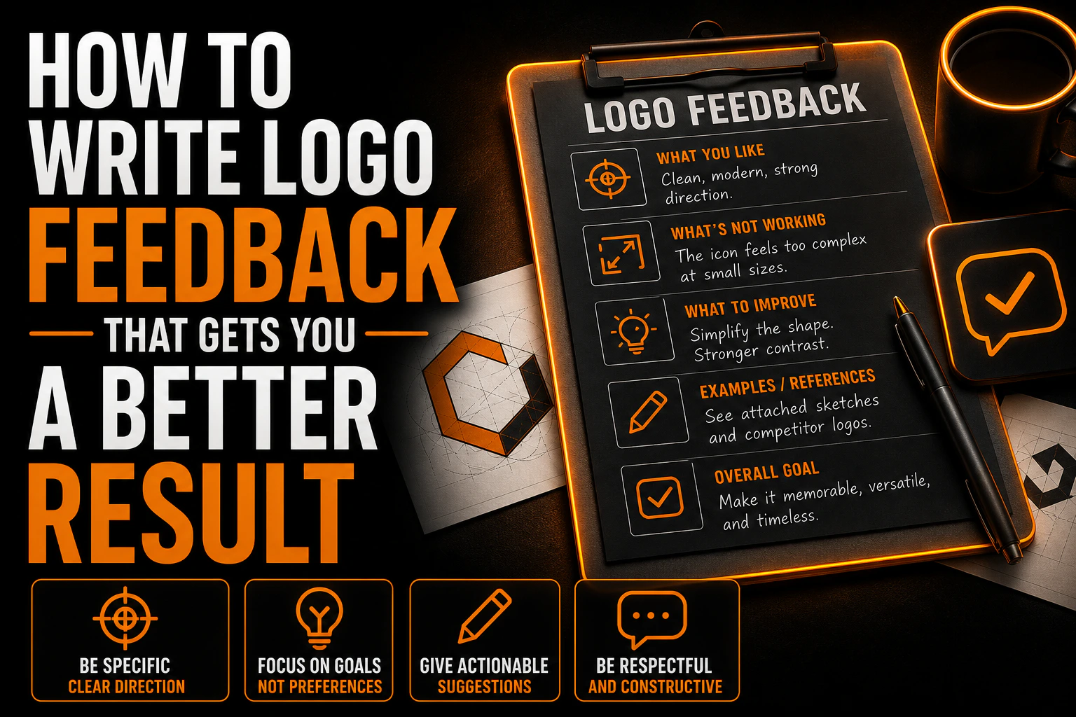
How to Write Logo Feedback That Gets You a Better Result
How to Write Logo Feedback That Gets You a Better Result
There is one part of a <a href=”https://conception-logo.com/en/services/graphic-design/logo/”>logo project</a> that belongs entirely to you, and it is not the brief. It is the email you send after you see the first concepts.
Key takeaways
- Describe the problem you see rather than prescribing the fix, so the designer can find the right solution.
- Avoid combining parts from different concepts, since each direction is a complete answer to the same question.
- Gather everyone’s input into one voice and one document per round instead of scattered messages from several people.
The brief is written before anyone has drawn anything, when you are describing a business. The feedback is written after, when you are looking at real options and reacting to them. Almost every logo project that ends badly ends badly here, in a reply that was written in ten minutes on a phone, between two meetings, by someone who was trying to be polite.
This guide is about writing that reply well. It is short work with a large effect, and nobody teaches it.
What this guide does not redo
The brief itself is a separate document with a separate job, and this site already has a full template for it, section by section, covering business description, audience, brand adjectives, visual references and practical constraints. That guide is named here rather than linked because it is not yet published.
Three other things are closed here as well. How to evaluate a designer, check their portfolio and read a revision policy before you sign belongs to the guide on choosing the right logo designer. How long each stage should take belongs to the realistic logo design timeline. What a project should cost is covered by the pricing guide, also named and not linked, since it is not published either.
This guide covers one thing: the words you send back.
1. Your job is to report, not to judge
The single most common mistake is treating a concept presentation as a vote. You look at three options, you decide which one you like, and you say so.
The problem is that “I like it” and “I do not like it” are the two least useful sentences in a design project. They are true, they are yours, and they carry almost no information the designer can act on. A designer who receives them has exactly two options: guess, or ask you the questions you should have answered.
The useful posture is closer to that of a witness than a judge. You are the only person in the room who knows what happens to this mark in real life. You know it is going to be embroidered on a golf shirt, that your biggest competitor already owns the colour blue in your town, that your name gets misread over the phone, and that half your customers will first see this logo at the size of a fingernail in a search result.
None of that is aesthetic judgement. All of it is reporting, and all of it changes the design.
2. Three kinds of feedback, and only one of them is arguable
Before you write anything, sort what you are about to say into three piles. Then say which pile it is in. This one habit removes most of the friction in a revision round.
Facts are things that are simply true and not open to discussion. The company name is spelled wrong. That is not our tagline. We do not offer that service any more. Facts get fixed, not debated, and they should be listed first and separately so nobody wastes time discussing them.
Constraints are conditions from the real world that the design has to survive. This goes on a sign. It has to work in one colour on an invoice. It has to sit next to a franchisor’s mark that we do not control. Constraints are also not really arguable, but unlike facts they usually have several possible answers, and choosing between them is the designer’s job.
Taste is everything else. The colour feels cold. It looks too corporate. I expected something rounder. Taste is legitimate, it is the reason you hired a human, and it is the only one of the three that is genuinely a conversation. But it has to be labelled as taste, because a preference presented as a fact ends a discussion that should have stayed open.
Write your reply in that order: facts, constraints, taste. A designer reading it knows immediately what to correct, what to solve and what to discuss.
3. Describe the symptom, not the cure
The second most common mistake is arriving with a fix already written. Make the logo bigger. Move the icon to the left. Use a darker blue.
This is the instruction that design professionals push back on hardest, and for a good reason. The Nielsen Norman Group, writing about design critique in a UX context, makes the same point about prescribing solutions: when someone proposes a fix, the useful move is to work backwards to the problem behind it, because a prescribed solution hides the actual issue and quietly narrows the range of things that could have solved it.
The translation for a logo is direct. “Make it bigger” is a cure. The symptom might be that the mark vanishes on your van at highway distance, or that it is unreadable in a phone-sized search result, or that the name gets lost next to the icon. Those three symptoms have three different solutions, and only one of them is making it bigger.
So write the symptom. It disappears when I look at it on the van photo. My name is harder to read than the icon. It does not survive the black and white fax our supplier still uses. Then let the designer choose the cure. That is what you are paying for.
4. Do not assemble the concepts into one
When a designer presents three directions, they are usually three answers to the same question, not three sets of parts. The most damaging reply in the entire process is the one that says: I like the icon from the first, the typeface from the second, and the colours from the third.
Each concept has an internal logic. The weight of the type was chosen against the weight of the mark. The colour was chosen for that shape and not another. Pulling pieces out and gluing them together produces something that looks assembled, because it is, and it usually takes several rounds to recover.
If more than one direction genuinely attracts you, say that, and say why in terms of the business rather than the parts. Something like: the first one feels like a company that has been here twenty years, and that is what we are selling, while the third feels newer than we actually are. That tells the designer what you are optimising for, and it lets them bring what worked in the third into the first without dismantling either.
Start the concept round on the right footing
Feedback is easier to give well when the concepts already show your logo on the real applications it has to survive, not just on a clean mockup. That is how we present every round.
5. One voice, one document, one round
Feedback that arrives in six separate messages from four people over nine days is not feedback. It is noise with a signature, and it is the most expensive thing a client can do to a logo project.
Collect it. Give everyone who has an opinion a fixed window and a single place to put it. Then, and this is the part that gets skipped, one person has to reconcile it before it is sent. If your operations manager wants it bolder and your sales lead wants it lighter, that contradiction is yours to resolve, not the designer’s. A designer who receives two opposite instructions will either pick one and disappoint someone, or split the difference and satisfy nobody.
The same applies to sequencing. Feedback given after a round is closed, on something that was already approved two rounds ago, costs real time. The Nielsen Norman Group’s short guidance on effective design feedback lands on three points that transfer cleanly here: remember that your insights are valuable, structure your feedback, and keep it balanced. The structure part is the one clients under-use, and it is the cheapest to fix.
6. Four things to check before you reply
Almost all genuinely useful feedback comes from looking at the concept somewhere other than the presentation deck. Four checks take about ten minutes and they change what you write.
Shrink it. Put the mark on your phone screen at roughly the size of a profile picture. What is still legible at that size is what your logo actually is.
Kill the colour. Print it in black and white on the office laser printer, the one nobody maintains. A logo that only works in its palette will fail on a form, a stamp, a fax and an embroidered shirt.
Put it on the real thing. Not on the elegant mockup, on a photo of your own van, your own storefront, your own invoice. This is where size and proportion problems become obvious and where most useful constraints are discovered.
Set it beside the competition. Open three competitor sites in tabs next to the concept. If the concepts and the competitors are indistinguishable, that is a finding worth reporting, and it is a much stronger comment than saying it feels generic.
When it comes time to approve, the files you receive matter as much as the mark itself, and there is a full checklist of what to request from your designer before you sign anything off.
Getting the round right the first time
Good feedback is not about being demanding or being nice. It is about being specific in a way only you can be, because you are the only person who knows where this mark has to live.
We build that into how we present concepts, with the real applications shown from the start, so the conversation starts at the constraint rather than at the preference. If you have a <a href=”https://conception-logo.com/en/services/graphic-design/logo/”>logo project</a> in motion, or one you are about to start, we are happy to talk it through.
FAQ
What should I do if I do not like any of the concepts?
Say so plainly, early, and then spend the rest of the message explaining what each one is missing rather than ranking them. A designer would far rather hear that none of the three landed in round one than receive a reluctant approval that unravels three weeks later. If you can point at what is closest, even in a single element, that is usually enough to redirect the next round productively.
How much feedback is too much?
There is no useful word count, but there is a useful test. If a line of your feedback cannot be traced back to a fact, a real-world constraint or a clearly labelled preference, it is probably commentary rather than direction. A tight page that sorts facts, constraints and taste is worth more than five pages of running reaction.
Should I show the concepts to my customers or my family?
Carefully, and rarely. Informal polls tend to measure novelty rather than fitness, and the person who sees a mark for four seconds cannot tell you whether it will survive on a work shirt. If you do ask, ask a specific question, such as what kind of business this looks like, rather than which one they prefer.
Can I ask for a completely new direction after seeing the first round?
Yes, and it is a normal outcome, but it is a scope conversation rather than a feedback one. What a project includes in terms of directions and rounds should have been settled before the work started, which is why the revision policy belongs in your first conversation with a designer rather than in your first reply to a concept.
Is it rude to give critical feedback to a designer?
No. Vague feedback is the difficult kind to work with, not critical feedback. A designer can act immediately on a clear statement that the mark disappears on your sign. They cannot act on three weeks of polite hesitation followed by a request to start over.