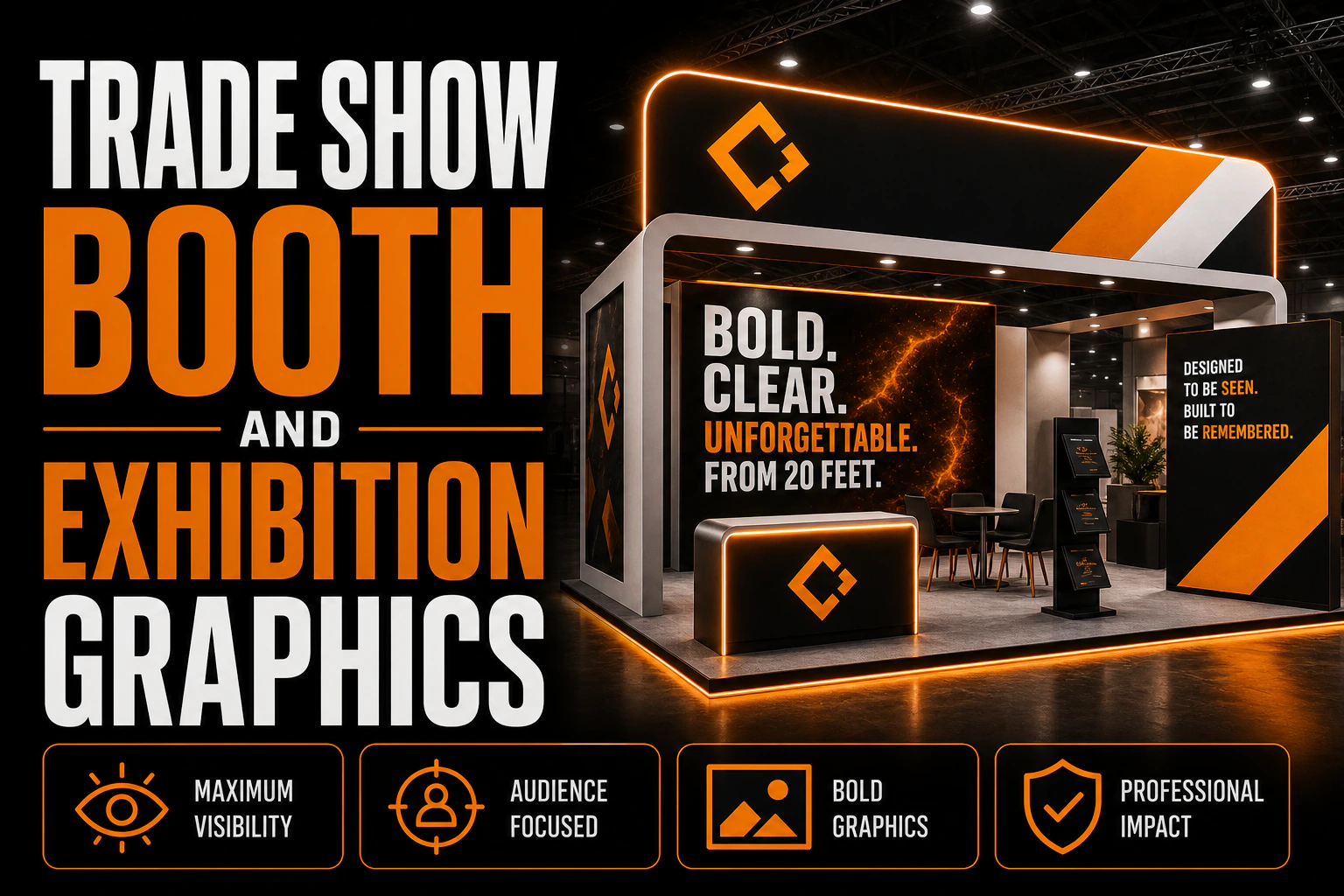
Trade Show Booth and Exhibition Graphics: Designing a Stand That Reads From 20 Feet
Your booth is not read at arm’s length. It is read from across the aisle
Most <a href=”https://conception-logo.com/en/services/graphic-design/”>booth graphics</a> are approved on a laptop screen, eighteen inches from the face of the person approving them. They are then judged by attendees standing thirty feet away, walking at three kilometres an hour, with a coffee in one hand and someone else’s booth in their peripheral vision.
Key takeaways
- Size booth text at roughly one inch of letter height for every ten feet of viewing distance.
- Place your logo in the top band of the backwall, since staff and visitors block everything at eye level or lower.
- Get the printable dimensions, required bleed and hidden zones in writing from your display supplier before artwork starts.
That gap is the whole problem. A layout that looks balanced and generous at 100 % zoom collapses into a grey smear at aisle distance, and the sentence you spent a week refining is never read by anyone. Designing for an exhibition floor is not designing a large poster. It is designing three different messages that have to work at three different distances, on a structure whose lower half is blocked by your own staff.
Our other signage guides cover permanent installations, this one is about the temporary, high-pressure version, where you get one day to be noticed and no second chance to fix the file.
How far away will people actually see your booth graphics?
Every booth graphic serves three readers at once, and the mistake is designing for only one of them.
The scanner, at twenty to fifty feet. Someone at the far end of the aisle who has not decided to walk toward you yet. They will give your stand under a second. At this distance they can absorb exactly two things: your logo and one short claim. Not a tagline about passion and innovation, a claim that tells them what you sell and why it might matter to them.
The approacher, at eight to fifteen feet. Someone who has slowed down and is deciding whether to make eye contact with your staff. This is where a second layer belongs: three or four benefits, a product visual, a category breakdown. Short lines, not paragraphs.
The visitor, at conversational distance. Someone already in the booth and talking to you. Detail lives here, specifications, case examples, a price structure, and honestly, most of it belongs on the printed material you hand them rather than on the wall behind you.
Designing all three layers into one flat wall of equal-sized text is the most common failure on an exhibition floor, and it is entirely avoidable.
The top band is the only space nobody blocks
Here is the constraint that separates booth graphics from every other format: for the entire duration of the show, the bottom half of your backwall is occupied. By your own staff, by a counter, by a product table, by visitors standing in front of it.
A logo placed at eye level is behind someone’s head from the moment the doors open. This is why the top band of the backwall, the strip above roughly six feet, carries your identity and your single claim. It is the only part of your structure that is visible from the aisle for eight straight hours.
Everything below that line should be treated as conditional. Put the second-layer content there if you like, but assume it will be intermittently hidden, and never put anything there that the show depends on.
The same logic applies to a hanging sign if your booth size allows one: it works precisely because it sits above the crowd. If your space does not allow a hanging sign, the top band of the backwall is doing that job instead, and it deserves the same discipline.
How big does your booth text need to be to read from 20 feet?
Type size for distance is one of the few things in design with a usable rule of thumb: roughly one inch of letter height per ten feet of viewing distance.
For a stand meant to be read from twenty feet, that puts your primary headline at a minimum of two inches of cap height, around 144 pt at full scale in your file, and several large-format printers argue that anything under three inches at that distance is not comfortably legible in a busy hall. For the fifty-foot scanner, you are into the range where only a logo and two or three words survive.
The <a href=”https://segd.org/”>Society for Experiential Graphic Design (SEGD)</a> sets the professional standard for this kind of distance-based signage work, and its guidance follows the same logic: size text to the distance it actually has to survive, not to the distance it looks good at on a screen.
Three further rules do most of the remaining work:
- Two typefaces, maximum. One for headlines, one for supporting text. Clean sans-serifs read fastest at distance.
- Bold weight for headlines. Light and regular weights disappear at banner scale, especially against a photographic background.
- No condensed, script, or decorative faces for primary messaging. They read slowly, and at print scale their thin strokes look blurry even when the file is perfect.
Contrast matters more than colour. Dark type on light, or light type on dark, in a hall lit unevenly by overhead rigging and your neighbour’s spotlights.
The 10 × 10 reality
A standard 10 × 10 booth sounds like a lot of space until you subtract what it holds. Backwall structures for that footprint typically run five to ten feet wide, and you still need room for a counter, a product, and at least one person on the floor.
Two practical consequences follow. First, your usable graphic area is smaller than the booth dimension you booked, so design to the structure’s actual printable area rather than to the square footage on the floor plan. Second, if you already own a 10 × 20 structure and are exhibiting in a 10 × 10 this time, check whether your system converts, many do, before you commission a second set of graphics.
There is also a seam question. Wide backwalls are frequently printed in panels, which means a seam will fall somewhere. If nobody decides where, it lands through the middle of your logo. Deciding the seam position is a design decision, not a production accident.
Get your booth graphics designed as one coordinated set
Backwall, banners, counter wrap and leave-behind pull in different directions when they are commissioned separately. We build the whole exhibition set from the same vector source files, sized for your structure’s real printable area.
Fabric or rigid: two different files
The same artwork does not go to both substrates unchanged.
Tension fabric wraps around a frame, which means several inches at each edge disappear around the curve. Your file needs real bleed, and critically, nothing important, no logo edge, no end of a headline, can sit near the trim. Fabric also has a slight texture and a small amount of stretch, so very fine hairlines and tight registration between two colours are riskier than they look on screen.
Rigid panels hold detail better and give crisper edges, but they are heavier, more expensive to ship, and far less forgiving of a last-minute content change. They also show every scratch from the previous show.
In both cases, the file has to be built from vector artwork wherever type and logos are concerned. A logo enlarged from a web-resolution PNG to two feet wide is visibly soft, and unlike a business card, there is no viewing distance at which that softness stops mattering, it just becomes a soft shape instead of a soft detail.
Match the booth to what leaves the booth with them
An exhibition is one of the few moments where your <a href=”https://conception-logo.com/en/services/graphic-design/”>large-format graphics</a> and your printed material are seen within thirty seconds of each other by the same person.
If the brochure they are handed uses a different blue, a different typeface, or a logo lockup they did not just see on the wall, the mismatch registers, not consciously, but as a vague sense that something is improvised. Conversely, when the backwall, the counter graphic, the brochure and the business card all share one system, the booth reads as a company rather than as a booth.
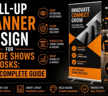
The practical version of this is simple: commission the event set as a set. Backwall, any roll-up banners flanking the stand, the counter wrap and the leave-behind, designed together, from the same vector source files.
If your booth also needs to direct people to a demo area or a meeting room within the space, the principles are the same ones we cover in our guide to indoor wayfinding and directional signage.
What to have ready before the deadline
Show deadlines are unforgiving, and the file specification is set by the display supplier, not by you. Before the artwork stage, get three things in writing from them: the exact printable dimensions of your structure, the required bleed, and any zone that will be wrapped, seamed or hidden by hardware.
Then make sure you own, in vector format, the pieces that go on the wall: your logo, its one-colour version, and any icons you use. If your logo only exists as a raster file, that is the item to fix first, every other decision on this list depends on it.
What do exhibitors ask most about booth graphics?
How big should the text be on a trade show booth?
Use roughly one inch of letter height for every ten feet of viewing distance. For a headline meant to be read from twenty feet, that means a minimum of two inches of cap height, and many large-format printers recommend three. Anything smaller is second-layer content for people already standing in front of the booth.
Where should the logo go on a booth backwall?
In the top band, above roughly six feet. Anything at eye level or lower is blocked by your own staff and by visitors for the entire show. If your booth size allows a hanging sign, it does the same job even better.
How much text should a trade show booth have?
Very little at scanning distance: a logo and one short claim that says what you sell. A second layer of three or four short benefit lines can sit lower, for people who have already slowed down. Detailed information belongs on the printed material you hand out, not on the wall.
Is fabric or a rigid panel better for booth graphics?
Fabric is lighter, cheaper to ship and easier to update, but it wraps around the frame, so it needs generous bleed and nothing important near the edges. Rigid panels hold fine detail and crisp edges but cost more to transport and show wear from previous shows. The choice changes the file, so decide before artwork begins.
Can I reuse my booth graphics for the next show?
Often yes, if the artwork avoids show-specific dates, booth numbers and one-off offers. Keeping those elements on a separate, replaceable panel, rather than printing them into the main backwall, is what makes a structure reusable across several seasons.
Design your booth as one system
A stand that reads from across the aisle is not a bigger version of a poster. It is a set of graphics built for three viewing distances, on a structure whose lower half is occupied, in files matched to the substrate your supplier will actually print.
We design exhibition graphics as a coordinated set, backwall, banners, counter and leave-behind, from vector source files you keep and reuse.
See our graphic design services
FAQ (summary)
- How big should the text be on a trade show booth?, About 1 inch of letter height per 10 feet of viewing distance; minimum 2 in. cap height for a 20-foot read.
- Where should the logo go on a booth backwall?, Top band, above roughly six feet, because everything at eye level is blocked all day.
- How much text should a trade show booth have?, A logo and one short claim at scanning distance; details belong on the handout.
- Is fabric or a rigid panel better?, Fabric is lighter and cheaper to ship but needs generous bleed; rigid holds detail but costs more to transport.
- Can I reuse my booth graphics?, Yes, if dates, booth numbers and one-off offers sit on a separate replaceable panel.
Internal linking proposed
All targets verified as really live (GSC snapshot for the article URL, Site-Pages-Index.md for the service pages).
| Anchor | URL | Role | |—|—|—| | brochure | https://conception-logo.com/en/services/graphic-design/brochure/ | Service, the leave-behind | | business card | https://conception-logo.com/en/services/graphic-design/business-card/ | Service, the leave-behind | | roll-up banners | https://conception-logo.com/en/services/graphic-design/roll-up/ | Service, the flanking banners | | indoor wayfinding and directional signage | https://conception-logo.com/en/billboard/indoor-wayfinding-directional-signage-design-guide/ | Related article, confirmed live in the GSC snapshot | | See our graphic design services | https://conception-logo.com/en/services/graphic-design/ | Main CTA |
Thumbnail prompt
Wide shot of an empty exhibition hall aisle before opening, a modern fabric backwall stand in the middle distance with large abstract shapes and no readable text, warm overhead rigging lights, shallow depth of field with the foreground carpet blurred. No visible brand names, no logos, no readable words anywhere, landscape 16:9.