Your Name in the Building Directory: One Line, Someone Else’s Template
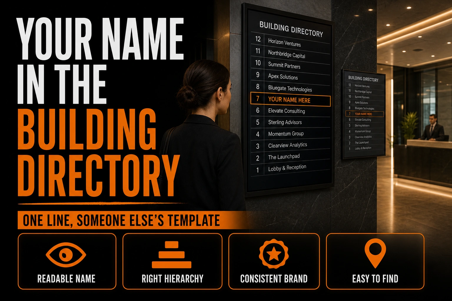
You chose the colours. You approved the spacing. You paid for the vector files. And then you signed a lease in a shared office building, and the first place a new client meets your company is a black board screwed to a lobby wall, holding one line of white plastic letters that somebody else set in a typeface you have never heard of.
Key takeaways
- Decide the exact characters of your name for the directory strip, since the building sets the typeface, colour and size.
- Ask the property manager about the directory the week you sign the lease, then supply your exact wording in writing.
- Make sure the line helps visitors find your floor and suite, which matters more to them than how your name looks.
That board is a tenant directory, and for a great many service businesses it is the single most-read appearance of the company name. The visitor who reads it is standing still, already inside, and actively looking for you. There is no other surface in your brand system with that combination. There is also no other surface you control less.
This is not a wayfinding article. Our indoor wayfinding and directional signage guide covers the sign system you design and install inside a space you occupy, including identification signs, directional signs and the materials that suit them. It is also not about your own exterior sign, which is treated in our guide to storefront sign design mistakes. The subject here is narrower: what happens to a brand when a landlord reduces it to a line of text you do not choose.
Who decides what your name looks like on the lobby board?
The building does. Almost every multi-tenant property uses one board, one template, and one supplier, with letter height, colour, and typeface fixed before you ever moved in. The property manager orders your strip, and it is set in whatever type the board already uses.
Three consequences follow, and none of them are obvious until it is too late.
Your logo does not appear. Not a reduced version, not a monochrome version, not a symbol. Directory boards carry characters, and characters only. Every decision you made about the mark itself is irrelevant here, which is a strange thing to say about the most-read appearance of a company name.
Your colour does not appear either. The board has one letter colour, chosen by the building. A business whose entire recognition strategy rests on a distinctive colour arrives at the directory with nothing.
You get a fixed amount of room. Usually one line. Sometimes two, if the building allocates by square footage. The number of characters that fit is a property of the board, not of your name, and nobody will ask you to approve the result.
Does accessibility law require directory boards to be legible?
No. In the United States, the ADA Accessibility Standards, published by the U.S. Department of Justice, exempt this exact category of sign, which surprises most tenants who assume the opposite.
Section 216.1 of the scoping requirements states that signs shall comply with section 703, then carries an exception which is worth reading slowly, because it names the exact objects discussed here. Building directories, menus, seat and row designations in assembly areas, occupant names, building addresses, and company names and logos are not required to comply with section 216.
Read that list again. Building directories are exempt. Occupant names are exempt. Company names and logos are exempt. The one place in the building where your brand physically appears is precisely the category the standard steps back from.
Two clarifications matter before anyone draws the wrong conclusion. This is an American standard, and Canadian requirements are set provincially and by building code, so nothing here should be treated as a statement of what applies to a building in Quebec or Ontario; check with your own building manager. And an exemption is not a prohibition. A landlord may well run an excellent, highly legible board. The point is narrower and more useful: nobody is obliged to make that board work for you, so no rule will rescue a name that fails on it.
The real design work is the string of characters
Once the mark, the colour and the symbol are all off the table, one decision remains, and it is usually made by accident: exactly which characters go on the strip.
Decide whether the legal form belongs there. Many businesses hand the property manager the name as it appears on the lease, so the board ends up carrying an incorporation suffix that the company never uses anywhere else. It eats characters, it looks nothing like the name on the website, and it introduces a small mismatch at the exact moment a visitor is confirming they are in the right place. If you trade under a shorter name, supply the shorter name.
Test your name at a length you do not control. A long name on a narrow board gets solved by the supplier, not by you: it is abbreviated, hyphenated across two lines, or set in a smaller size than every other tenant. Any of the three makes the company look like an afterthought. Knowing your own break point, that is, the shortest form of your name that still reads as your name, is a piece of brand information every business should possess and almost none do.
Accept the alphabetical order. Directories are almost always alphabetical, which means you sit beside businesses that have nothing to do with you and, occasionally, beside a competitor. This is the same neighbouring problem that shows up on a shelf and in a sponsor wall, and it has the same answer here as anywhere: clarity beats cleverness. A descriptive word after the name does more work than any styling you cannot apply.
Say what you do, if the board allows it. Some boards give a second line. Most tenants waste it on a repeated word or leave it blank. A plain three-word description of the service is worth far more than a slogan, because the reader is scanning for a category, not for a personality.
A brand that still works when the logo is not allowed
We design logos as a system, which includes deciding how your name is written when a mark, a colour and a symbol are all unavailable. That decision belongs in the brief, not in a phone call with a sign supplier.
What matters more to a visitor than your branding?
The floor and the door. It is easy to treat the directory as a branding surface and forget that the person reading it has a practical problem: finding a suite, not admiring a name.
That reframing settles most of the arguments. If the board offers limited room, the suite number is not negotiable and the descriptive line is. If the building lists your name on one board and your suite on another, the two need to agree, and it is worth checking, because a suite change at renewal often updates one and not the other. And if your own printed materials give an address without the suite number, the directory is the only thing standing between a visitor and a wrong floor.
This is also the reason the directory line should be handled as part of your identity, alongside the file set you keep for print and screen. It is a written asset, not a piece of signage, and it deserves a decision the same way your complete brand identity kit deserves one. We settle it during logo design, while the name is still open to discussion.
What should you ask the property manager before you sign?
Ask three things while you still have their attention, which is the week you sign and not a day later. Then supply your exact wording in writing.
Ask who orders the strip and who pays for a change. In many buildings the tenant pays, which makes a rushed decision expensive to reverse. Ask how many characters the board takes per line and how many lines you are allocated. That single number converts an aesthetic argument into an arithmetic one. Ask what happens when you change suites, so that both boards are updated by the same person on the same day.
Left to itself, the default is the name on the lease, and the lease was written by a lawyer, not by you. Building a name that survives this treatment, with the incorporation suffix dropped and the short form already decided, is part of what a professional logo design process is supposed to deliver.
Can you get your logo onto the lobby directory?
Five questions come up most often once a tenant sees the board for the first time.
Can I ask the landlord to put our logo on the directory?
You can ask, and in a small building with a flexible owner it occasionally works. In a professionally managed building it almost never does, because the board is a single fabricated system and one exception forces the manager to consider every other tenant’s request. Plan on characters, and treat a logo as an unexpected bonus rather than a design assumption.
Should the directory name match our legal name exactly?
Not necessarily, and this is worth confirming rather than assuming. Some leases specify how the tenant is identified in common areas. Where the choice is yours, the name your clients recognise is the more useful one, since the reader is confirming an appointment rather than verifying a corporate record. If your lease is silent on the point, ask before you supply the string.
Our name gets abbreviated on the board. Is that a problem?
It depends entirely on whether the abbreviation still reads as you. A shortened form that clients already use in conversation is fine. An abbreviation invented by a sign supplier under time pressure is not, and it will stay on the wall for the length of your lease. This is why deciding your own short form in advance is the single most valuable preparation for this surface.
What about the directory in the elevator lobby of our own floor?
Treat it as a second, separate board with its own template and its own supplier, because it frequently is. The two are updated by different people at different times, which is how a company ends up correctly listed downstairs and listed under a former name upstairs. Check both, and check them again after any change.
Does any of this matter for a business with a single street-level entrance?
Much less, and it may not apply at all. This guide addresses businesses inside multi-tenant buildings, where a third party controls the first surface a visitor reads. A business with its own door and its own sign faces a different problem, treated in our storefront guide.