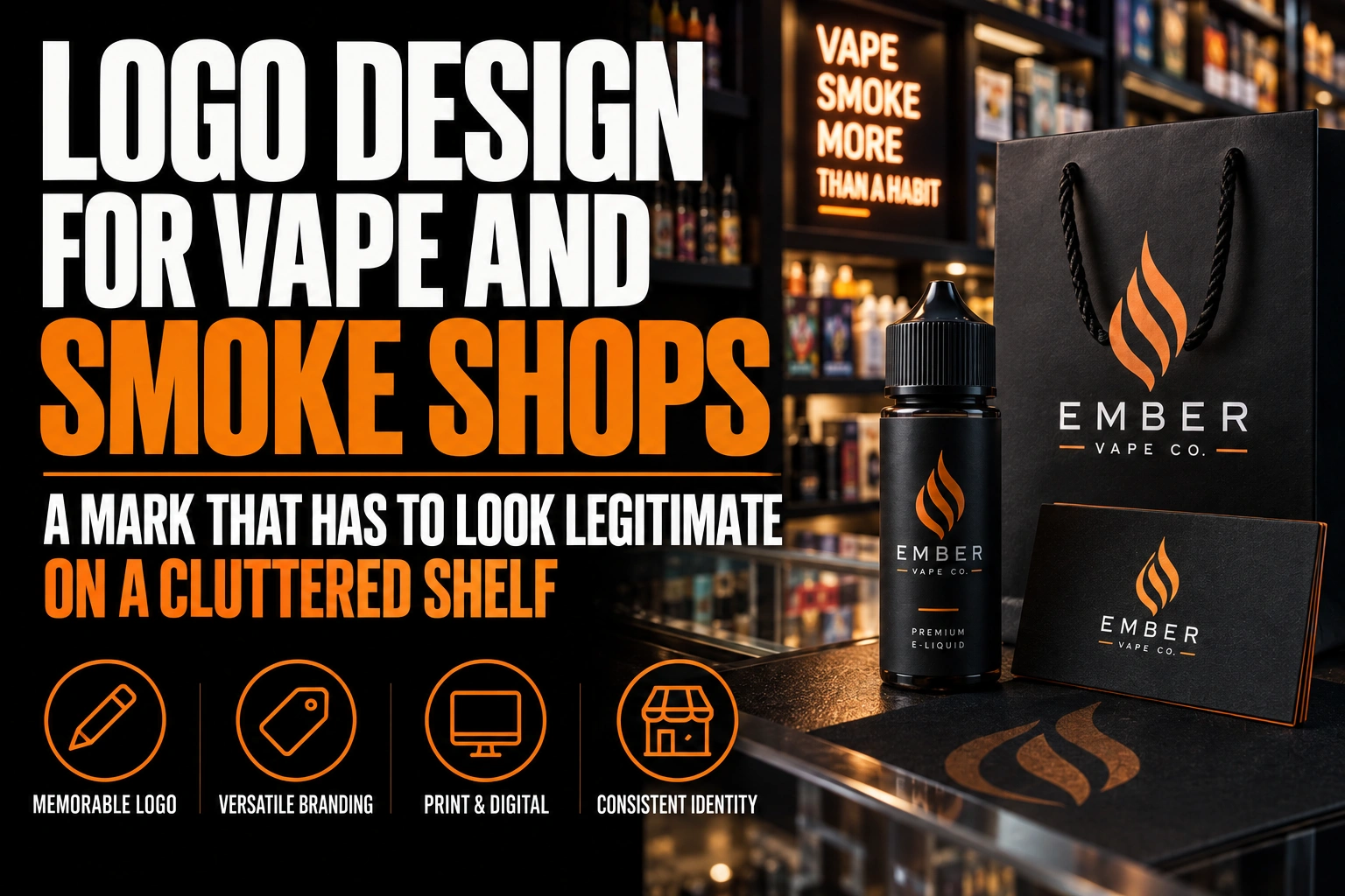
Logo Design for Vape and Smoke Shops: A Mark That Has to Look Legitimate on a Cluttered Shelf
A vape or smoke shop logo stands out from the shop next door through colour choice, a mark that is not a cloud or a leaf, and lettering sized to actually read from the sidewalk. Most shops on a crowded strip fail on size and colour long before anyone judges the artwork.
Key takeaways
- Borrow the codes of a well-run specialty retailer: a clean wordmark, 1 or 2 calm colours and generous spacing.
- Avoid smoke clouds, lightning bolts, skulls and dripping fonts, which make the store look like a temporary pop-up.
- Stand out from loud packaging by being the calmest element, with one logo in the same spot on every shelf strip.
This guide walks through the design choices that separate one storefront from the next 3 on the same block, and what a logo needs to hold up on a window decal, a sign and a loyalty card.
Why do so many vape and smoke shop logos look the same?
Because most draw from the same small set of ideas: a puff of vapour, a leaf, a flame, set in neon green or electric blue. When 4 or 5 shops on one strip reach for the same visual shorthand, none of them actually separate from the others.
The fix is not a completely different industry look. It is picking one or 2 of the usual choices, colour, shape or typography, and doing something the shops around you are not already doing.
What colours help a vape shop logo stand out on a crowded strip?
Walk the block before choosing a palette. If every storefront within view is already neon green, purple or electric blue, a fourth version of the same colour gets lost rather than noticed.
A muted or warm colour, deep teal, rust, mustard or a dark neutral with one bright accent, reads as different the moment someone glances down the street. Keep the working palette to 2 colours plus black and white, since fewer colours also print cleaner on vinyl and embroidery.
Our guide to colour psychology by industry goes further into how colour choice shifts the mood of a storefront before a customer reads a single word.
How big does your sign need to be to read from the sidewalk?
As a starting rule, 1 inch of letter height reads clearly from about 10 feet of distance. Coast Graphics & Signs, a commercial sign company, lays out this ratio with concrete examples.
A 3 inch letter is built to be read from around 30 feet, and a 12 inch letter carries to roughly 120 feet. A storefront on a narrow sidewalk can work with smaller lettering than one set back from a wide parking lot. Measure the actual distance a walking or driving customer will have between first noticing your sign and reaching your door, then size the letters to that number, not to what looks good on a screen.
A logo built with thin script or a tiny tagline rarely survives this test. If the design only works at business card size, it will not work as a storefront sign, which is exactly where a vape shop needs to win the first glance.
What logo style actually works on a small window decal?
Simple shapes and bold letterforms survive the trip from a large storefront sign down to a 3 inch window decal. Fine detail, thin strokes and small text do not.
A wordmark built from a distinctive letter shape, or a tight monogram of the shop’s initials, tends to scale better than an illustrated scene. Test any candidate logo at 2 sizes side by side, one the size of a business card and one the size of a full storefront sign, before deciding it works.
Many new shop owners start with a free template tool, which is a reasonable first step but often leaves the file as a flat image rather than a true vector. Our honest look at template tools versus professional design explains where that gap shows up once a logo needs to go on a sign, a decal or embroidered staff wear.
How do you avoid generic cloud, leaf and flame icons without losing customers?
Drop the literal icon and let typography carry the message instead. A confident, well-chosen typeface signals the same energy as a cloud or a flame icon, without repeating what 3 other shops on the block already use.
Our guide to typography in logo design covers how letter shape, weight and spacing build a tone on their own. A bold condensed font reads as modern and direct; a rounded one reads as friendly and approachable, both without a single icon.
If an icon still feels necessary, a professional logo design can build it from an abstract shape tied to the shop name rather than the product category itself, so it stays yours even if 5 new shops open on the same strip next year.
A logo built to win the first glance on a crowded strip
We design a mark that reads at sidewalk distance and holds up on a window decal, a storefront sign and a loyalty card, not just on a screen.
What to check before your vape shop logo goes on the window
Run through 5 checks before approving any sign or decal: colours and icons already used nearby, a 2 colour palette, letter size matched to viewing distance, size testing, and file formats for every surface.
- Walk the strip and note which colours and icons repeat, then avoid them.
- Keep the palette to 2 colours plus black and white for cleaner print results.
- Size the lettering using the 1 inch per 10 feet rule for your actual viewing distance.
- Test the design at business card size and storefront sign size before approving it.
- Build a full colour, single colour and reversed version for decals, signs and apparel.
What do shop owners ask about standing out from the competition?
Five questions come up most often once a vape or smoke shop owner starts comparing their storefront to the ones next door. They cover competition, colour, icons, sign size and multi-use files.
How can a smoke shop logo stand out from competitors?
Pick one colour the shops around you are not using, build the mark from a letterform or an abstract shape instead of a cloud or a leaf, and keep it simple enough to read as a 3 inch window decal and a 12 inch storefront sign. Most vape shop logos fail on the second point, not the first.
What colours work best for a vape shop logo?
Walk the strip first and note which colours repeat. Neon green, electric blue and purple show up on most vape storefronts, so a muted or unexpected colour, such as deep teal, rust or a warm neutral, separates your sign at a glance. Keep the palette to 2 colours plus black and white for the cleanest print result.
Should a vape shop logo include a cloud, leaf or vape icon?
Not by default. These icons appear on a large share of smoke shop signage already, so a new one blends into the strip instead of standing apart from it. A strong wordmark, a monogram or an abstract shape built from the shop name usually reads faster and ages better than a literal vapour icon.
How big should a vape shop storefront sign be?
As a starting rule, 1 inch of letter height reads clearly from about 10 feet away, so letters meant to be read from across a parking lot or a wide sidewalk need to be sized accordingly. A sign meant to be read from 30 feet needs roughly 3 inch letters, and one meant to carry across 120 feet needs letters closer to 12 inches.
Can one logo work for a storefront sign, a window decal and a loyalty card?
Yes, if the logo is built as a vector file with a full colour version, a single colour version and a reversed version for dark backgrounds. A design that depends on a gradient or a thin outline often breaks down at decal size or on a one colour embroidered patch, so those variants should be planned before the first print order.
Conception-Logo.com has completed more than 5,000 design projects and builds every logo as a vector master so it holds up on a window decal and a full storefront sign alike.