Your Logo on a Ceramic Mug: The Print That Wraps Around a Handle It Has to Avoid
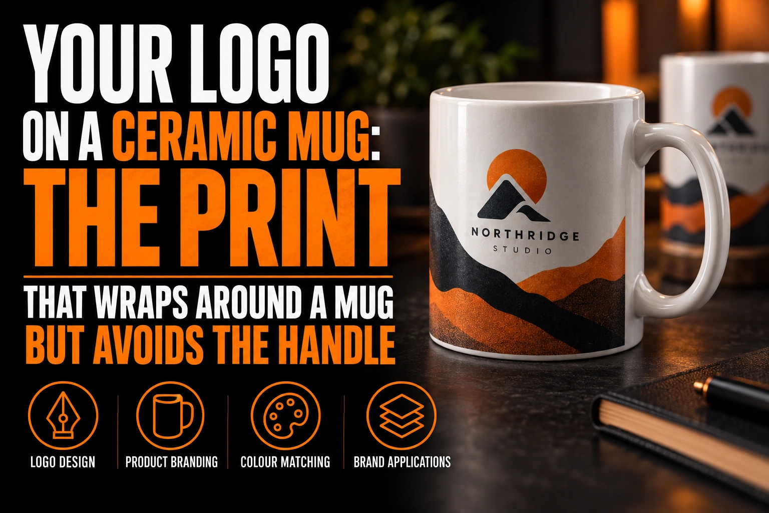
A logo on a ceramic mug looks stretched when flat artwork is pulled to fill the wrap. It also looks squeezed when it runs so wide that its ends curve out of view. Keep the mark compact and centre it on the side people see. Stop it well before the handle, where the print usually cannot reach.
Key takeaways
- Never stretch a square logo to fill the long mug template, since uneven scaling widens every letter.
- Keep the logo compact and centred on the side people see, stopping well before the handle where print cannot reach.
- Decide who the mug is for, since the drinker and colleagues across the desk see opposite faces of it.
Most mug orders start from a business card file and a quick guess. This guide covers the print area, the handle gap, the viewing side and the file, not mug models or order quantities.
Why does a logo look stretched on a mug?
Usually because someone scaled it unevenly to fill the template. A mug template is a long, low rectangle, and dragging a square logo across it widens every letter.
The second cause is geometry. A mug is a cylinder, so its surface turns away from you on both sides of centre. About 60 degrees from the middle, a letter appears only half as wide as it really is.
A long wordmark that crosses that zone looks squeezed at both ends, even when the file is perfect. The fix is not a wider print. It is a more compact mark, placed where the surface still faces the viewer.
That comfortable band covers roughly one third of the wrap. On a standard mug, picture a strip a little under 7.5 cm wide, centred on the face you want seen.
How much of a ceramic mug can actually carry your logo?
Less than the full circle. The sublimation guide from the University of Florida’s Marston Makerspace recommends an image of 8.75 by 3.75 inches for mugs, about 22 by 9.5 cm.
That rectangle is the maximum, not the target. It includes the zone beside the handle and the back of the mug, which no single viewer sees at the same time as the front.
The same guide runs its mug press at 390°F, about 199°C, for 75 seconds. Settings vary by press and by blank, so a test mug is worth approving before any larger run.
For a single logo, plan a print much smaller than the template. For a pattern that wraps all the way around, plan for the handle gap described next.
Where does the handle leave a gap in a ceramic mug print?
Right beside the handle. The Marston Makerspace guide notes that the press cuff cannot close all the way around a mug because of the handle. A thin unprinted line can remain there.
That line is not a defect you can fix. It is part of the object, and the design should expect it from the start.
- Keep logos and text well clear of the zone on each side of the handle.
- Never let a wordmark run from one face to the other across the back.
- End any background colour or pattern with a clean margin before the handle.
A coloured band that stops short of the handle looks intentional. A background that tries to meet itself shows a white sliver, and that sliver looks like a printing mistake.
Which side of a ceramic mug should carry the logo?
Decide who the mug is for: the person drinking or the people around them. With the handle in the right hand, the drinker sees one face while colleagues across the desk see the opposite one.
Left-handed users flip that arrangement. A mug printed on one side only therefore faces the wrong way for part of its audience.
The simple answer for promotional mugs is 2 prints, one on each face, with the handle between them. Each print stays inside the one-third band, so neither one stretches.
Video calls add a third audience. The camera sees the outward face, the same one your colleagues see. A team mug with a single print should aim it away from the drinker.
How should a logo be simplified for a ceramic mug print?
Simplify for size more than for colour. Sublimation, the heat transfer process in the guide above, can reproduce a full-colour image, but a logo about 7 cm wide still loses fine detail.
Thin outlines, small taglines and tiny symbols inside the main shape blur first. A version without the tagline, with slightly heavier strokes, holds up better on a curved, glossy surface.
Mugs also meet other decoration methods, such as pad printing or UV printing, which have tighter colour limits. Our guide on preparing a logo for UV printing on promo products covers those cases.
If your brand already has a compact icon, the mug is a natural place for it. Our guide on horizontal, vertical and icon logo versions explains when the icon should replace the full lockup.
Mug-ready artwork that stays clear of the handle
We rebuild your logo as clean vector artwork, simplify it for a print about 7 cm wide and place one version per face on your supplier’s template.
What file does a mug supplier need for your logo?
A vector file with outlined text and defined colour values, placed on the supplier’s own template. A screenshot or a low-resolution PNG prints soft on a mug, as on any other surface.
Send that template back with your logo already positioned on each face, at final size. It removes any guesswork about the handle side and the height of the print.
Give colours as values, not as a description. A brand blue described in words can drift from one batch to the next. Our guide on why a printer rejects a logo file lists the formats most shops accept.
Conception-Logo.com prepares the artwork and the print-ready files. The promotional products supplier you choose then handles the mugs themselves.
What to check before your logo goes on a ceramic mug order
Run through these points with a logo vectorization specialist before you approve the proof.
- Never scale the logo unevenly to fill the template.
- Keep each print inside a band about one third of the wrap.
- Stay clear of the handle and the unprinted line beside it.
- Print 2 faces if both the drinker and the room should see the logo.
- Drop taglines and thicken fine strokes for a mark about 7 cm wide.
- Send outlined vector artwork placed on the supplier’s template.
- Approve a test mug before the full order.
How do you get a logo to look right on a ceramic mug?
A logo looks right on a ceramic mug when it is compact, centred on the face people see and kept clear of the handle. Supply it as vector artwork at final size.
Why does my logo look stretched on a mug?
Either the logo was scaled unevenly to fill a long template, or it runs so wide that its ends curve out of view. On a cylinder, letters about 60 degrees from the centre appear half as wide as they are. A compact mark centred on one face avoids both problems.
What is the print area on a standard mug?
A university makerspace sublimation guide uses an image of 8.75 by 3.75 inches, about 22 by 9.5 cm, for mugs. That is the full wrap, including the back and the zone beside the handle. A single logo should occupy only part of it.
Why is there a white line near the handle of my printed mug?
The heat press wraps a cuff around the mug, and the handle stops it from closing completely. A thin unprinted strip can remain beside the handle. Designs should end with a clean margin there rather than trying to meet.
Which side of the mug should the logo go on?
With a right-handed grip, the drinker sees one face and the people across the desk see the other. Left-handed users reverse that. Printing the logo on both faces is the simplest way to reach everyone.
Conception-Logo.com has completed more than 5,000 projects, and promotional items are often where a logo first meets a curved surface. Get a print-ready vector version of your logo sized for both faces of the mug before the order goes out.