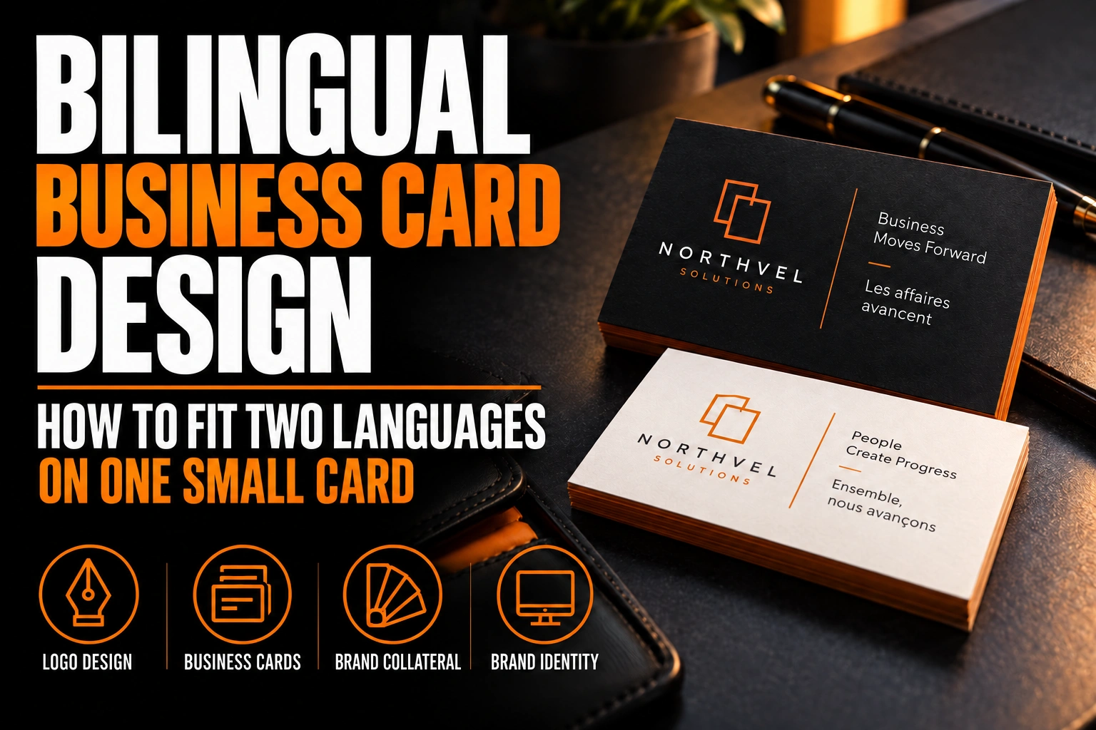
Bilingual Business Card Design: How to Fit Two Languages on One Small Card
A bilingual business card works best with one of 3 layouts: one language per side, side-by-side columns, or a shared front with a translated back. Your logo, name, phone number and email appear once. Only the words that actually change get translated.
Key takeaways
- Choose one of three layouts: one language per side, side-by-side columns, or a shared front with a translated back.
- Show your name, logo, phone and email once, and translate only the lines that change, usually title and services.
- Put the language most of your clients use first, and keep contact lines at 7 or 8 points for comfortable reading.
Here is how to choose a layout and keep both languages readable on a card the size of your palm.
What actually needs translating on a bilingual business card?
Much less than most people assume. Your name, logo, phone number, email address and website stay the same in both languages, so they should appear only once.
What changes is usually short: your job title, your department, a services line and sometimes the words around your address. That often adds up to just a few lines. Treating the card as 2 full copies of the same content is what creates the clutter.
Start by listing every element, then mark each one as shared or translated. The shared items form the backbone of the layout. The translated items become a compact block you can place twice.
Which 3 layouts work for a card in two languages?
The 3 layouts that work are one language per side, side-by-side columns, and a shared front with a translated back. Each suits a different amount of text and a different audience.
One language per side
Each face is a complete card in one language, with the logo and contact details repeated. It is the cleanest option when both languages matter equally. The trade-off is that you give up the back for anything else, such as a QR code or an offer.
Side-by-side columns
Both languages share one face, in 2 parallel columns, while the back stays free. This works when the translated block is short. It needs a disciplined grid, or the card starts to look like a form.
Shared front, translated back
The front carries the logo, name and contact details once. The back carries the title and services in both languages, stacked. This keeps the front clean and puts the translation where there is room for it.
How does the Government of Canada lay out a bilingual card?
The federal government uses side-by-side columns with a strict hierarchy. Its approach makes a useful model, even for a private business that is free to design however it likes.
The Government of Canada’s Federal Identity Program specifies a card of 90 by 50 mm for its single-sided version. English and French run in 2 columns separated by a gap equal to 3 times the x-height. The x-height is the height of a lowercase letter such as x. The cardholder’s name is set at 11 points and the details at 6, 7 or 8 points.
Two lessons carry over to any business card. First, the gap between columns is defined by the type, so it scales with the font you choose. Second, the name stands clearly above everything else, and only the details are duplicated. The specification also leaves the order of the languages to the person named on the card.
Which language should go first on your card?
Put the language most of your clients use first. On a one-language-per-side card, that language gets the front with the logo. It is the face people see first when you hand the card over.
For side-by-side columns, the first language goes on the left, where readers start. If your clientele is evenly split, print 2 versions of the same card, one led by each language. Then hand out the right one. That takes a second print file, not a second design.
How small can the text get before a bilingual card stops being readable?
The federal specification never sets details below 6 points, which makes a sensible floor for short contact lines. With most typefaces, 7 or 8 points is the safer choice.
Bilingual cards add 2 typographic challenges. French phrasing usually runs longer than English, so the French column often sets the width. Accented capitals, such as É or À, need a little extra line spacing so they do not touch the line above.
Choose a typeface with a generous x-height and a full set of accented characters. A font that looks elegant in English but lacks a proper ç or ê will force awkward substitutions.
Where does the logo go when a card carries two languages?
The logo goes on the front once, or on both faces if each side is a complete card in one language. It should never be squeezed between the 2 language columns.
A horizontal logo usually suits side-by-side layouts, where it can sit above both columns. A stacked or icon version works better on a one-language-per-side card, centred on each face. The guide to horizontal, vertical and icon logo versions explains when to use each.
Whatever the layout, protect the space around the mark. Our article on logo clear space and minimum size rules shows how much room a logo needs before text crowds it.
Two languages, one clean card
We design bilingual cards that show your name and contact details once and give each language its own clear space.
Can a QR code replace part of the translated text?
Yes. A QR code can link to a bilingual web page or a contact file. That lets you remove secondary details such as a long list of services.
Keep the core information in print anyway: name, phone and email. A card should still work if nobody scans it. The article on designing the back of a double-sided business card explains how to give a QR code its own place.
Paper matters too, since a dense bilingual layout needs crisp printing at small sizes. Our guide on why paper quality matters for business cards covers how the stock affects fine text.
What to check before a bilingual card goes to the printer
Review this list with your business card designer before you approve the proof.
- List every element and mark it as shared or translated.
- Show the logo, name, phone and email only once per face.
- Choose one of the 3 layouts and keep the grid consistent.
- Keep details at 7 or 8 points, never below 6.
- Check that the typeface includes every accented character you need.
- Put the language most of your clients use first.
How do you lay out a bilingual business card?
Pick one of 3 layouts, show the shared elements once, and translate only the lines that change, usually your title and services.
Should a bilingual business card have one language on each side?
One language per side is the cleanest option when both languages matter equally, since each face becomes a complete card. The trade-off is losing the back for a QR code or an offer. Side-by-side columns keep the back free but need a tight grid.
Which language should come first on a bilingual business card?
The language most of your clients use should come first, on the front or in the left column. The Government of Canada’s federal card specification also leaves the order to the cardholder. If your clientele is split evenly, print 2 versions, each led by one language.
Do I need to translate my name and logo on a bilingual card?
No. Your name, logo, phone number, email and website are the same in both languages and should appear only once per face. Only titles, services and taglines usually need translation on a bilingual business card.
What is the smallest readable font size on a bilingual business card?
About 6 points is the floor for short contact lines, and 7 or 8 points is safer with most fonts. The Government of Canada’s card specification uses 6 to 8 points for details and 11 points for the name. Choose a typeface with a large x-height and full accent support.
Conception-Logo.com has completed more than 5,000 projects, from logos to complete business stationery. Start with a professional bilingual business card design that gives both languages room to breathe.