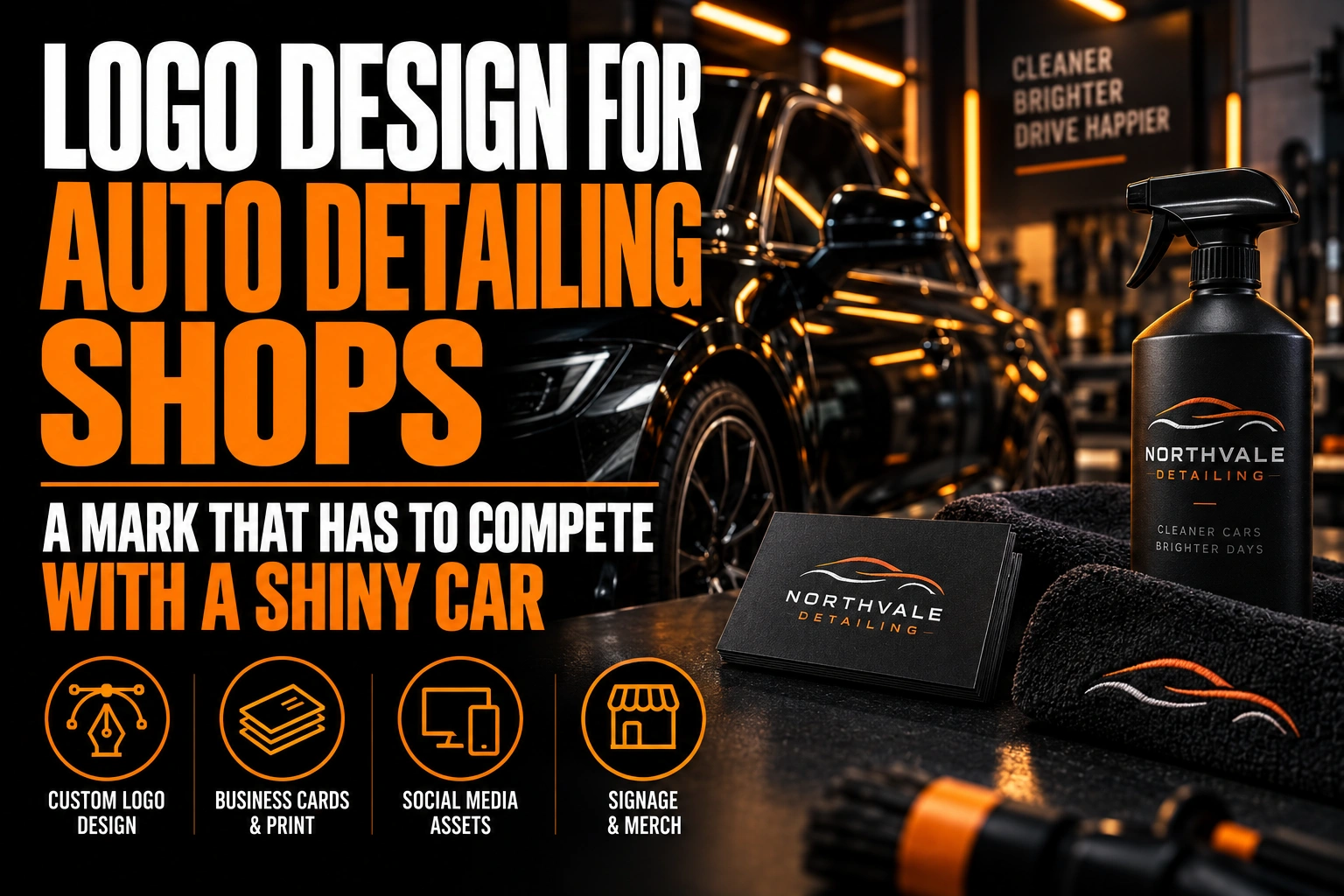
Logo Design for Auto Detailing Shops: A Mark That Has to Compete With a Shiny Car
An auto detailing logo works when it signs the finished car without competing with it. The gloss, the clean interior and the corrected paint are the product. The logo should sit beside that proof, never on top of it.
Key takeaways
- Place a small single-colour mark in the same corner of every photo, well away from the paint, like a signature.
- Leave chrome gradients and bevels out of the master file, since they break once embroidered, cut in vinyl or printed flat.
- Plan at least 3 versions: a horizontal lockup, a square icon and a single-colour watermark for photos.
Here is how to build a mark that holds up on before-and-after posts, Google listings, a van and an invoice.
Why does an auto detailing logo have to step back from the car?
A detailing logo has to step back because the customer is buying the result shown in the photo. Every post features a car with its own paint colour, chrome trim and manufacturer badge. A loud logo pulls the eye away from the reflection you spent the afternoon polishing.
That changes the brief. Most logos are designed to be noticed first. A detailing logo is designed to be noticed second, right after the viewer has been impressed by the work.
How is a detailing logo different from a car wash logo?
A car wash logo is read by drivers from the road. A detailing logo is judged up close, on a phone, inside photos of finished work. The first needs size and speed. The second needs restraint and precision at small sizes.
Detailing customers also scroll before they book. They compare ceramic coating results, paint correction close-ups and interior shots from several shops in the same city. Your logo appears dozens of times across that feed, so consistency matters more than impact.
How should your logo appear on before-and-after photos?
Your logo should appear as a small, single-colour mark in the same corner of every photo, well away from the paint. Treat it like a signature on a print, not a sticker on the hood.
Consistency does the branding work. When the mark always sits in the same spot, followers recognize your posts before they read the caption. Prepare a white version for dark interiors and evening shots, and a black version for bright exteriors.
Keep the edit honest, too. Google’s photo guidelines for Business Profiles ask for images that are in focus and well lit, without significant alterations or excessive filters. A huge logo overlay or a heavy filter on an after shot works against that standard. It also undercuts the trust a detailing result is supposed to build.
The same guidelines recommend 720 by 720 pixels for profile photos, with 250 by 250 pixels as the minimum. Your square icon should be built for that format from the start.
Which symbols make every detailing logo look the same?
Sports car silhouettes, water droplets, sparkle stars, polisher pads and chrome-effect lettering appear on a large share of detailing logos. Using one of them makes your shop easy to confuse with the next result in a search.
A stronger route starts with what makes your shop specific. That might be a monogram built from your initials or a wordmark with one distinctive letter. An abstract highlight line can also suggest a reflection without drawing a car. The guide to wordmarks, lettermarks, pictorial marks and combination logos explains how each structure behaves at small sizes.
If you specialize, say so through the name or a short tagline rather than the symbol. A clean line reading “ceramic coating” or “paint correction” tells a car owner more than a generic sparkle.
Should a detailing logo use chrome, gloss or metallic effects?
No, not in the master file. Chrome gradients, bevels and glossy highlights look impressive on a laptop. They break the moment the logo is embroidered, cut in vinyl or printed in 1 colour.
Build the logo flat first, as a clean vector. Effects can come later on a specific piece, such as metallic foil on a gift certificate, where the medium supports them. Our article on monochromatic logos shows why a single-colour mark tends to look more confident, not less.
A flat file also travels better between suppliers. The embroiderer, the sign shop and your social media scheduler all need different exports. Every one of them starts from the same print-ready vector file.
How many logo versions does a detailing business need?
A detailing business needs at least 3 versions: a horizontal lockup, a square icon and a single-colour watermark. Each one solves a different surface, and forcing one file to cover all of them usually crops or shrinks the name.
The horizontal version goes on the shop sign, the van door and the invoice header. The square icon covers Instagram, Google and booking apps, where profile photos are cropped into circles. The watermark is a stripped-down mark, often the icon alone, sized to sign photos without covering the work.
Our guide to horizontal, vertical and icon versions details how to derive each one from the same master. The article on adapting your logo for social media profile photos and banners covers the circle crop in detail.
How can a carousel post make your logo work harder?
A carousel lets you place the logo once, on the last slide, instead of stamping it on every image. The first slides show the before and after cleanly. The final slide carries the logo, the service name and a booking prompt.
This keeps the transformation clear while still ending on your brand. The article on using Instagram carousels to promote a product or service explains how to build a sequence people swipe through.
A mark that signs the work instead of covering it
We design detailing logos with the versions your posts need: a horizontal lockup, a square profile icon and a clean photo watermark.
Where else does a detailing logo show up besides social media?
Beyond social media, a detailing logo works on the shop wall, the van, staff shirts and the paperwork customers take home. The shop wall matters most, because it appears in the background of almost every photo you take.
A clean logo on the bay wall, lit evenly and placed behind where cars park, signs your photos naturally. Viewers see the brand in context, behind a finished car, without any digital overlay at all.
Mobile detailers have the van instead of a wall. It sits in a customer’s driveway for hours, in full view of the neighbours, so the same single-colour mark used on a sign or a banner should carry over cleanly to that surface.
Finally, think about the small pieces: the gift certificate, the invoice and the care card left on the passenger seat. Each one has to carry the logo in 1 colour on plain paper, without the glossy effects a screen can fake.
What to settle before your detailing logo signs its first after photo
Review these points with your logo designer before you post the next transformation.
- Build the master logo flat, with no chrome or gloss effects.
- Prepare 3 versions: horizontal, square icon and photo watermark.
- Size the icon for Google’s 720 by 720 pixel recommendation.
- Fix one watermark corner and one size, and keep them on every post.
- Skip the sports car silhouette and the sparkle star.
- Check that the logo still reads in 1 colour on a plain invoice.
How do I design a logo for a car detailing business?
Start from restraint: design a simple, flat mark that signs a photo of a finished car without covering the paint. Then build a square icon and a watermark from it.
What colours work best for an auto detailing logo?
Black, white and one accent colour cover most needs for an auto detailing logo. A limited palette stays readable on dark interiors, bright exteriors and plain paper invoices. Pick the accent for contrast against the cars you photograph most, not for how shiny it looks on a screen.
Should I watermark my before-and-after detailing photos with my logo?
Yes, with a small single-colour mark placed in the same corner every time. Keep it away from the paint and the area you corrected. A large overlay hides the result customers want to judge and makes the photo look edited.
Should an auto detailing logo include a car?
It can, but a sports car silhouette is one of the most common symbols in the detailing trade. A distinctive wordmark, a monogram or an abstract reflection line usually separates a shop more clearly. It also avoids clashing with the real car shown in every photo.
What size should a detailing logo be for a Google Business Profile?
Google recommends 720 by 720 pixel images for Business Profile photos, with 250 by 250 pixels as the minimum. A square icon version of a detailing logo fits that format without cropping the name. Export it as a PNG from the vector master file.
Conception-Logo.com has completed more than 5,000 projects. Start with a professional auto detailing logo design built to sign your work, not compete with it.