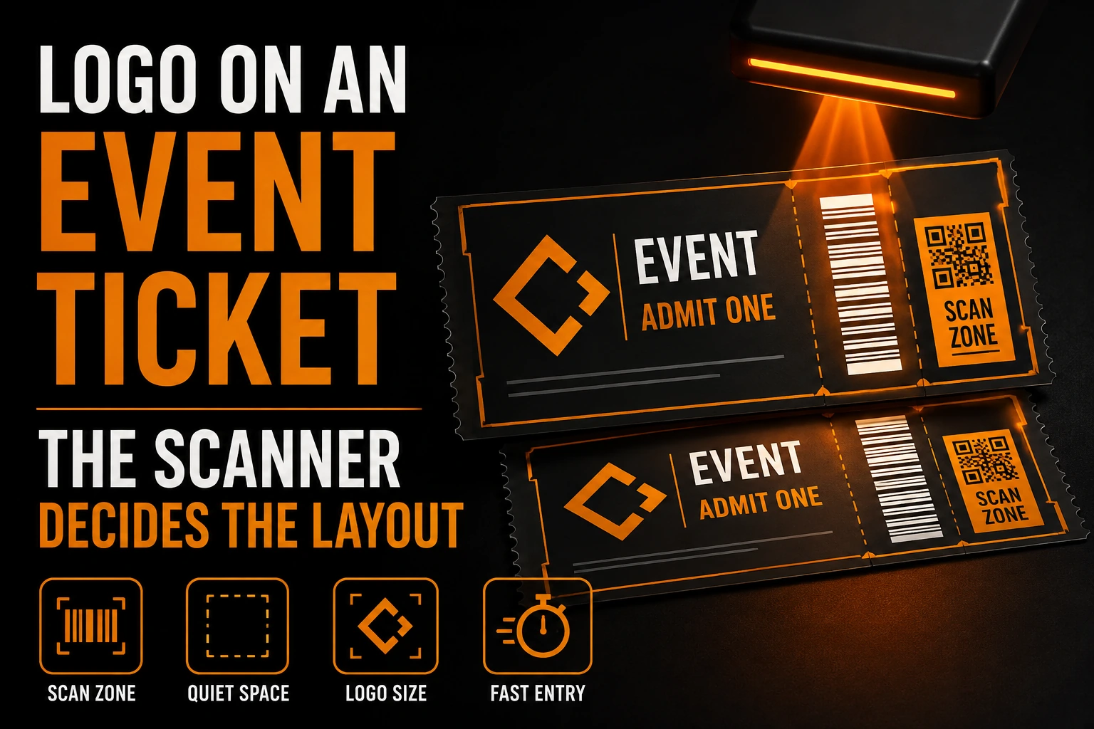
Your Logo on an Event Ticket: The Scanner Decides the Layout
Every branded object your business produces is read by a person. An event ticket is read by a person and by a machine, and only one of them can be persuaded to try harder.
Key takeaways
- Keep logos and photos out of the blank border around the code, since cropping into it can make the scan fail.
- Place your logo beside the QR code rather than in its centre, so error correction can absorb creases and rough prints.
- Size the code and logo for the thermal printer at the door, which sets your minimum sizes more than the phone screen.
That single fact reorders everything. On a poster, a badge or a business card, the design decides where the eye goes. On a ticket, a scanner decides what the layout is allowed to be, and your brand gets whatever room is left over. Designers who treat a ticket as a small poster produce tickets that look excellent in a mockup and stall a queue at the door.
A ticket is a scan target with decoration around it
A ticket has three jobs, in a strict order.
It has to be scanned in under 2 seconds, by a volunteer holding a handheld reader, in a doorway, often at night, from a phone screen held by someone also carrying a coat. It has to tell that volunteer, without being scanned, which event and which admission type they are looking at. Only then does it have to look like it came from you.
The first job is binary: either the code reads or the line stops. The second is human and forgiving. The third is where your brand lives, and it matters, because a ticket is one of the few branded objects an attendee looks at twice, once on the way in and once weeks later in an inbox.
Why does the quiet zone decide your ticket layout?
The scanner needs a blank border to find the code. Crop into that border with a logo or a photo, and the code can fail even if every module is printed correctly.
DENSO WAVE, which developed the QR code, states that the symbol requires a clear margin 4 modules wide on every side. A module is one of the small squares making up the code. That margin is not a design preference you can trim to fit a logo: a scanner uses the blank border to locate where the code starts and ends, so a graphic element encroaching on it can make a technically perfect code unreadable.
The practical consequence is easy to forget. Draw the code, draw its 4-module margin, treat the two together as one locked object, and design around the outside of it. Nothing crosses the boundary: not a logo, not a background photograph, not a coloured band, not a rounded corner that clips it.
That settles a question which comes up in every ticket project. A low opacity watermark of your logo behind the whole ticket looks refined, but running it under the code introduces texture into an area a scanner treats as empty. Keep the watermark, stop it at the locked object.
The door printer is the real constraint, and it is worse than the screen
Most tickets are shown on a phone. Some are printed at the box office, on the same class of thermal printer that produces a store receipt, and that printed version sets your minimum sizes.
DENSO WAVE publishes minimum module sizes by printer type, and thermal is the least forgiving on the list: 0.33 mm on a 300 dpi thermal printer, rising to 0.5 mm on a 200 dpi one, because each module should be made up of 4 or more printer dots. A larger module is more stable and easier to read.
Two things follow. First, the code cannot shrink to make room for your brand: if the layout is tight, your logo moves. Second, a thermal printer has no colour and no reliable greys. It puts a dot down or it does not. Any part of your identity that depends on a gradient, a tint, a soft shadow or a pale corporate grey comes out as solid black or as nothing, and you do not control which from the design file. A ticket layout needs a version of your logo that is pure black on white and still recognisable, the same discipline that governs any logo destined for a print process that rejects the file you have.
What does the ticketing platform do with the logo you upload?
If you sell through a ticketing platform, you do not design the ticket. You fill slots in someone else’s template, and the template has opinions.
Eventbrite, to take a documented example, recommends a 1:1 ratio for the organizer profile image, something on the order of 400 by 400 pixels, and states that a main event image which is not 2:1 will be cropped using a focus point. Those two facts describe the whole problem with third party ticketing: your identity is poured into two fixed shapes, one square and one wide, neither of which is the shape your logo was designed in.
A wide horizontal logo, the most common format for a business, is the worst possible candidate for a square slot. It will either be letterboxed with large empty margins, which reads as an accident, or shrunk until the wordmark is unreadable at the size the slot is actually displayed. The fix is a genuinely square lockup, usually a symbol alone or a stacked arrangement, prepared once and kept with your other files. This is one of the assets worth naming when you decide which logo files to ask your designer for.
For the wide slot, remember the crop is computed from a focus point, not from your composition. Keep the mark away from the corners and assume the outer band may not survive.
Error correction is not permission to cover the code
Somewhere in every ticket project, someone suggests putting the logo in the middle of the QR code, because they have seen it done.
QR codes carry 4 levels of error correction, named L, M, Q and H, and DENSO WAVE notes that level M, which restores 15% of the code, is the one most frequently used. That redundancy exists so a code survives a scuff, a fold, a thumbprint or a bad print run. A logo over the centre spends that budget on purpose, before the ticket has been handled at all. On a poster in a lobby, that trade can be acceptable. On a ticket it is a bad one: the ticket will also be creased in a pocket, printed on thermal stock, or shown on a scratched screen. Put the logo beside the code, not on it.
The screen it will actually be scanned from
Design reviews happen on a colour calibrated monitor at full brightness. Scans happen on a phone that has dimmed itself to save battery, at an angle, sometimes behind a cracked protector.
Two rules follow. Keep the code on a plain white field rather than on your brand colour, because contrast is what a reader needs and no palette is worth a rescan. Set the human readable information, the event name, the date, the door time and the admission type, large enough to be read at arm’s length, since that is what lets a volunteer sort a queue without scanning anything. Your brand does its work in the band above and below all of this, and that is enough. A ticket that reads instantly and carries a well set logotype at the top does more for a reputation than a ticket that is beautiful and slow. Getting that band right is ordinary graphic design work, and it is far cheaper to do once, in advance, than to improvise the week tickets go on sale.
Get the square lockup before the platform crops you
We prepare the square, stacked and pure black versions your ticketing platform and door printer will ask for, so nobody improvises them the week of the event.
What survives a screenshot
Many attendees will not open your email at the door. They will have screenshotted the ticket days earlier, because the venue has poor reception and they know it.
That screenshot is a flat image, so every live element is gone: the web font loading from a server, the animated header, the dark mode variant that was going to be chosen at display time. Design the ticket so the screenshot is the real product, with everything that matters, brand included, baked into the pixels. This is the same failure mode as a logo that degrades once it leaves the environment it was designed in, and the test is easy: screenshot your own ticket on the cheapest phone in the office and look at it in a dim room. If it fails, the source files are usually the cause, which is where a design team earns its fee.
What should you check before the ticket goes to print?
Design outside the code’s protected zone, size everything for the thermal printer at the door, and prepare square and pure black logo versions before the event goes on sale.
- The scanner comes first. Draw the code, add its 4-module margin, lock the two together, design outside that object. Nothing crosses into the quiet zone, not even a low opacity watermark of your own logo.
- Size the code for the thermal printer at the door, not for the phone. That is the tightest case.
- Prepare a pure black version of your logo. Thermal printing has no colour and no dependable greys.
- Prepare a genuinely square lockup. Platform profile slots are square, and a wide logo does not survive one.
- Assume the wide image is cropped from a focus point, so keep the mark away from the edges.
- Do not place the logo over the code. Error correction exists to survive handling, not decoration.
- Test the screenshot on a dim phone screen, because that is what most people will present.
Where can I put my logo on an event ticket without blocking the scan?
Five questions come up on almost every ticket project.
Can I put my logo in the middle of the QR code on a ticket?
Possible, but not advisable on a ticket. QR codes offer 4 error correction levels, and the commonly used one restores 15% of the code. That redundancy is what lets a ticket survive a crease, a thumbprint or a rough thermal print. Covering the centre spends it before the ticket is handled. Place the logo beside the code.
What size should the QR code be on a printed ticket?
Size it for the printer that will actually produce it. Guidance from the developer of the format gives a minimum module size of 0.33 mm on a 300 dpi thermal printer and 0.5 mm on a 200 dpi one, with the recommendation that each module cover 4 or more printer dots. Derive the code size from the module size and the number of modules your data needs, then leave the 4-module margin on every side.
Why does my logo look wrong on the ticketing platform?
Almost always because the slot is a different shape than your logo. Platforms use fixed ratios, commonly a square for the organizer image and a wide one for the event image, and they crop anything that does not match. A wide horizontal logo in a square slot is either floating in empty margins or shrunk past legibility. The answer is a separate square lockup, not a resized copy.
Should the ticket use my brand colours?
Around the code, yes. Under it, no. Keep the code dark on a plain white field: a scanner needs contrast more than the ticket needs consistency, and the printed version may have no colour at all. Your palette belongs in the header band and the footer.
Does the digital ticket need a different design than the printed one?
They should share one layout, designed against the harder constraint, the printed one. A layout that survives a thermal printer survives a screen. The reverse is not true, and discovering that on event night is expensive.