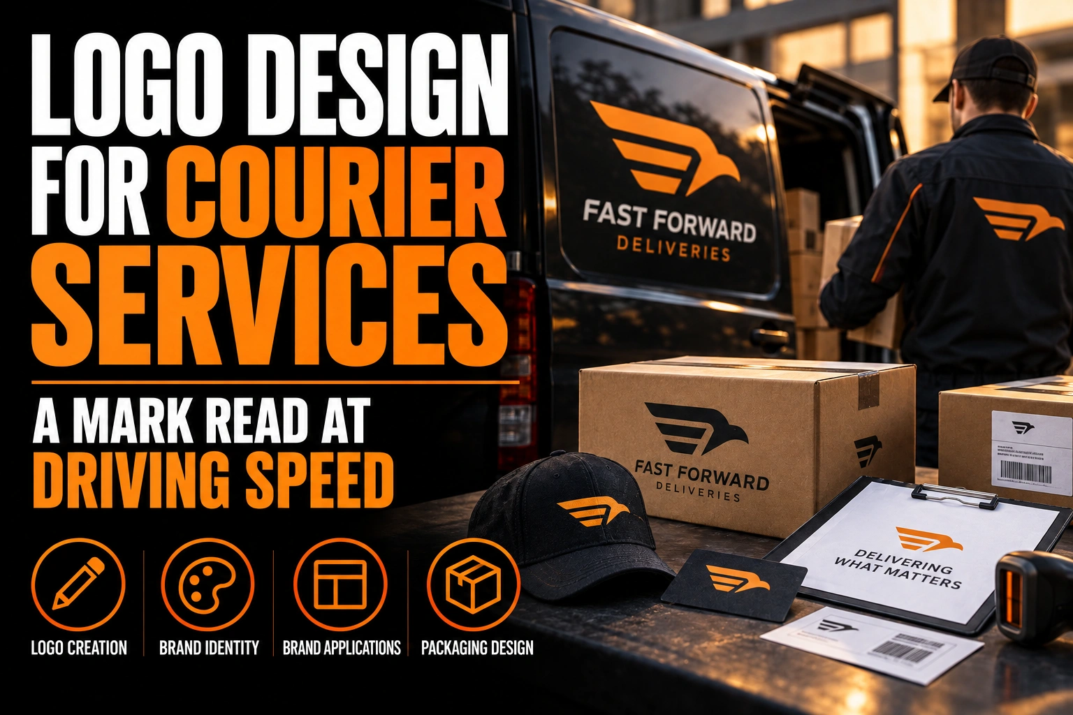
Logo Design for Courier Services: A Mark Read at Driving Speed
A courier service logo must be recognized in about 3 seconds on a moving vehicle, then remain recognizable as a small app icon. Build it around one distinctive shape, a readable name, and 4 coordinated formats instead of one complicated badge.
Key takeaways
- Build a courier logo around one distinctive shape and a readable company name rather than one complicated badge.
- Use the core symbol for the app icon instead of squeezing the full company name into a small square.
- Choose a primary colour that stays distinct on your fleet’s actual paint, then define a high-contrast fallback.
This guide focuses on the mark itself across courier touchpoints. It does not repeat full vehicle-wrap production, truck-side orientation, or shipping-label rules covered by separate published guides.
What should a courier service logo communicate first?
A courier logo should identify the company before it explains every service. Reliability, movement, and local reach matter, but a customer must first connect the mark to one specific carrier.
Parcel boxes, vans, arrows, wings, and speed lines communicate delivery quickly. They also appear throughout the category. Combining several of them creates a busy emblem that still looks generic.
Choose one idea and make it ownable. A letter from the company name can become a route. A negative-space opening can suggest a parcel. A simple directional shape can imply movement without copying a road sign.
The vehicle already tells viewers that the business moves goods. The uniform, handheld scanner, and parcel add more context. Your logo does not need to illustrate the complete delivery process.
How large must the company name appear on a moving van?
The name must stay readable from the distance and angle where another driver first notices the vehicle. Small lettering that looks balanced on a monitor disappears once the van enters traffic.
The Federal Highway Administration reports a road-sign reference of 1 inch of high-contrast character height for every 30 feet of viewing distance. A commercial logo is not a traffic sign, so use that figure as a legibility reference, not a legal specification.
At 60 feet, that relationship points to letters near 2 inches tall. A viewer may see the van farther away, at an angle, or beside visual clutter. Testing printed artwork at realistic scale remains more useful than trusting an enlarged screen preview.
Prioritize the company name and the distinctive mark. A phone number or short web address can form a second tier. Service lists, long taglines, and social handles compete for the same brief glance.
Our published guide to vehicle wrap design covers the larger composition across doors, panels, and windows. Here, the requirement is narrower: the logo must remain identifiable before any supporting message can work.
Which shapes stay recognizable when the vehicle moves?
A compact silhouette with clear negative space survives motion better than a detailed illustration. The viewer should recognize its outer shape before noticing internal detail.
Test the mark as a solid black shape. If its identity depends on a gradient, tiny road lines, or several parcel outlines, it will weaken on vinyl and disappear at distance.
Direction also needs care. An arrow embedded in the symbol can appear to move forward on one van side and backward on the other. A neutral shape avoids that conflict. If direction is essential, prepare left-facing and right-facing symbols while keeping the wordmark readable.
This is not the same problem as a moving truck’s roll-up door and mirror view. Our article on moving-company logos handles those surfaces. A courier fleet needs faster recognition across compact vans, cars, bicycles, and digital dispatch screens.
How can the same identity work as an app icon?
The app icon should use the logo’s core symbol, not squeeze the entire company name into a small square. Consistent shape and colour connect the dispatch screen to the vehicle outside.
Apple’s Human Interface Guidelines recommend simple, recognizable app icons with minimal shapes. Apple also advises keeping primary content centred because the operating system applies its own mask and corner treatment.
The current Apple production canvas for iPhone, iPad, and Mac icons is 1024 by 1024 pixels. That large source still gets reduced to much smaller interface sizes. Fine detail can therefore exist in the file while remaining invisible in actual use.
Do not place a phone number, URL, or delivery promise inside the icon. The app name usually appears beside it. A strong initial, route shape, or simplified parcel symbol is enough.
A responsive logo system formalizes this reduction. It defines what disappears at each size while preserving the visual cue customers already saw on the van.
Which 4 logo formats does a courier company need?
A courier company needs 4 coordinated formats because no single arrangement fits a van side, rear door, uniform, parcel label, and app icon equally well.
- Horizontal lockup: the symbol and name sit side by side for long vehicle panels and website headers.
- Stacked lockup: the symbol sits above the name for rear doors, jackets, and square signs.
- Icon: the symbol works alone for dispatch apps, social profiles, favicons, and scanner screens.
- Single-colour version: the complete mark reproduces without gradients on labels, stamps, uniforms, and simple vinyl.
Each format must feel like the same company. Reusing one shape, one typographic voice, and a controlled colour system creates that continuity.
Conception-Logo.com’s documented services include logos and visual identity. That scope lets the master mark and its reduced versions be planned together, instead of leaving a sign installer or app developer to invent missing artwork later.
Show the 4 formats together during approval. Seeing them as a family exposes inconsistencies in stroke weight, spacing, and symbol proportions before those differences spread across vehicles and software.
If your current file only works in one layout, a professional logo design service can build the horizontal, stacked, icon, and single-colour versions as one system.
Give every delivery touchpoint one recognizable mark
We design a courier identity that stays clear on a moving van, a uniform, and a compact app icon, with the versions your suppliers need.
How should colour work across vehicles and screens?
Choose a primary colour that remains distinct on the fleet’s actual paint colour, then define a high-contrast fallback. A white van, dark jacket, and phone screen create 3 different backgrounds.
Colour can support recognition, but shape must carry the identity when colour is unavailable. Test the mark in black, white, and greyscale before approving the palette.
Avoid assigning too many colours to individual service levels. Same-day, scheduled, and local delivery can use interface labels without turning the main logo into a coded legend.
Our guide to logo colour choices by industry explains the broader associations. For courier use, contrast against real surfaces matters more than a generic claim that one hue always means speed or trust.
What files should you hand to installers and developers?
Give suppliers editable vector masters plus approved raster exports. The installer needs scalable paths, while the app team and office staff need files they can place without opening design software.
Request AI, EPS, SVG, or vector PDF masters. Add transparent PNG exports for routine digital use. Include the 4 approved layouts and both full-colour and single-colour variants.
Name files by use, not by unexplained version numbers. “CourierLogo_Horizontal_FullColour.svg” is safer than “final_logo_v7.svg.” Clear names reduce the chance that an old or unsuitable version reaches production.
Define minimum size and clear space in a short brand sheet. The published guide on logo clear space and minimum size shows why these limits protect recognition.
A second link to the logo design service is useful when those production versions do not yet exist. Creating them centrally prevents each vendor from redrawing the mark differently.
What to test before branding the first delivery vehicle
Approve the identity only after testing it in the situations where customers and drivers will actually see it.
- Read the company name from at least 60 feet using a printed or full-scale proof.
- Reduce the symbol to an app-sized square and check that its core shape remains clear.
- Test the full-colour mark on white, dark, and photographic backgrounds.
- Confirm the logo still works as one solid colour for labels and simple vinyl.
- Check directional symbols on both vehicle sides without mirroring any letters.
- Deliver all 4 formats as named vector masters and ready-to-use PNG files.
How do you design a courier logo for vehicles and apps?
Start with one distinctive shape, pair it with a readable company name, and build 4 coordinated formats for long, square, small, and single-colour uses.
What makes a courier service logo easy to recognize?
A courier logo becomes easy to recognize when it uses one distinctive shape, a short readable name, and a controlled colour palette. The same core shape should remain visible on a van, uniform, parcel label, and app icon.
Should a delivery company logo include a van or a parcel?
It can, but it does not need to. Vans, parcels, wings, and speed lines explain the category quickly, yet they also make many courier brands look alike. A distinctive abstract mark or letterform can identify the company more effectively once the vehicle and delivery context already explain the service.
How many versions of a courier logo are needed?
Most courier companies need at least 4 coordinated versions: a horizontal lockup for vehicle sides, a stacked version for rear doors and uniforms, an icon for apps and profiles, and a single-colour version for labels and simple production methods. These should come from one master identity rather than separate designs.
What file format should a courier company request?
Request editable vector masters in AI, EPS, SVG, or vector PDF, plus ready-to-use PNG exports. Vector files let a sign shop scale the mark for a van, while PNG files support dispatch software, profiles, and everyday office use.