

Logo Design for Financial Advisors: How to Signal Trustworthiness in a Competitive Market
Financial advisory is one of the highest-trust professional categories. A client selecting a financial advisor is making a decision that will affect their retirement security, their family’s financial future, and often the most significant wealth accumulation of their lifetime. Trust is the primary purchase driver, not price, not convenience, and often not even track record, which is difficult for most prospects to evaluate objectively. Visual identity communicates trust signals before any conversation, before any credentials are reviewed, and before any performance data is examined.
The Trust Communication Challenge
Financial advisors must communicate authority and competence, to justify the client’s trust with significant assets, and warmth and approachability, to ensure the client feels comfortable discussing personal financial matters. A logo that communicates authority without warmth feels cold and institutional, inappropriate for an independent advisor whose primary competitive advantage is personal relationship. A logo that communicates warmth without authority feels informal and inexperienced, exactly the opposite of what a client needs to feel before entrusting their financial future to a professional.
Color: The Most Immediate Trust Signal
Navy blue is the most effective color for financial advisory logos because its trust associations are universal, cross-demographic, and deeply established. It has been used by financial institutions for decades precisely because it consistently communicates the stability and reliability that financial clients evaluate when making selection decisions. Deep forest green communicates stewardship and long-term perspective. Charcoal grey communicates sophisticated analytical capability. Gold and warm bronze as accent colors communicate premium positioning. Bright energetic colors conflict with the measured, trustworthy positioning all financial advisors need to project.
Typography: The Second Trust Signal
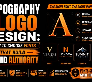
Typeface choice communicates depth, experience, and professional character that color alone cannot convey. Transitional serif typefaces, Baskerville, Times, communicate formal authority and established expertise. Humanist sans-serif typefaces communicate modern accessibility alongside professionalism, working well for advisors targeting younger wealth accumulators or entrepreneurial clients. The typeface weight matters: medium to bold weights communicate confidence and directness; light weights communicate refinement and restraint.
Frequently Asked Questions About Financial Advisor Logo Design
What visual qualities communicate trustworthiness in a financial advisor logo?
Stability (balanced grounded compositions), precision (clean exact geometry and typography), restraint (limited color palettes and deliberate white space), and maturity (typefaces with depth and colors in the deeper end of the palette rather than bright energetic tones).
Should a financial advisor use their personal name or a firm name?
Advisors who are the primary relationship driver benefit from personal name branding. Advisors building a practice beyond their personal involvement benefit from firm name branding. Advisors planning to sell their practice benefit from firm name branding that creates a more transferable asset.
What colors communicate well for financial advisory logos?
Navy blue for trust and stability. Deep forest green for stewardship and long-term perspective. Charcoal grey for analytical sophistication. Gold and warm bronze as accent colors for premium positioning. Bright energetic colors are inappropriate for financial advisory branding.
What design elements should a financial advisor logo avoid?
Generic financial symbols (dollar signs, coin stacks), bright energetic colors, complex emblems with fine details that become illegible at small sizes, and any design element suggesting impermanence, risk, or instability.
How important is a logo for a financial advisor building a referral-driven practice?
Highly important. Referred prospects research the advisor before making contact. A professional visual identity confirms the positive impression the referral created. An amateurish identity creates doubt that undercuts the referral’s recommendation. The logo is often the first thing a referred prospect sees.





No comment