Your Logo on a Golf Ball: A Curved Surface With Holes in It
A branded golf ball is one of the few pieces of company material that a client keeps, uses, loses and replaces without ever thinking about it. For a corporate tournament, a client gift or a supplier thank you, it is also one of the few objects where your mark is examined closely, held at arm’s length, and then hit with a stick.
Key takeaways
- Keep your golf ball logo to one or two colours, since pad printing lays down a single colour per pass.
- Place the imprint around the middle of the ball, where the surface is flattest and prints most predictably.
- Send a vector file with type converted to outlines and colours named as spot references, not screen values.
It is also the most geometrically hostile surface your logo will ever meet. Every other object in your brand kit gives you a flat plane. A golf ball gives you a small sphere covered in several hundred shallow holes, and the printable part of it is smaller than most people expect.
What this article does not cover
It does not cover promotional objects in general, nor printing methods that lay ink on a flat item. It does not cover apparel, bags or anything sewn. It stays on one narrow question: what a dimpled sphere does to the drawing of your logo, and what the printer needs from you before a run starts.
Three constraints arrive at the same time
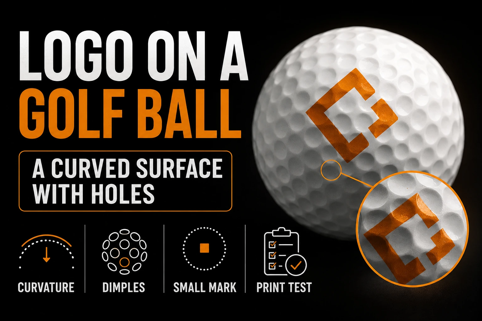
The first is area. The usable print zone is a small circle roughly the size of a coin, and it has to hold everything you want people to see. That is not a limitation you can negotiate, because the ball does not get bigger.
The second is curvature. The surface falls away in every direction from the centre of the imprint. A shape that is perfectly square in your file will not look square on the ball, because its outer edges sit further from the eye than its middle. Long horizontal wordmarks suffer the most, since their ends curve out of view first.
The third is texture, and it is the one nobody anticipates. The ball is covered in dimples. Ink sits on that surface rather than filling it, so every dimple under your mark leaves a small depression in the printed shape. Solid forms handle this without trouble. A hairline rule, a thin serif or a one point outline does not, because a single dimple can break a stroke that is barely wider than the dimple itself.
Where the mark sits changes how well it prints
Manufacturers place the imprint around the middle of the ball rather than near the top or the bottom, and the reason is practical rather than aesthetic. Toward the poles, the curvature increases sharply and the dimple pattern converges, so the pad has to deform more to make contact and the ink film becomes uneven. The band around the middle is the flattest and most predictable part of the surface.
This has a consequence for your artwork. A tall, stacked logo pushes toward those poles as soon as it is scaled up to be legible. A wide, low logo stays in the good band but runs out of room sideways. The version that survives is usually neither: it is a compact, roughly square arrangement, which is exactly the shape most brand logos are not.
There is a second consequence that people discover after the order arrives. A ball rotates. Unlike a sign or a business card, there is no correct orientation, and the mark will be seen upright, sideways and upside down within the same round. Anything that depends on being read in one direction, such as a long tagline, is effectively decoration.
One or two colours, and that is the honest limit
The standard method for this object lays down a single colour per pass by picking ink out of an etched plate with a soft pad and pressing it onto the ball. It is the right process for clean edges on a curved surface, and it repeats reliably across a large order.
What it does not do is blend. Each colour is a separate pass, which means a separate plate, a separate alignment and a separate chance of the two passes not landing on top of each other. On a flat card, a small registration error is invisible. On a sphere the size of a coin, it is the whole logo.
So the practical range is one or two solid spot colours. Gradients, drop shadows, soft edges and photographic elements are not options to be argued about with the supplier, they are things the process cannot produce. If your identity depends on a gradient, this is one of several surfaces where you will need a flat equivalent, prepared once and reused. The same reasoning applies to engraving, embroidery and single colour signage, and it is the reason a serious brand kit contains more than one file. Our guide on the logo files to request from your designer lists what that set normally includes.
A one colour version built for a surface this small
We rebuild your logo as clean vector outlines, thicken what would close up at coin size, and deliver the simplified spot colour version a ball printer can use without redrawing it themselves.
How to simplify without losing the brand
Simplifying is not the same as redrawing. The goal is a version that a stranger recognises as yours, not a new mark. Four moves usually get there.
Remove the tagline. It is the first thing to go on any small surface, and nobody has ever read one on a golf ball. Remove the outline if the shape already reads without it, because an outline at this scale eats into the counters of the form it surrounds. Thicken thin strokes, especially connecting strokes inside letters, so that no part of the drawing is close to the width of a dimple. And open tight gaps between elements, since ink spreads slightly on contact and two shapes that nearly touch in the file will touch on the ball.
If your logo is already minimal, most of this is already done. If it is detailed, resist the temptation to shrink it and hope. A shrunk detailed logo does not read as detailed, it reads as smudged, which is worse than a simple mark. Our article on professional vectorization compared with automatic tracing explains why an automatic conversion tends to produce exactly the fragile edges this surface punishes.
What to send, and what to ask for back
Send a vector file. Convert type to outlines so the printer’s software cannot substitute a font. Specify colours as named spot references rather than as screen values, because the ink is mixed to a standard and not built from a screen preview. Include the simplified version explicitly, labelled as the one to use, rather than leaving the supplier to guess which of your files is the right one. If you are unsure whether your current file qualifies, our guide on what to do when a printer rejects your logo file covers the usual causes.
Then ask for one thing back before the run: a physical sample on the exact ball model you ordered, not a rendering. A rendering shows a smooth sphere. The ball is not smooth, and the only honest preview is ink on the real surface. If a supplier will not produce one for a large order, that is useful information in itself. A properly rebuilt vector file is what makes that sample worth looking at, because any flaw you see will be a process issue rather than a file issue.
Takeaways
- Treat the imprint area as a coin sized circle, not a canvas.
- Keep the mark in the band around the middle of the ball.
- Aim for a compact shape rather than a wide or tall one.
- Limit the design to one or two solid spot colours.
- Drop the tagline and any hairline detail.
- Thicken strokes so nothing approaches dimple width.
- Send vector artwork with outlined type and named colours.
- Approve a physical sample on the real ball, never a rendering.
Frequently asked questions
Can I use my regular logo file on a golf ball?
Rarely without changes. The printable area is small, curved and interrupted by dimples, so thin strokes, small type and tight counters close up. Most brands need a simplified version built specifically for this surface, usually the symbol alone or the symbol with a very short wordmark.
How many colours can a golf ball imprint carry?
Pad printing lays one colour per pass, so one or two solid spot colours is the practical range for a clean result. Every additional colour adds a pass and a chance of misalignment on a surface that curves away in every direction, which is why gradients and photographic effects are not viable here.
Where on the ball does the logo go?
Around the middle of the ball rather than at the top or the bottom. Near the poles the curvature increases sharply and the dimple pattern converges, so ink transfer becomes uneven. Keeping the mark in the flattest band available is what keeps it consistent across a full order.
Will the dimples show through my logo?
Yes, and that is normal. The ink follows the surface, so every dimple under the mark leaves a small dip in the printed shape. Solid areas absorb this well. Hairlines and small text do not, because a single dimple can interrupt a stroke that is only slightly wider than the dimple itself.
What file should I send for a golf ball imprint?
A vector file with type converted to outlines, colours specified as named spot references rather than screen values, and a simplified one or two colour version prepared for a small round surface. A web image cannot be used, because the printer has to scale and separate the artwork before making the plate.