Your Logo Is on the Job Posting: What Candidates See Before They Read a Word
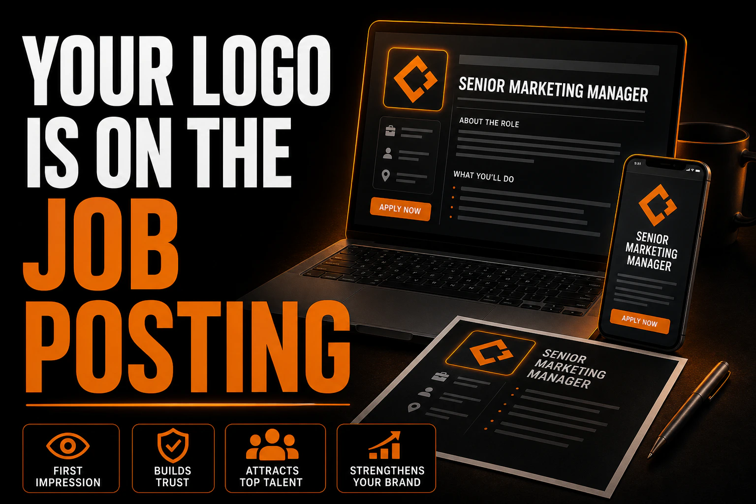
Most small businesses think about their logo in terms of customers. It goes on the truck, the invoice, the storefront, the proposal. Then hiring gets hard, a job posting goes online, and that same logo shows up in a completely different context: a vertical list of employers, each one reduced to a small square, scrolled through by someone deciding in about two seconds whether your company is worth reading about.
That is a different job for the same image, and almost nobody designs for it.
The logo on your posting may not be the one you uploaded
Here is the part that surprises employers. When a job posting appears in Google search results, the logo shown beside it is not necessarily the file attached to the posting.
Google’s own documentation for job posting structured data is explicit about this. For postings that come through a third party job site, it states that “Google will pick the best logo to display in Search results, whether it’s the knowledge panel logo or the hiringOrganization logo.” For companies posting directly on their own site, it goes further: “Google uses the same logo for your job postings as the image shown in your company’s Knowledge Graph card.”
Read that again, because it has a practical consequence. The image representing your company to job seekers may be pulled from a knowledge panel that was assembled from public sources, possibly years ago, possibly from an old version of your brand. Google’s own troubleshooting guidance acknowledges the failure case directly, describing sites where the knowledge panel “shows an incorrect logo,” and the remedy is either to specify the organization logo in your structured data or to correct the panel itself.
So the honest answer to “which logo do candidates see” is: the one your systems can prove is yours. If nothing on your site declares it clearly, something else fills the gap.
One technical rule worth knowing before you export anything
The same documentation states a single hard constraint on the image: “the image width and height ratio must be between 0.75 and 2.5.”
That range is narrower than people assume. It permits a square, a moderately tall image, and a moderately wide one. It does not permit the long horizontal lockup that many companies use as their only logo file, the kind where a small symbol sits beside a company name written out in full. A logo that is five times wider than it is tall falls outside the range entirely.
This is the same structural problem that shows up in app icons, directory listings and social avatars, and it has the same solution. A brand needs more than one arrangement of its own logo. At minimum, a horizontal version for wide spaces, and a compact version, closer to square, where the symbol carries the recognition and the wordmark is reduced or dropped. If you only have one file, you do not have a logo system, you have a logo.
On a job board, you are not read, you are compared
A customer usually arrives at your brand alone. They searched for a service, they landed on you, and there is no competitor sitting three centimetres below.
A candidate never sees you alone. Job boards are lists. Your logo appears in a column with fifteen other employers hiring for the same role in the same region, at the same tiny size, on a phone. The comparison is involuntary and it happens before a single line of your job description is read.
This changes what “good” means for that image. Detail loses. A crest with fine linework, a tagline set in small type, a gradient that reads as grey mush at forty pixels: these all survive on a letterhead and fail in a list. What survives is a clear silhouette, real contrast, and a shape that is not interchangeable with the four generic marks around it.
For small and mid sized employers in Quebec competing for skilled trades and technical staff, this is not a vanity concern. When several employers in the same trade post similar wages for similar work, the visual signal is one of the few differences a candidate can perceive before applying.
The second test happens on the first day
There is a second, harsher comparison, and it happens after the hire.
The candidate saw a clean logo on a screen. Then they arrive for the interview and see the actual company: the van in the parking lot, the sign over the door, the shirt the foreman is wearing, the safety helmet in the shop. If those carry a different version of the logo, an older one, a stretched one, or a rough approximation recreated by whoever did the lettering, the candidate registers an inconsistency they will not name out loud but will absolutely feel.
This is where employer branding stops being a marketing exercise and becomes a file management problem. The van, the shirt and the sign were each produced by a different supplier, at a different time, often from whatever file was available that week. The job posting is simply the first place where the gap becomes visible to an outsider who has not yet decided to trust you.
If you want one test that reveals the state of your brand honestly, this is it: put a photo of your posting, a photo of your vehicle and a photo of your entrance side by side, and ask whether a stranger would conclude these are the same company.
What this guide does not redo
Three neighbouring subjects are deliberately left out.
How to keep your brand consistent once other people start sending things out on your behalf, including where files live and what happens when a new employee opens a document on a different machine, is covered in a separate guide on brand consistency after your first hire. Optimizing profile images across each social platform is a different exercise with different dimensions, treated in Social Media Profile Design. And the technical preparation of a logo for stitching on uniforms and caps is its own discipline, covered in How to Prepare Your Logo for Embroidery.
What stays here is narrow on purpose: the image that represents your company to someone who has not applied yet, and whether it holds up.
One official file, in the shape every platform actually needs
If nobody in your company can name the one true logo file in ten seconds, that gap shows up the moment a candidate compares you to the employer next to you. We build a clean vector master, declined into the square, horizontal and single colour versions every supplier and platform actually asks for.
Three things to fix before your next posting
Decide, in writing, which file is the official one. Not “the one in the marketing folder,” an actual named file, in vector format, from which every export is made. If nobody in your company can answer that question in ten seconds, that is the real finding, and the complete checklist of logo files to request from your designer is the fastest way to know what you should already have.
Produce a compact version that fits inside the accepted ratio. Square or close to it, symbol led, legible at the size of a fingernail. Export it cleanly rather than cropping the wide version, because a crop leaves either dead space or a chopped wordmark, and both read as carelessness at small sizes.
Check what is actually on your vehicles and your signage. Not what you think is on them. Walk out and photograph them. Any version that does not match the official file is a version a candidate will see on the day they decide whether to accept your offer. Our guide to vehicle wrap design covers what a correct fleet application looks like.
When the fix is upstream
In a good share of the cases we see, the job posting is not the problem. It is the first place the problem becomes public.
The company has a logo drawn a decade ago, a sign installed from a low resolution file, a truck lettered by a third party who redrew the shapes by eye, and a digital file that matches none of the three exactly. Each version lived quietly in its own corner. A hiring push puts one of them on a screen next to competitors, and suddenly the inconsistency has an audience of people you are trying to recruit.
Fixing it starts with a clean master logo file in vector format, declined into square, horizontal and single colour versions, from which every supplier works without reinterpreting anything. That is the work we do at Conception-Logo.com, whether that means rebuilding from your existing logo or reconstructing it when the original files are gone.
If you are about to post a role and you are not sure which of your files is the real one, send us what you have. That question is usually settled faster than people expect, and it is worth settling before the posting goes live rather than after.
FAQ
Can Google really show a different logo than the one on my job posting?
Yes. Google’s documentation states that for third party job sites it will pick the best logo to display, whether that is the knowledge panel logo or the hiring organization logo, and that for companies posting directly, it uses the same image shown in the company’s Knowledge Graph card. Declaring your organization logo in your structured data is what gives you a say.
What image ratio does a job posting logo need?
Google’s requirement is that the image width and height ratio must be between 0.75 and 2.5. A very wide horizontal lockup falls outside that range, which is one reason a compact version of your logo matters.
My logo looks fine on my website. Is that enough?
Not necessarily. A website header gives your logo a wide space, a controlled background and no competition. A job board gives it a small square, an unfamiliar background and fifteen competitors on the same screen. Those are different tests and the second one is harder.
Should the job posting logo be different from my main logo?
It should not be a different logo. It should be a different arrangement of the same logo, which is a normal part of a brand system rather than a compromise. The symbol, the colours and the typography stay; the proportions and the level of detail adapt.
We are a small company. Does this really affect hiring?
It affects the moment before someone reads your posting, which is the only moment where a small employer and a large one are shown at the same size. In a tight labour market, being visually indistinguishable from every other employer in your trade is a cost, even if it never appears on a report.