How to Design a Promotional Flyer That Does Not End Up in the Trash
Most flyers are glanced at for a second and tossed. But a well-designed promotional flyer can grab attention, get read and drive real action, all for a very low cost per piece. The difference is entirely in the design and the message. A flyer that tries to say everything says nothing, while one with a clear hook, a focused offer and a strong call to action can outperform far more expensive marketing. This guide explains the principles that make a promotional flyer effective instead of disposable.
Key takeaways
- Build the top of your flyer around one dominant hook, such as a bold headline, a striking image or an offer.
- Focus on one clear message and one offer, since a flyer with competing messages overwhelms and gets discarded.
- Make the call to action prominent and specific, give a reason to act now, and consider a QR code to book.
You Have One Second to Grab Attention
A flyer competes for a sliver of attention, often while someone is deciding whether to keep it or bin it. That means the top of your flyer has to land an immediate hook: a bold headline, a striking image or an irresistible offer that makes someone pause. If the most important thing is not instantly clear, the flyer is gone. Designing for that first second, with one dominant focal point rather than a wall of equal-weight information, is the single biggest factor in whether your flyer gets read at all. Posters face the same test from much farther away, as explained in designing event posters seen from across the room.
One Clear Message and Offer
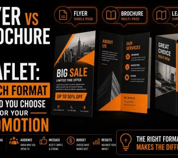
The most common flyer mistake is trying to communicate everything at once. An effective flyer has one clear message and ideally one compelling offer. Decide the single most important thing you want the reader to know or do, and build the flyer around it. Supporting details can be small and secondary. This focus is what makes a flyer easy to absorb in seconds. A cluttered flyer with five competing messages overwhelms the reader and gets discarded, while a focused one drives a single, clear action. If your message genuinely needs more room than one sheet, compare flyers, brochures and leaflets before you commit to a format.
Visual Hierarchy Guides the Eye
Good flyer design leads the eye in a deliberate order: hook first, then the offer, then the details, then the call to action. You create this hierarchy with size, color, contrast and spacing, making the most important elements biggest and boldest. When the hierarchy is clear, a reader absorbs your message effortlessly even at a glance. When everything is the same size and weight, the eye has nowhere to land and the message is lost. Thoughtful hierarchy is what turns a busy sheet into a readable, persuasive piece.
Color That Attracts and Directs
Color does double duty on a flyer: it attracts attention and it guides the eye. Bold, high-contrast colors help your flyer stand out on a crowded board or in a stack of mail, while a consistent accent color can highlight your offer and call to action. Your brand colors keep the flyer recognizable. Using color intentionally rather than randomly is key, a topic explored in our article on choosing logo colors. The right color choices make your flyer both eye-catching and easy to navigate.
A Strong, Clear Call to Action
A flyer that grabs attention but does not tell the reader what to do next wastes its moment. Every effective flyer has a clear call to action: visit, call, scan, book, redeem by a date. Make it prominent and specific, and give a reason to act now, such as a deadline or limited offer. A QR code can bridge print to digital, sending readers straight to a booking page or website. The call to action is where attention turns into a customer, so it deserves prominence, not a tiny line at the bottom.
Get a Flyer That Drives Real Action
We design promotional flyers with a strong hook, clear offer and print-ready files.
See our flyer design service →Why Print-Ready Files Make It Look Professional
A flyer’s impact depends on looking professional, and that requires print-ready artwork. Your logo and graphics must be sharp at print size, which means clean vector files, the foundation explained in our guide on logo quality at every size. A blurry logo or pixelated image instantly cheapens a flyer and undermines your message, the kind of problem described in our article on why low-resolution artwork fails in print. Clean files ensure your flyer looks credible and worth reading.
Common Flyer Mistakes That Send It to the Trash
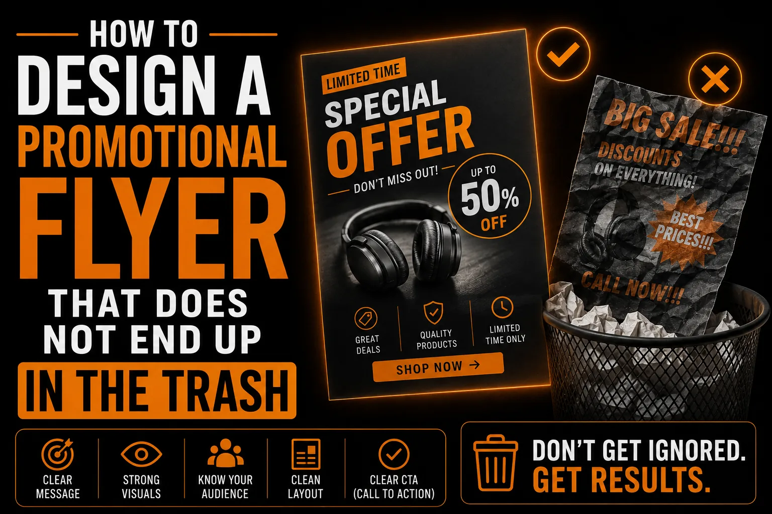
Flyers fail when they cram in too much, lack a clear focal point, use weak or no call to action, rely on low-resolution images, or simply look unprofessional. Any of these gives the reader a reason to toss it. The fix is a single clear message, a strong hook, deliberate visual hierarchy, a prominent call to action, and clean print-ready design. Get these right and your flyer earns a few more seconds of attention, which is all it needs to work.
Your Converting Flyer Checklist
Make sure your promotional flyer grabs attention and drives action.
- A bold hook at the top that lands in one second.
- One clear message and one compelling offer.
- A deliberate visual hierarchy guiding the eye.
- Eye-catching, intentional use of color.
- A prominent, specific call to action, ideally with urgency.
- Clean, print-ready vector artwork.
When your flyer covers these, it gets read and drives results. A professional flyer design service builds it to convert, not to be tossed.
Why a Good Flyer Is Such a Smart Investment
Few marketing tools offer a lower cost per impression than a well-designed flyer. Printed in bulk and distributed locally, it puts your offer directly into hundreds of hands for very little, and a strong design turns a fraction of those into customers. The economics only work, though, when the flyer is actually effective. Whether you operate in Montreal, across Quebec, throughout Canada or internationally, a focused, professional flyer can punch well above its cost, the kind of high-return, customer-engaging design our article on creative design and customer engagement describes. Done right, it is one of the most efficient promotions available.
A Real Scenario: Two Flyers, One Winner
A shop prints two flyers for the same sale. The first crams in every product, a paragraph of text and a small logo. The second leads with a bold headline, one clear offer and a prominent call to action. The second flyer fills the shop while the first is ignored, despite costing the same to print. The difference was entirely design and focus. This is why a clear hook, single message and strong call to action matter so much, and why clean, professional files, as our guide on logo quality at every size explains, complete the picture.
What You Receive With a Professional Flyer
A professional flyer comes as a polished, print-ready file built around your brand, with a clear hook, focused message, strong call to action and clean vector graphics. You receive files ready for any printer or digital sharing. This ensures your flyer looks credible and works hard for a very low cost, part of the lasting value described in our overview of professional design and vectorization. A well-designed flyer is one of the most cost-effective promotions there is.
Frequently Asked Questions
How do I make a flyer people actually read?
Lead with a bold hook at the top that lands in one second, focus on one clear message and offer, and use deliberate visual hierarchy so the eye moves in order. A focused, well-designed flyer earns the few seconds of attention it needs to work.
What is the biggest flyer design mistake?
Trying to say everything at once. A cluttered flyer with several competing messages overwhelms the reader and gets discarded. An effective flyer has one clear message and ideally one compelling offer, built around a single focal point.
Does a flyer need a call to action?
Yes. A flyer that grabs attention but does not tell the reader what to do next wastes its moment. Include a clear, prominent call to action, visit, call, scan, book or redeem by a date, ideally with a reason to act now.
Why does my flyer look cheap?
Usually because of low-resolution artwork or a blurry logo, which instantly undermines the message. Print-ready vector files keep your logo and graphics sharp at print size, making the flyer look professional and credible.
What do I receive with a professional flyer?
You receive a polished, print-ready file built around your brand with a clear hook, focused message, strong call to action and clean vector graphics, ready for any printer or digital sharing.