AI Logo for Web vs Print: Why the Same File Does Not Work Everywhere
Your AI logo looks crisp on your website, so it should be ready for business cards and signs too, right? Not quite. Web and print have different technical requirements, and a file that is perfect for one can fail completely in the other. Understanding the difference will save you from blurry prints and wasted money. For a related practical example, see our guide to the logo files needed for signs, shirts and the web.
Different Mediums, Different Rules
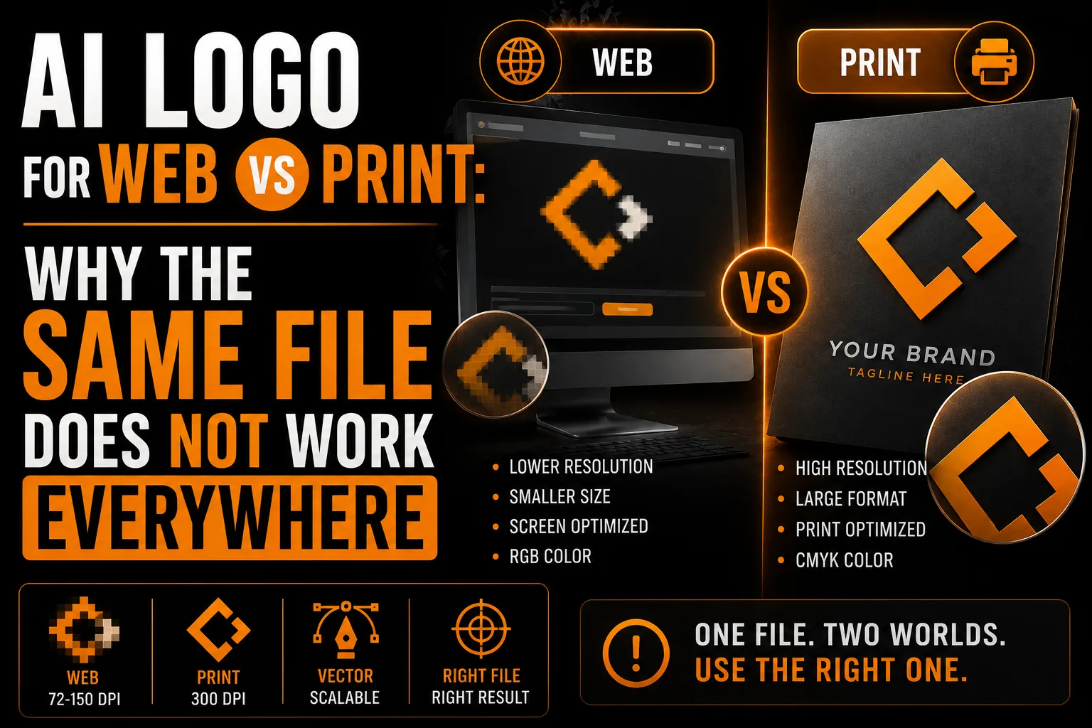
Screens display images using light and a relatively low pixel density, so a small, lightweight file looks sharp. Print lays down ink at high density on physical material, which demands far more detail. A file built for the screen simply does not carry enough information to print well at size.
Resolution: The Web vs Print Gap
Web images are commonly around 72 pixels per inch, which is plenty for a screen. Print generally needs 300 pixels per inch or, better still, a vector file. Your AI logo was almost certainly made for the screen, so sending it straight to a printer produces a soft, pixelated result.
One Logo, Ready for Web and Print
We vectorize your AI logo so it works perfectly on screen and in print, every time.
See vectorization service →Color Looks Different Too
Screens use RGB light while printers use CMYK ink. Colors that glow on your website can shift noticeably in print. A properly prepared logo accounts for this so your brand color stays consistent across both worlds.
The File That Works Everywhere
A vector logo solves the whole problem. Because it is built from mathematical shapes rather than pixels, it scales to any size for print and exports cleanly for the web. One vector master becomes the source for every web and print format you will ever need.
Getting There From an AI Logo
Have your AI logo vectorized into a clean master, then exported correctly for each medium. You end up with the right file for your website and the right file for your printer, with no surprises.
The Resolution Gap Between Screen and Paper
Screens display images using light at a relatively low pixel density, so a small, lightweight file looks sharp. Print lays down ink at high density on physical material and demands far more detail. Web images are commonly around 72 pixels per inch, while print generally needs 300 or, better, a vector file. Your AI logo was almost certainly made for the screen, so sending it straight to a printer produces a soft, pixelated result, the same gap explained in our guide on logo quality at every size. Understanding this is the key to never being surprised by a blurry proof again.
Why Colors Shift Between Web and Print
Screens use RGB light while printers use CMYK ink, so colors that glow on your website can look noticeably different in print. A properly prepared logo accounts for this, with defined color values that keep your brand color consistent across both worlds. Getting this right is part of thoughtful color work, a topic explored in our article on choosing logo colors. An AI image straight from a generator has no such preparation, which is why your bright on-screen logo can come back muted or off on a printed sign or card. The fix is a logo built with both mediums in mind.
One File That Works Everywhere
A vector logo solves the whole problem. Because it is built from mathematical shapes rather than pixels, it scales to any size for print and exports cleanly for the web. One vector master becomes the source for every web and print format you will ever need. Whether your business is in Montreal, across Quebec, throughout Canada or working internationally, you have the right file for your website and the right file for your printer, every time. This is the difference between constantly working around a limited image and confidently using a logo that simply works wherever you put it.
DPI, PPI and What They Mean for You
These acronyms sound technical, but the idea is simple. PPI and DPI describe how many dots of detail fit into an inch. Screens get by with relatively few, around 72 per inch, while quality printing wants about 300, or better still a vector that has no fixed count at all. Your AI logo was almost certainly made at screen density, so it lacks the detail to print large cleanly. Understanding this single concept, explained further in our guide on logo quality at every size, demystifies why a logo that looks perfect online can disappoint on paper and points straight to the solution.
RGB vs CMYK in Plain Language
Screens create color with red, green and blue light, a system called RGB. Printers create color by mixing cyan, magenta, yellow and black ink, called CMYK. Because they build color differently, a shade that glows on screen can look muted or shifted in print. A properly prepared logo defines your brand color for both systems so it stays consistent, part of the thoughtful color work explored in our article on choosing logo colors. An AI image straight from a generator carries no such preparation, which is why your vivid on-screen logo can surprise you on a printed sign or card.
A Real Scenario: The Card That Printed Muted
An entrepreneur loves the bright teal in their AI logo on screen, then orders business cards and finds the color came out dull and grayish. Nothing was broken; the vivid RGB screen color simply did not translate to CMYK ink, and no print-ready color had been defined. After the logo is properly prepared with defined color values, the reprinted cards match the brand perfectly, and so do the signs and brochures that follow. Getting color right once, as part of building a real, vectorized logo, means every printed piece looks the way you intend, with no unpleasant surprises at the print shop.
A Simple Pre-Print Color Check
A quick habit prevents most color surprises in print. Before ordering anything, ask your printer whether they need CMYK values or a specific color reference, and confirm your brand color is defined for print, not just for screen. If you are not sure, that is a sign your logo needs proper preparation first. A vector logo with defined color values makes this effortless, because each shape already carries the right color information for both screen and ink. Getting color right is part of the thoughtful design work explored in our article on choosing logo colors. Whether your business is in Montreal, across Quebec, throughout Canada or serving international clients, a simple pre-print color check, backed by a properly prepared logo, means every printed piece matches your brand and you avoid the disappointment of a muted or shifted result.
Getting a Logo Ready for Web and Print
Here is how to make your AI logo work everywhere, on screen and on paper.
- Vectorize the AI image into a clean master file.
- Export an SVG and optimized transparent PNG for the web.
- Export print files (PDF, EPS) at the right quality.
- Define your brand colors for both RGB and CMYK.
- Keep the master so you can produce any future format.
Done once, your logo behaves predictably on every medium. A professional vectorization service prepares the right file for each use so nothing is left to chance.
Frequently Asked Questions
Why does my AI logo look good online but bad in print?
Web images are low resolution and built for screens, while print needs much higher detail or a vector file. Your AI logo was made for the screen, so it lacks the information to print sharply at size.
What resolution does print need?
Print generally needs 300 pixels per inch, or ideally a vector file that has no fixed resolution. Web images are often around 72 pixels per inch, which is fine for screens but too low for quality printing.
Why do my logo colors change when printed?
Screens use RGB light and printers use CMYK ink, so colors can shift between the two. A properly prepared logo accounts for this so your brand color stays consistent across web and print.
What file works for both web and print?
A vector file. Because it is built from mathematical shapes rather than pixels, it scales to any size for print and exports cleanly for the web, making it the single source for every format you need.