
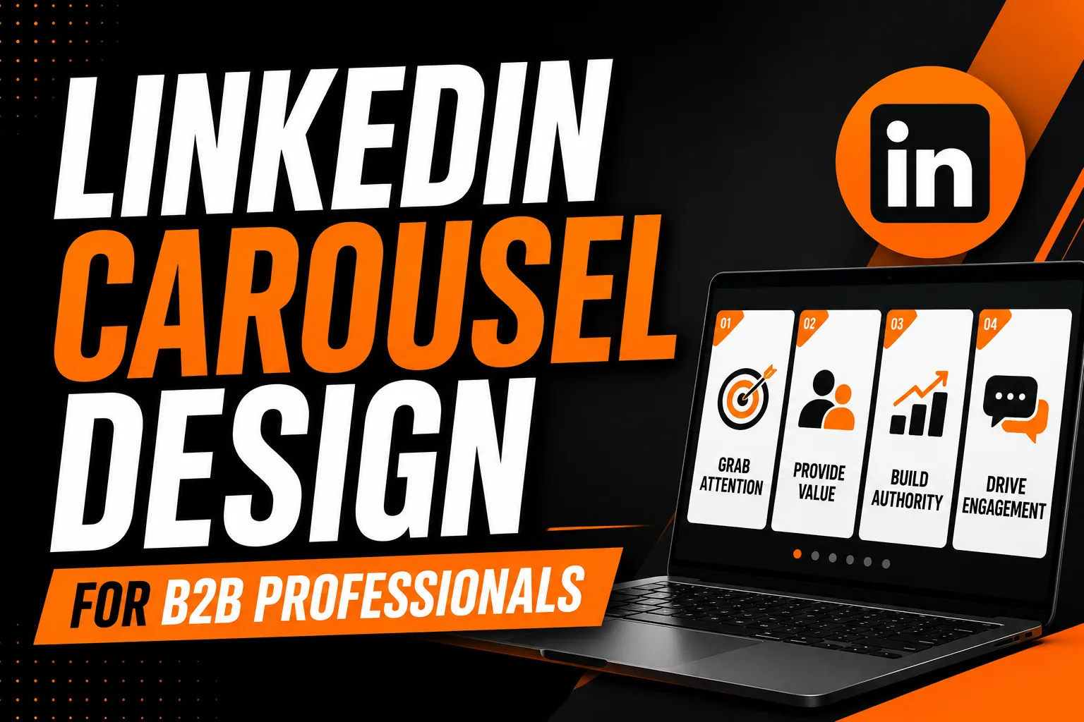
LinkedIn Carousel Design for B2B Professionals: The Framework That Builds Authority
LinkedIn carousels, document posts that display as swipeable slides in the LinkedIn feed, have become the highest-performing content format for B2B professionals building thought leadership and generating qualified inbound leads. They generate significantly more impressions than standard text posts, more saves than single images, and more profile visits than video for most professional content categories. But the majority of professionals who attempt LinkedIn carousels produce designs that look amateurish, structures that do not hold attention past the second slide, or content that is too vague to build genuine authority. This guide gives you the exact framework that works.
Why LinkedIn Carousels Outperform Every Other Post Format for B2B
LinkedIn’s algorithm rewards engagement depth rather than engagement volume. A post that generates 500 passive likes is worth less to the algorithm than a post where 100 people spend 45 seconds swiping through all 10 slides and then save it for future reference. Carousels are uniquely positioned to generate the deeper engagement signals the algorithm values most: time spent, saves, and shares.
There is also a structural advantage that most carousel creators do not know about. When a user scrolls past a carousel without engaging, LinkedIn automatically shows them the next slide of the same carousel on their next feed refresh, effectively giving carousels a second chance at engagement that single images and text posts do not receive. Over the lifespan of a post, this re-serving behavior can meaningfully extend the total reach of a carousel beyond what its initial engagement would predict.
For B2B specifically, the carousel format aligns perfectly with the kind of educational, detailed content that positions a professional as genuinely expert rather than merely active on social media. A carousel that teaches a specific framework, analyzes a specific problem, or documents a specific case study delivers real professional value that a caption or a single image cannot, and that value, when consistently delivered, builds the trust that converts connections into clients.
The Three-Part Structure Every High-Performing Carousel Uses
Every carousel that consistently performs well has the same fundamental structure, regardless of topic. Understanding this structure and applying it deliberately separates carousels that stop the scroll from carousels that get swiped past after two slides.
Part one is the hook slide. Slide one is the only slide visible in the feed before a user decides to swipe. It must communicate a specific, credible promise of value in a single headline. The most effective hook slides use one of four proven formats: a numbered promise (“7 mistakes that are costing B2B sales teams qualified meetings”), a bold claim that creates an information gap (“The pricing strategy that doubled our close rate in 90 days”), a direct question to a specific audience (“If you’re a consultant billing under $5,000 per project, read this”), or a transformation statement (“How we went from 3 inbound leads per month to 23 with one content change”). The headline must be specific enough to feel credible and compelling enough to create genuine curiosity about what follows.
Part two is the value delivery section, slides two through the penultimate slide. Each slide in this section must deliver one complete, specific piece of value. Not a fragment that requires the next slide to make sense, but a complete thought, insight, or data point that would be valuable on its own. This slide-by-slide complete value delivery keeps viewers swiping because each swipe rewards them with something complete and useful. Carousels that spread a single idea across three slides, requiring viewers to accumulate three slides of information to get one complete thought, lose viewers rapidly.
Part three is the call to action slide. The final slide must explicitly tell the viewer what to do next. The best CTAs for authority-building carousels are: “Follow for more frameworks like this,” “Save this for your next [relevant situation],” “Share with a colleague who [specific situation],” or “Comment with your experience of [specific aspect of the topic].” An implicit “thanks for reading” is not a call to action and leaves the most engaged viewers, those who reached the final slide, without a path to deepen the relationship.
Visual Design Principles That Make Carousels Look Professional
The visual design of a LinkedIn carousel must accomplish two things simultaneously: look polished enough to reflect positively on your professional brand, and not be so visually complex that it distracts from the content. The most effective carousel designs are not the most elaborate, they are the most consistent and the most readable.
Use a single, locked template for all slides. The background treatment, font sizes, logo placement, and color usage should be identical across every slide, changing only the headline and supporting content. Template consistency signals professional discipline and makes the carousel feel like a coherent document rather than a collection of independently designed slides.
Text density is the most common design error in LinkedIn carousels. Each slide should contain no more than 30 to 50 words of total text including the headline. A slide that looks like a paragraph from an article is a slide that will not be read, viewers process LinkedIn content in a scanning mode, not a reading mode. Distill each slide to its single most important statement and trust that the following slides will carry the detail.
Use a minimum font size of 28pt for headlines at 1080px slide width. Supporting text should be no smaller than 18pt. Text smaller than this becomes difficult to read on mobile screens, which account for the majority of LinkedIn usage time.
Content Topics That Build B2B Authority Through Carousels
The topics that most reliably build professional authority through LinkedIn carousels share a common characteristic: they address a specific, commonly experienced professional problem with a specific, actionable solution or insight. Vague topics produce vague authority. Specific topics produce specific authority with a specific audience, which is the foundation of effective B2B positioning.
High-performing B2B carousel topic categories include: frameworks that solve a common problem in your field (the more specific the problem, the more authority the framework demonstrates); mistake analyses that show you understand the nuances of your domain well enough to identify non-obvious errors; case studies with specific, measurable results that prospective clients can envision applying to their own situation; industry data interpreted through your professional lens rather than just reported; and process transparency, showing how you or your clients approach a specific challenge step by step.
Frequently Asked Questions About LinkedIn Carousel Design
How do I create a LinkedIn carousel post?
Design your slides in Canva, PowerPoint, or Adobe InDesign at 1080x1080px (square) or 1080x1350px (portrait). Export as a PDF file. In LinkedIn, start a new post, click the document icon to upload a file, select your PDF, and add a strong caption with a compelling hook in the first line. LinkedIn displays the PDF as a swipeable carousel in the feed.
What is the best content for a B2B LinkedIn carousel?
The highest-performing content types are step-by-step frameworks for solving a specific professional problem, industry statistics organized into one-stat-per-slide format, before-and-after case studies with specific measurable results, common mistake analyses with explanations and solutions, and tool or resource roundups with brief value explanations. The common characteristic is educational value most efficiently delivered across multiple slides.
How many slides should a LinkedIn carousel have?
The optimal number is 7 to 10 slides. Fewer than 5 feels incomplete. Carousels using the full 10 slide allowance generate higher save rates because users who reach the final slide are highly engaged and the content has delivered substantial value they want to reference again. The final slide should always include an explicit call to action.
What should a LinkedIn carousel look like visually to appear professional?
A professional LinkedIn carousel uses a consistent visual template across all slides, the same background, font hierarchy, brand colors, and logo placement. Each slide should contain one headline in large readable type, supporting text in a noticeably smaller size (maximum 50 words per slide), and generous white space. The first slide must contain a headline compelling enough to make a viewer stop scrolling.
How often should I post LinkedIn carousels to grow my professional authority?
One to two carousels per week is the recommended cadence. LinkedIn’s algorithm rewards consistent posting with sustained reach, and carousels have a longer content lifespan than text posts because they continue to be shared and saved as users discover them through their network’s engagement. Consistency over several months produces significantly better cumulative results than occasional high-effort posts with long gaps between them.

No comment