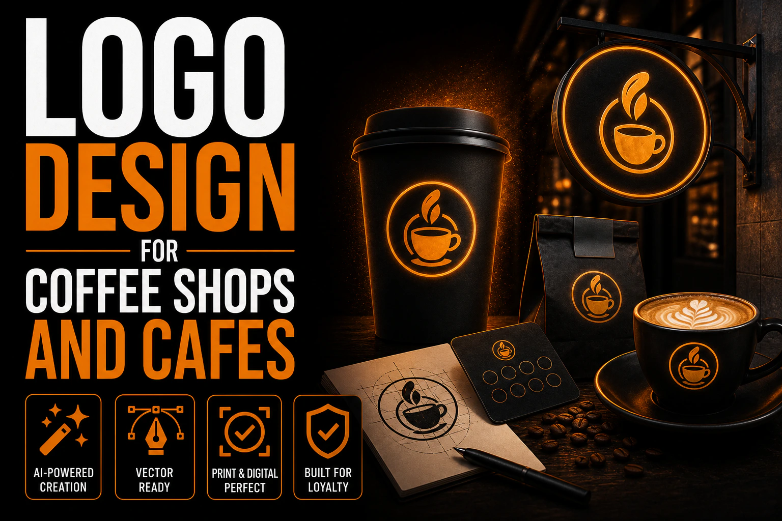
Logo Design for Coffee Shops and Cafes: Building a Brand Customers Want to Return To
A great cup of coffee gets a customer through the door once. A logo that sticks in their memory is what brings them back tomorrow, and the day after that, until stopping by becomes part of their routine. With more than 65,000 coffee shops operating in the United States alone and new independent cafes opening every month, the businesses that build lasting brand loyalty are rarely the ones with the best beans alone, they’re the ones customers can recognize at a glance, on a cup, a window, or a social media feed, before they’ve tasted a single sip.
Key takeaways
- Skip generic coffee imagery like steaming cups and beans, which are so overused that cafes blur together in memory.
- Build your cafe logo from what makes your shop specific, such as its pace, its roasting or its neighborhood.
- Choose warm tones for a cozy neighborhood feel or cooler palettes to signal a modern specialty coffee positioning.
That recognition is not an accident. It is the product of a logo built specifically for how a coffee shop actually operates: small spaces, high foot traffic, low-attention purchase decisions, and a brand that has to work equally well on a hand-lettered chalkboard sign and a to-go cup sleeve.
Why coffee shop branding carries so much weight
Coffee is a habit-driven business. Most customers who order from you today will decide, almost unconsciously, whether to walk into the same shop again tomorrow or try somewhere new. Because coffee itself has become a commodity that many shops can execute reasonably well, the deciding factor for that repeat visit is often the feeling a brand creates rather than a measurable difference in the espresso. A distinctive, <a href=”https://conception-logo.com/en/services/graphic-design/logo/”>well-designed logo</a> builds that feeling faster than almost any other single asset, and it does it silently, every time someone walks past your window or takes a photo of your cup.
This is also why so many major chains are remembered visually before anything else. Customers picture a mermaid, a cup shape, or a color combination before they picture a specific drink. A local coffee shop cannot out-market a national chain’s advertising budget, but it can absolutely out-brand a chain on personality, warmth, and a logo that feels like it belongs to a real place with a real story, not a franchise template.
Start with what makes your shop different, not with clip art of a coffee bean
The single most common mistake in coffee shop logo design is starting with generic industry imagery: a steaming cup, a coffee bean, a stack of beans forming a circle. These symbols are so overused that they cancel each other out, making one cafe indistinguishable from the next in a customer’s memory. Before any visual work begins, a good designer will ask what makes your shop specific: Are you a fast commuter counter or a slow, linger-all-morning space? Do you roast your own beans? Are you known for your neighborhood, your baristas, a specific ritual your regulars have made part of their day? A logo built from that specificity will always outperform one built from category clichés, because it gives customers something to actually remember.
If your shop’s identity leans toward nostalgia, heritage, or a hand-crafted feel, it is worth knowing that this is one of the strongest-performing aesthetic directions in food and beverage branding right now. Our guide on retro logo design explains why vintage-inspired marks communicate authenticity so effectively for independent coffee and craft food brands specifically.
Color and typography choices that actually change how your coffee tastes (psychologically)
Color is doing real work in a coffee shop logo, more than in almost any other retail category, because it primes the customer’s expectation before they order. Warm tones, browns, deep reds, muted oranges, read as cozy, comforting, and traditional, which suits a neighborhood cafe built around slow mornings and familiar faces. Cooler, fresher palettes, sage greens, teals, soft blues, read as modern, clean, and often signal a specialty or third-wave coffee positioning built around single-origin beans and precise brewing. Neither is objectively better; the right choice depends entirely on the experience you’re selling. Our deeper breakdown on logo color psychology walks through how these associations work across industries, and the same principles apply directly to a cafe’s palette decisions.
Typography carries just as much weight. A hand-lettered or script-inspired typeface signals craft and warmth; a clean geometric sans-serif signals speed, modernity, and consistency, closer to what a commuter-focused counter needs. Because so much of a coffee shop’s brand lives in small, fast-glance formats, a cup sleeve, a chalkboard, an Instagram grid, legibility at a distance and at small sizes has to be a non-negotiable requirement, not an afterthought. Our guide to typography in logo design covers how to choose a typeface that still reads clearly once it is shrunk down to app-icon size.
The symbol question: mascot, monogram, or wordmark
Coffee shop logos tend to fall into a few structural categories, and picking the right one early avoids a lot of wasted design revisions later.
A wordmark or lettermark (your shop’s name, carefully typeset, with no separate icon) works exceptionally well for cafes with a distinctive or memorable name, since it builds recognition without asking customers to learn what a symbol means. It is also the easiest structure to keep consistent across every format you’ll need. Our wordmark, lettermark, and combination logo guide explains the tradeoffs between these approaches in more depth.
A mascot or illustrated character can build outsized affection fast, especially for a shop leaning into a playful or community-driven personality, but it requires a genuinely original take. Steam clouds, coffee cups with faces, and beans with arms have all been done thousands of times; a mascot only works as a differentiator if it is drawn with real specificity to your shop’s actual story.
A monogram or initial-based mark suits a shop with a longer or harder-to-read name, condensing your identity into something that still works cleanly on a two-inch cup lid sticker.
Whichever structure you choose, resist stacking more than one of these approaches into a single overloaded mark. A logo that tries to be a wordmark, a mascot, and a monogram at once usually ends up illegible at the sizes a coffee shop actually needs.
A cafe logo built for the counter, not just the screen
Wordmark, mascot or monogram: whichever structure fits your shop, we design it to survive a cup lid, a chalkboard and a one-color stamp, not just a clean presentation deck.
Where your logo actually has to work
This is the part of the process that separates a logo that looks nice on a screen from one that performs in a real coffee shop. Your mark needs to hold up across an unusually wide range of physical formats, often at extremes of scale:
- Storefront signage and window decals, viewed from across the street by someone deciding whether to cross over.
- Cup sleeves and lids, often printed in a single color, sometimes stamped rather than fully printed.
- Menu boards, frequently hand-lettered or chalk-based, which means your logo needs a version simple enough to be recreated by hand.
- Staff aprons and uniforms, typically embroidered or heat-pressed, which limits fine detail and gradient use.
- Social media profile photos, cropped to a circle, where anything near the edges of a square logo gets cut off.
- Delivery app listings and loyalty cards, tiny formats where only the boldest, simplest version of your mark survives.
A logo designed only for a laptop screen frequently falls apart the moment it meets one of these real-world constraints. This is exactly why a professional logo project should always deliver more than a single flattened image. Our guide to what logo files to request from your designer lists the vector master files, color variants, and simplified marks a coffee shop actually needs to cover every one of these formats without a costly redo down the line.
Common mistakes independent coffee shops make
Over-detailing for a chalkboard-sized world. An intricate mark with fine linework might look sophisticated on a business card, but the same detail turns into a smudge on a cup sleeve or a hand-drawn sandwich board. Simplicity is not a compromise here; it is the actual requirement.
Following the trend of the moment too closely. Millennial pink, hand-lettered scripts, or a specific illustration style can look fresh for a year or two and dated the year after. A logo built on a genuine, specific idea about your shop ages far better than one built purely to match a current aesthetic.
Skipping the “does it still work in one color” test. Many of the surfaces a coffee shop logo appears on, stamps, embroidery, single-color cup printing, strip away color entirely. If your mark only works with its full color palette, you will regularly be stuck with a version that doesn’t represent your brand properly.
Treating the logo as separate from the rest of the brand. A strong coffee shop identity is consistent from the sign outside to the cup in a customer’s hand to the Instagram grid. Our guide on optimizing your logo across social media profiles and on maintaining visual consistency as a business grows both apply directly here: the goal is one recognizable mark that flexes across formats, not a different logo for every surface.
Working with a designer versus a template tool
Online logo makers can produce something usable in minutes and at a low cost, which makes sense for a shop opening on a tight budget or timeline. The tradeoff is that these tools draw from shared libraries of icons and layouts, so a template-generated coffee cup mark has a real chance of resembling another shop’s logo somewhere else, since the same popular prompts and templates get used repeatedly across a saturated category. For a coffee shop specifically, where recognition and a sense of place are the entire point, a <a href=”https://conception-logo.com/en/services/graphic-design/logo/”>custom mark</a> built around your actual name, neighborhood, and story tends to earn back its cost quickly through the loyalty it builds. Our honest comparison of Canva and professional graphic design walks through exactly when a do-it-yourself tool is genuinely enough and when it starts costing you more than it saves. If you decide a custom mark is the right investment, our guide on how to choose the right logo designer covers what to look for in a portfolio and process before you commit.
FAQ
What colors work best for a coffee shop logo?
Warm browns, deep reds, and muted oranges suit a cozy, traditional cafe experience, while sage greens, teals, and soft blues suit a fresher, more modern specialty coffee positioning. The right choice depends on the atmosphere and experience you’re selling, not a universal rule.
Should my coffee shop logo include a coffee cup or bean icon?
It can, but these images are extremely common, so a generic cup or bean silhouette risks blending in with countless other cafes. If you use this kind of imagery, make sure it is rendered with a distinctive style, angle, or detail specific to your shop rather than a stock icon.
How much does a professional coffee shop logo cost?
Costs vary widely based on the designer’s experience and how many deliverables (file formats, variations, brand guidelines) are included, and can range from a modest flat fee for a freelance designer to a more comprehensive investment for a full identity package. What matters most is confirming upfront exactly which files and versions are included in the price.
Can I design my coffee shop logo myself with a free tool?
Yes, and it can be a reasonable starting point on a tight budget, but be aware that template-based tools draw from shared design libraries, which increases the odds your mark will resemble another local business. A custom logo is generally worth the investment once brand recognition becomes central to your growth plan.
What files do I actually need for a coffee shop logo?
At minimum: a vector master file (AI, EPS, or SVG), a full-color version, a single-color/black version for embroidery and stamping, and a simplified icon-only version for tiny formats like app icons and cup lids. Ask your designer to confirm all of these are included before the project is considered complete.
Ready to build a coffee shop brand customers remember before they’ve even ordered? Start your logo brief or get in touch with our team to discuss a custom identity for your cafe.