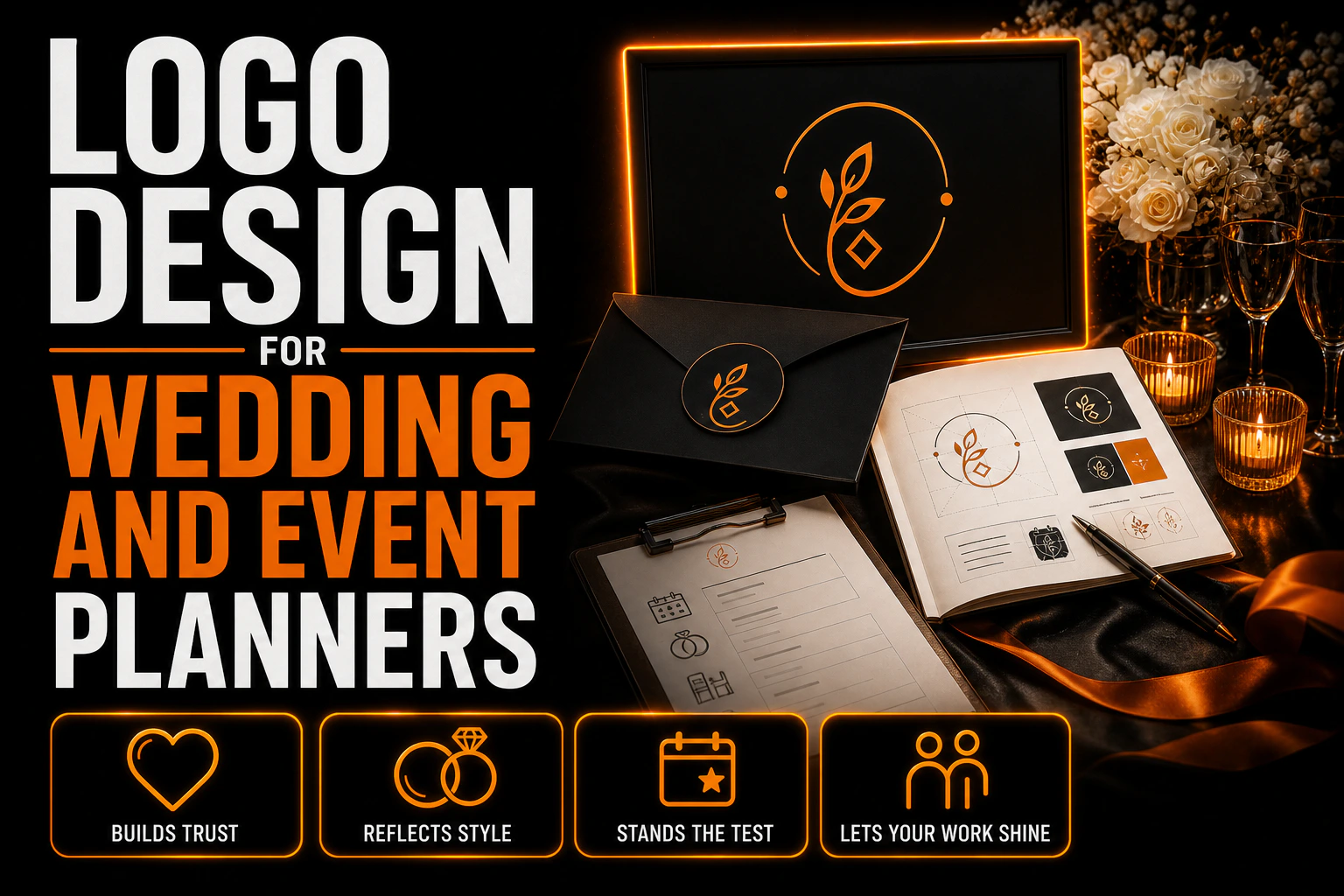
Logo Design for Wedding and Event Planners: The Brand That Has to Step Back
Every other business designs a logo to be seen. Yours has to know when to disappear
A bakery wants its logo on the window. A law firm wants it at the top of every page. An event planner is in a stranger position: the most important thing you produce, the event itself, is the one place your logo does not belong.
Key takeaways
- Design your logo to hold up in vendor grids, since couples work with an average of 14 vendors on one wedding.
- Build stacked and watermark versions from the start so your mark holds up on top of portfolio photographs.
- Choose a neutral wordmark over script and blush if you want corporate work, and carry the warmth through photos and paper.
The stationery, the signage, the menus and the welcome board at a wedding carry the couple’s colours and the couple’s names. At a corporate gala, they carry the client’s brand guidelines. You built all of it, and none of it is yours to sign.
That single fact should shape the whole design brief, and it almost never does. Most planner logos are drawn as if they were going on the event. They are not. They go somewhere else entirely, and the somewhere else has rules of its own.
Your logo lives in a crowd of about a dozen other brands
According to the most recent Real Weddings vendor report from The Knot, which surveyed 16,956 US couples, couples worked with an average of 14 vendors. Photographer, florist, caterer, band, rentals, stationer, officiant, hair and makeup, transportation, and you.
Every one of those vendors has a logo. They all end up in the same places: a shared vendor folder, a venue’s website, a photographer’s blog post crediting the team, a styled shoot submission, a thank you post on social. Your <a href=”https://conception-logo.com/en/services/graphic-design/logo/”>mark</a> is read next to a dozen others, at the same small size, with no space around it.
Two design consequences follow, and both cut against what planners usually ask for.
The first is that a wide, horizontal lockup loses. In a grid of vendor logos, every slot is roughly square or a fixed width. A long name set in a single line shrinks to fit the width, which means it gets vertically tiny while a compact competitor beside it stays readable. If your business name is long, and planner names often are, you need a stacked version built for a square slot, not just a horizontal one squeezed down.
The second is that fine hairline strokes and thin script weights vanish in that context. Not because they are bad design, but because they are being rendered at a few hundred pixels wide, often on a page the venue built years ago with no attention to image quality. Whatever survives that treatment is your real logo.
The venue is your front door, and it decides how you appear
The same report found that 82% of couples hired their venue first. The venue is booked before most of the team exists, which makes venue relationships the strongest referral channel in this business.
That channel has a specific format. Venues keep vendor lists, and The Knot draws a distinction worth knowing: a preferred list is a suggestion couples can take or ignore, while an approved list is mandatory, meaning couples must hire from it except in rare and usually expensive cases. The Knot also notes that these lists are normally built on trust and repeated good experiences, though some approved lists are commercial arrangements where vendors pay the venue for an exclusive agreement.
Either way, you do not control the presentation. You submit a file and the venue places it. In practice this means three things for the design.
You need a version that works on a white background and a version that works on a dark one, because you cannot predict the page. A logo delivered only as a coloured PNG on white will eventually appear as a white rectangle floating on a dark page, and it will look careless next to the vendor who supplied a transparent file.
You need a one colour version, because some venues normalise every logo on their list to a single ink so the page looks tidy. If your identity depends on a two colour contrast to be legible, it breaks there.
And you need the name to be readable without the symbol, because vendor lists are frequently text plus a small thumbnail. If your mark is a monogram that means nothing to a stranger, the thumbnail carries nothing at all.
Your portfolio is photographs, and your logo has to sit on top of them
This is the one place where your logo really does go on the work, and it is the case nobody designs for.
Planners sell through images: reception rooms at golden hour, tablescapes shot from above, a dark ballroom lit by candles, a white tent in flat afternoon sun. Those images get watermarked, posted, reposted and screenshotted. Your mark has to survive on all of them.
A single white file at reduced opacity does not do this. It disappears on the overexposed outdoor shot and it glares on the candlelit ballroom. What works is a small watermark set built at the same time as the logo: a light version, a dark version, and a horizontal variant narrow enough to sit in a corner without covering the part of the image that sells the room.
There is a design judgement embedded here too. A watermark that fights the photograph damages the very thing it is meant to promote. In a business where the product is a beautiful room, the correct watermark is quiet, small and placed where nothing is happening in the frame. If your logo only reads when it is large, it cannot be watermarked, and you have lost your main distribution channel.
A logo built to travel, not just to be seen
Vendor grids, watermarked photos, dark fabric and one-colour venue pages all punish a logo built for a single clean presentation. We design event planner logos as a complete set from day one, including the stacked and watermark versions most designers skip.
The style trap: deciding you are a wedding brand closes the corporate door
Most planners take both kinds of work, or want to. The report puts wedding planner hiring at 37% among millennials and 29% among Gen Z, which is a real but not universal market, and corporate work is what levels out the seasonality.
The trap is that the visual codes of the two markets are almost opposites. Flowing script, blush and gold, a floral flourish and a delicate serif read as bridal instantly. They also disqualify you in the eyes of a procurement manager booking a sales kickoff for four hundred people. The reverse is also true: a tight geometric sans in navy reads as competent and organised, and it can feel cold on a couple’s first meeting.
The way out is not to split the difference into something bland. It is to decide what the logo is for. The logo carries the company: your name, set well, in a form that says organised and current without picking a lane. The warmth, the romance and the mood belong to everything around it, that is to say the photography on your site, the paper you print proposals on, the colour of the folder you hand over, the way your galleries are sequenced. Those elements can shift by audience. The logo cannot, because it has to be the same on a wedding contract and a corporate invoice.
If you genuinely only do weddings and intend to keep it that way, the calculation changes and a warmer mark is defensible. That should be a decision you make out loud, not one your designer makes for you because the mood board was pretty.
The day itself: badges, crates and a lot of black fabric
On event day your brand shows up in a form nobody plans for at the logo stage.
Your team wears something, usually dark, often black, and often with a small embroidered or printed mark. Embroidery has a minimum stroke thickness, and thin scripts turn into a fuzzy line at chest size. On black fabric the effect is worse, because thread on dark cloth loses contrast fast.
Your equipment travels in cases and crates, labelled so that a venue’s loading dock knows whose gear it is. Those labels are printed cheaply, in one colour, and read from six feet away by someone in a hurry.
Your vehicle may carry a mark, and back of house signage sometimes needs one so guests can find the coordination table.
None of these supports are glamorous, and all of them are seen by the people who refer you, that is to say venue managers, catering captains and audiovisual crews. A <a href=”https://conception-logo.com/en/services/graphic-design/logo/”>logo</a> that works beautifully on a website and turns into a smudge on a crate label is failing in front of exactly the audience that fills your calendar.
The practical test is simple. Print the mark in solid black at one inch wide, then look at it from across a room. Then imagine it stitched in white thread on black. What is left is what your industry actually sees.
What this guide does not redo
Designing the graphics that go inside an event, that is to say booth backwalls, banners and the panels a brand installs at a trade show, is a different job with different rules, and it has its own guide covering viewing distances, substrates and file preparation. This article is about the planner’s own mark, not the event’s artwork.
The same goes for preparing a logo for embroidery and for the file formats to request from a designer, both of which are covered elsewhere and apply to every industry.
What is specific to this business is the position your logo occupies: never on the product, always beside a dozen competitors, on top of your own photographs, and stitched onto dark fabric at the loading dock. Design for those four places and the website takes care of itself.
FAQ
Should a wedding planner logo look romantic?
Only if you are certain you will never take corporate work. Script, blush and gold read as bridal immediately, which helps with couples and hurts with a company booking a conference. A safer structure is a neutral, well set wordmark carrying the company name, with the warmth expressed through photography, paper stock, colour and the way you present proposals. Those elements can change by audience. The logo cannot, because it appears on both contracts.
Where does an event planner’s logo actually appear?
On proposals, contracts and invoices, in your email signature, on your website and social profiles, in venue vendor lists, as a watermark on portfolio photographs, on team badges and shirts, on equipment crate labels and sometimes on a vehicle. It generally does not appear on the event’s own stationery or signage, which carry the client’s identity rather than yours.
What logo files does an event planner need?
A vector master, a one colour version, a version prepared for dark backgrounds, a stacked version for square slots in vendor grids, and a small watermark set with both a light and a dark variant. The stacked and watermark versions are the ones planners most often discover they are missing, usually at the moment a venue or a photographer asks for a file.
How do I make my logo work as a photo watermark?
Build it at the same time as the logo rather than improvising later. You need a light and a dark variant, because reception interiors and outdoor daylight shots need opposite treatments, and a narrow horizontal form that can sit in a corner without covering the part of the room that sells the image. If the mark only reads at large size, it cannot be watermarked at all.
Why does my logo look tiny on venue vendor pages?
Because those grids give every vendor a slot of roughly the same width, and a long horizontal lockup has to shrink vertically to fit it. Planner business names are often long, which makes this worse. A stacked version built for a square slot solves it, and it is worth supplying that version to venues rather than letting them scale the horizontal one.
Does the logo matter if my business runs on referrals?
It matters differently. Referral traffic sees you in low control, low quality contexts: a venue list you did not lay out, a crate label at a loading dock, a shirt in a dark room, a screenshot of a photograph. Those are exactly the settings that punish thin strokes, colour dependence and wide lockups. A referral business needs a more robust mark than a business that only ever shows its logo on its own website.