Logo for Vehicle Wraps: File Specs and Design Tips for Maximum Impact
A wrapped vehicle is one of the best advertising investments a business can make: a giant, moving billboard that puts your brand in front of thousands of people every day across your whole service area. But a wrap only works if your logo is built for it. The wrong files turn into a blurry, underwhelming wrap, while the right ones make your vehicle bold, sharp and impossible to ignore. This guide covers the file specs and design tips that make your vehicle wrap deliver maximum impact.
Why Your Vehicle Is a Rolling Billboard
A vehicle wrap reaches an enormous audience for a one-time cost, advertising continuously as you drive and park across your region. Studies consistently show vehicle graphics generate large numbers of impressions at a fraction of the cost of other advertising. But that value only materializes if the wrap looks sharp and professional. A blurry, cluttered or hard-to-read wrap wastes the opportunity, while a bold, clear one turns every trip into effective marketing. Getting the logo and files right is what unlocks the full return on a wrap.
Vector Files Are Non-Negotiable for Wraps
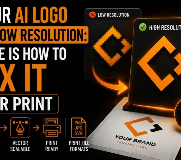
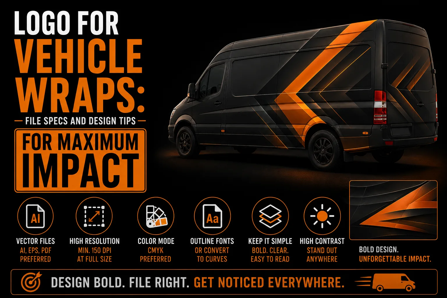
A wrap covers large vehicle panels, so your logo and graphics must be vector files to print sharply at that scale. A pixel-based image stretched across a van or truck comes out blurry and pixelated, the exact problem covered in our guide on logo quality at every size. Vectors scale to any size with no quality loss, which is why every wrap shop asks for them. If your logo only exists as a low-resolution image, it must be vectorized first through a proper vectorization service before it is ready for a wrap.
Designing for Distance and Speed
People see your wrapped vehicle from across a parking lot or while it drives past in traffic, often for just a few seconds. That means your wrap design must be bold and simple: a large, clear logo, a few key words, and strong contrast, all readable at a glance and from a distance. Cramming in too much text or fine detail makes the wrap ineffective, because no one can absorb it quickly. The most effective wraps prioritize a strong logo and one or two clear messages, drawing on the kind of bold simplicity discussed in our article on minimalist logos and effectiveness.
Color and Contrast That Pop
Bold, high-contrast colors make a wrap stand out in traffic and keep it readable from far away. Your brand colors should be reproduced accurately and chosen so the text and logo pop against the vehicle and the background. Weak contrast or muddy colors make a wrap fade into the street. Reproducing your colors correctly at large scale requires properly defined color values, connected to the choices explored in our article on choosing logo colors. The right contrast is what makes your vehicle impossible to miss.
Planning Around Vehicle Shape
Vehicles are not flat canvases: doors, windows, curves, handles and panel gaps all affect a wrap. A good wrap design places your key elements, especially your logo and contact information, where they stay visible and uninterrupted by windows or hardware. Working from clean vector files lets the wrap designer position and scale your logo precisely around these obstacles without degrading quality. Planning around the vehicle’s shape ensures your most important elements land where people will actually see them.
Get Your Logo Ready for a Vehicle Wrap
We prepare clean, large-format vector files so your vehicle wrap prints bold and sharp.
See vectorization service →What to Include on a Wrap
The most effective wraps keep it focused: a bold logo, your core service in a few words, and one clear contact method such as a phone number or website, all large and readable. Resist the urge to list every service or fill every panel. A clean wrap with a strong logo and a single clear call to action outperforms a cluttered one every time, because viewers only have seconds to take it in. Less, presented boldly, is far more effective than more, presented small.
Common Vehicle Wrap Mistakes
Frequent mistakes include using a low-resolution logo that prints blurry, cramming in too much text and detail, weak contrast that makes the wrap hard to read, and placing key elements where windows or handles cut them off. The fix is clean vector files, a bold and simple design, strong contrast, and smart placement around the vehicle’s shape. These ensure your wrap looks professional and actually gets your message across at a glance.
Your Vehicle Wrap Checklist
Before wrapping your vehicle, make sure your logo and design are ready for maximum impact.
- Clean vector files for your logo and all graphics.
- A bold, simple design readable from a distance and at speed.
- Strong, high-contrast colors that pop in traffic.
- Key elements placed away from windows and hardware.
- One clear contact method, large and readable.
When your wrap covers these, your vehicle becomes a powerful moving billboard. A professional vectorization service prepares your logo files so the wrap prints sharp.
How a Wrap Pays for Itself Over Time
A vehicle wrap is a one-time cost that advertises for years, every day you drive and park across your service area. Compared to ongoing ad spend, the cost per impression is remarkably low, which is why wraps are such a smart investment, provided the design works. A sharp, bold wrap turns routine trips into continuous marketing, while a blurry or cluttered one wastes the chance. Whether you operate in Montreal, across Quebec, throughout Canada or beyond, a well-prepared wrap built from clean vector files keeps working for you on every road, the kind of lasting value our overview of professional vectorization describes.
A Real Scenario: The Blurry Van That Cost a Brand
A contractor wraps their van using a low-resolution logo, and the result is soft and pixelated, seen by thousands of potential customers every day. Instead of building credibility, the blurry van quietly undermines it. Vectorizing the logo first would have produced a crisp, professional wrap that worked as intended. This is the cost of skipping file preparation on your largest advertising surface, and it is entirely avoidable with a proper vectorization service before the wrap is printed.
What You Receive for a Vehicle Wrap
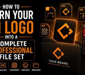
To be wrap-ready, your logo should be delivered as clean vector files (AI, EPS, SVG, PDF) that any wrap shop can scale to your vehicle, with the bold and one-color versions a strong wrap design may need. You own these files and use them with any wrap provider. Having them ready means your vehicle becomes effective advertising the moment it is wrapped, part of the lasting value described in our overview of professional vectorization.
Frequently Asked Questions
Why does a vehicle wrap need vector files?
A wrap covers large vehicle panels, so your logo and graphics must be vector files to print sharply at that scale. A pixel-based image stretched across a van or truck comes out blurry and pixelated, while vectors scale to any size with no quality loss.
What makes an effective vehicle wrap design?
Bold simplicity. People see your vehicle for just seconds from a distance, so use a large clear logo, a few key words, strong contrast, and one clear contact method. Cramming in too much text or detail makes the wrap ineffective.
Can I wrap my vehicle with my current logo?
Only if it is a clean vector file. If your logo only exists as a low-resolution image, it must be vectorized first, otherwise it will print blurry across the large panels of the vehicle.
What should I put on a vehicle wrap?
Keep it focused: a bold logo, your core service in a few words, and one clear contact method such as a phone number or website, all large and readable. A clean wrap with a strong call to action outperforms a cluttered one every time.
What files do I need for a vehicle wrap?
You need clean vector files (AI, EPS, SVG, PDF) that any wrap shop can scale to your vehicle, plus the bold and one-color versions a strong wrap design may need, all owned by you and usable with any wrap provider.