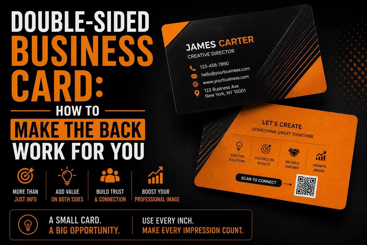
Double-Sided Business Card: How to Make the Back Work for You
Most business cards use only the front, leaving the entire back blank. That is a missed opportunity, because the back of your card is free, valuable space that can make your card more memorable, more useful and more effective. A well-designed double-sided card can reinforce your brand, deliver a key message, or give people a reason to keep it instead of tossing it. This guide explains how to make the back of your business card work for you rather than going to waste.
Key takeaways
- Use the back of your card instead of leaving it blank: a bold brand statement, added utility or a key message.
- Give each side a clear job and keep the styling consistent so neither side feels busy or mismatched.
- Use vector artwork and print-ready files, since a blurry logo looks especially cheap on a card examined up close.
Why a Blank Back Is a Wasted Opportunity
A business card is one of the most personal pieces of marketing you have, handed directly to someone you have just met. Leaving the back blank wastes half of that prime real estate. The back can reinforce your brand, communicate what you do, or add genuine utility, all for little or no extra cost since you are already printing the card. Used well, the back turns a standard card into a more memorable, more useful one. Understanding the value of a great card starts with the fundamentals, as our article on why card quality matters explains.
Option One: A Bold Brand Statement
One of the most effective uses of the back is a strong, simple brand statement: your logo large and centered, your tagline, or a striking brand visual. This reinforces your identity and makes the card feel designed and intentional. A bold logo on the back, balanced against the contact details on the front, creates a polished, professional impression and strengthens brand recognition. Keeping it clean and simple, rather than cramming in more information, often makes the most powerful statement, drawing on the clarity discussed in our article on minimalist design.
Option Two: Added Utility
The back can also deliver real usefulness that gives people a reason to keep your card. A QR code linking to your website, booking page or portfolio bridges print to digital instantly. Other options include a small map, a loyalty stamp area, an appointment reminder space, or a short list of key services. Utility makes a card something people hold onto rather than discard, which keeps your contact details in their pocket longer. A useful back quietly increases the chances your card does its job later.
Option Three: A Key Message or Offer
The back can carry a single key message: your core value proposition, a memorable line, or a special offer for new contacts. A short, compelling statement of what makes you different, or an incentive to get in touch, can turn a card from a passive contact record into an active prompt to act. The key is restraint, one clear message, not a cluttered paragraph. A focused message on the back gives the recipient a reason to remember you and reach out.
Keeping Both Sides Balanced
A good double-sided card balances the two sides so they work together. Typically the front carries your essential contact details and the back delivers the brand statement, utility or message. Both sides should share the same colors, fonts and style so the card feels cohesive, and neither should be cluttered. Consistency between the sides reinforces your brand, while balance keeps the card clean and professional. The two sides are partners, not competitors, each doing a distinct job within one coherent design.
Make Both Sides of Your Card Count
We design double-sided business cards, print-ready and built to be memorable and useful.
See our business card design service →Why Print-Ready Files Matter
A business card is small, so any imperfection shows. Your logo and graphics must be crisp at card size, which requires clean vector files, the foundation explained in our guide on logo quality at every size. A blurry logo on a card looks especially cheap because the card is examined up close. Proper vectorization keeps both sides sharp, and a professionally prepared, print-ready file ensures crisp results, avoiding the problems described in our article on print-ready files.
Common Double-Sided Card Mistakes
Frequent mistakes include cramming both sides with information until the card feels busy, mismatched styling between the sides, wasting the back on nothing, and using low-resolution artwork that prints fuzzy. The fix is to give each side a clear job, keep both clean and consistent, use the back purposefully, and prepare clean print-ready files. A well-balanced double-sided card looks professional and works harder than a one-sided one, for essentially the same cost.
Your Double-Sided Card Checklist
Make the back of your card work for you with these essentials.
- Give the back a clear job: brand statement, utility or key message.
- Keep both sides clean, not crammed with information.
- Match colors, fonts and style across both sides.
- Consider a QR code linking to your site or booking page.
- Use clean, print-ready vector files for crisp results.
When your card covers these, it is more memorable and useful. A professional business card design service builds both sides to work together.
How a Better Card Keeps You Top of Mind
A business card’s job is to keep your details in someone’s pocket until they need you, and a well-designed double-sided card does that better than a forgettable one. A useful or striking back gives people a reason to hold onto your card rather than discard it, which means your contact information stays available longer. Whether you work in Montreal, across Quebec, throughout Canada or internationally, a memorable card quietly keeps you top of mind, the kind of customer engagement our article on creative design and customer engagement describes. For little extra cost, the back of your card can meaningfully extend your card’s working life.
A Real Scenario: The QR Code That Won a Booking
A consultant adds a simple QR code to the back of their card, linking straight to an online booking page. Weeks after a networking event, a contact finds the card, scans the code, and books a meeting in seconds, something a blank back would never have prompted. That small piece of utility turned a passive card into an active lead. It shows how purposeful use of the back, paired with clean, print-ready files as our guide on logo quality at every size explains, makes a card work harder long after it changes hands.
What You Receive With a Professional Card
A professional double-sided business card comes as a balanced, print-ready design where each side does a clear job, built around your brand with clean vector graphics that stay crisp at card size. You receive files ready for any printer. This ensures your card looks polished and works harder for you, part of the lasting quality described in our overview of professional design and vectorization. A well-designed card makes a strong, lasting impression.
Frequently Asked Questions
Should a business card be double-sided?
Using the back is usually worthwhile, since it is free, valuable space already being printed. A double-sided card can reinforce your brand, add utility like a QR code, or deliver a key message, making the card more memorable and effective than a blank back.
What should go on the back of a business card?
One of three things, kept clean: a bold brand statement like your logo and tagline, added utility such as a QR code or map, or a single key message or offer. Avoid cramming the back with information.
How do I balance both sides of a card?
Typically the front carries essential contact details and the back delivers the brand statement, utility or message. Both sides should share the same colors, fonts and style so the card feels cohesive, and neither should be cluttered.
Why does my business card logo look blurry?
Because the logo is a low-resolution image, which shows badly on a small card examined up close. Clean vector files keep your logo and graphics crisp at card size, giving a professional, print-ready result.
What do I receive with a professional business card?
You receive a balanced, print-ready design where each side does a clear job, built around your brand with clean vector graphics that stay crisp at card size, ready for any printer.